Monday 25th we presented our site maps to the class. I found this helpful to see how other students interpreted the brief and the way they explored their threshold relationships.
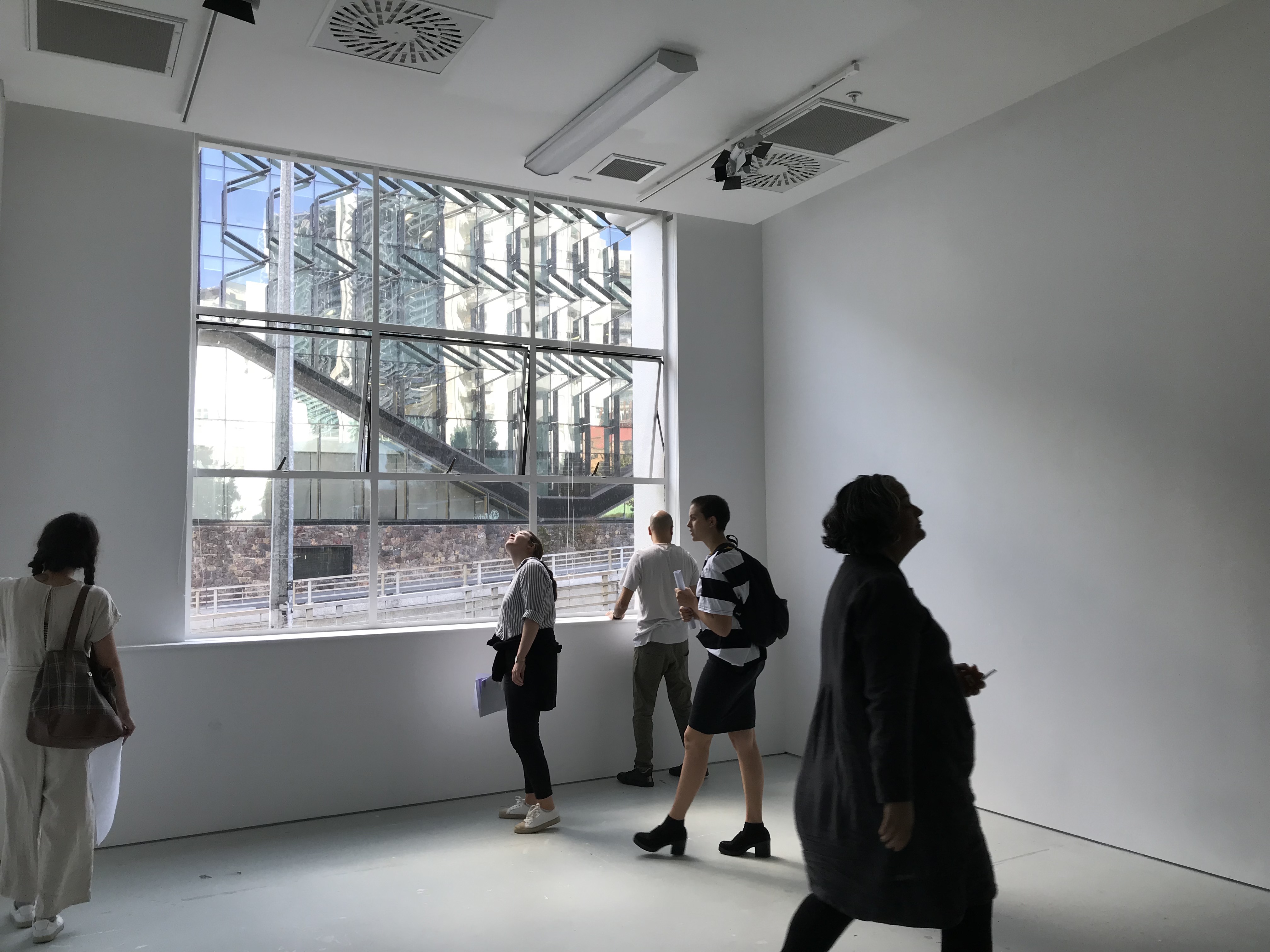
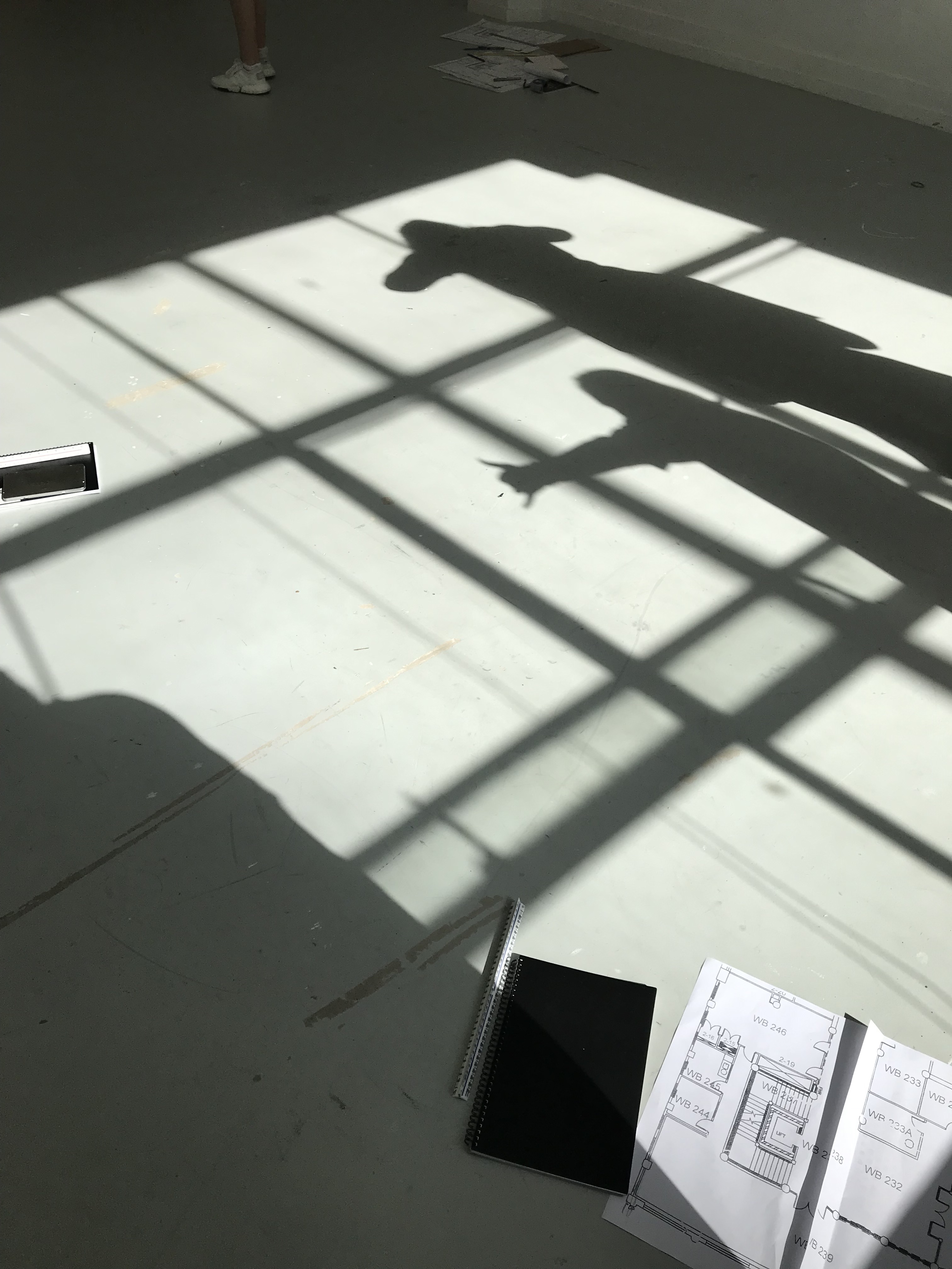
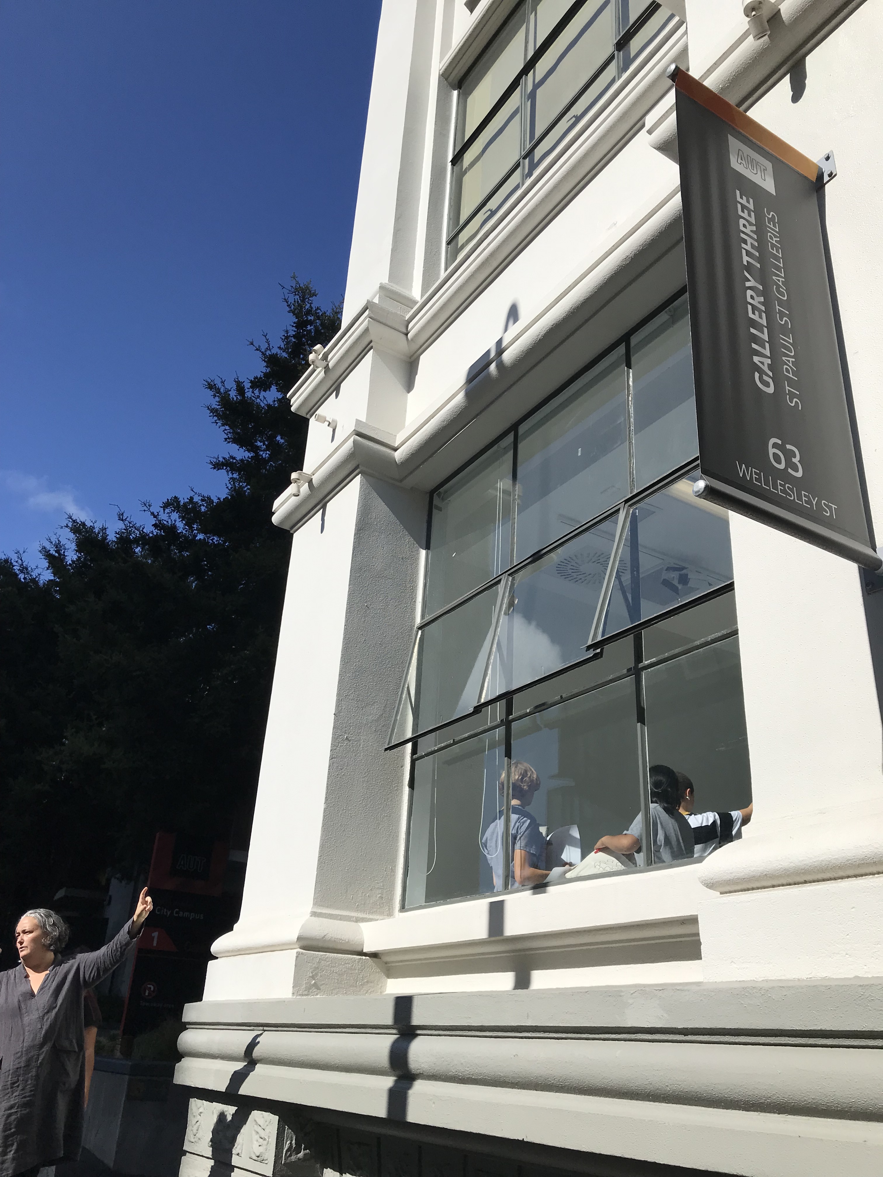
We were able to enter into the gallery space for the first time and take all the measurements we need to start drawing our plan and section drawings. I observed the natural light and the way it affected the room. The shadow it cast on the ground was beautiful and i’d love to incorporate this into my design. The light also bounces off the walls and carries quite far down the room creating a lovely naturally light space.
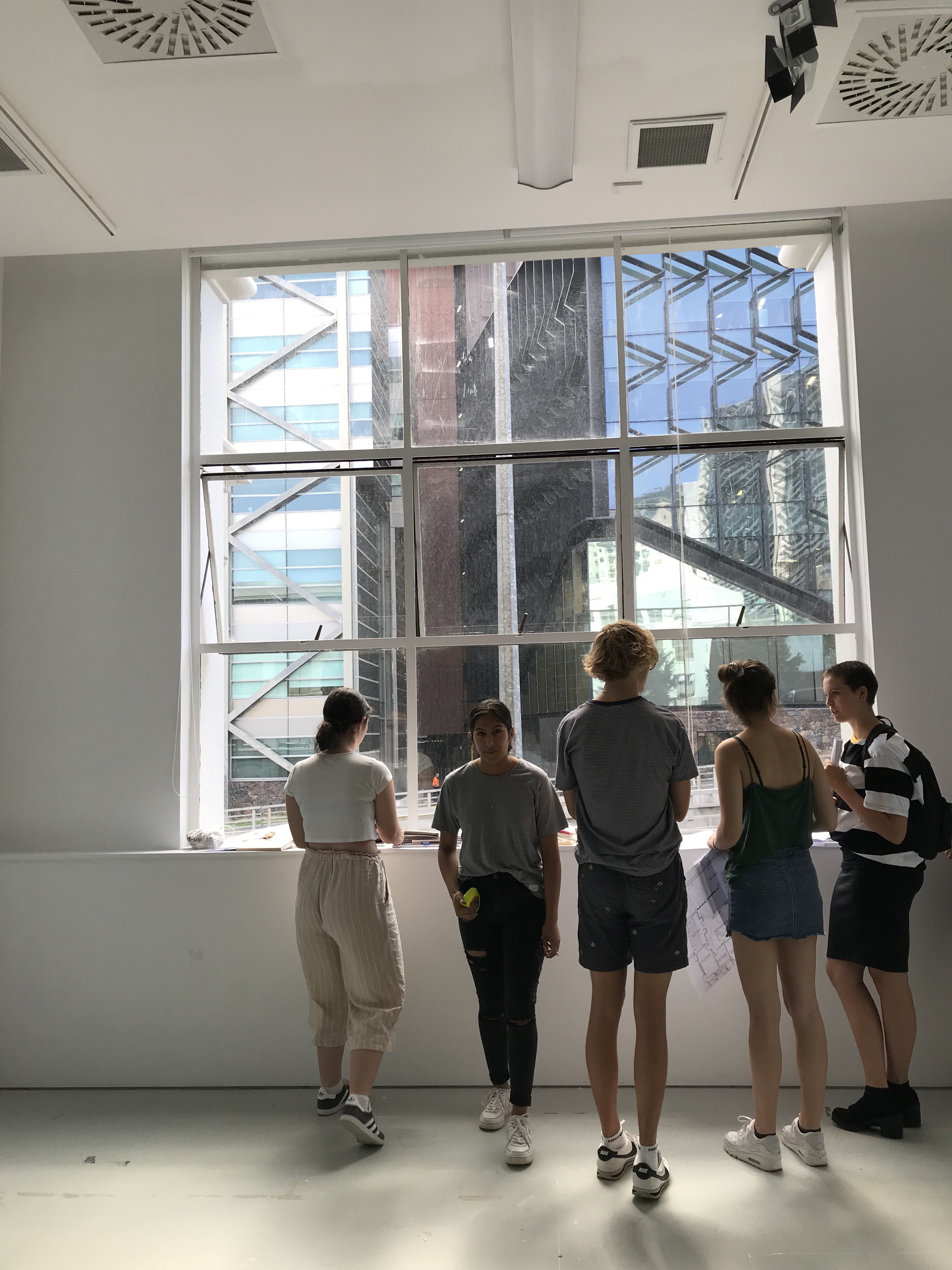
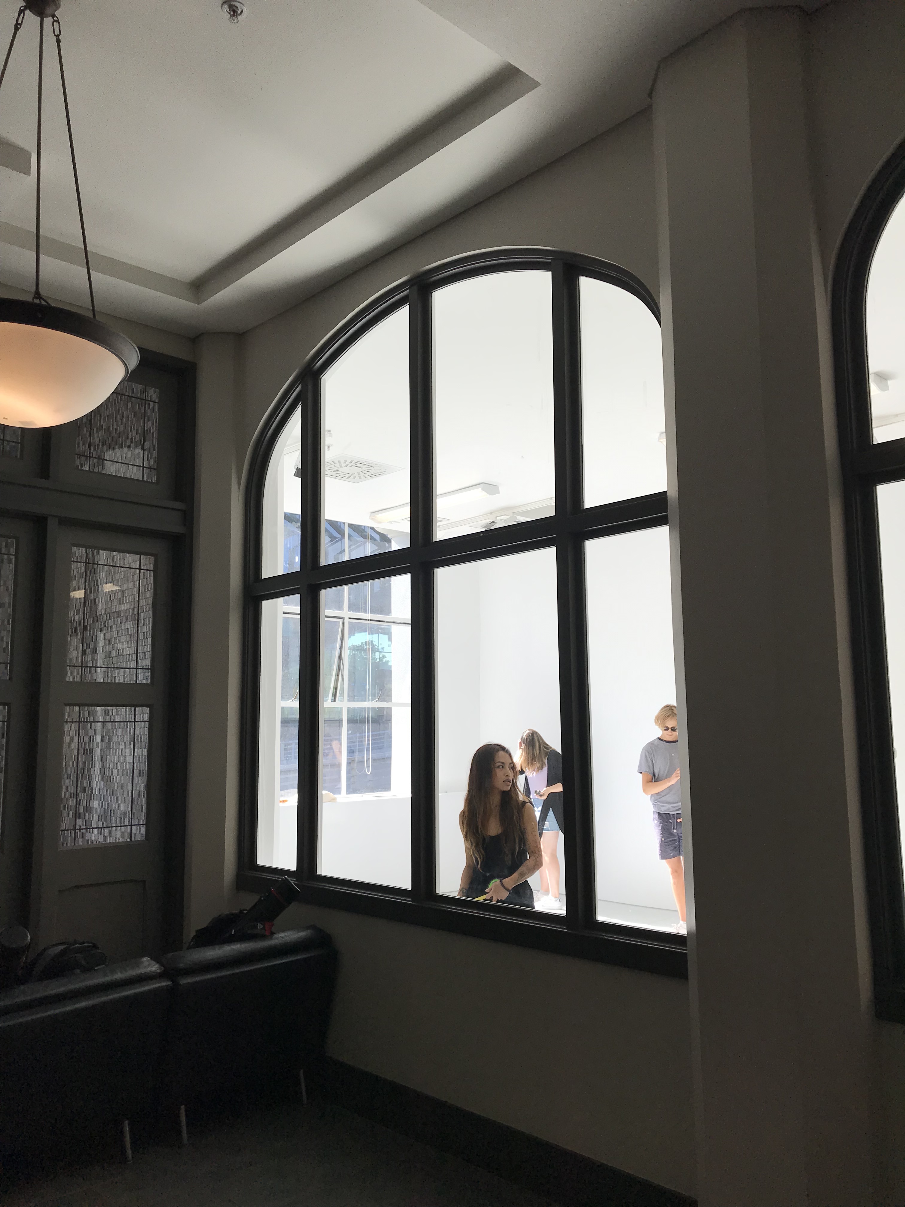
The space felt very open and calm which caused people to move slowly and be more relaxed. It is quite a private space despite the large window. You are only able to see pedestrians when right up close to the window therefore thats the only time they can see you.
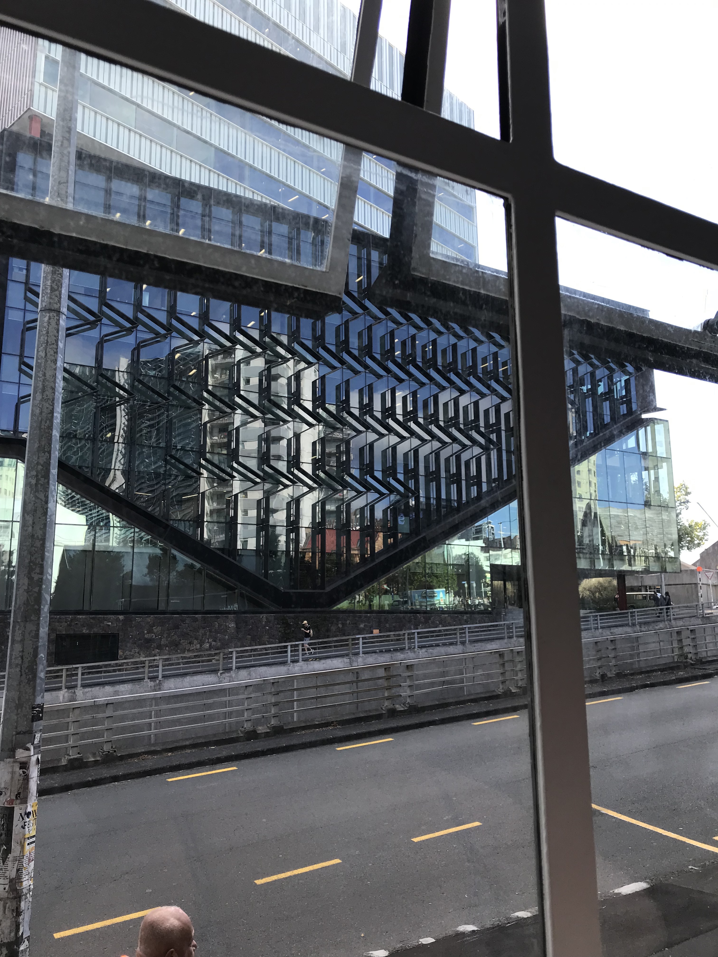
The buildings opposite the gallery are made of a reflective glass allowing a reflection of the sky and the city to be seen from the gallery space creating a unique view of the city.
The gallery space is very much a blank canvas for us to use which makes me excited to start designing.


I started researching different, unique doors/ ways of entering into a space. I like the idea of an interactive experience between the person and the door.
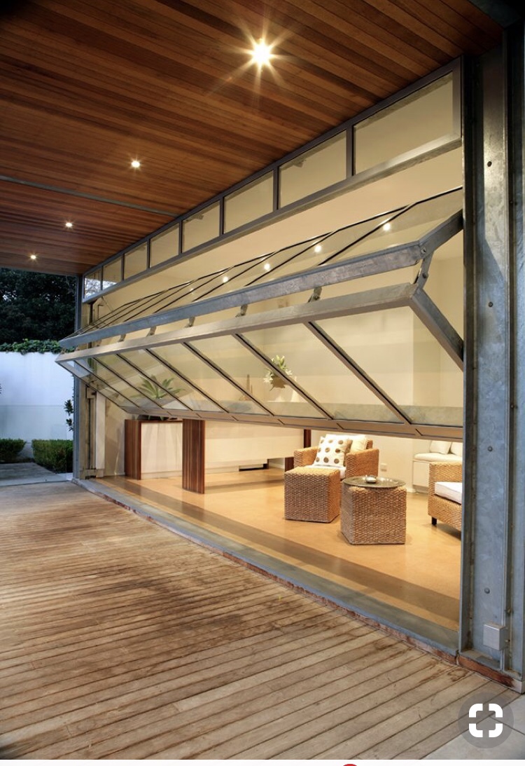 Image source: Gliderol
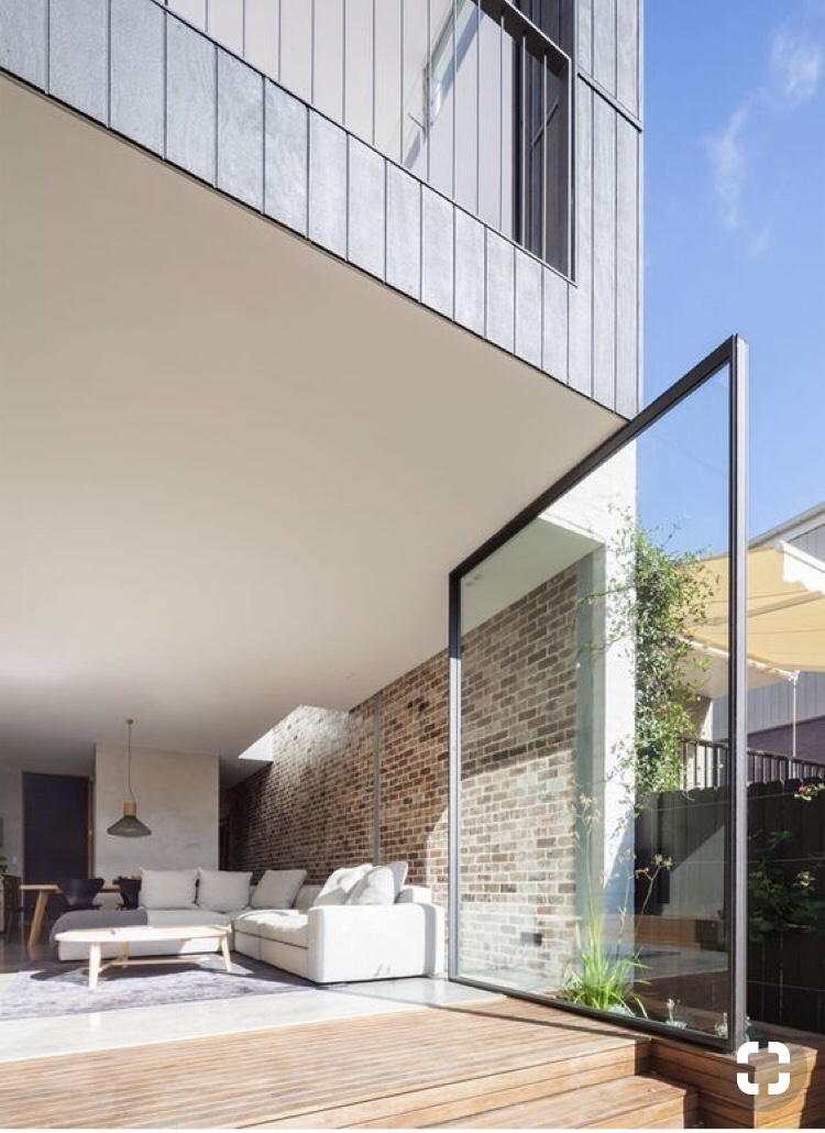 Source: Marston Architects
 Source: Paz Arquitectura
On Wednesday I started my plan drawings. I wanted to centre my new threshold moment around the front facing window. To focus more on the window I have designed a false floor that is raised by 1000mm to meet the base of the window. The entrance into the space will be through the window. There will be two sets of parallel rollers on tracks so as you push the window, it moves straight back. This then opens two spaces two your left and right to enter into the gallery. I didn’t know how i wanted to lead people to the window. At first i designed a stair way that wrapped around the corner of the building leading to a platform in front of the window. this design imposed onto the footpath and wasn’t as grand as I had hoped.
I consulted with Pip and she brought the idea of moving further into the space to create a grander entrance which I hadn’t considered. I altered my design incorporating this feedback, moving further into the gallery space to fit a staircase up to the window.
I wanted to do something with the interior of the space. I used mirrors in my first project so did some research on how different designers have used mirrors. Eileen Gray designed the Satellite mirror for a bathroom setting but it creates an interesting reflection having the two mirrors. Spandana Gopel with Tiipoi designed Mirror 6 which is a large, raw, circular mirror. Large scale is quite striking in a mirror and the imperfection holds it own unique beauty.

Mirror 6 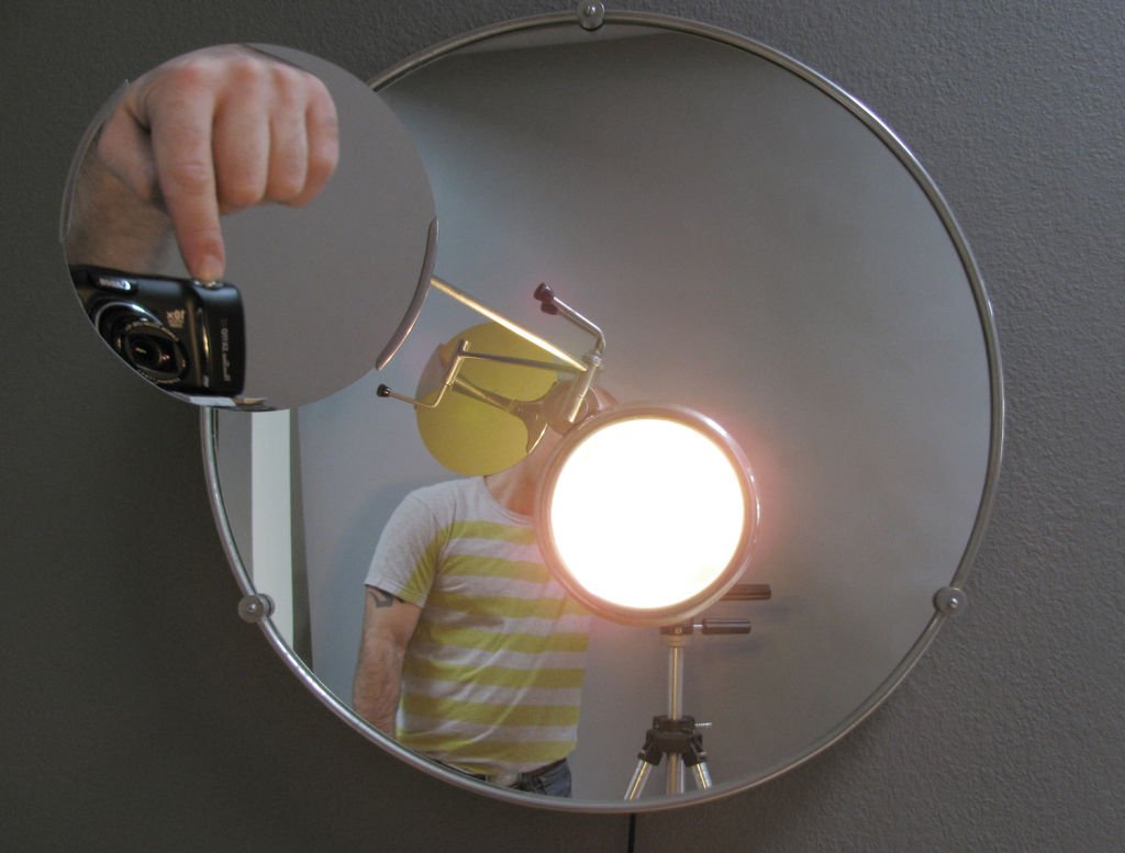
Satellite Mirror
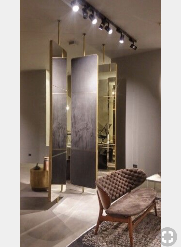
Through my research I came across the use of sectioned mirrors in an interior space and love the way it changed the space.


I like the way mirrors manipulate a room so I incorporated some slim mirrors that are also on tracks in the ceiling and floor so they can move up and down the room. Bringing the outside in. It allows the people that are in the space to interact with the interior as well as the exterior landscape. This also allows pedestrians to interact with the space as they are passing by seeing their own surroundings being reflected back at them. A city in a room.
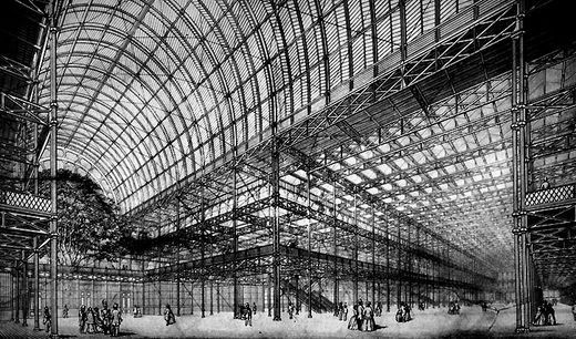
Joseph Paxtons crystal palace similarly has this concept of bringing the outside in. Its quite surreal and blurs the line of interior/ exterior creating a unique space to interact with.

Origional Floor Plan 
Threshold Studies 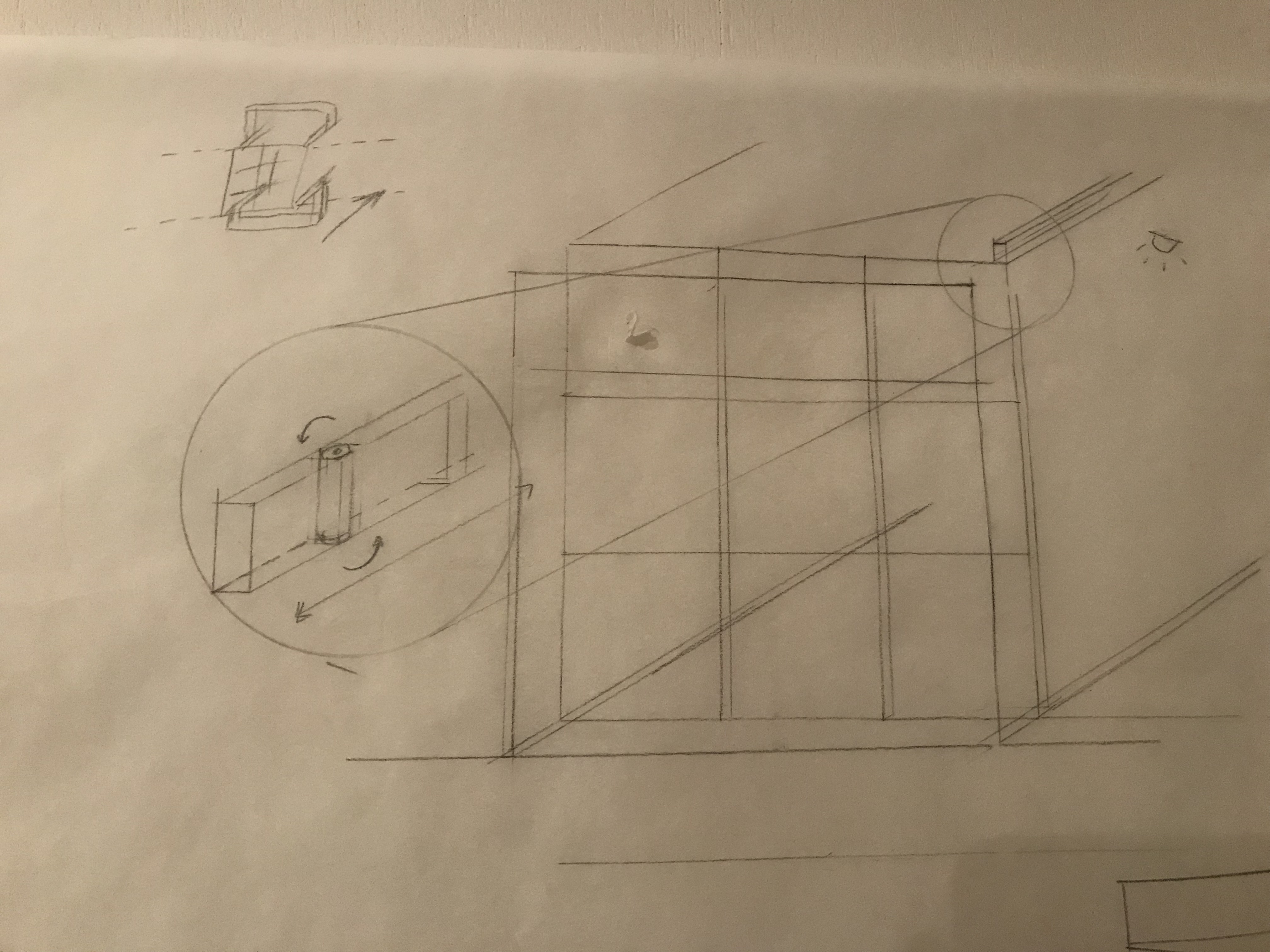
Threshold Studies detail sketch 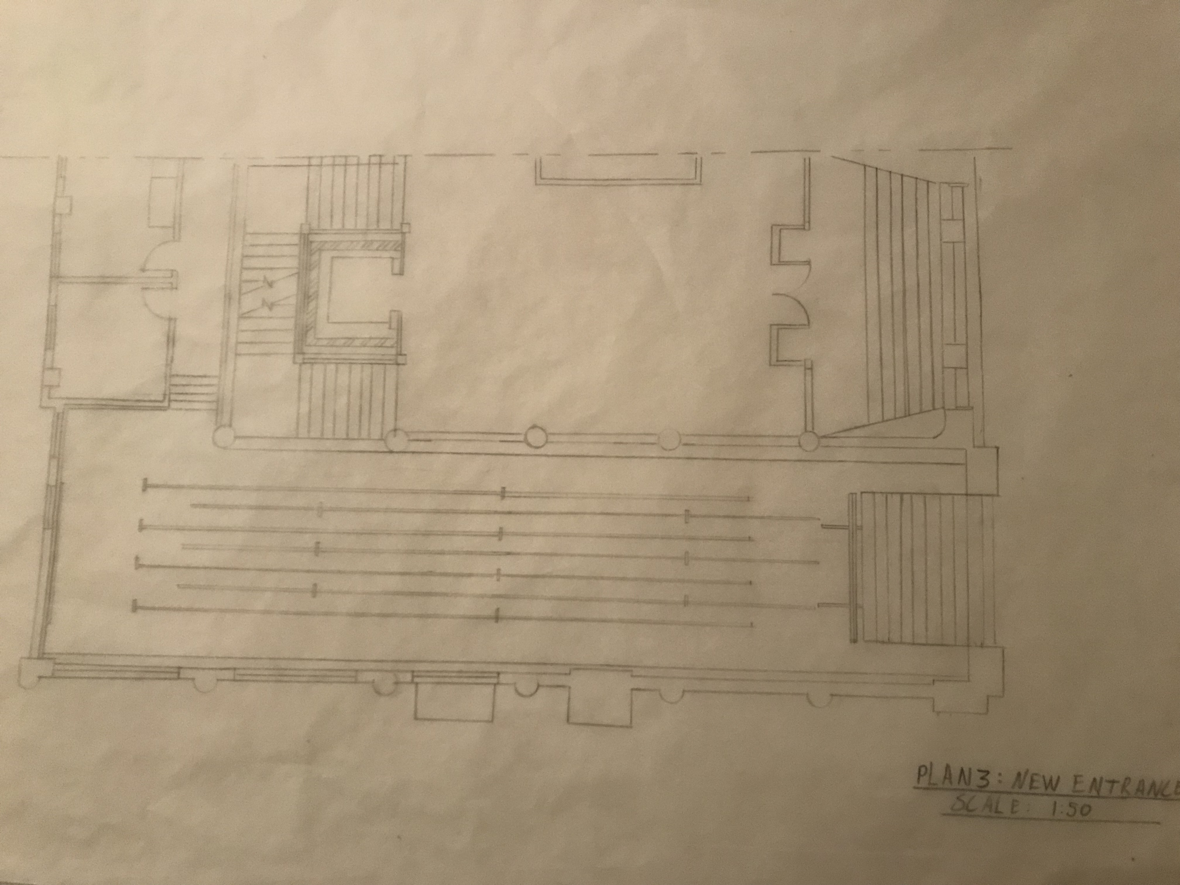
New Entrance Floor Plan 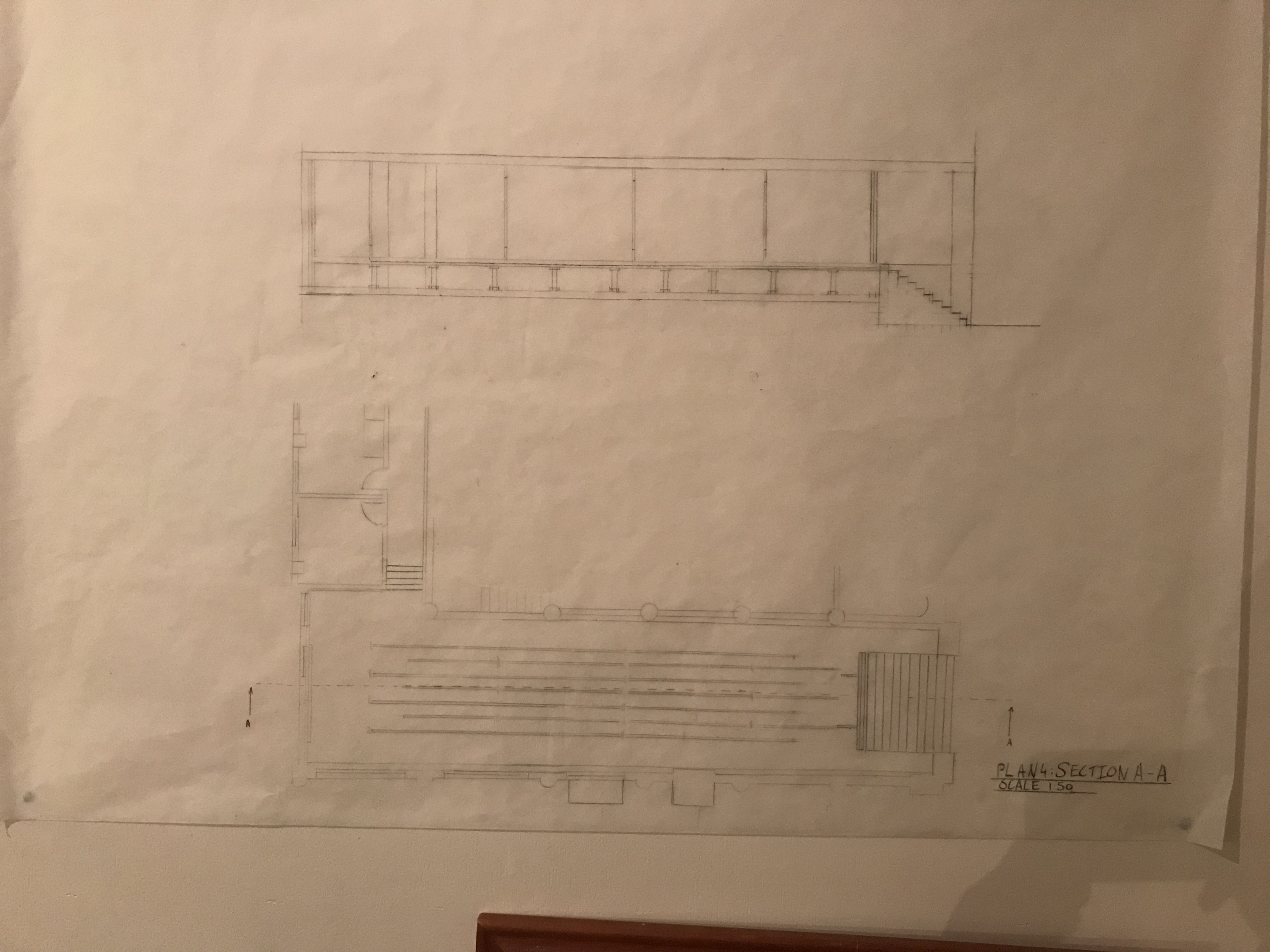
Section Drawing
