First day back we walked from our studio class down to the St James theatre observing the colour used in the urban environment and the way that the light interacts with the infrastructure.
As I walked I was encouraged to consider colour in relation to ‘materiality, light, scale and texture’.
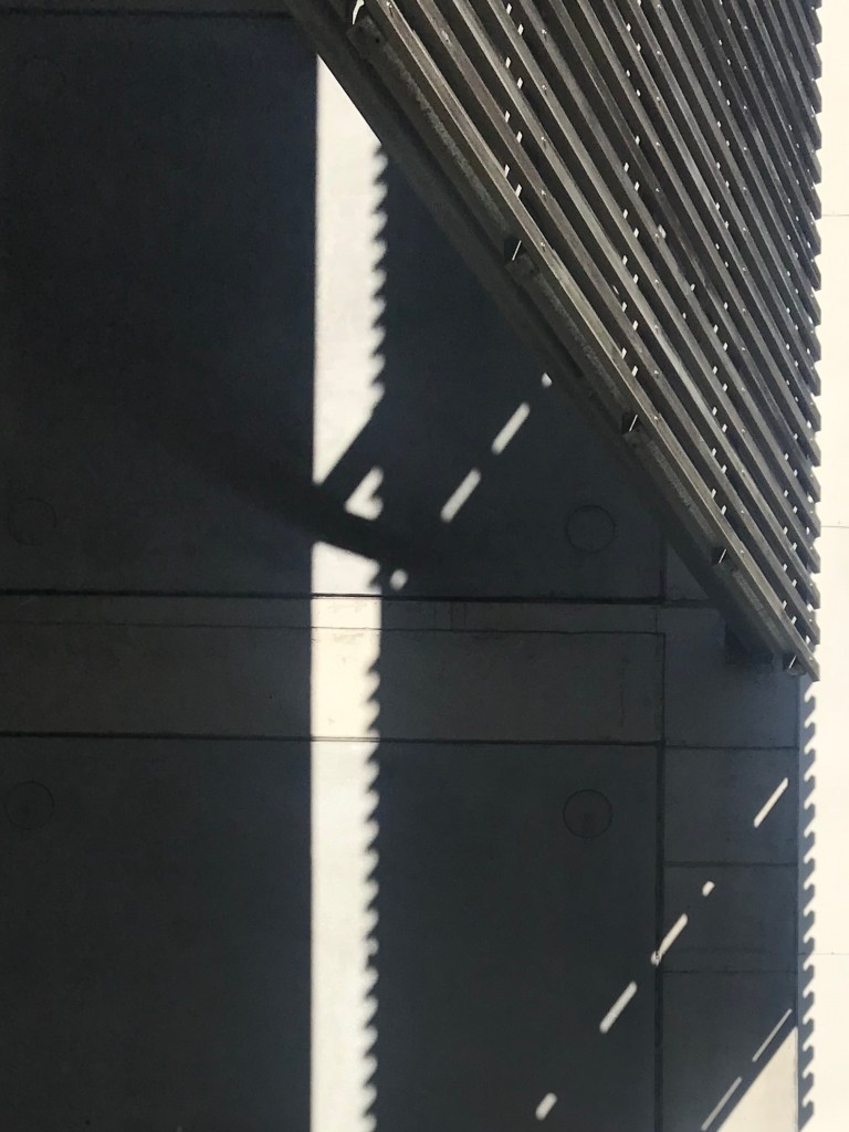
Shadow Play 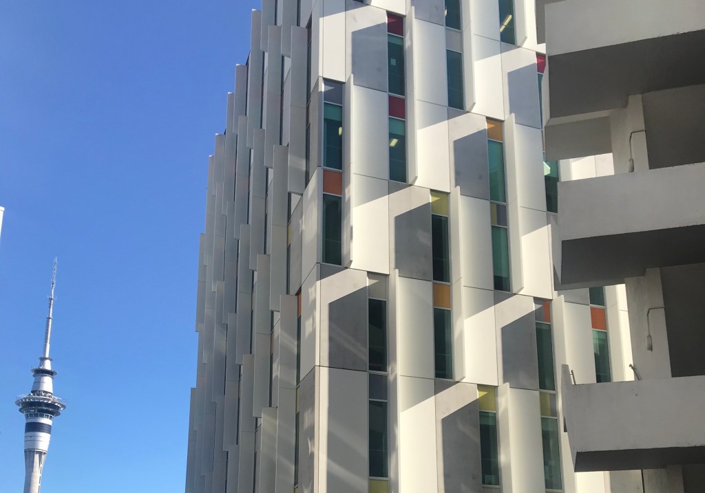
Shadow Play and Pops of Colour 
Natural Dappled Light 
Glass vs Brick Reflections 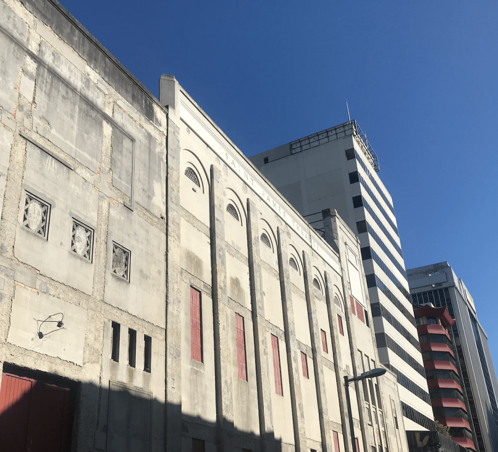
Saint James Theatre 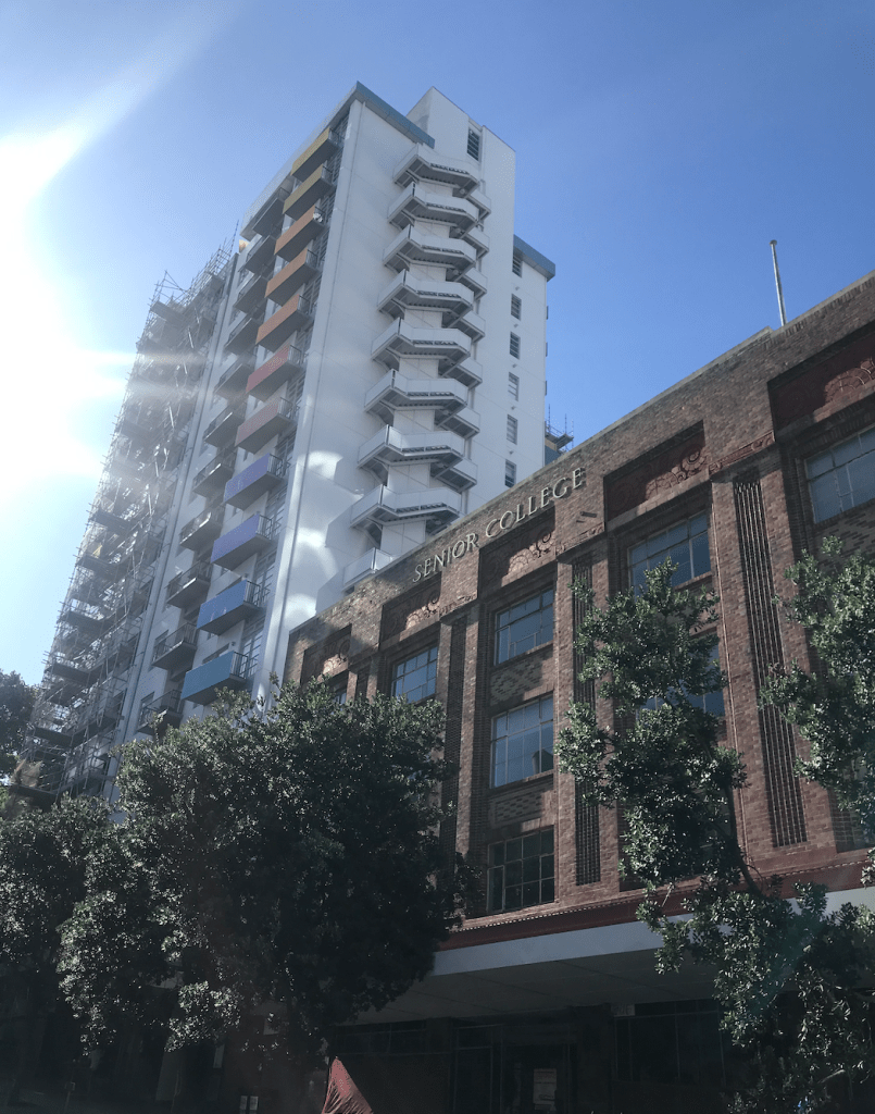
Light Play and use of Colour 
Functionality Details 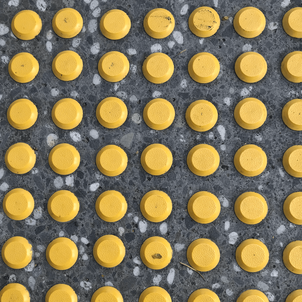
Functionality Detail 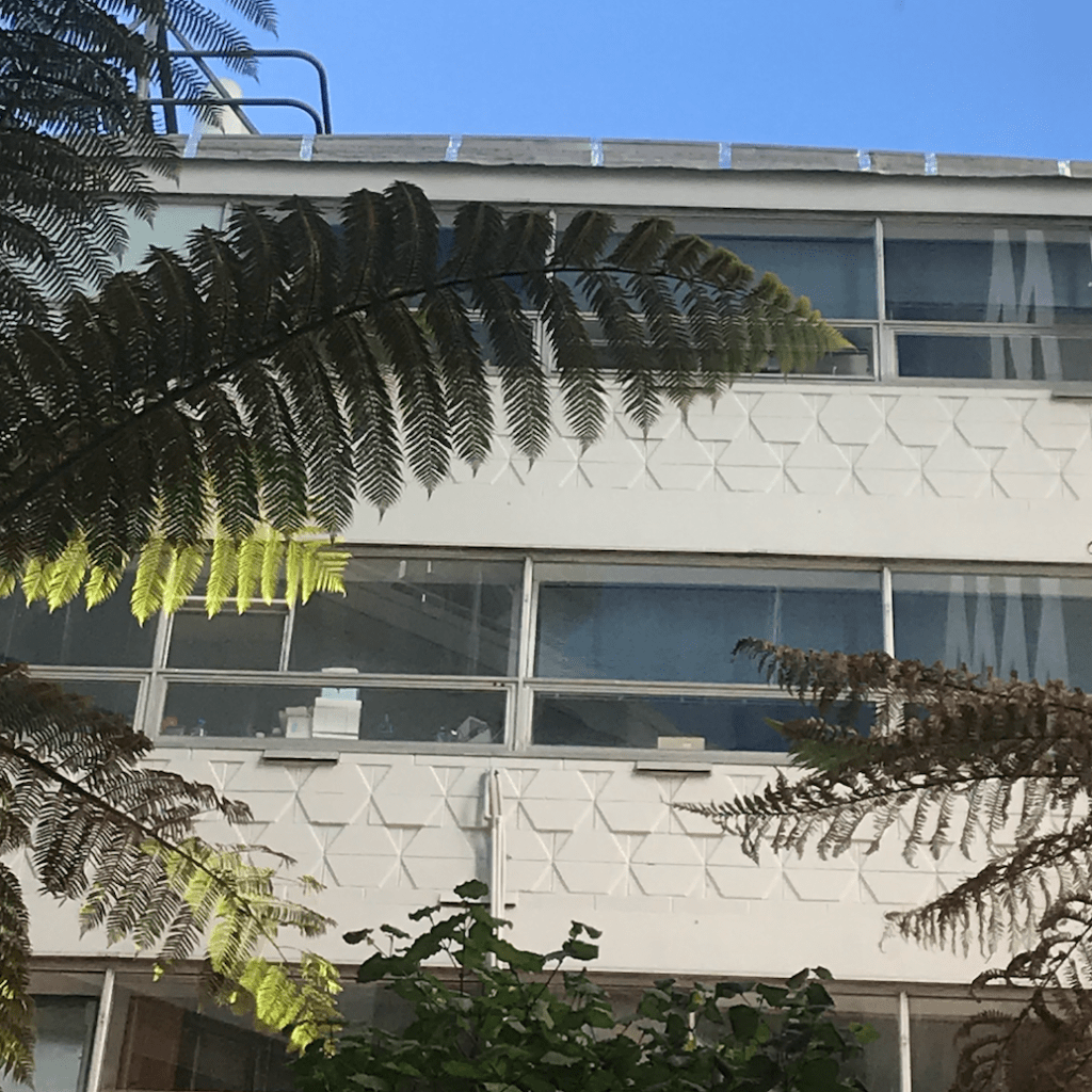
Detailing and Shadows
I sketched out some interesting details and use of colour that had caught my eye on the walk.
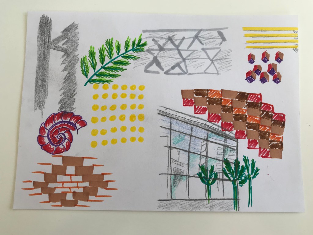
Sketch 1 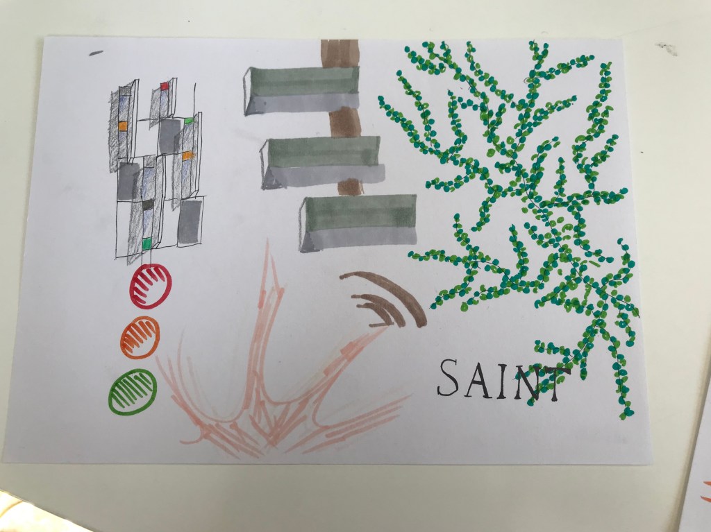
Sketch 2
I found that my eye was drawn to the bright pops of colour. I also noticed little detailing on different buildings that would create small shadows that made the design standout.
From the sketches I made, I created a collage of the different details I liked and found interesting.

I really like the yellow dots in its grid pattern so used that as the element to tie things together. This turned into a nice contrast to the brick like blocks of colour that I also added. I found that I liked the relationship between the angular boxy shapes and the round and natural shapes.
This helped me analyse the environment that surrounds the site of the Saint James Theatre for this semesters project in a unique way.
Through this exercise I realised just how much detail is in the ordinary, everyday infrastructure of Auckland city. The city is full of contrasts and opposites that live in harmony. An example of this is in the contrast of matte surfaces vs glossy e.g glass vs brick, or nature vs concrete.
