The question I was given for our presentation is:
How has the designer analysed and interpreted the particular site and context of the project relative to colour? What relationships have been set up between the user and the space because of colour?
The Weiss-heiten Studio designed the interiors of the Aesop Mitte store in Berlin Germany. The designer drew on the historical context of the site leaning into the Bauhaus movement to influence the use of colour and aesthetic in the space. This meant marrying functionality with beauty and in this case using the colour green to achieve it.
The outworkings of Bauhaus design style has created a clinic aesthetic which promotes the cleanliness of the products being sold causing customers to experience the feel of the product before they have even used it. The use of green in the tiles, paint and furnishings further promotes this idea and sets the scene in which customers would use the product. With green being a dominant colour in nature, people associate it with being fresh, natural and luxe all of which are synonymous to the Aesop products.

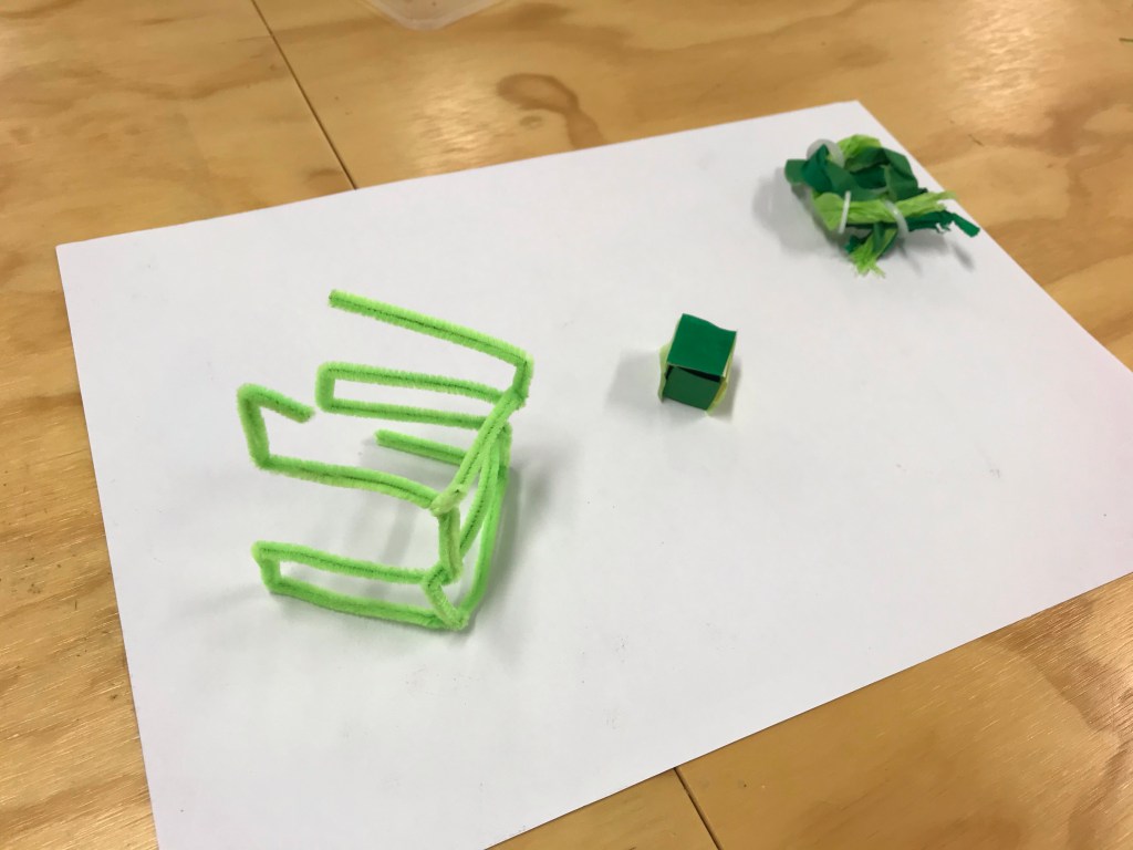
Colour complex: Iterative model making exercise
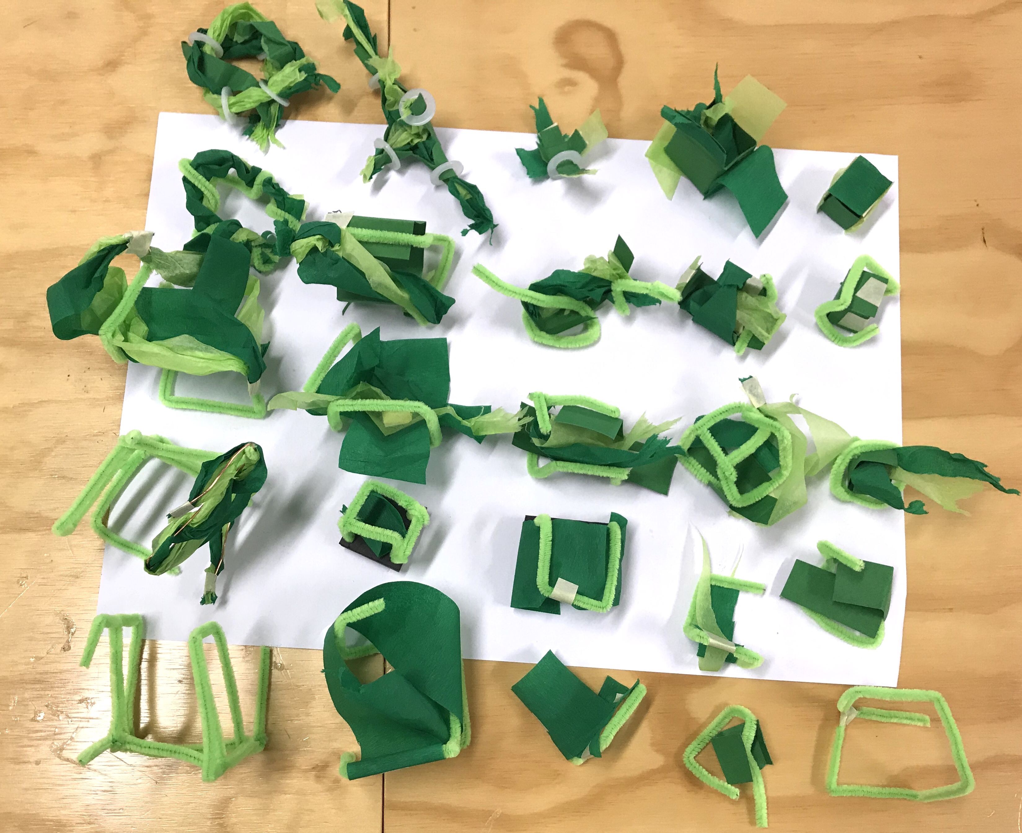
Through this exercise I found that I was able to abstract out my initial ideas creating really unique models and shapes. This was helpful in informing my practise to push my ideas and pull them apart and put them back together to create shapes and produce ideas that are more complex and interesting than my initial concept. I found it interesting to observe the merging of ideas as the models evolved through the grid. The crossing over of the initial ideas (interaction of colour, an aspect of your seminar research and a detail) and the marriage of those ideas as they intersected across the grid.
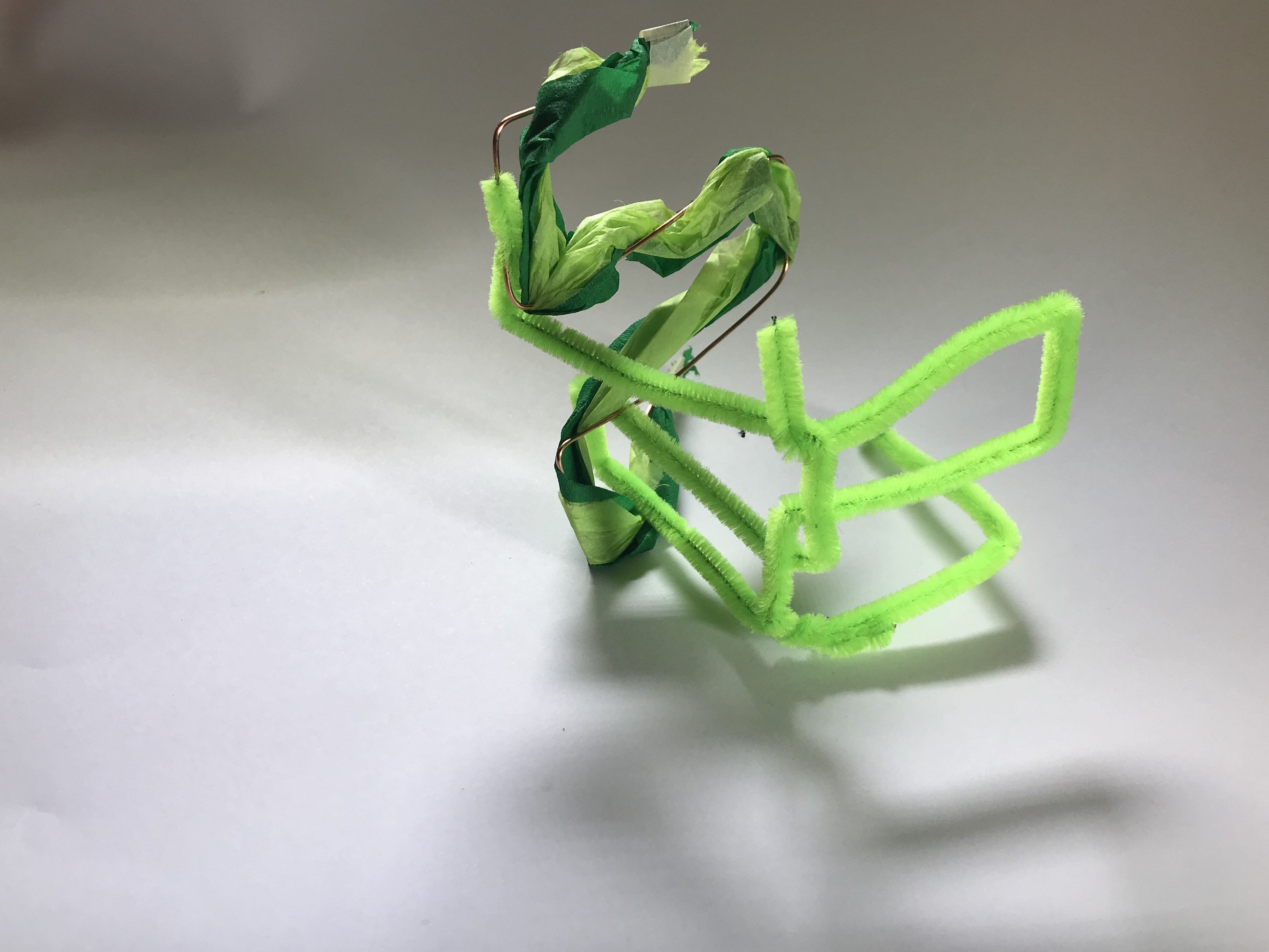
Through the photographing of my favourite model with good light, it caused me to slow down that part of the process and pay more attention to the details of my model and the effect it creates on its surroundings. The results looked great, playing with shadow and highlighting colour.
