My artist model is the director Wes Anderson and I will be focusing on his film The Grand Budapest Hotel.
Questions about Wes Andersons work:
When and where did he produce his work?
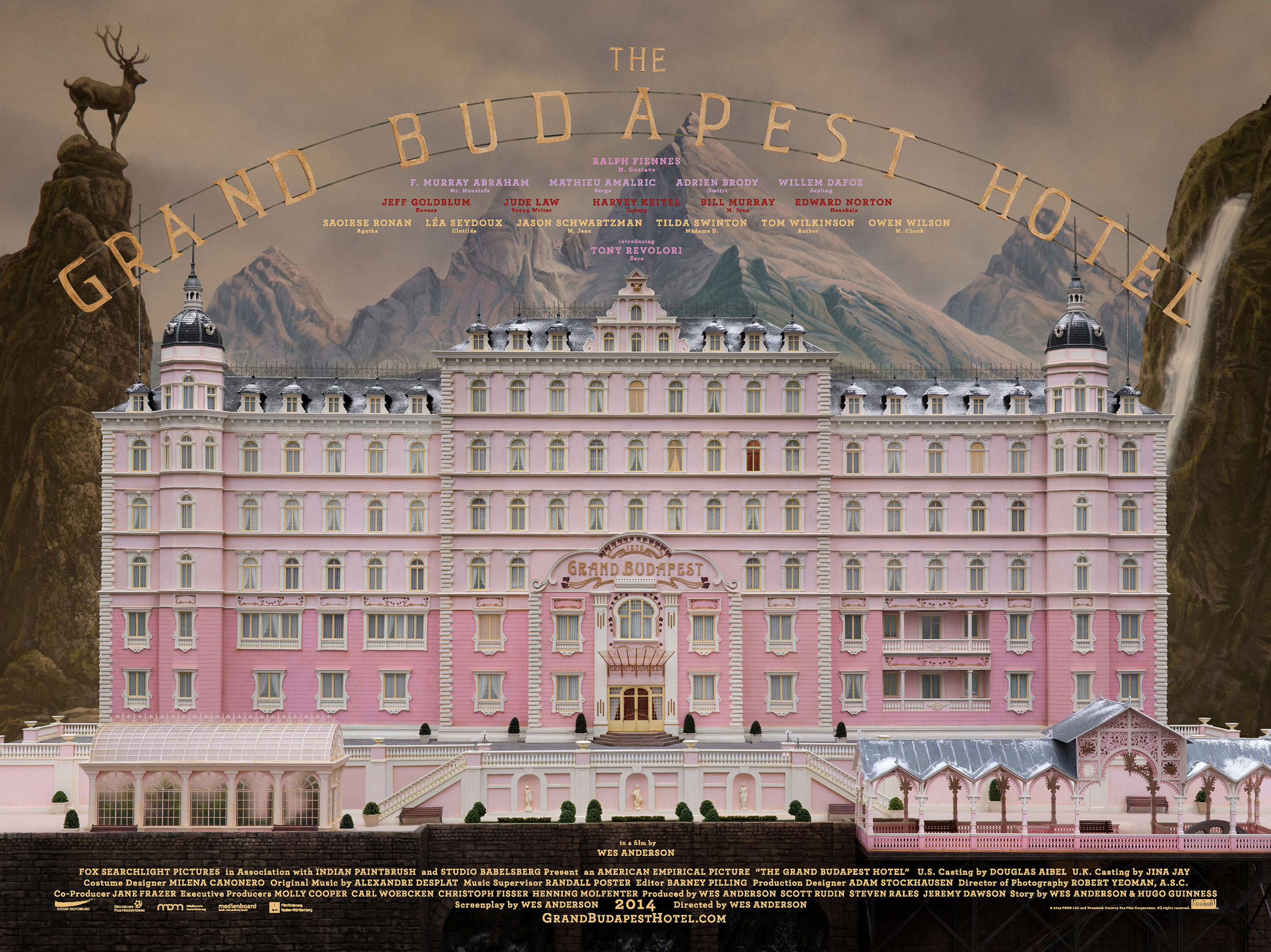
Wes Andersons The Grand Budapest Hotel was released in 2014 and was filmed at multiple locations around eastern Germany.
Identify the key conceptual ideas that underpin their work.
Nostalgia, Fascism, Colour. “We made a pastiche of the greatest hits of Eastern Europe” – Wes Anderson https://www.npr.org/2014/03/12/289423863/wes-anderson-we-made-a-pastiche-of-eastern-europes-greatest-hits
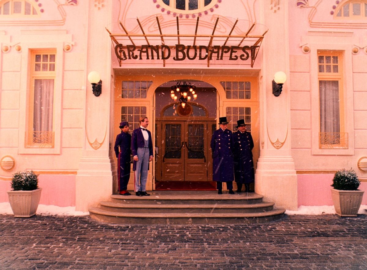
Anderson is also famous for the symmetry of his shots in all his films.
Identify their critical position on colour in relation to their work (i.e. how is colour applied, in what proportions, what particular theories about colour inform the making of the work, how does colour change dependent upon the environment in which the work is viewed.
The Grand Budapest Hotel uses colour to accentuate elements of the story. It was also used to emphasis different themes and the passage of time. Anderson is known for his bright colour ways in his films and The Grand Budapest Hotel is no different. However, Anderson didn’t use his classic soft yellow hue with this film instead went for a highly saturated palette.
With such a bright palette in use Anderson plays with the saturation to help communicate things like the impending war and flashback scenes exploring Zero’s memory of wartime by desaturating the colours.
What type of surface treatments are used in the work? Do they use matte, satin, or gloss paints or material finishes or all of them together? Why might they do this and what is the effect of doing this?
The film overall has a warm, bright palette with soft pastel accents. With this as the films base colour way Anderson used hardwoods, strong greens and golds in the Schloss Lutz to express oppressive wealth and used a cool bluish grey tint for Checkpoint Nineteen to show its slow decay and neglected position creating contrast and helping the viewer to differentiate location, mood, and time.
What scale are the artworks you have researched? How does scale impact on how the work is experienced and how colour and materiality are perceived?
To create the sense of size and grandeur in some of the more elaborate scenes the film makers used matte paintings and miniture effect techniques to play with the perspective. Scale models of structures were created to help set the scene of this fictitious world which Anderson has done in a few of his films previously. The scale model of the front elevation of The Grand Budapest hotel was one-eighteenth scale. It’s about four metres wide and three metres high.

The film also draws from Europe-set mid-century Hollywood films and the Library of Congress’s photocrom print collection of alpine resorts for visual motifs. These images did not showcase much of recognisable Europe; rather they catalogued obscure historical landmarks not known to the general public.
Complete the design research and carefully photograph your work to upload to your blog with some writing that reflects on this design exercise.


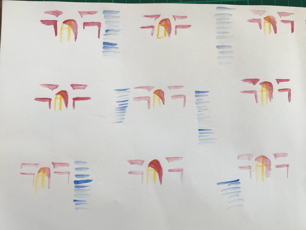
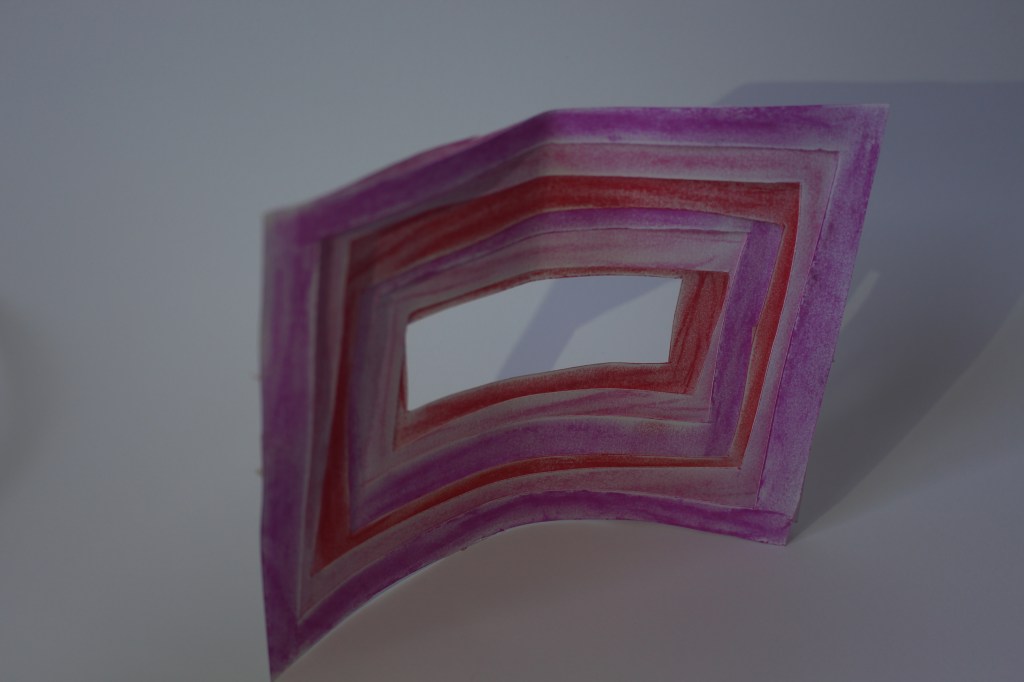
I focused on the use of colour, pattern, shape and symmetry when extracting ideas from Andersons work. I found that the use of symmetry creates the opportunity for pattern making and repetition. I also drew on the subtle details of The Grand Budapest Hotel such as the shadows and trimmings. I used the primary colours keeping the simplicity of the original design. I love the use of the arches and shadow making of layered materials and the atmosphere that the clean lines, curves and symmetry create.
When thinking about my application to the St James Theatre I will explore further the use of shadow making through layering. I will also play with the use of clean lines and repetition.
Model Making:
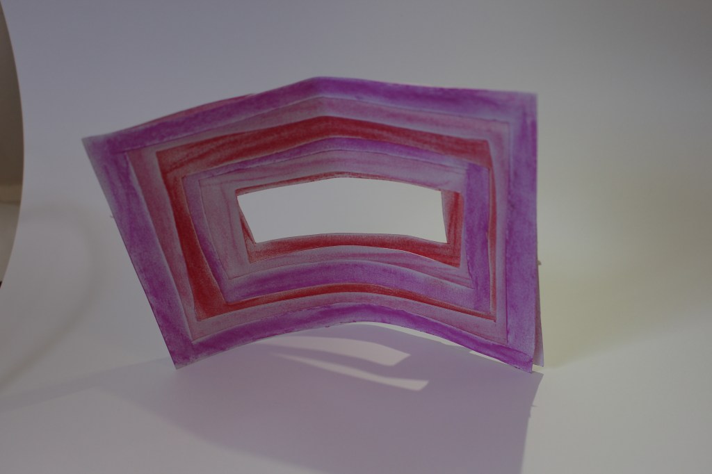

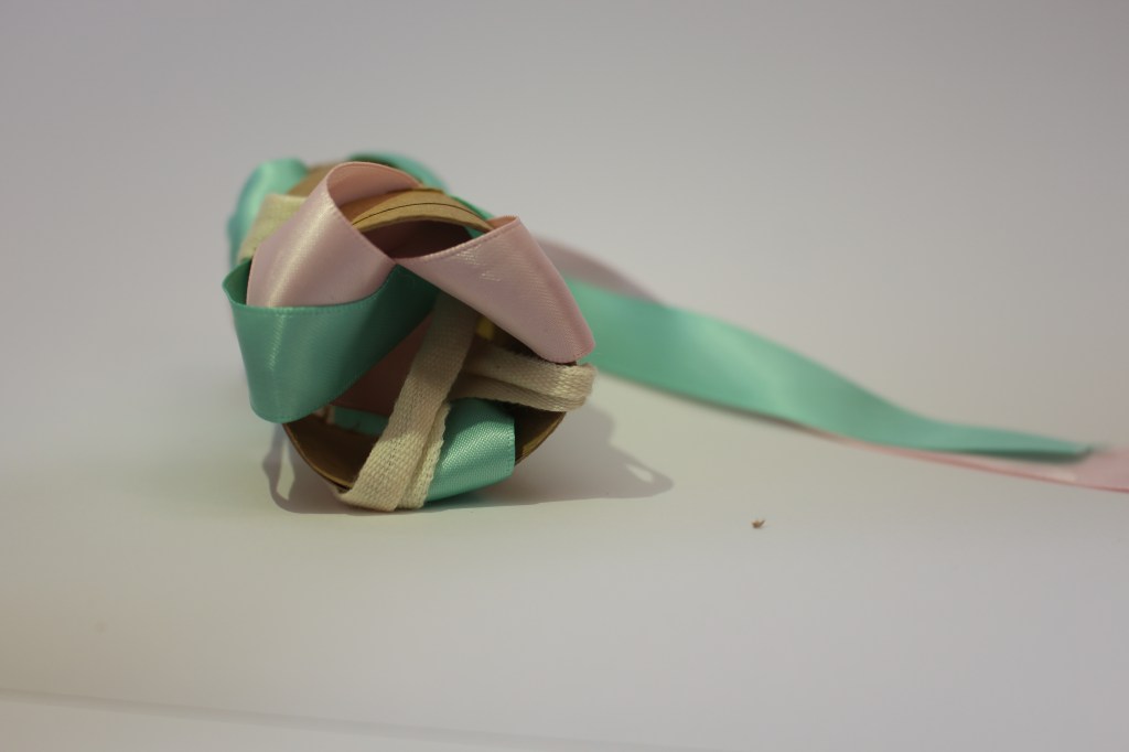
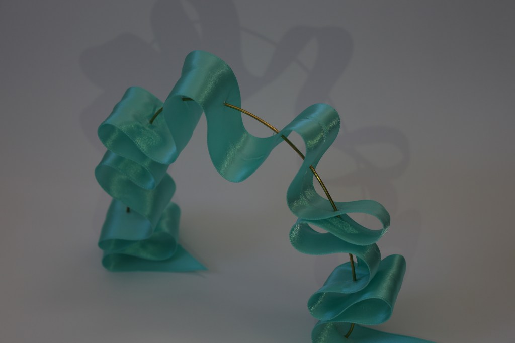
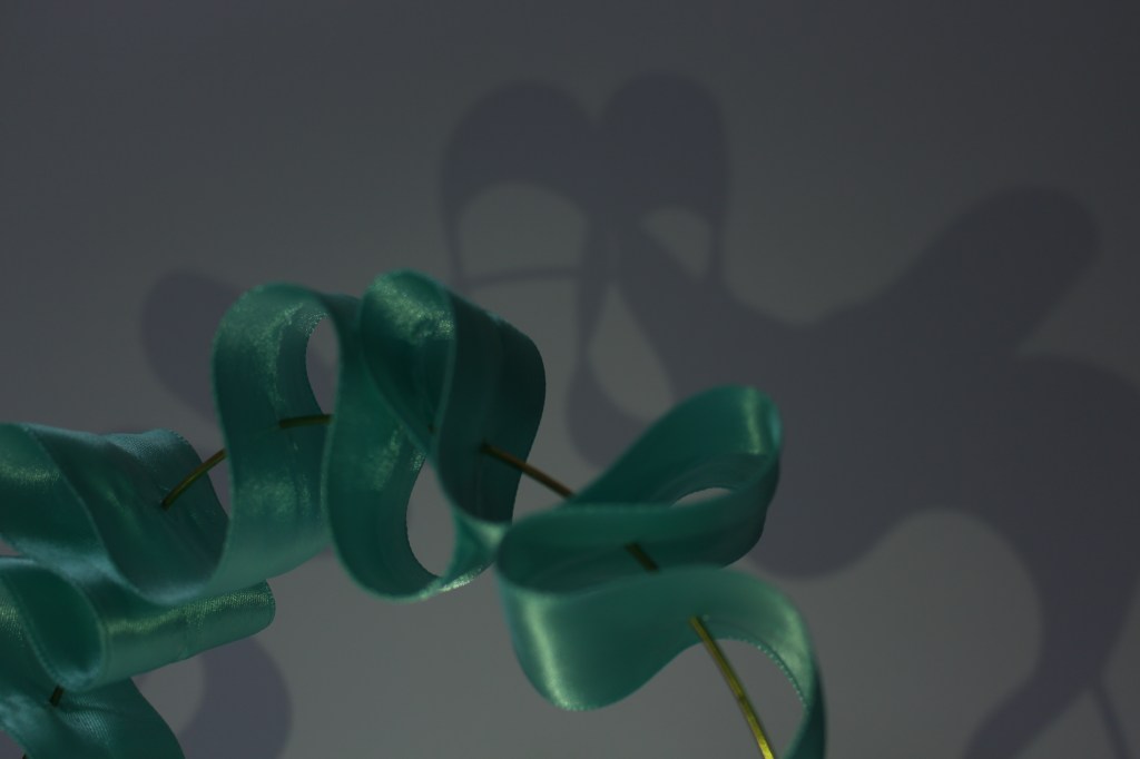
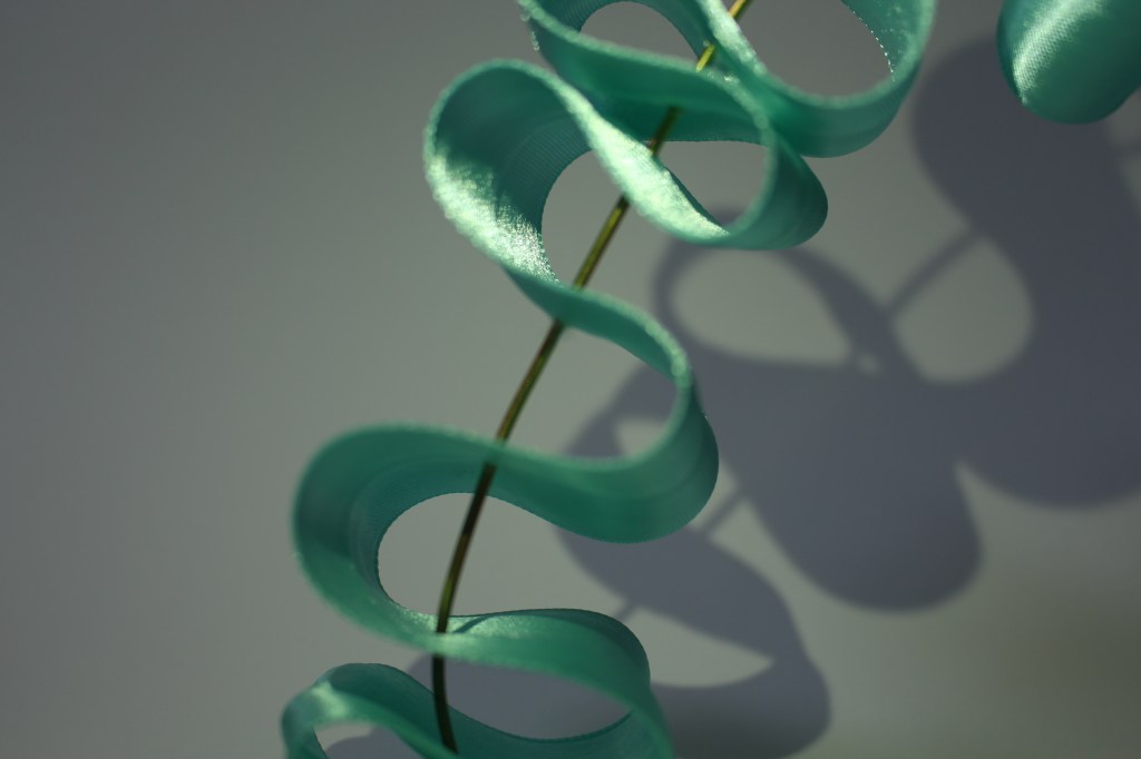
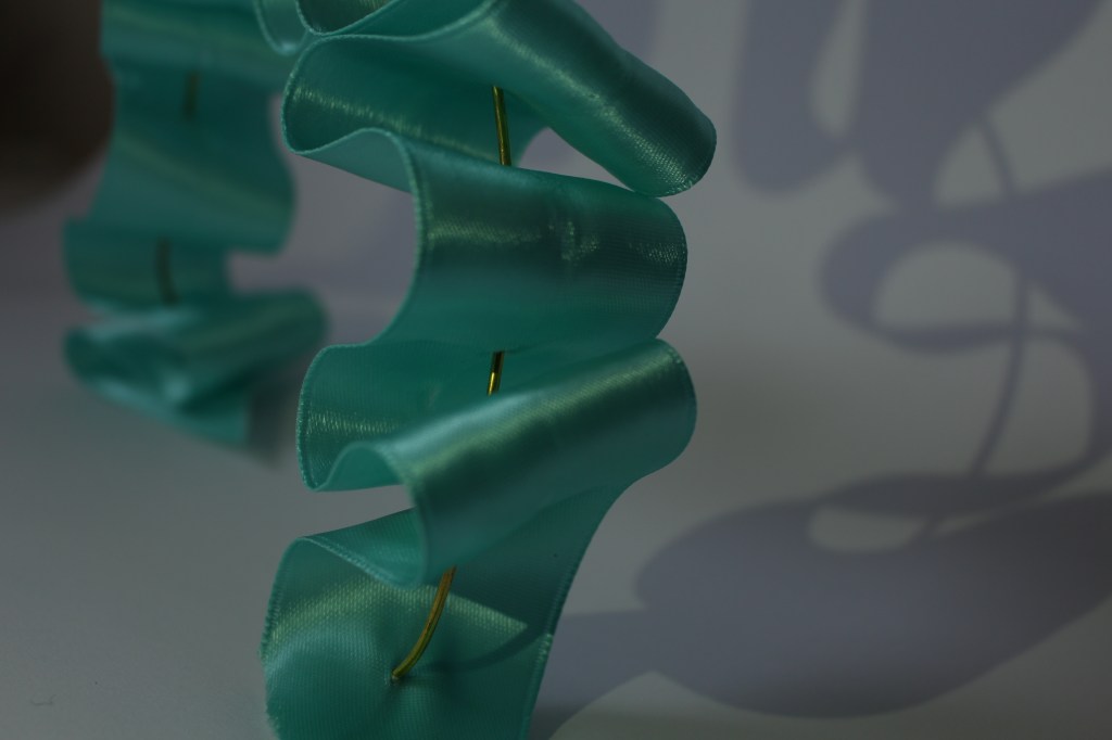
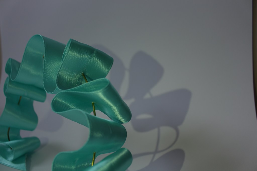
To create my third model I used the ribbon from my second model as it created soft shadows and caught light nicely creating depth. I then drew, from my first model, the layering technique through stacking and applied that to the ribbon. This created a third model that cast very interesting, clear shadows allowing the model to multiply on the surrounding surfaces. Through layering the material it allows light to break up its form making the structure take on new shapes depending on the angle that you view it, transitioning from solid to soft and back again.
