
When thinking about my surface application, I went back to my favourite model of my ribbon archway that I created during my artist research. I liked the soft atmosphere this model created more that any of the models created in my surface research.
Drawing on this model of the ribbon woven through brass wire, I expanded the scale, and thought through the issue of the satin ribbon material holding its form at a larger scale. By weaving wire into the fabric it gives it the strength to support its own weight when at a larger scale.
These ribbon archways will be located at the Lorne Street entrance to the theatre drawing guests into the space.
In between each archway will be soft lighting allowing the blue satin to catch the light and shine into the space. The walls and ceiling will be painted a darker blue that will bounce out through reflecting off of the surface of the ribbon creating more depth to the blue of the ribbon.
Initial design concepts and first iteration of design:
When thinking about the overall intention for the space i drew on the order and simplicity of Andersons work and the classic style he often uses in his films. With this in mind i designed a ticket booth to stand in the middle of the space oriented towards the Lorne St entrance. This brings the theatre aspect into the design space. With the ribbon archways at the entrance it draws the focus to the ticket booth as it blocks your peripheral view of the space.
Anderson also uses colour to create a point. I applied this thinking to the colours I will use in the space. I played with the idea of have the walls be a bright colour but be broken up with either ribbon archways or frosted plastic sheets encroaching into the space allowing the colour to bleed into the space through bouncing off of these surfaces. This idea was influenced by my model from Trial 2 Surface 3.
Developing this idea of colour further, I would use bright red and soft pink for the ticket booth and to contrast the soft blues of the ribbon archways helping to emphasis the ticket booth as the key focal point.
Once I decided on the ribbon archway design, I trialed what the colour of the walls could look like with the archways.
I felt that using red would take away from the main contrast of the ticket booths colour scheme. I liked the use of a darker blue better as it gives depth to the ribbon as-well as keeping the main contrasts between the walls and the ticket booth.
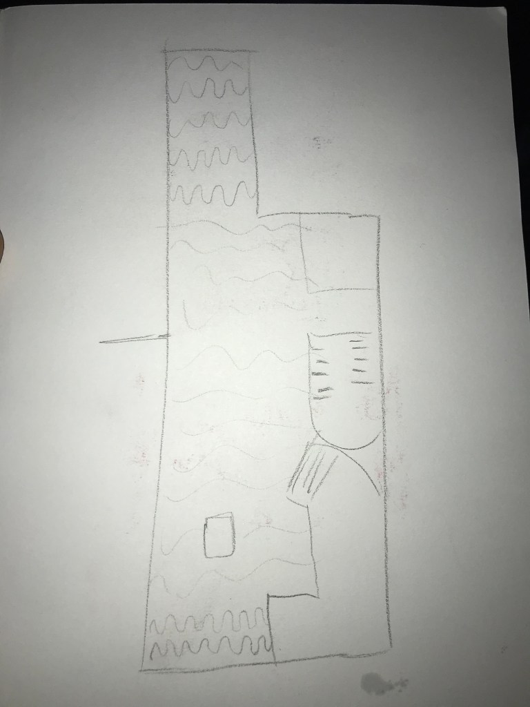
Plan View – First Iteration 
Sketch of Blue Ribbon with Red walls 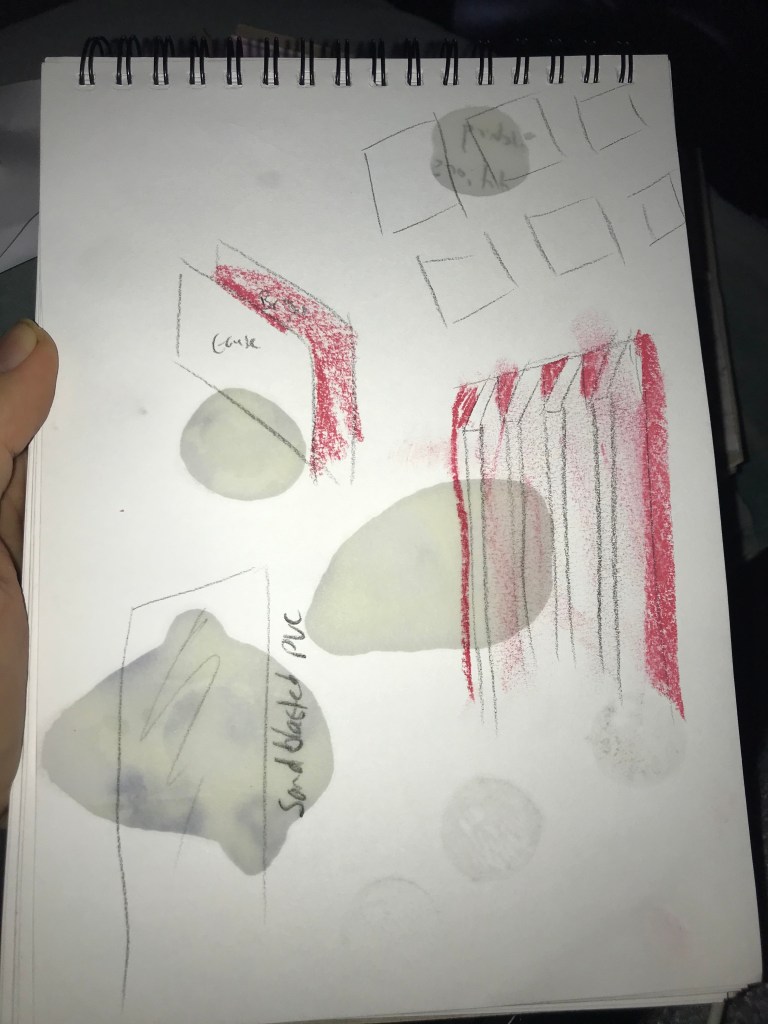
Sketch of plastic sheets with red walls 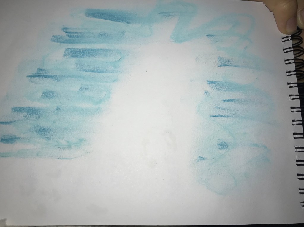
Sketch of Blue Ribbon with Blue walls 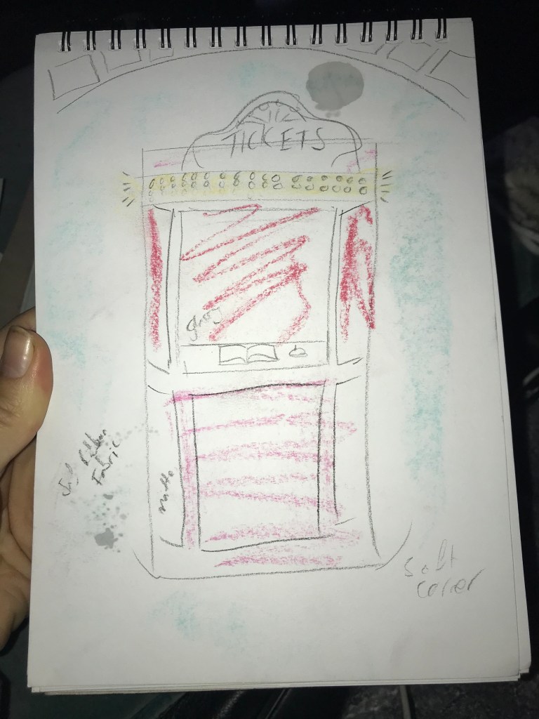
Sketch of Ticket Booth concept 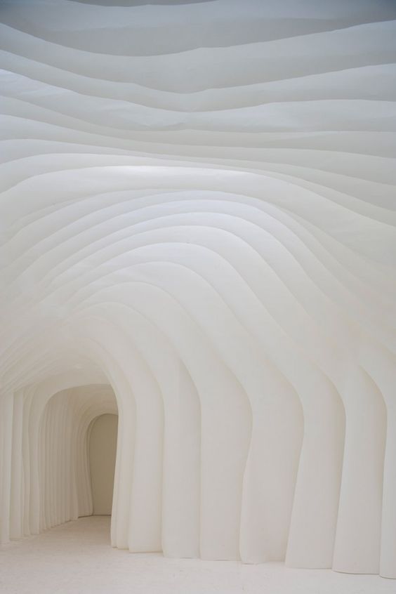
Lighting inspiration for Ribbon archways
