Manifesto Definition:
noun, plural man·i·fes·toes.
a public declaration of intentions, opinions, objectives, or motives, as one issued by a government, sovereign, or organization.
Formats:
- List
- Poem
- Graphic Poster
- Report/article
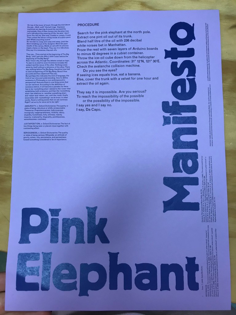
This manifesto is very poetic in writing and uses abstract ideas to communicate the main point. The use of Font, text size and layout slowly draws you in as you focus in on the smaller texts creating a playful tone.

This manifesto is very direct and clear as it breaks down their process in a list with a clear font. No nonsense document.

This manifesto grabs your attention with the graphics used which then leads you to the message of the text focusing on our relationship with objects. The bold ‘Nice, very nice, nice’ captures your attention straight away.
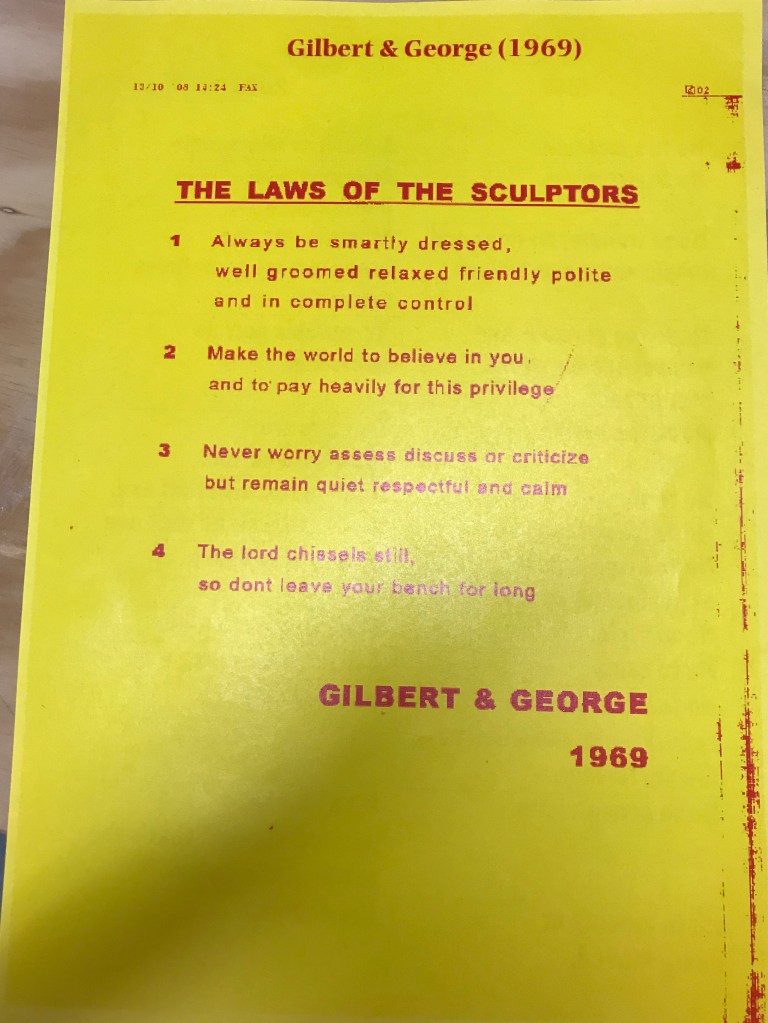
The use of font and layout are very clean and orderly. The text itself plays a game of tug of war with each statement leaving you perplexed as to how ‘worth it’ it is to be a sculptor.
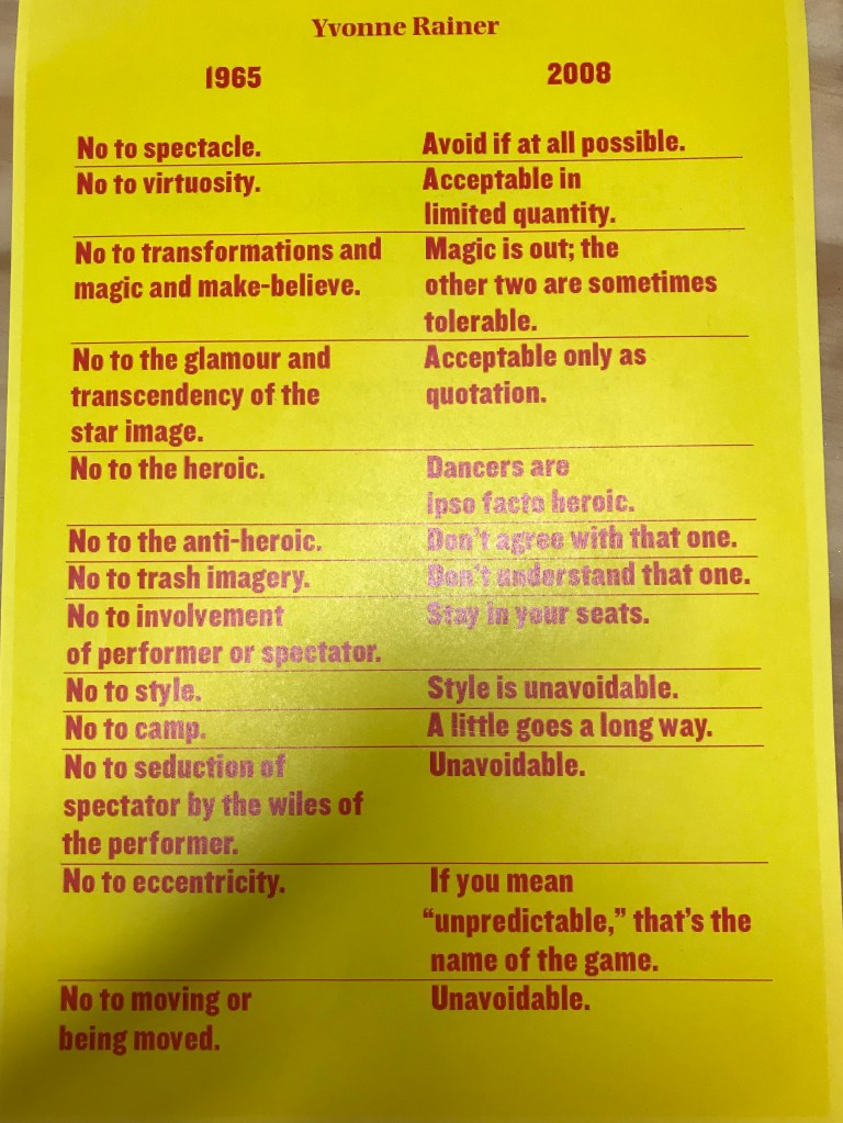
Yvonne Rainer is an American Dancer who’s reconsidered manifesto is a personal reflection on her past views. It’s very clear to understand and interesting how her perspective has evolved. It almost feels like a conversation.
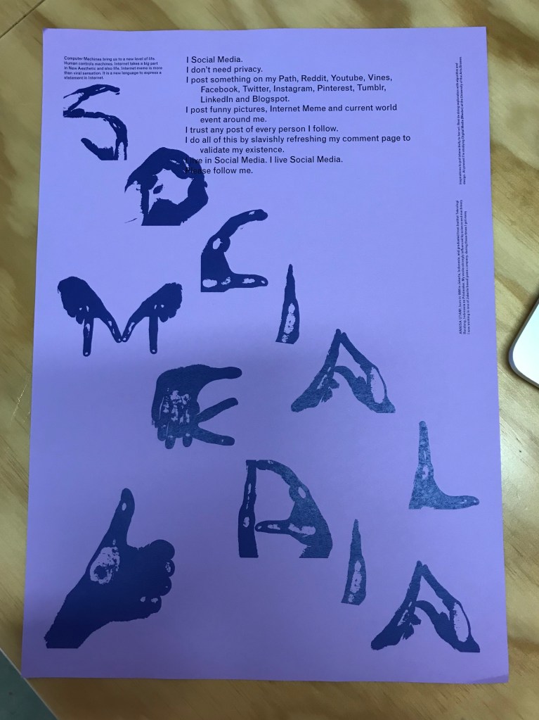
The use of the hands on this manifesto ties into the message of a thumbs up ‘like’ referred to in the text. Its taking the thumbs up symbol and extrapolating it to open the space for discussion.
Things to consider when analysing a manifesto –
Tone
Layout
Connection between tone and layout
Concepts applied through the layout, text format and content of writing e.g. the title is missing its top half, does the text then cut out certain things like adfectives or is very to the point? no waffle?
who wrote it?
what was their context?
Analysing Pink Elephant Manifesto as a group:
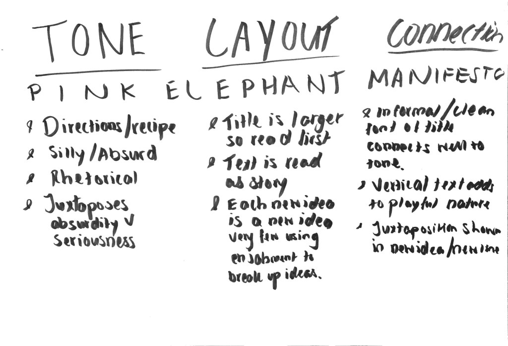
What is it and why is it like that?
First Draft of my Manifesto:
The relationship between people and spaces is an on going fluxuating being. Each person has a unique relationship and perspective towards their surroundings formed out of their personal experience and personality. As I designer I choose to highlight these perspectives and challenge the why or call attention to their actions/ reactions. And to highlight how your relationship to/with a space can then affect others.
- A space/place is never just your own
- Everything we do/touch is connected
- Its all just a matter of perspective/outlook
Thursday:
My first three manifestos:
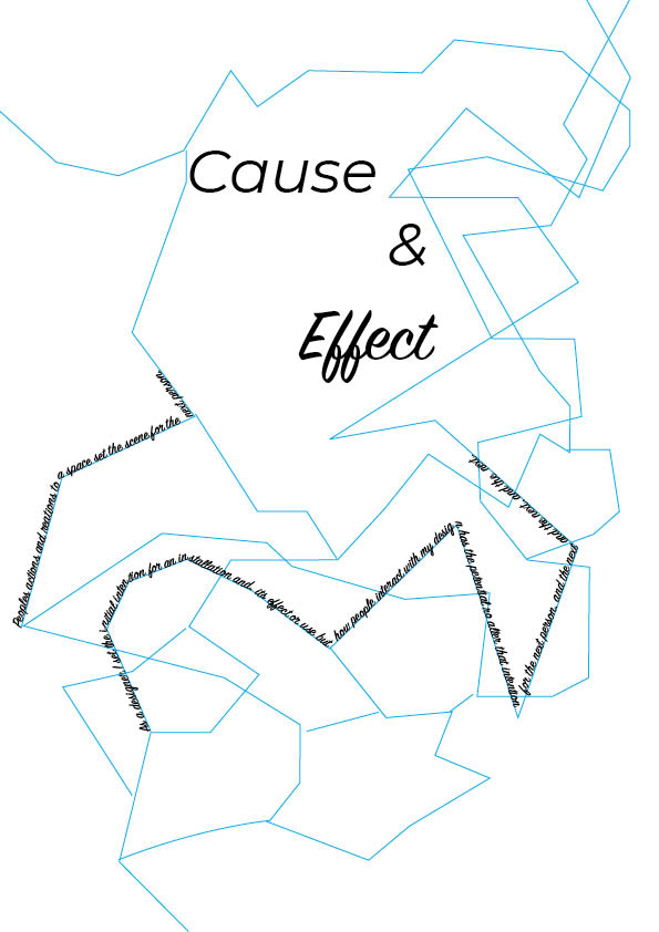
no. 1 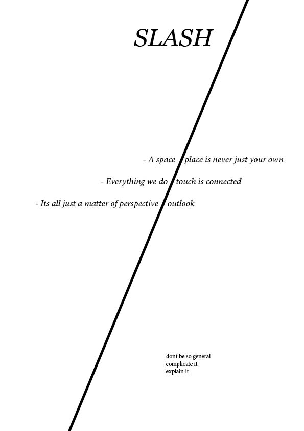
no. 2 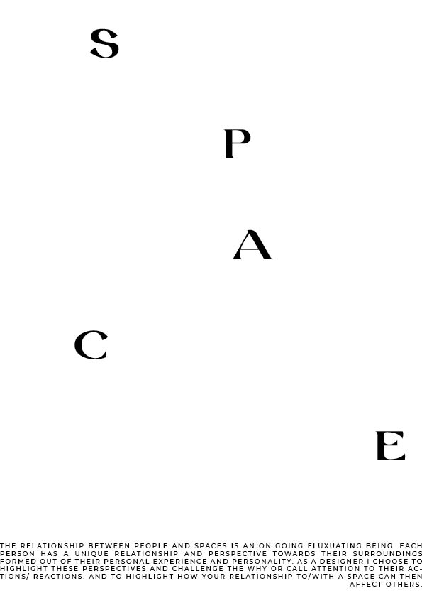
no.3
In manifesto 1 I was trying to explore how everything is linked like a map or a root system where an action of one person effects the experience of the next. I also chose a script font where the letters flow onto the next to continue this theme. As I made more manifestos I found that this one was my least favourite.
In manifesto 2 I went for a minimal approach. I used italics to keep everything slanted and a list format to my punchy and to the point.
In my 3rd manifesto I played with the space on the document trying to arrange the letters in a random order to catch peoples attention with the manifesto at the bottom of the page. The letters of ‘space’ almost acts as a path drawing your eye down the page to the manifesto.
Feedback I got from Lucy on my manifestos was to not speak so generally with my ideas or concepts I was exploring. To complicate my sentences and explain them in a clear concise way.
