10th iteration:
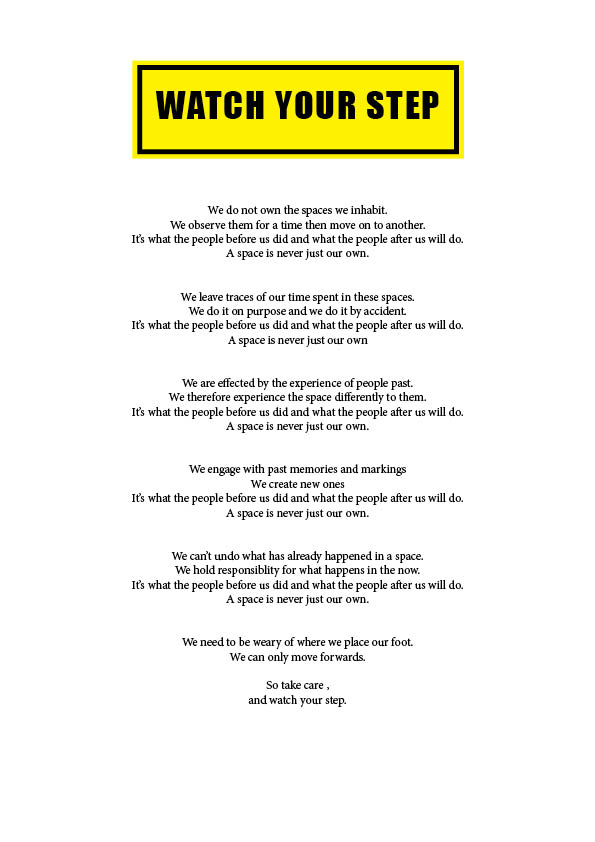
I went a bit more poetic with the way i formatted the text in this one. i think by establishing a rhythm through out the text it makes the final line have a stronger impact to the reader really bringing home the point. I also started playing with colour and carrying on the theme of caution and hazard sign tying in my part two project.
Presentation development:
colour
subtle boundaries
I was thinking it could be a cool continuation of the idea of taking care where you step by laying my manifesto on the floor to see if anyone stands on it – tread lightly, the affect of our actions on others. Gathering marks and footprint which then affects how its perceived for the next viewer and exploring this idea of being weary of your actions in your environment as they affect others.
Final iteration of manifesto:

Explain design decisions:
I used the colour and format of a caution sign to really bring home the theme of taking care and being cautious. I used a font that was clear to read but also bold and made a statement. To emphasis the caution sign style I added an image that is commonly used for caution signs when telling people to watch their step. Its a universally acknowledged sign that doesn’t require the use of the english language to understand. I chose a ‘falling’ image where the man was falling forwards as I focus on the forward motion of time in my manifesto.
