Developed written statement:
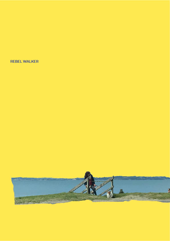
Orewa beach is a space open to anyone to visit and spend time. More often used by people local to the area. Orewa is generally quite a tame beach making it family friendly and more enjoyable for a wider audience. However, Orewa goes through seasons where the elements have eroded and damaged the beachfront, creating steep drops and destabilised access points.
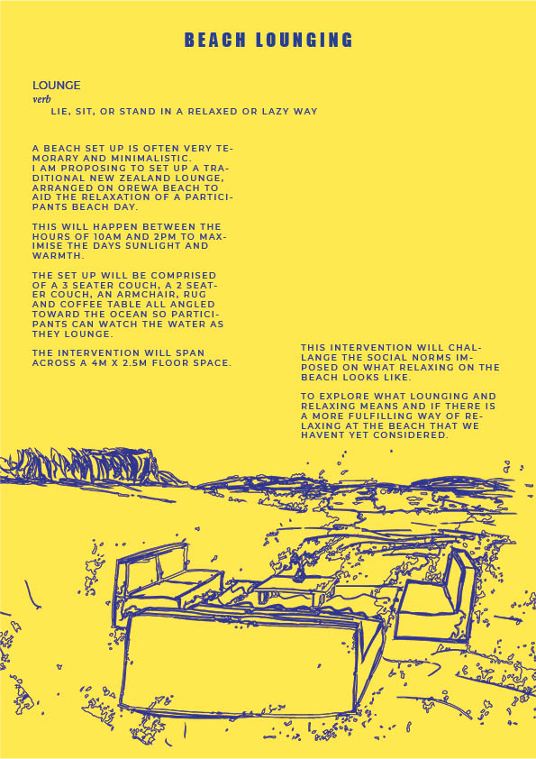
Heavy erosion during big storms results in temporary protective barriers being put up to protect people from hurting themselves from something like a fall and to protect the bank from further erosion from people. They are simple interventions in the space that due to the use of colour and placement they communicate, without words, that people need to take care in that area. Whether people actually respect this subtle, unspoken request, is a different story.
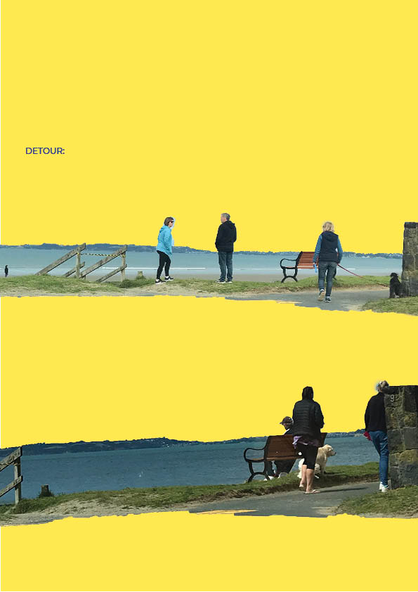
In my observations I found there is a certain level of entitlement toward this shared space. The unspoken rules/social norms of how people engage with the space are enforced by these entitled folk. How much space you take up, what kind of items you bring into the space, the amount of sound you make. If you don’t abide by these unspoken rules you get told off with multiple sets of evil eyes glaring at you and snarky remarks made out of ear shot.
As a spatial designer I want to challenge this sense of entitlement that we feel towards public space. To open the conversation as to how our entitlement makes us interact with our surroundings and how that then affects the space and the other people that enter into the space.
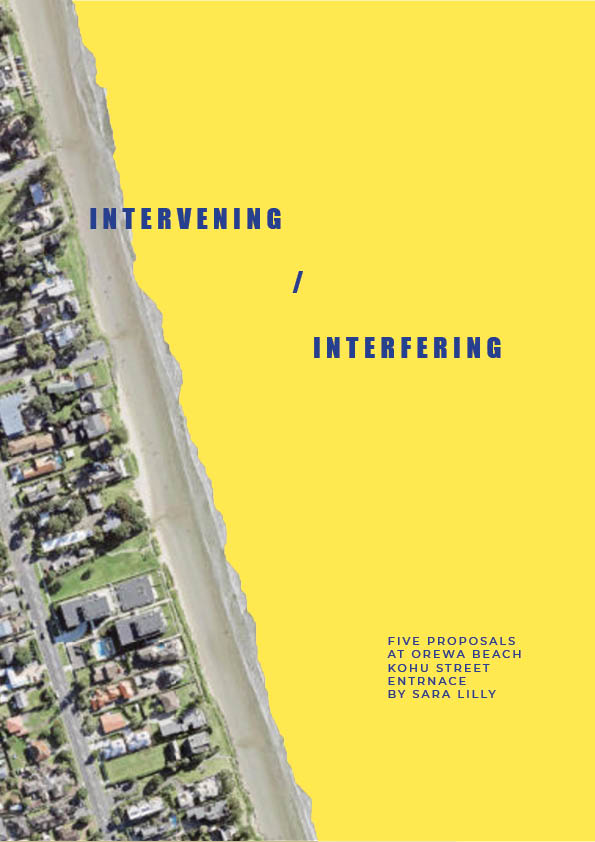
I want to explore this by creating discomfort and inconvenience and being disruptive as that’s a sure way to get people’s attention.
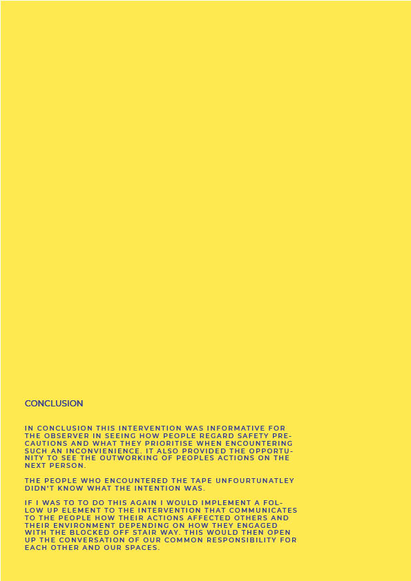
I want people to reflect on their actions and ask, what are you prioritising through the way you act in a space? Are people the real hazard in our spaces?
Final iteration of how its presented:
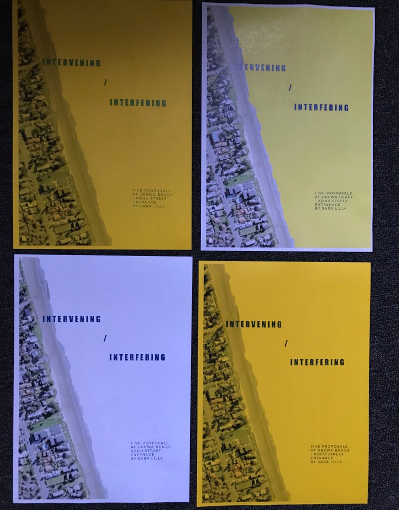
I reworked the layout of my document artefact editing images to give them a more interesting aesthetic and to focus on the main point of the image. I edited the way I described/ explained the interventions going more minimalistic like Allen Kaprows proposals for his happenings. I also played with the layout of the page a bit more using negative space as part of the page layout. This took a few goes playing with colouring the images, using different kinds of image tracing on illustrator and playing with different fonts and colours.
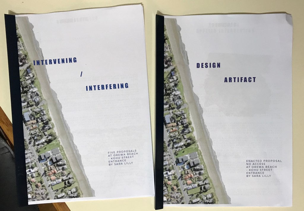
To tie my part two to my part three I added yellow in the background of my document to provide a nice aesthetic flow through my work but also drawing on the colours of the beach, blue and yellow helping set the scene.


For my physical copy I was going to print onto yellow paper so that it didn’t have that inky finish but when i printed out a test run the yellow muted all the other colours on the page leaving it looking quite dull. I did another test with altered colours on the page but still didn’t pop off the page. I then tested what it looked like when printed on white paper with a plain white background and then with a printed yellow background. The yellow had the inky finish I was still trying to avoid so I chose to print it on white with a white background, bound together with a blue Bindfast Bar.
Final design artifact: