Final Design Decisions:
Material decisions in blender –
When applying materials to my model in blender i was wanting to achieve a level of transparency with the construction of the house and faux fire escape similar to Do Hu Suhs work with nylon and steel. Still quite structural but with an incredible atmospheric narrative.
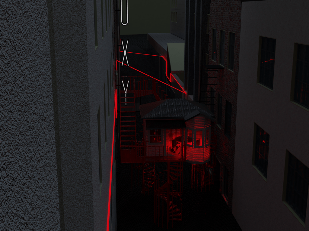
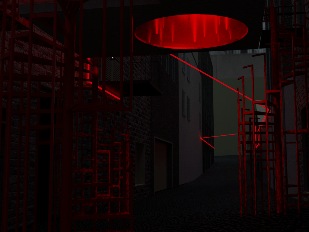
The faux fire escape material decisions where easy for me to make. I knew i wanted the main frame of the structure to be steel painted red with a clean glossy finish. For the platforms i wanted them to be a steel red painted square grid allowing a solid surface to stand on but also a surface that you can look through. Using steel and sharp square angles on the faux fire escape structure creates an industrial, urban aesthetic inspired by Fort Land and Auckland city. For construction, this structure will be in 9 different parts, each part welded into one and then bolted together with the other pieces.
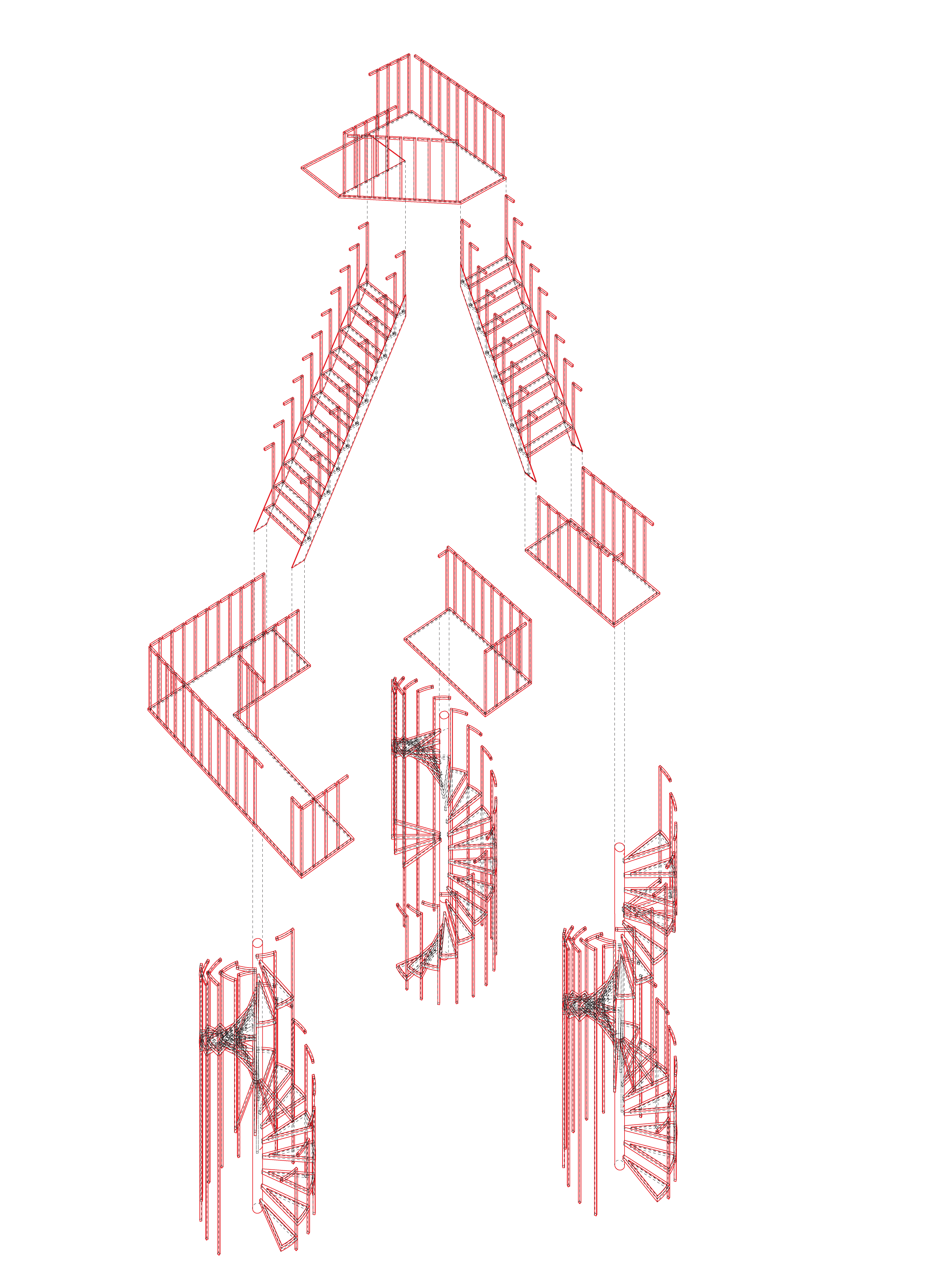
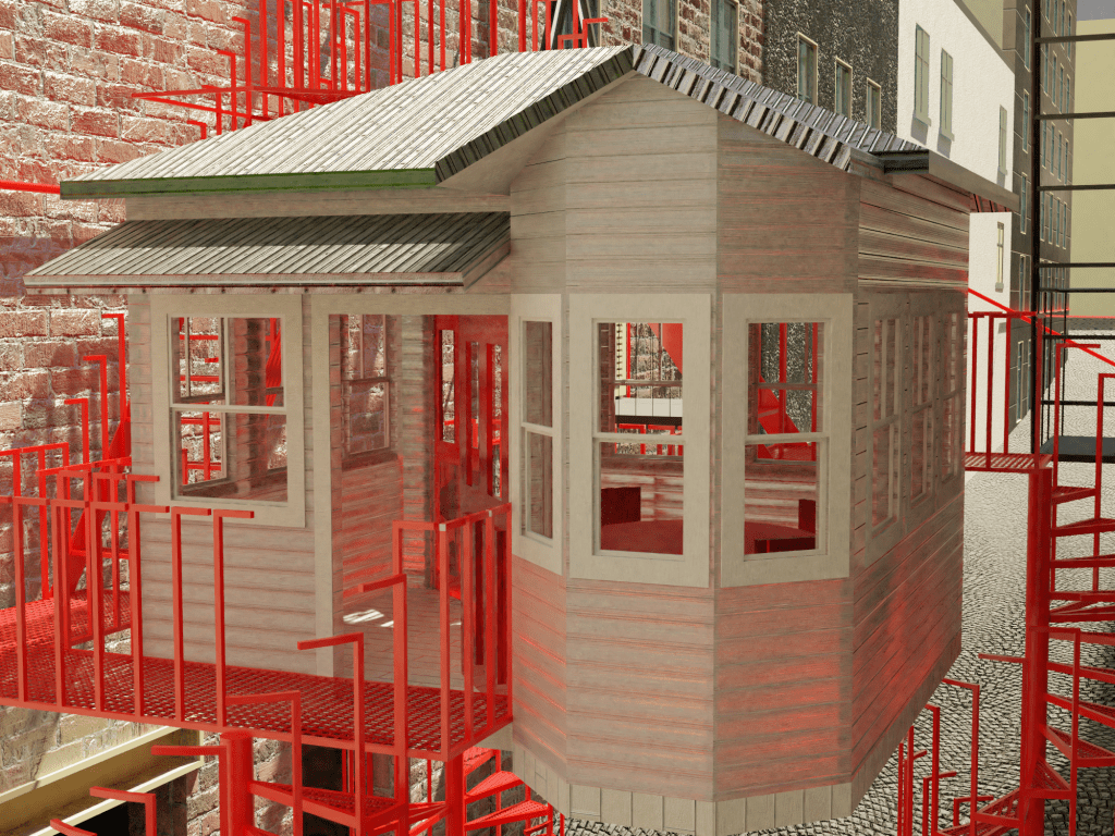
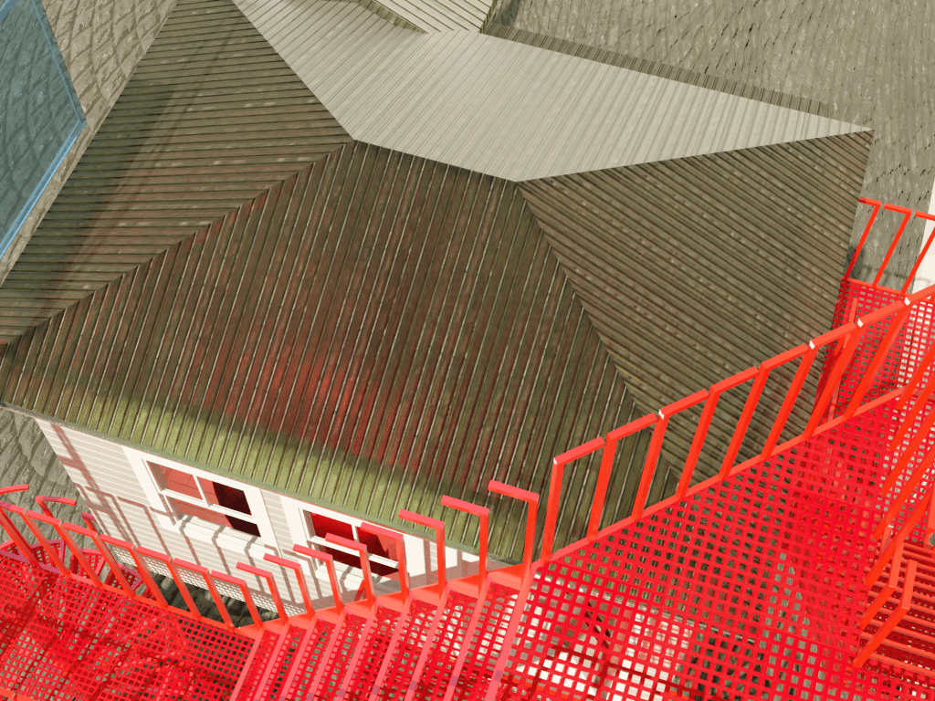
For the house i decided to have the walls, doors and roof be made using a practise by Rachel Whiteread. Where you make moulds of materials, traditionally used for the building of a house, and cast them in resin. This creates texture and depth within the surface of the building whilst also having a level of transparency in the structure.
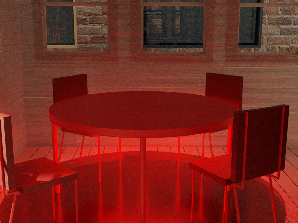
For the materiality of my table and chairs I went with a red painted steel frame on the chairs and legs. I used a red velvet on the chairs to create a soft environment and make it comfortable to spend time. The table will be made using a red formica as its hard wearing but also warm to touch as apposed to my other idea which was to have a completely steel table.
The use of colour within my design is very intentional. The green roof and white walls are very classic in the early New Zealand homes especially the bay villa styled homes. By including that colour scheme in the resin cast structure it makes it clear that this house is tied to a different time. The red is used as an invitation to pedestrians. A yellow brick road of sorts. You journey up the red stairs and are faced by a red door or a red platform to take you around the structure. If you enter into the red door you are greeted by a red table and chairs on a red floor. At this point in the journey through the structure, people will have recognised that red is where they are allowed to go and will feel comfortable sitting.
The red ties together with the red neon light in the lane making my design cohesive to the site. The red also provides a great contrast to the house structure. Its marrying ‘industrial urban’ with ‘traditional domestic’, a physical representation of what i’m trying to invite urban dwellers into. to adopt the domestic element of sharing a meal at the dining table within an urban living condition.
The use of light in my installation is used to in a way to draw attention to the centre piece of my design, the table and chairs. The lighting sits on the under side of the table which floods the room in red which you can see through the cast resin walls and ceiling. It also shines through the red acrylic circle in the floor which lights the lane at night.

Temporal/ contextual details:
The installation will be up for the month of August to coincide with Aucklands restaurant month. This will hopefully encourage urban dwellers to grab food from the featured restaurants and meet at my Nosey Neighbours installation to enjoy their meal and meet new people.
Because my installation is focusing on the dining table it seems fitting to tie it to Aucklands restaurant month and to also open the interior to the public at meal times. It will also be open late on Friday and Saturday night to allow club goers the opportunity to meet people as we all know peoples walls come down at night and are more receptive to new friends.
The Faux fire escape will be assessable a to explore at all times.
The Interior will be open 7am-9am, 12-2pm, 6-8pm all days of the week with a bonus few hours of 10-1pm on Friday and Saturday.
Final written presentation:
Statement:
Many people experience urban loneliness when living in big cities. Nosey Neighbors is an intervention designed to encourage urban dwellers in Auckland’s CBD to become more neighborly through elements of the urban environment and domestic tradition. To challenge them to go beyond observing their neighbor through their window or hearing them through a wall to crossing the threshold into a neighbor’s life. To not just observe their neighbor but know their neighbor.
Utilizing the dining table within my design as a key destination within my site pays homage to the history of the table being a place of intimacy, community, and relationship, encouraging city dwellers to go back to basics to build a community for the future.
Everyone is very good at watching other people’s lives unfold but not very good at getting involved. I have used red as a tool to draw people into the installation, crossing the threshold from observer to participant. Inspired by anarchitecture, thinking beyond the function of form, and transforming space into a state of mind, Nosey Neighbors becomes an invitation for connection.
Notes/ Talking Points:
an-architecture inspired faux fire escape
transparency
nostalgia
domestic traditions
food event
Temporal qualities
