Next three manifestos:
no. 4 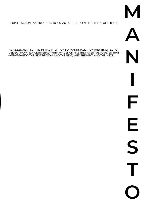
no.5 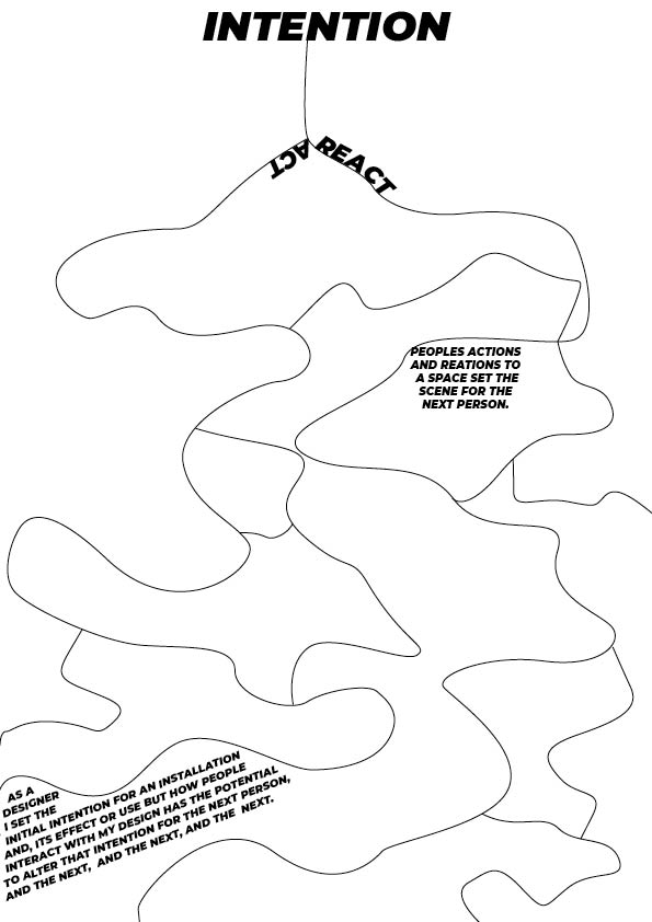
no.6
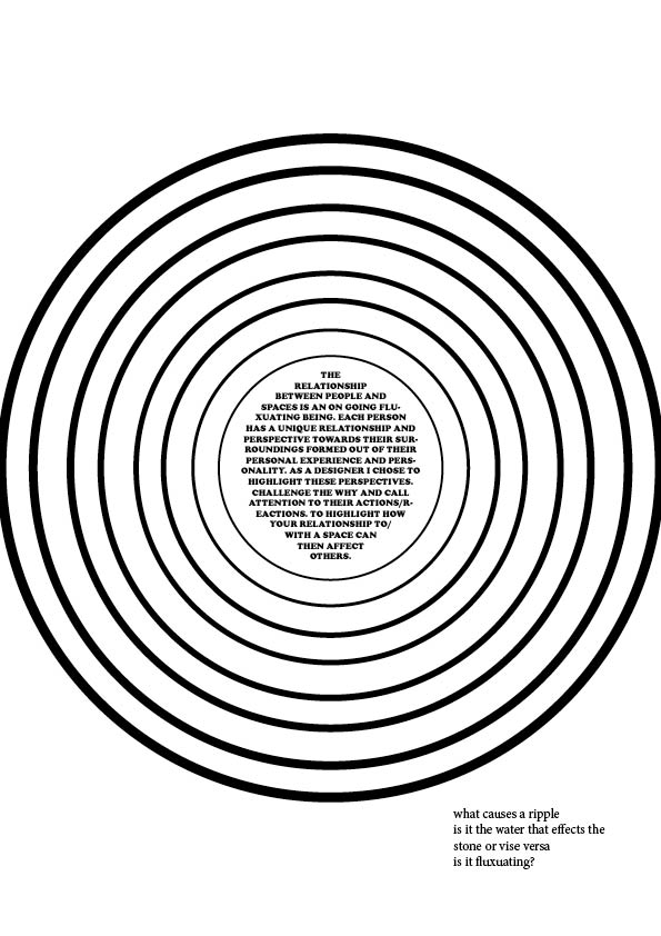
In manifesto 4 I was trying to convey the ripple effect with the manifesto at the centre being the initial ‘drop’ to cause the ripple.
The feedback I got for this one was that Lucy thought it looked more like a target than a ripple. She also posed the question of what causes a ripple. Is it the water that effects the stone or visa versa.
In manifesto 5 I don’t really know why I put lines through some of the words. I think I was trying to highlight key words in the manifesto but I didn’t have a strong reason as to why or why those words. I quite like the text going in the two different directions. They relate quite well together.
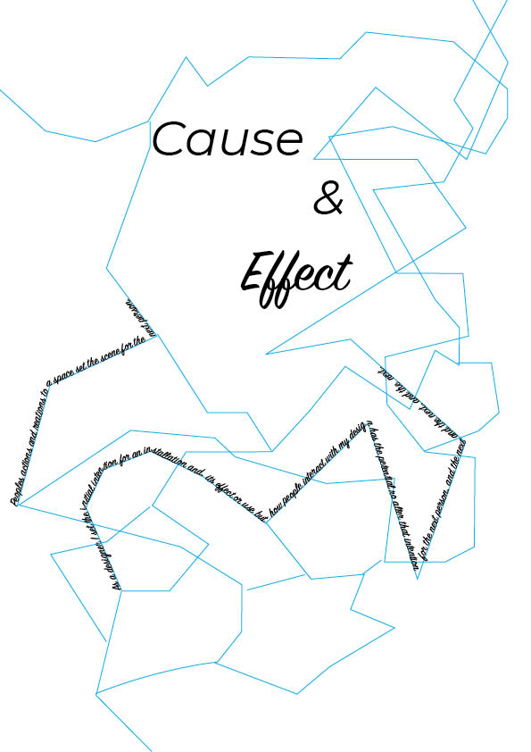
Manifesto 6 was a reworking of manifesto one. I was drawing on the format of a ‘Yes/No’ quiz map in the flow of the documents. I was also drawing on the idea of meandering rivers with the lay out of the lines.
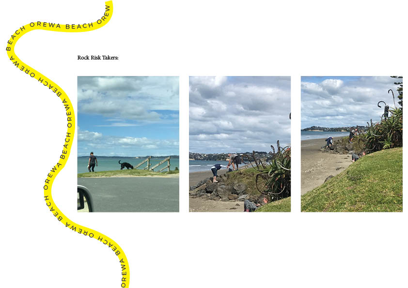
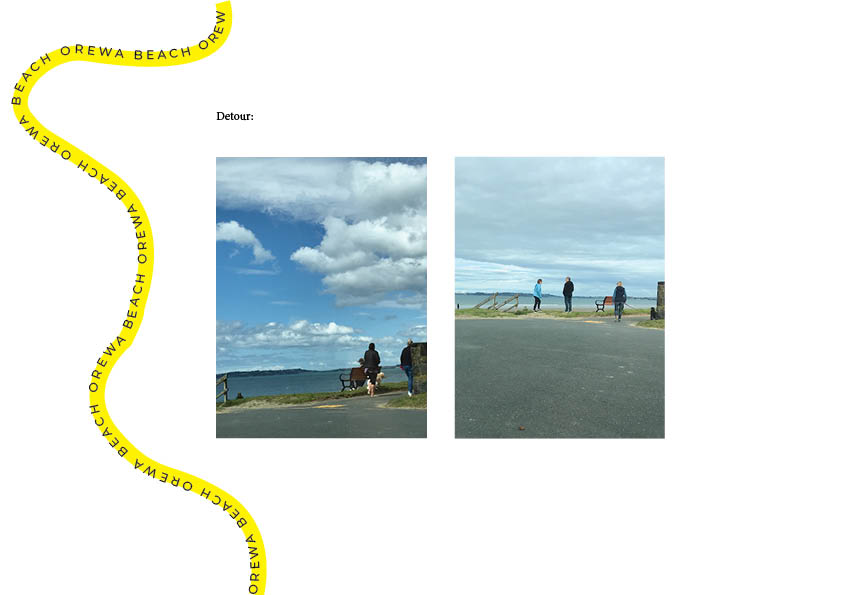
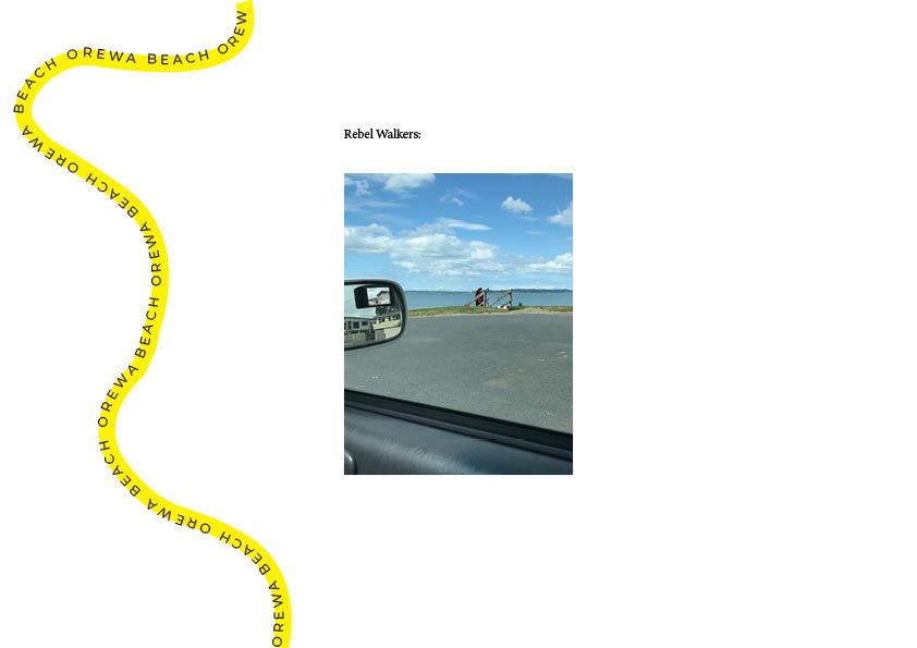
More analysis of manifestos:
I Am for an Art: Claes Oldenburg on His 1961 “Ode to Possibilities”
https://walkerart.org/magazine/claes-oldenburg-i-am-for-an-art-1961
Oldenburgs ode is very poetic with the rhythm of starting each line with ‘i am’. It creates a powerful flow and makes you engage with whats being said. I like that it also opens your eyes to the broadness of what art can be. That art isn’t just the classic painting hung up in museums but in the intricate details of modern life.
The Why Cheap Art manifesto:
The use of different fonts and capital letters brings variety to the page emphasising the idea that art comes in many forms. This also brings emphasis to different words in the manifesto.
The use of explanation marks in the second half of the text ramps up the pace combined with the slow increase of the size of the text as we move down the page. The urgency increases.
The use of strong statements, then similies, then the key statement ‘Art is Cheap’ acts as a finale for the manifesto and frames that key statement nicely.
A 38-Point Design Manifesto :
https://nodesignonstolen.land/
I really like this manifesto. Its orderly and concise which I think is a testament to the list format. Its very simple in its presentation not letting anything take away from the main point. The language used is very self assured and inspires action from people. Each point starts off with a brief statement which is then expanded on a little. this creates the tone of this call to action. Its an instruction.


