Year 2 Semester 1


Week 11: Colour Way and Material Pallet
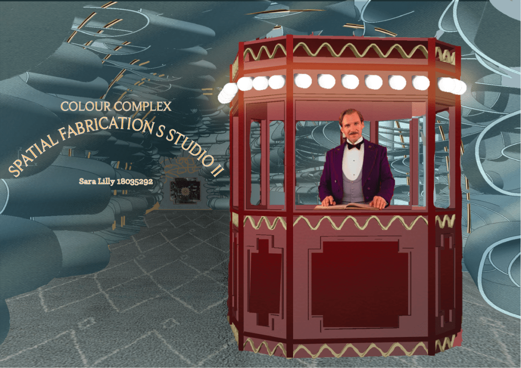
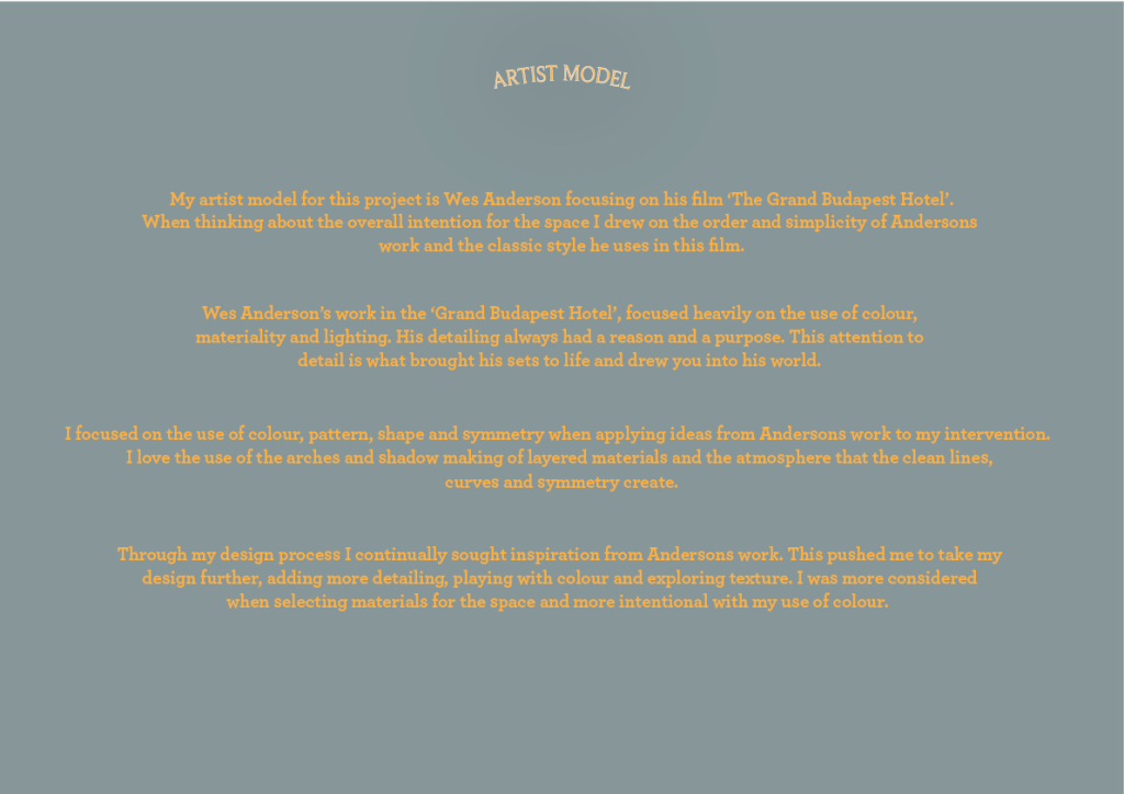
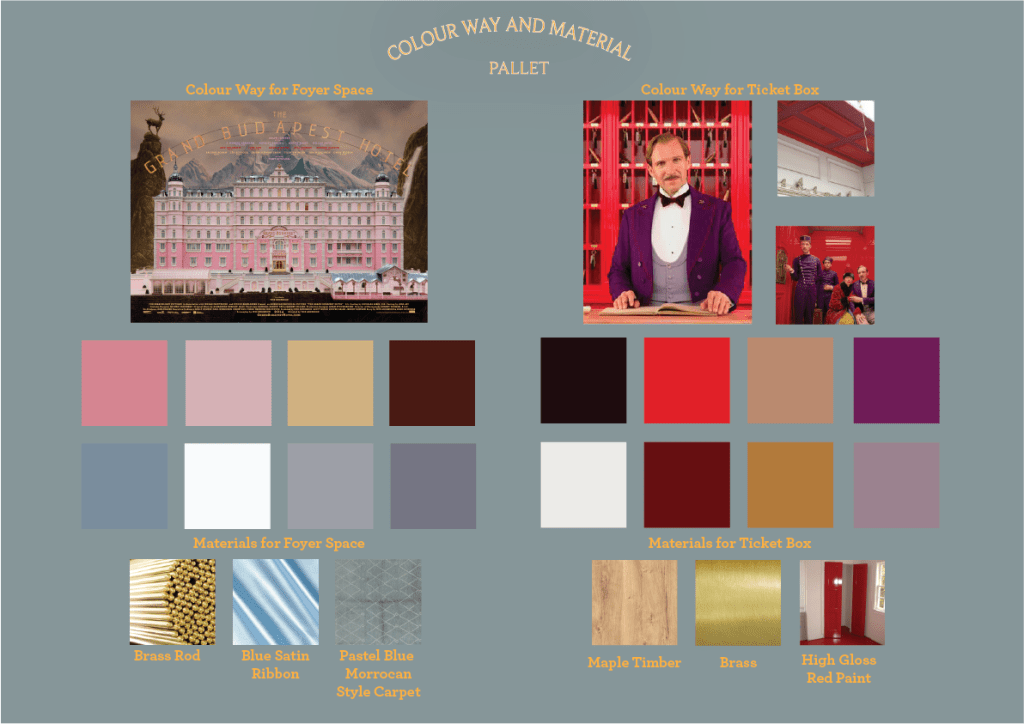
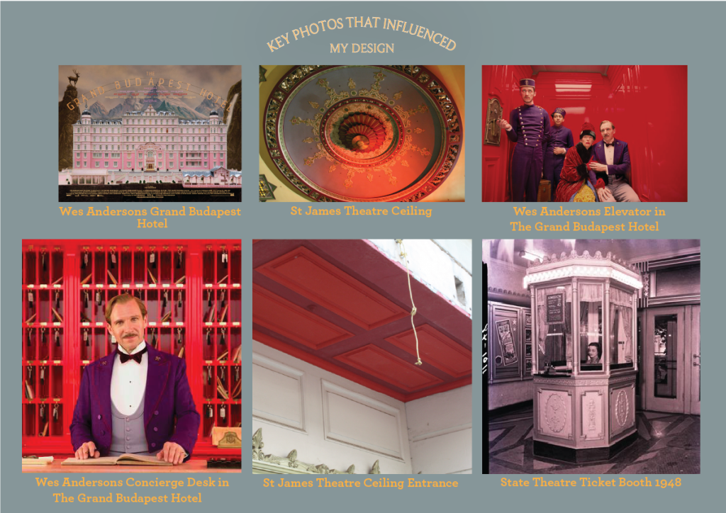
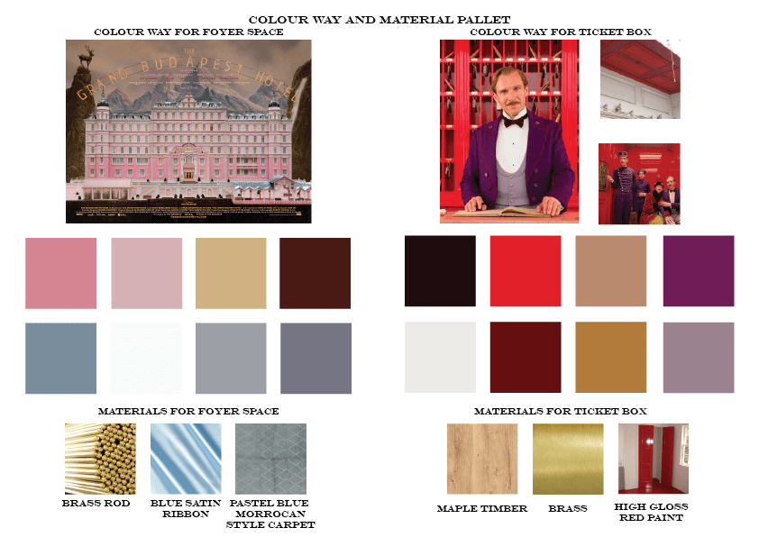
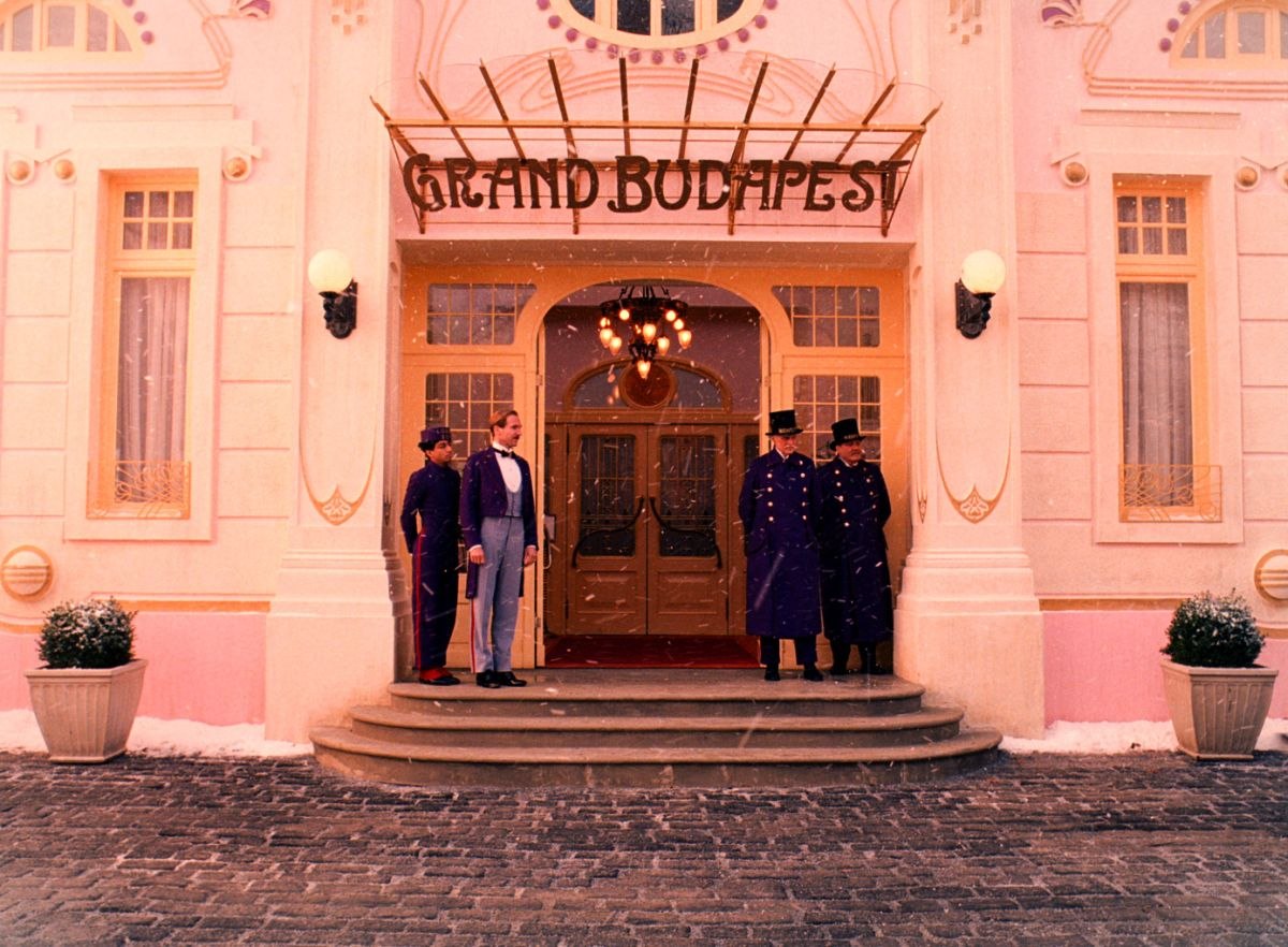
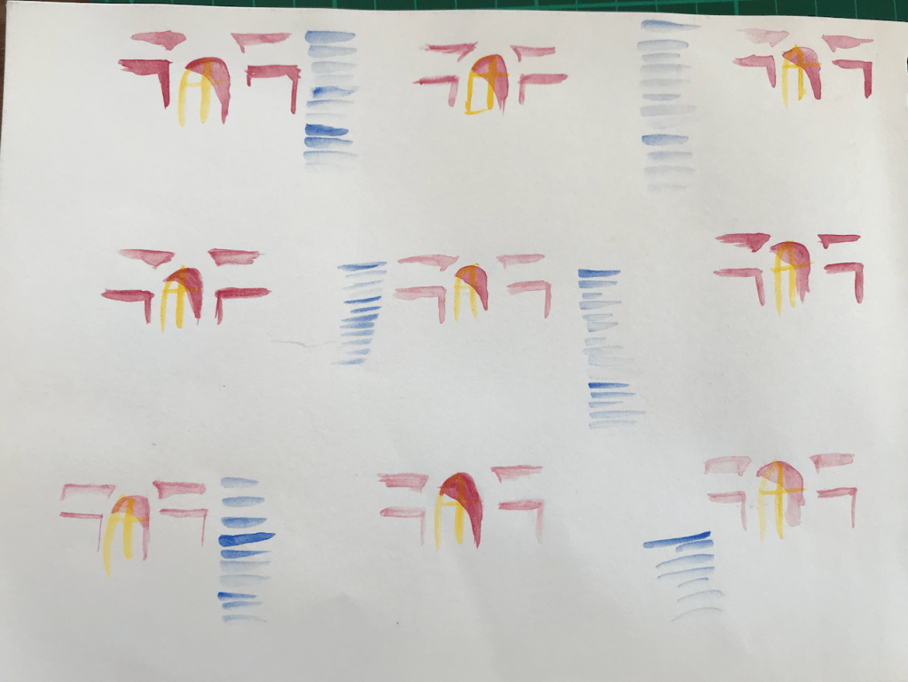
Year 2 Semester 1To create my colour way and material pallet I drew influence from my artist model Wes Anderson and his film ‘The Grand Budapest Hotel’, focusing on the hotel itself, the elevator scene and the concierge desk. I also referred to some of the images taken from our site visit at the St James Theatre.
Week 10: 3rd Iteration and Design Development
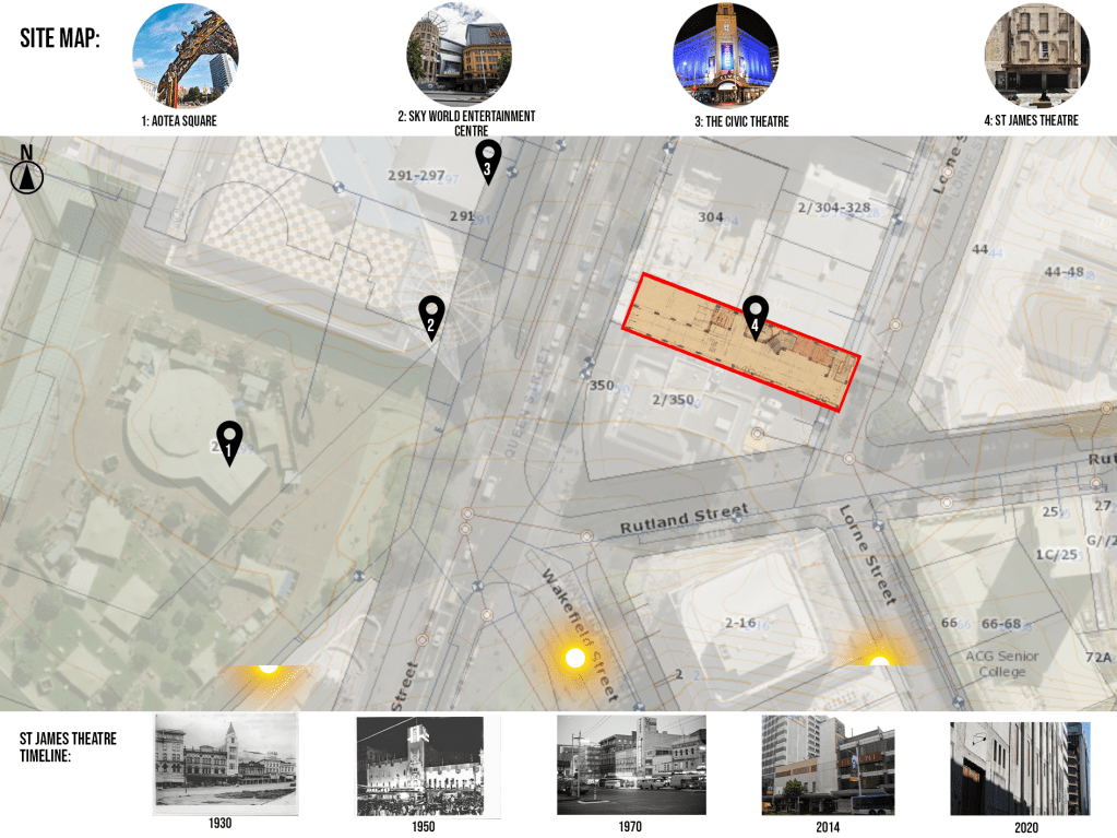
Year 2 Semester 1Site Map Developed:
3rd Iteration Design Development:

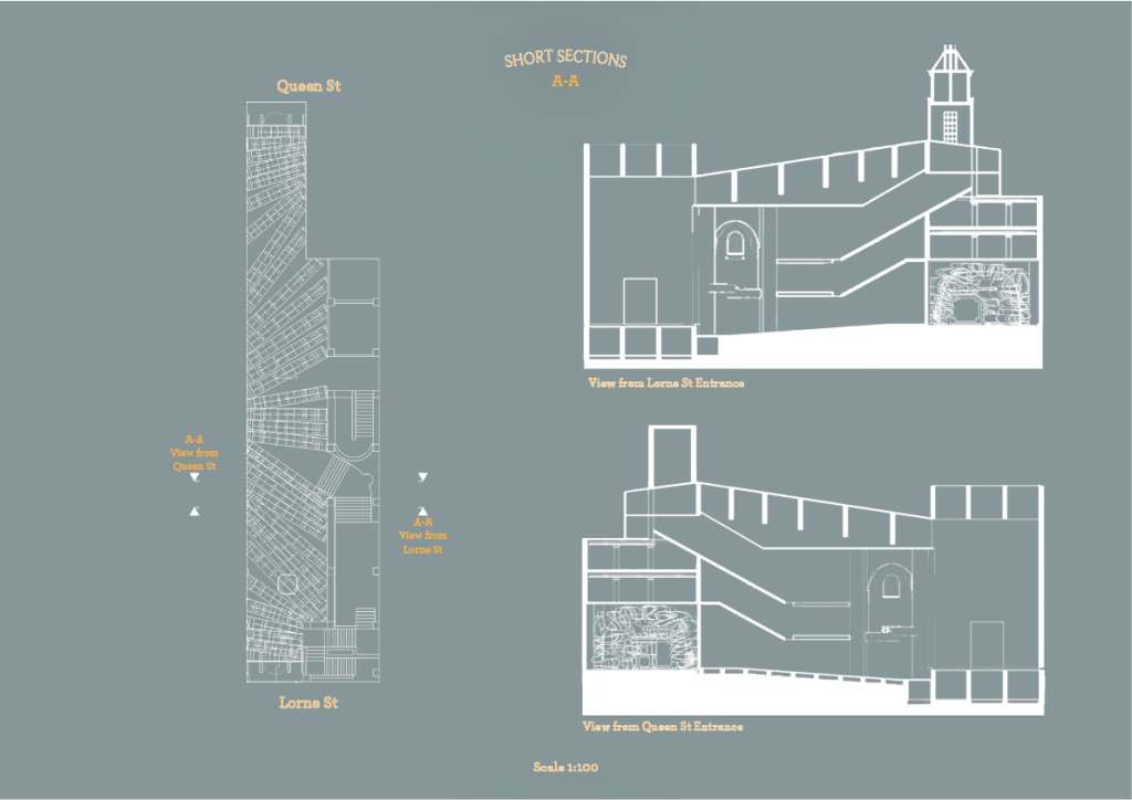
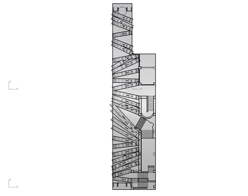
In my third iteration of my design I altered the angles of the arch ways creating a stronger emphasis on the stairway openings, acting as a subtle guide for the punters. I also added more archways to create a fuller space especially around the entrances to create a ‘Narnia wardrobe’ effect where you enter through a smaller opening and emerge into a grand space further strengthening the idea that you are leaving reality and entering into fantasy. I also explored a few entranceway ideas keeping in mind Wes Andersons classic use of symmetry.
Developed Entrance Way:

Front Exterior Elevation
I wanted to tie the Lorne Street and Queen street entrances to the style and shapes used on the ticket box creating harmony with all the different elements used. With symmetry in mind I have made the two entrances identical. I have used glass windows in the entrance space to provide a passerby a sneak peak into the interior, positioned in a way to not give away too much. This taste of what’s inside combined with a grand door knob on a pivoting door act as an invitation to enter into the space.
Develop Ticket Booth:
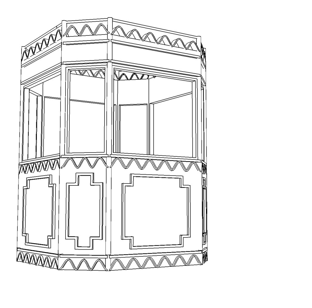
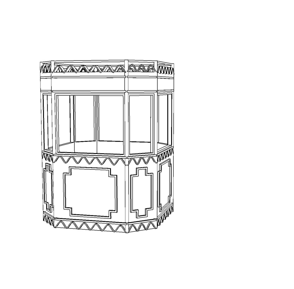
I added more wavey patterns onto the design and added more details to help it come to life a bit more. I referred to my previous research of 1920-1950 ticket booth designs when developing my design.
Plan and Section Drawings:
My Intervention in Site:

Floor Plan 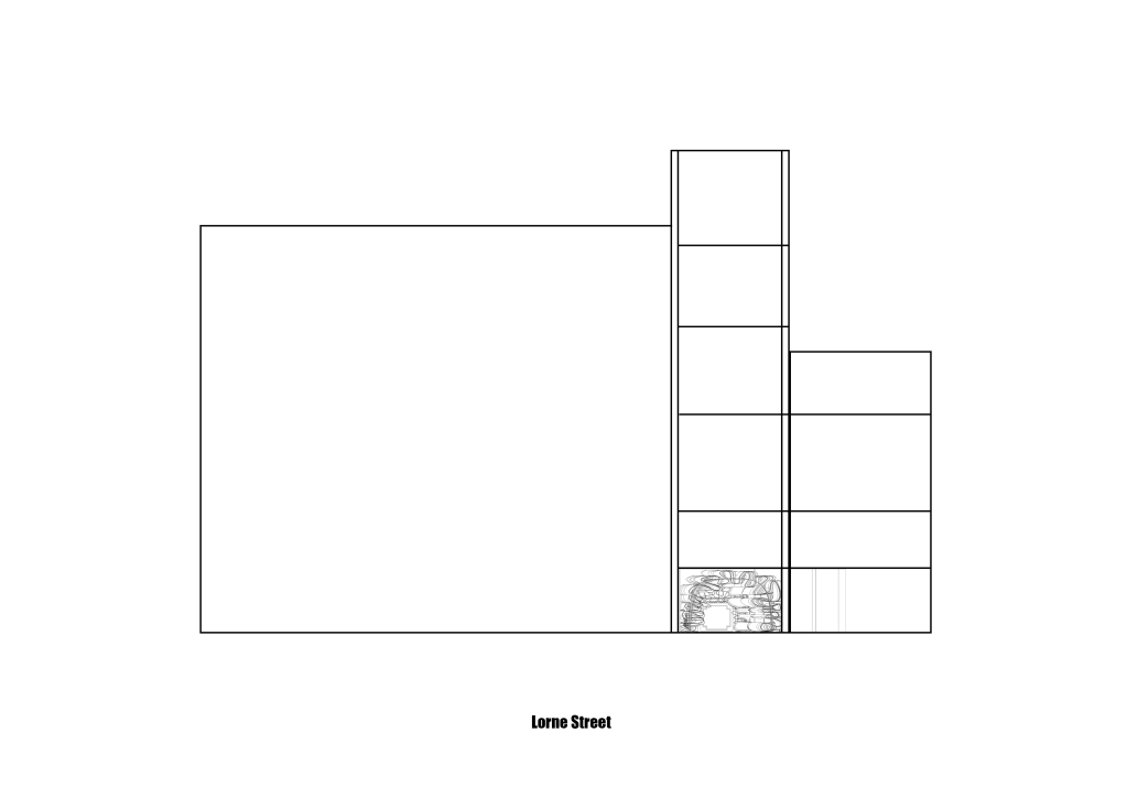
Elevation A-A 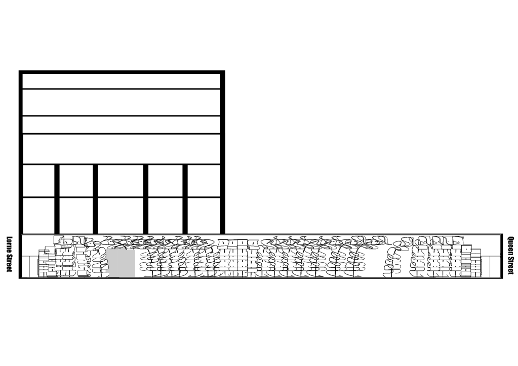
Elevation B-B
Week 9: Developing Ticket Booth and 2nd Iteration of design
Year 2 Semester 1
START DESIGNING & DEVELOPING YOUR INTERVENTION
Studio_Submission_Format_2020.pdf
Ticket Booth Development:
Inspiration:
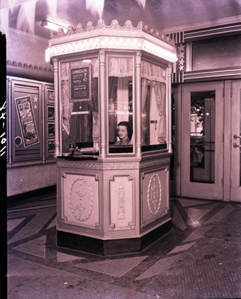
Ticket booth at the State Theatre with ticket attendant. 1948 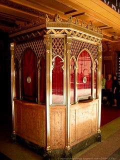
The Fox Theatre ticket Booth. Opened 1929 
The Warner Theatre ticket booth. Opened 1924

Sketch of first iteration 
Digital Model of first iteration
Drawing on designs from the 1920s-50s I designed a booth incorporating the wavey pattern used in the foyer space with the ribbon archways and keeping to the traditional forms of the old booths.
Going forward i think i will add more detail as the booths from the 1900s were quite ornate. The St James theatre also has a lot of detail within the theatre which i might draw on to tie the booth to the theatre.
Design Development – Second iteration of Design:

Changes made:
I tapered the angles of the archways to create emphasis around the stairways, subtly guiding guests through the space. I think having these angles created more depth in the space and more interest in the design. I also added more archways into the space to fill it and make an all encompassing environment.
Floor Plan 
Internal view from Queen Street Entrance 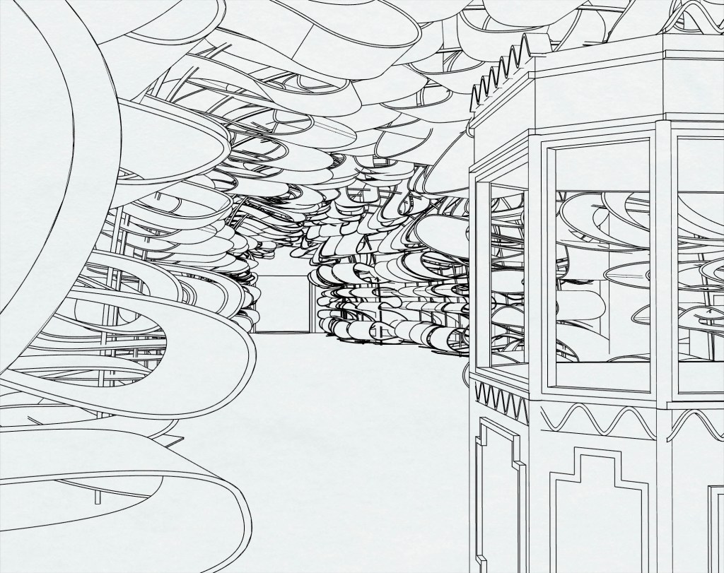
Internal view from Lorne Street 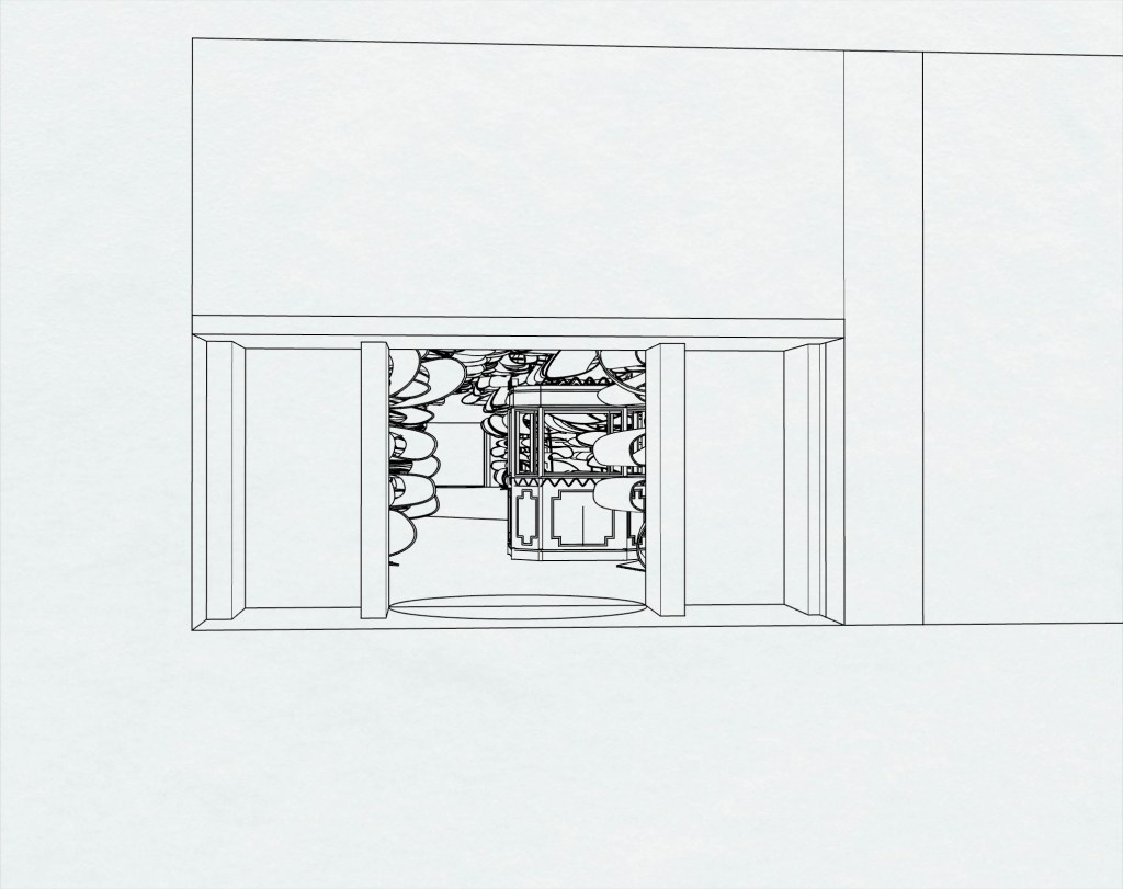
Lorne Street entrance
I feel like there are still too many gaps between archways breaking the spell of the tunnel like, all encompassing environment. Going forward I will work to fill these gaps and make the ribbon tunnel more consistent as you move through the space. I would like to create more movement with the ribbon archways going forward, creating a more dynamic surface texture.
Week 8: Mind Mapping and Abstract
Year 2 Semester 1Mind mapping:
Abstract:
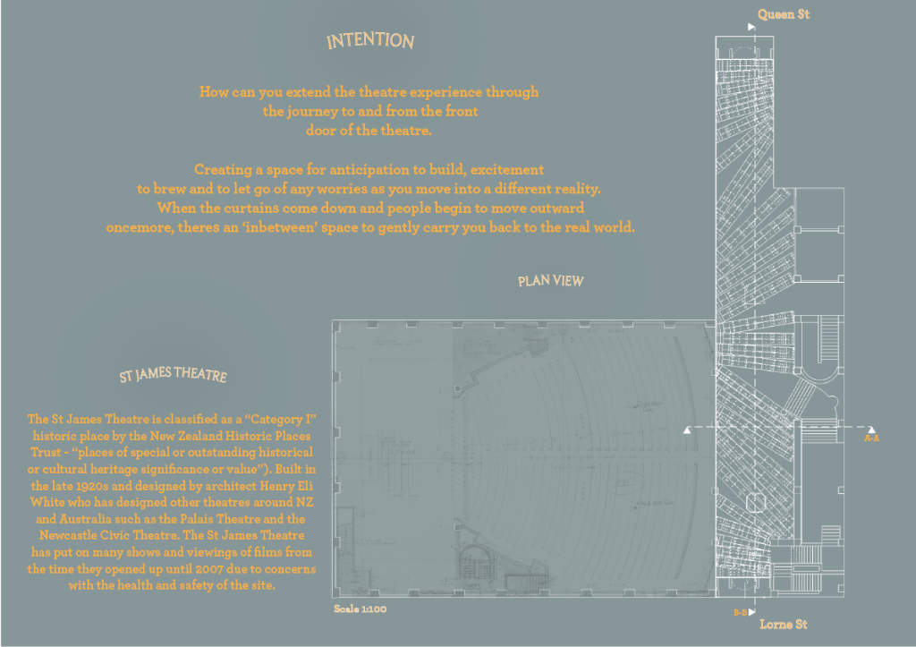
How can you extend the theatre experience through the journey to and from the front door of the theatre. creating that anticipation and beginning the journey into a different reality. Spreading the magic of the theatre into the space surrounding it.
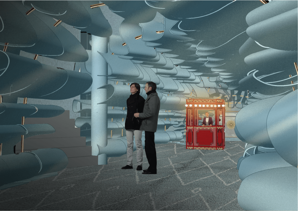
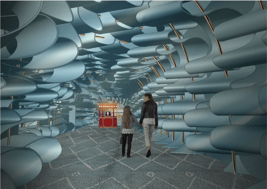
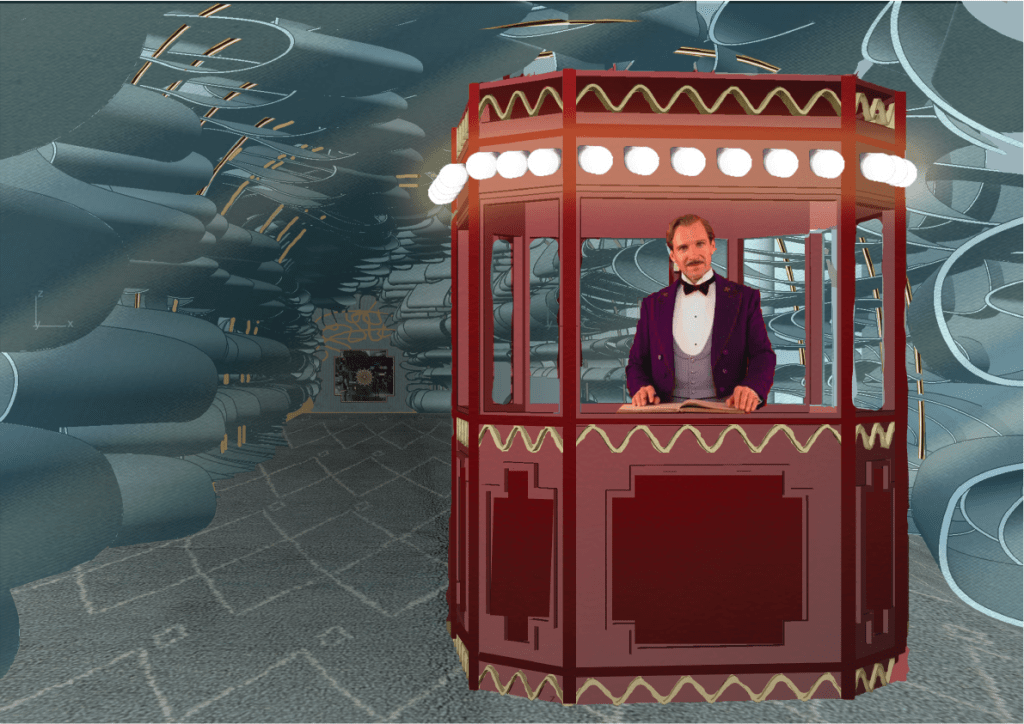
So much of designed space today is to serve a function. However the theatres only function is to entertain. I wanted to continue this theme of pure entertainment, pure experience into the foyer space of St James theatre through the creation of a tactile walkway bathed in colour and playing with light connecting the outside world the the fictitious. Wes Anderson’s work in the Grand Budapest Hotel, focused heavily on the use of colour, materiality and lighting and his detailing always had a reason and a purpose. This attention to detail is what brought his sets to life and drew you into his world. With Anderson as an influence I have designed a walkway of baby blue folded ribbon archways creating a soft, tunnel like atmosphere drawing you into the space. This leads to the focal point within the space, a small traditional ticket box further communicating that the purpose of the space is to connect you to the theatre. I will be using colour to create drama by having the ticket booth be in shades of red and the rest of the space in shades of blue. I will implement lighting into the space to further this contrast and amplify the drama. The use of materials and application of design will nod to the original St James Theatre design. The combination of these things will act as a space to transport people to a different time a different place and will open an ‘in-between’ experience softening the transition from reality to fantasy.
To construct my design I will be using digital techniques to build, render and create atmospheric images communicating my final intervention.
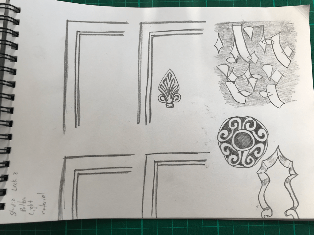
Week 7: Door Handle Threshold
Year 2 Semester 1


“It should in some way reflect how the artist model uses colour and or material.”
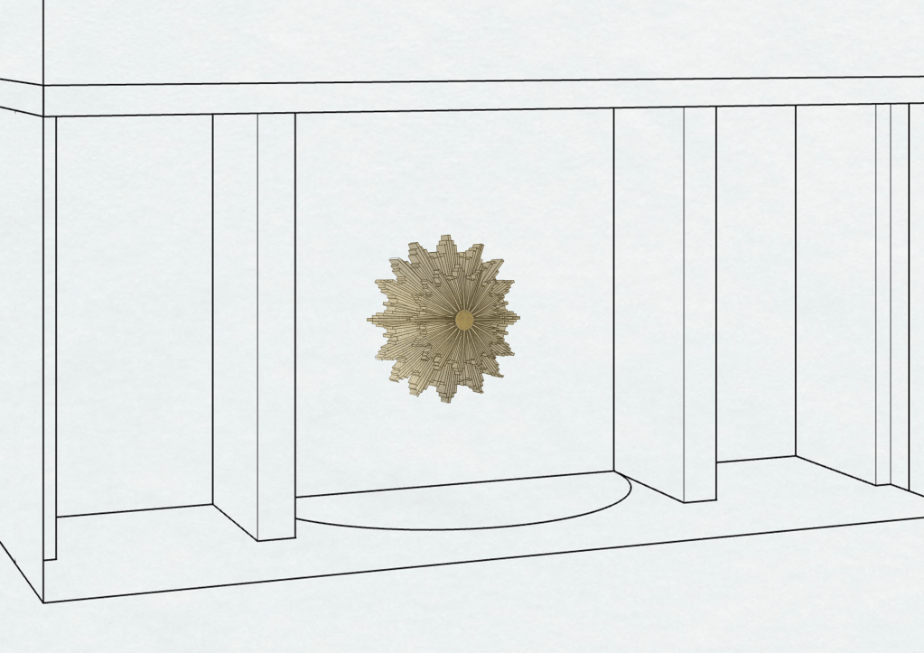
When designing my door knob I kept in mind the motifs used by Wes Anderson in the Grand Budapest Hotel such as symmetry, grandeur and classic european shapes.
My proposed door knob alludes to the grandeur of the theatre and walkway inside. The use of a larger scale for the door knob strengthens this idea. Large versions of traditionally small objects can evoke the feeling of being small or childlike. The proposed measurements are a 10mm attachment from the wall, and 150mm by 150mm for the knob.
It also draws on the ceiling detail of the theatre remaining true to the original designs of the theatre but in a new way. It also adds a bit of drama to the front of the building.
Make 10 sketch designs, that explore elements from your surface design and the threshold transition between Lorne St and the interior foyer space:
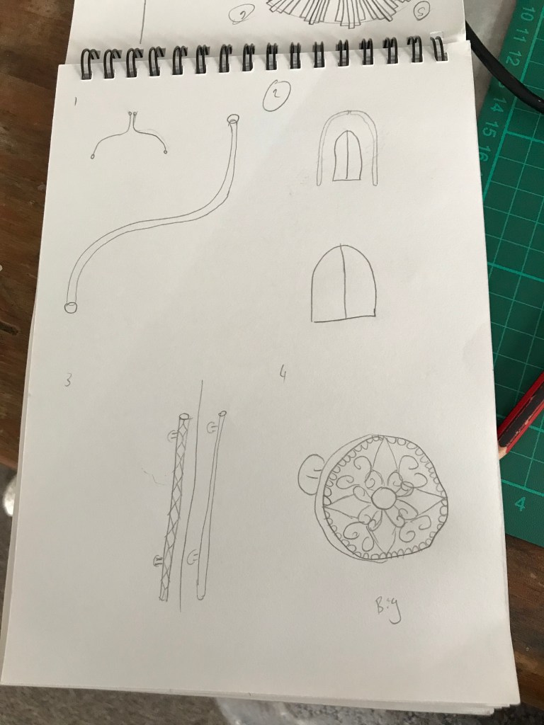
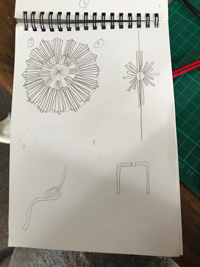
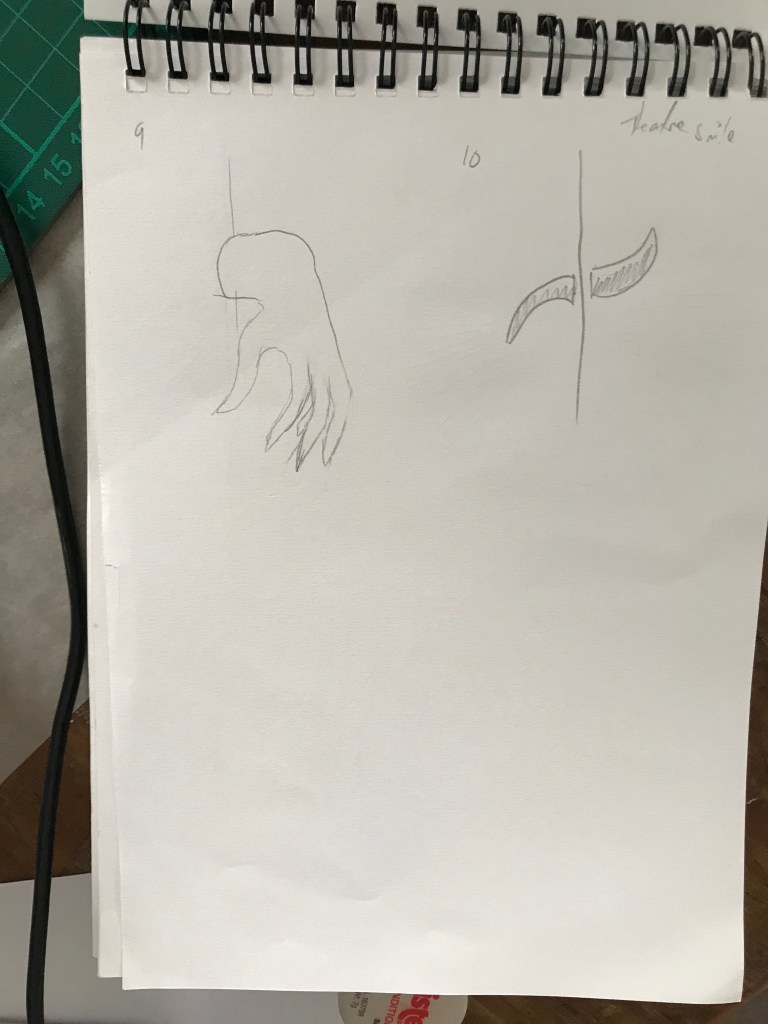
Take the best three sketch designs. For each sketch design, make a further 3 iterations of exploring how these designs could function as a door handle:
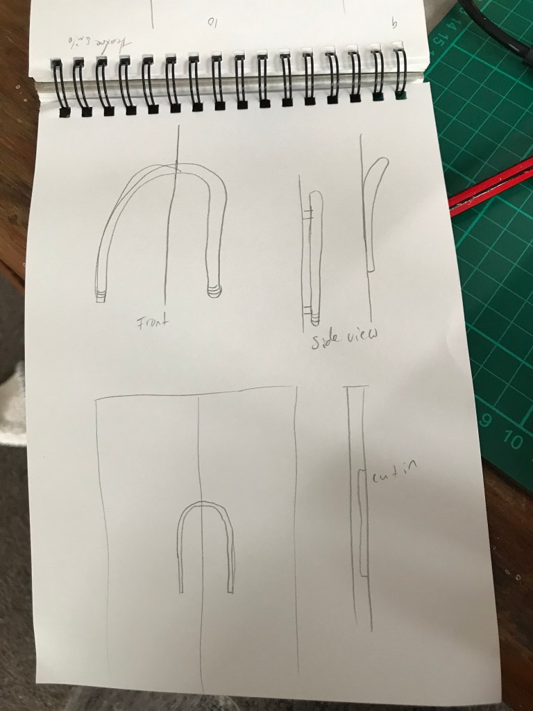
Archway Handle. 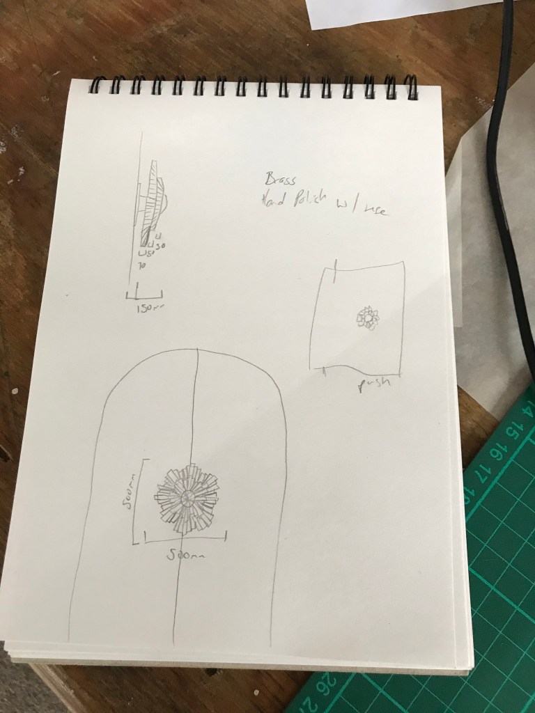
Large Door Knob. 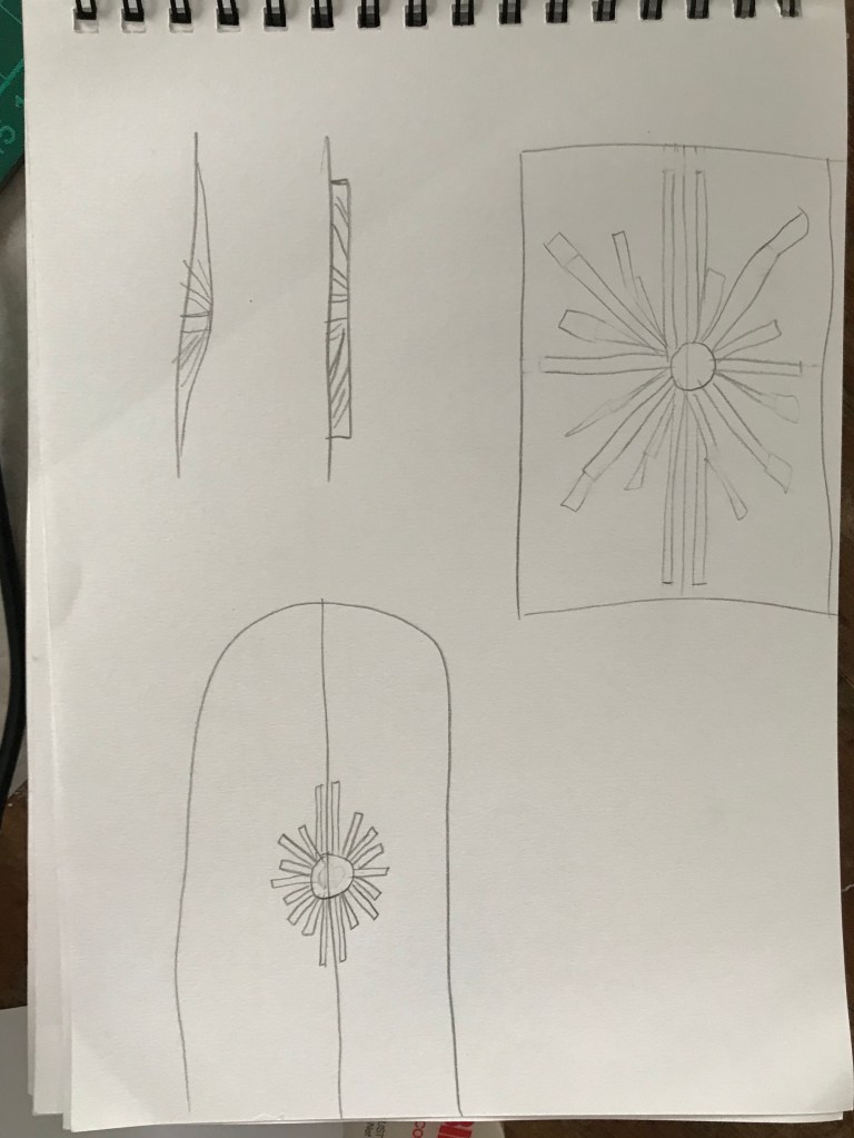
Handle of handles in a Star formation.
I want my door handle to be heavy and to radiate strength and luxury so materials like brass, copper, polished stone etc. could be used to convey this.
These materials would provide a smooth polished surface, cool to the touch unless bathed in sunlight (which would be the case in the morning as Lorne Street faces east). If brass or copper was used, the use of peoples hands would polish the door knob creating a relationship of reliance that the theatre needs the people just as much as the people need the theatre. The use of small sections to create the door knob ‘halo’ act as an invitation to touch, to feel the undulating texture of this door knob.
The door knob would be placed on a pivot door causing people to interact with it needing to push or pull the door to enter into the space.
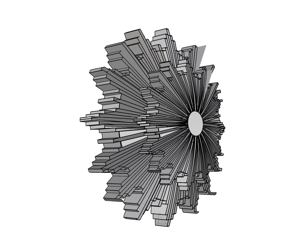
Perspective view of Door Knob 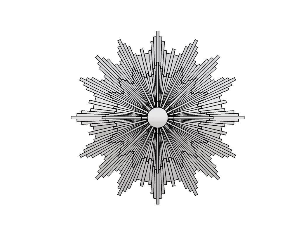
Front View of Door Knob 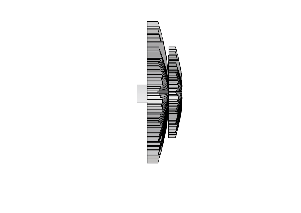
Side View of Door Knob
***Things to consider while doing this exercise – identify any ideas or material exploration you could use in the design brief going forward. Include this in a post reflecting on the exercise. This will be useful for the written abstract that will support your final submission as well as proposing the intervention and programming of the space.
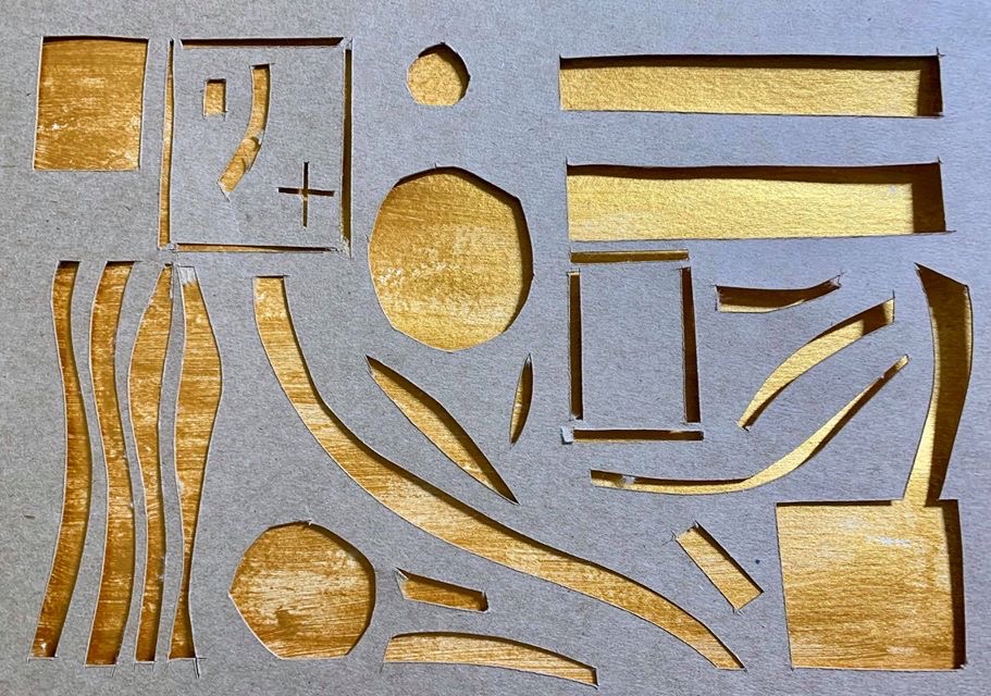
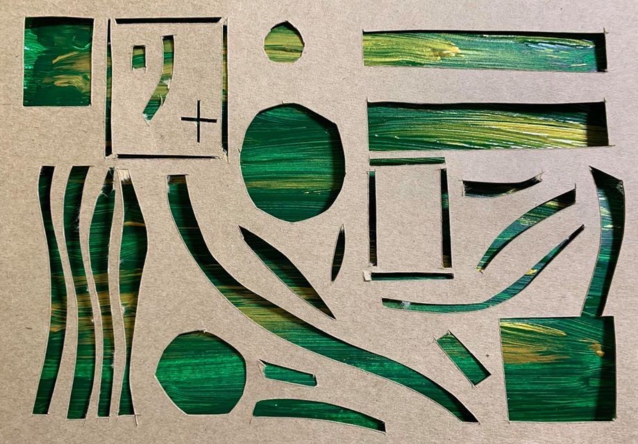
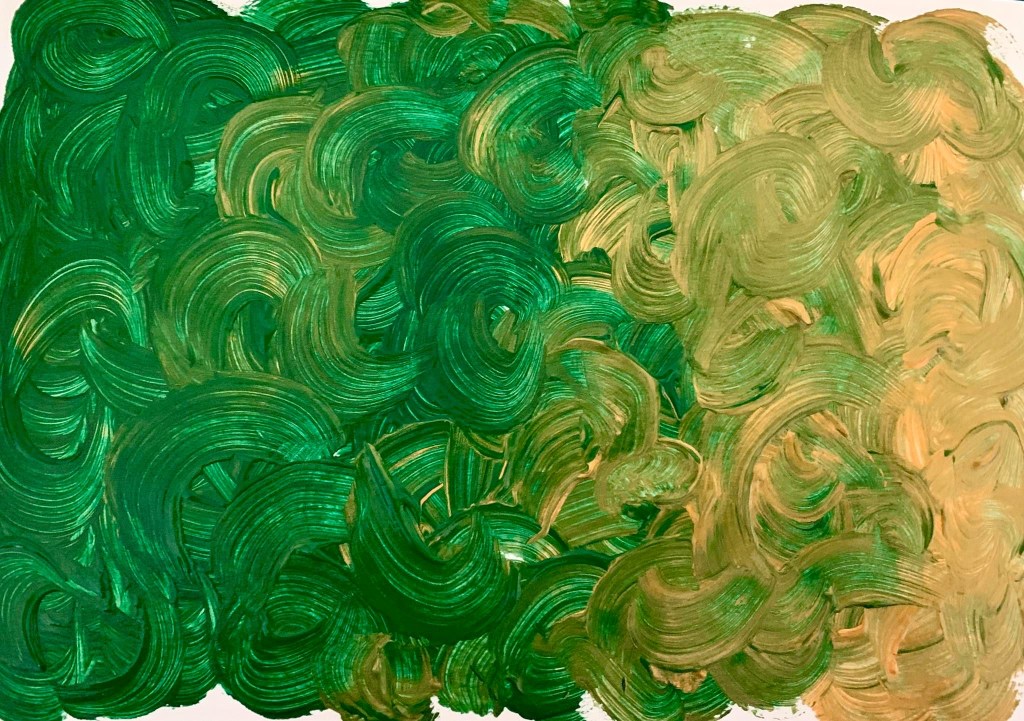
Week 6: A3 Surface Application and First Iteration of Design
Year 2 Semester 1
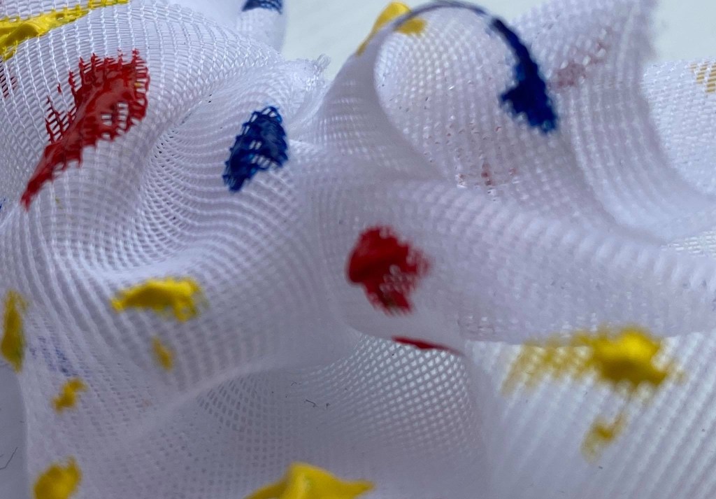
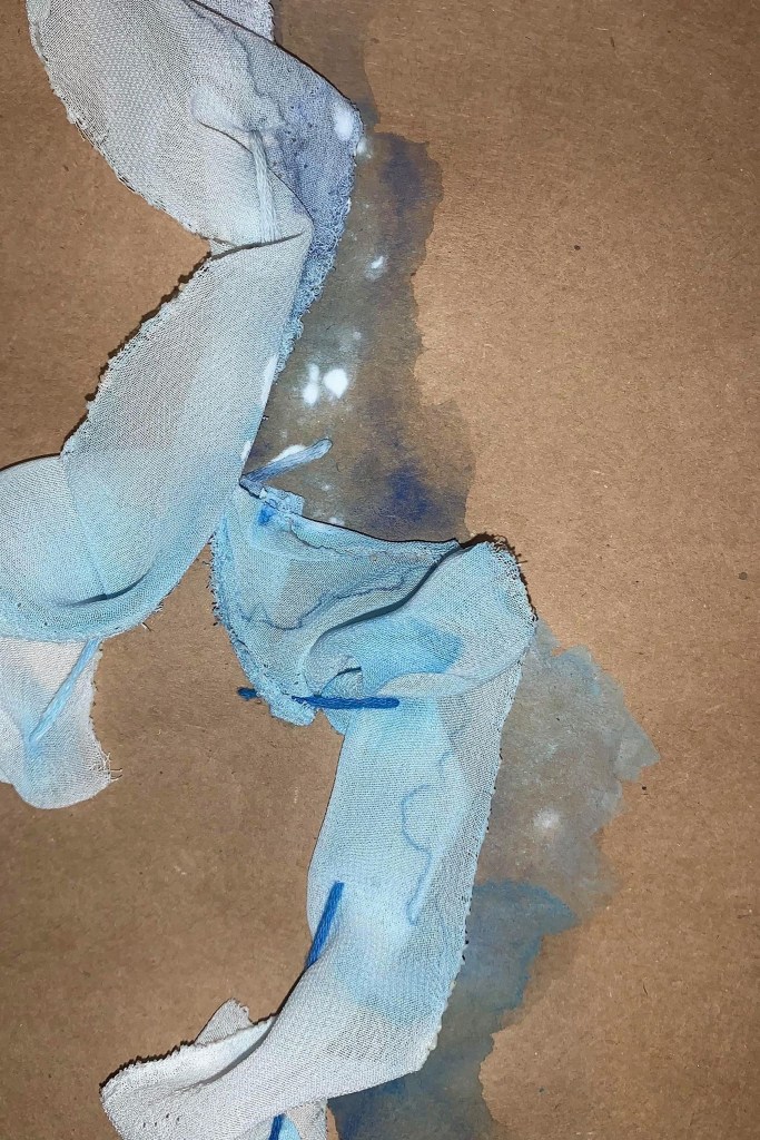
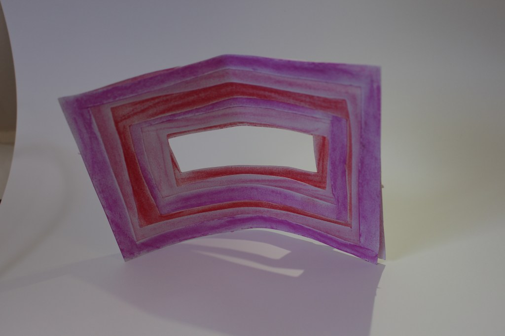
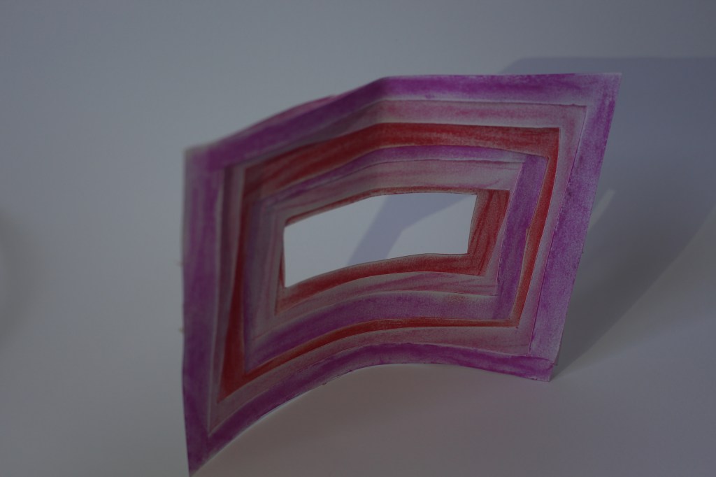
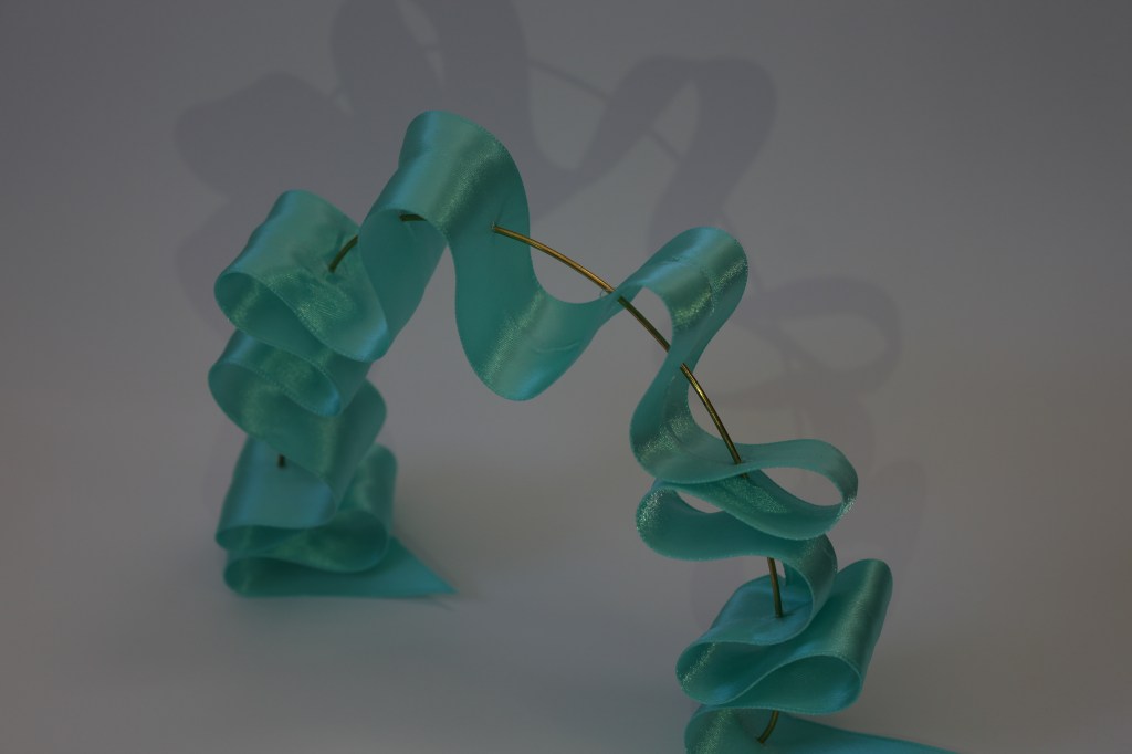
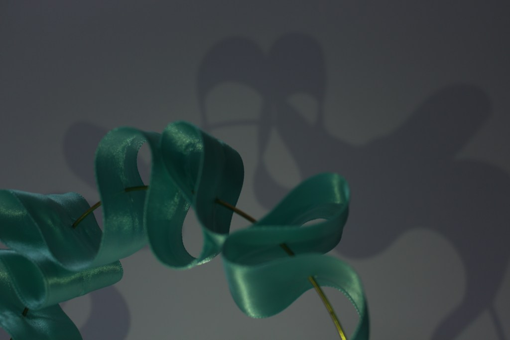
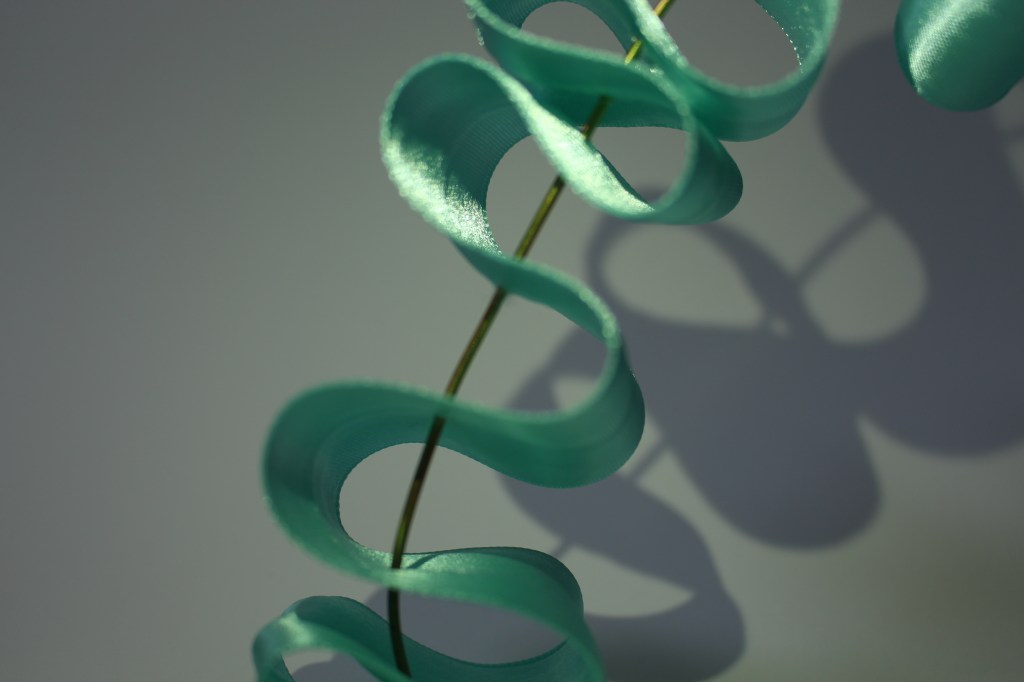
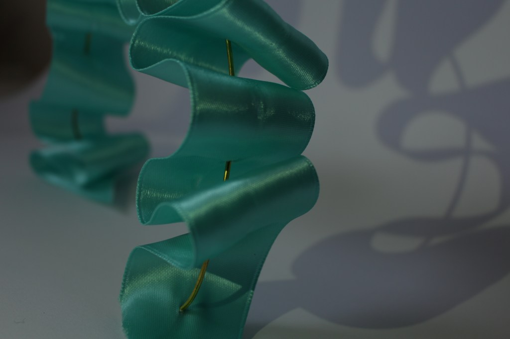
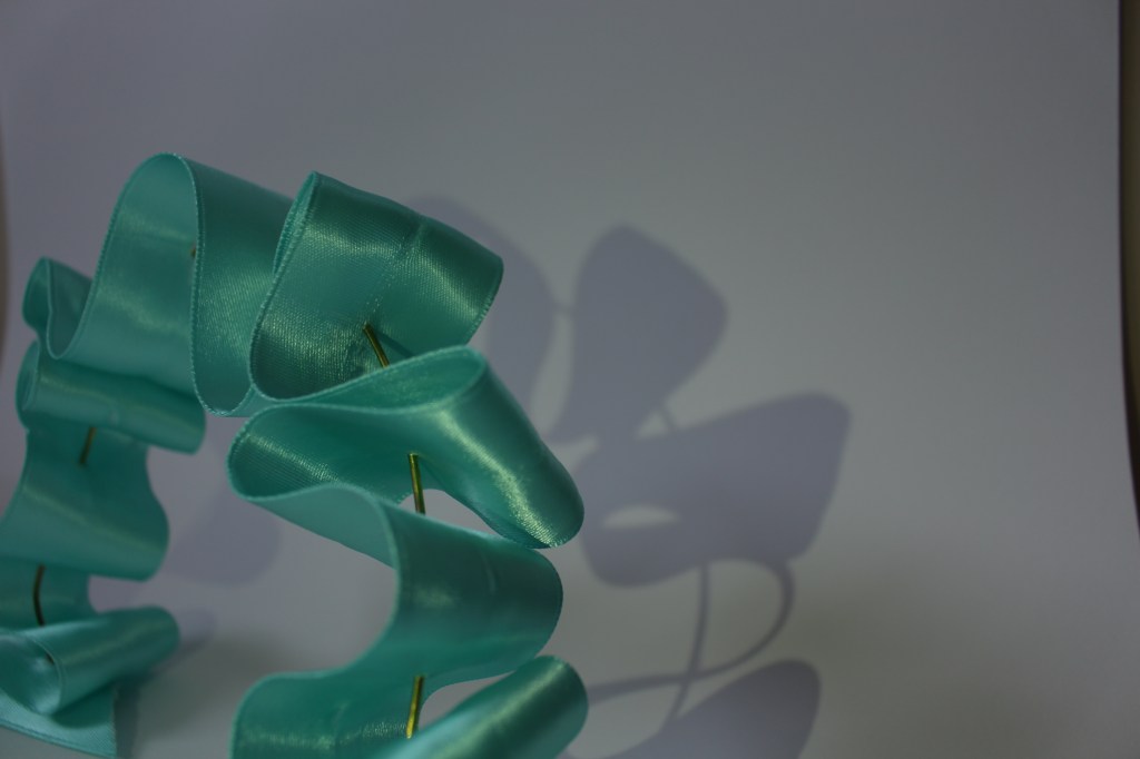
When thinking about my surface application, I went back to my favourite model of my ribbon archway that I created during my artist research. I liked the soft atmosphere this model created more that any of the models created in my surface research.
Drawing on this model of the ribbon woven through brass wire, I expanded the scale, and thought through the issue of the satin ribbon material holding its form at a larger scale. By weaving wire into the fabric it gives it the strength to support its own weight when at a larger scale.
These ribbon archways will be located at the Lorne Street entrance to the theatre drawing guests into the space.
In between each archway will be soft lighting allowing the blue satin to catch the light and shine into the space. The walls and ceiling will be painted a darker blue that will bounce out through reflecting off of the surface of the ribbon creating more depth to the blue of the ribbon.
Initial design concepts and first iteration of design:
When thinking about the overall intention for the space i drew on the order and simplicity of Andersons work and the classic style he often uses in his films. With this in mind i designed a ticket booth to stand in the middle of the space oriented towards the Lorne St entrance. This brings the theatre aspect into the design space. With the ribbon archways at the entrance it draws the focus to the ticket booth as it blocks your peripheral view of the space.
Anderson also uses colour to create a point. I applied this thinking to the colours I will use in the space. I played with the idea of have the walls be a bright colour but be broken up with either ribbon archways or frosted plastic sheets encroaching into the space allowing the colour to bleed into the space through bouncing off of these surfaces. This idea was influenced by my model from Trial 2 Surface 3.
Developing this idea of colour further, I would use bright red and soft pink for the ticket booth and to contrast the soft blues of the ribbon archways helping to emphasis the ticket booth as the key focal point.
Once I decided on the ribbon archway design, I trialed what the colour of the walls could look like with the archways.
I felt that using red would take away from the main contrast of the ticket booths colour scheme. I liked the use of a darker blue better as it gives depth to the ribbon as-well as keeping the main contrasts between the walls and the ticket booth.
Plan View – First Iteration 
Sketch of Blue Ribbon with Red walls 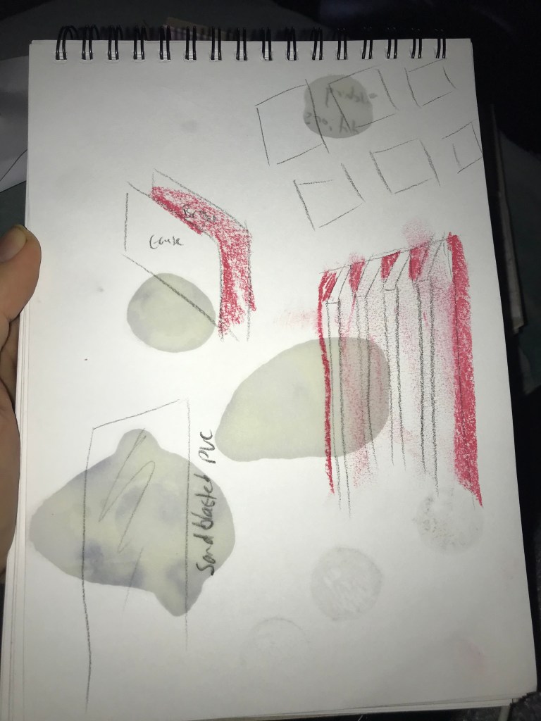
Sketch of plastic sheets with red walls 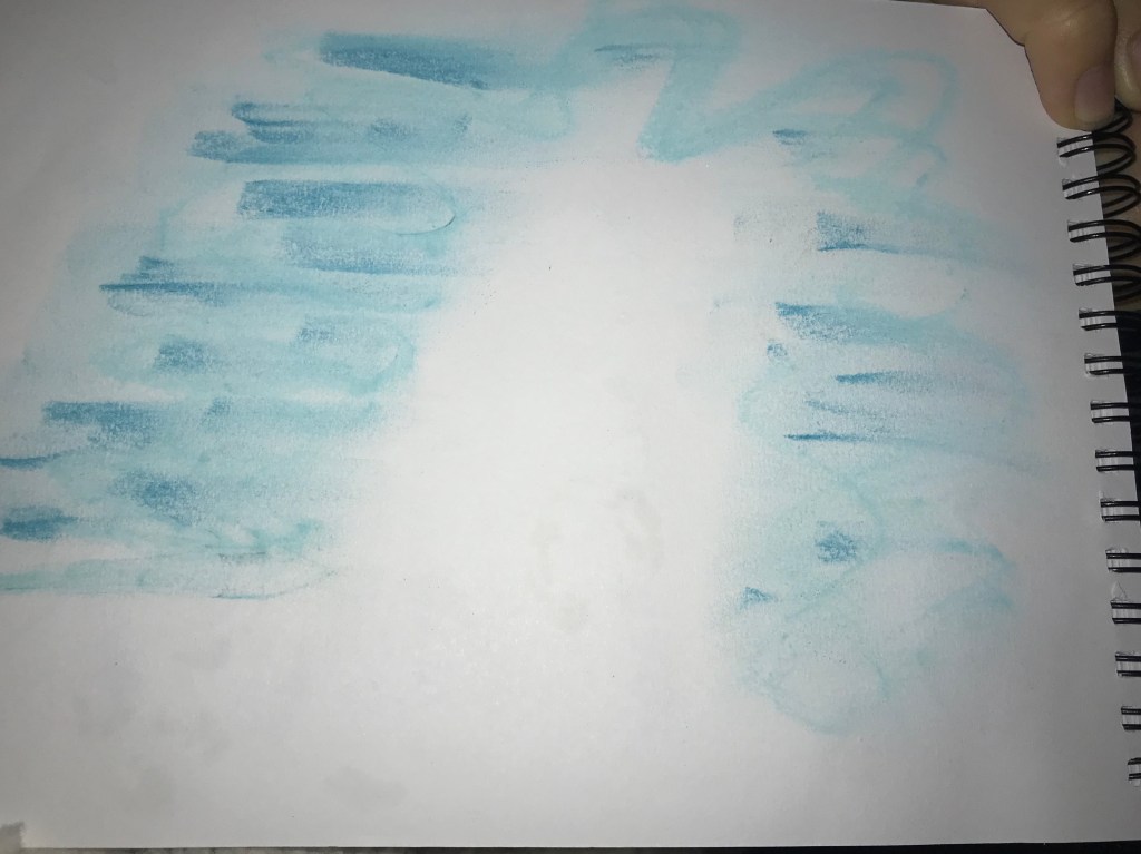
Sketch of Blue Ribbon with Blue walls 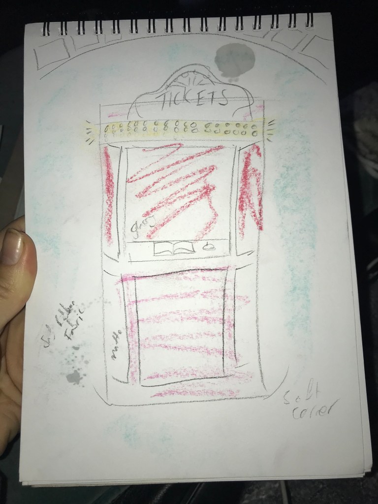
Sketch of Ticket Booth concept 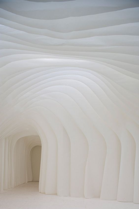
Lighting inspiration for Ribbon archways
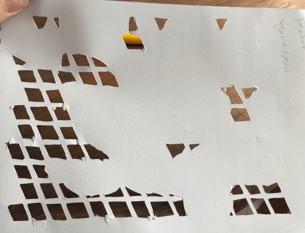
Week 5: Slow Surfaces
Year 2 Semester 1Part 1:
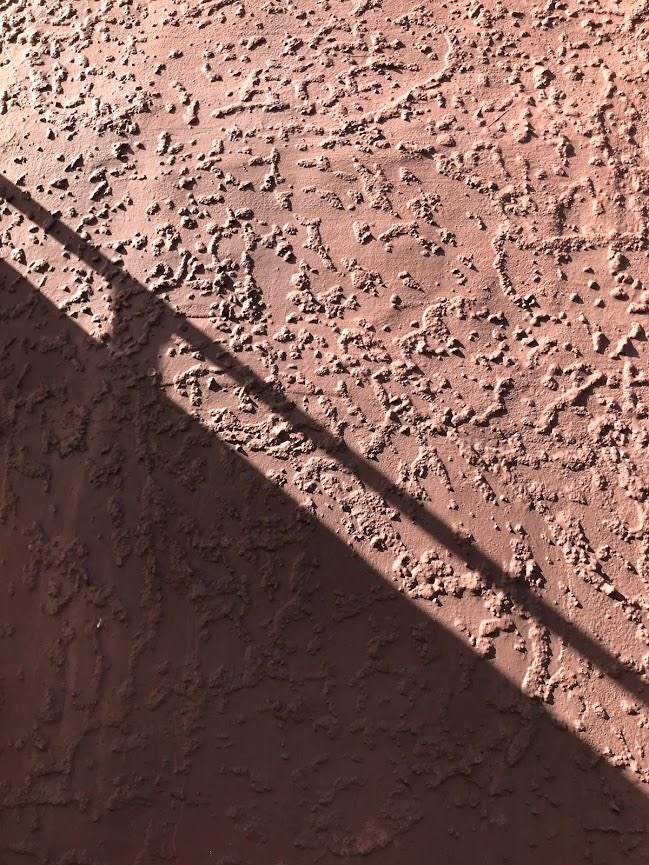
Surface I observed in my home:

Surface of my desk 
A rubbing of the deteriorated varnish
You can see the different stages of the varnish deterioration. This contrasts the consistency of the wood grain with the sporadic, random cracks in the varnish.
The contrasting relationship of matte vs sheen with the different areas of varnish deterioration. Horizontal light vs vertical light allows these varnish patterns and sheen appear and disappear.
This surface has layers of texture. Wood grain, varnish, scratches, marks, indents, holes, dirt, paint platter making for a very detailed surface.
Group activity:
Angel’s Surface 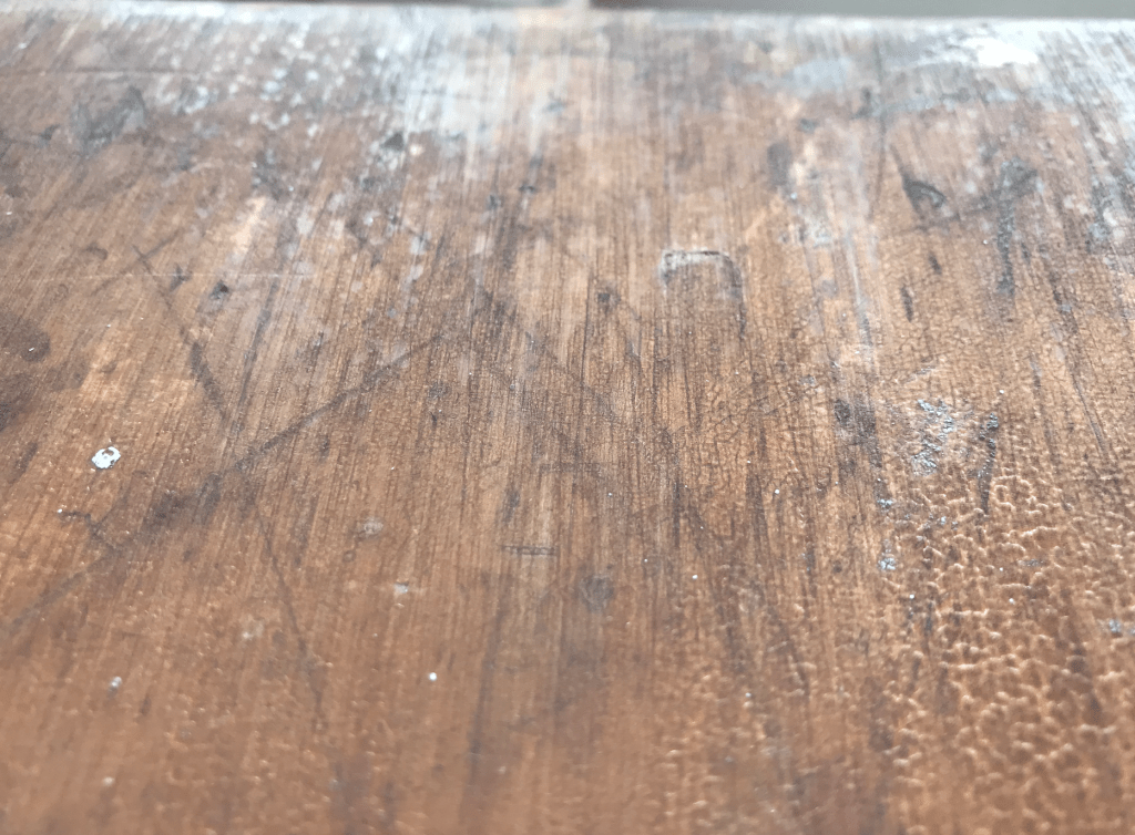
My surface


I found just how much light comes into play when thinking about interesting surfaces. Light and shadow bring a surface to life and create depth even when the surface is flat.
Making:

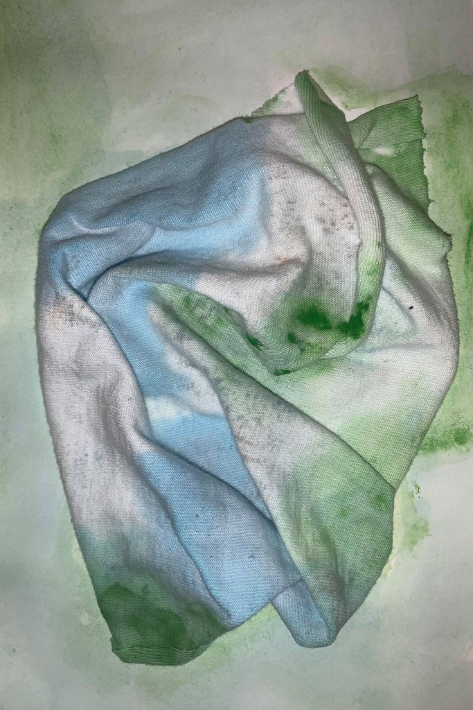
Trial 1 Surface 1 
Trial 1 Surface 2 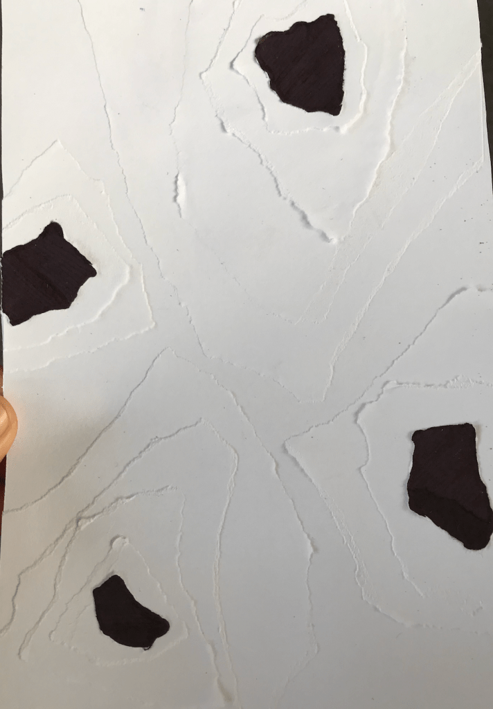
Trial 1 Surface 3
I found that layering was a very effective tool when trying to translate texture and depth. Interesting surfaces seem to have multiple layers and the longer you look at them the more layers, texture and detail emerge so i attempted to create that same depth through layering with my surfaces. If I was to develop these surfaces deeper I would experiment with more layering with different materials.
Part 2:
Produce a second series of surface designs based on your analysis of the temporality, movement, materiality, atmospheric affects, of the creative work you have studied.
I was drawing on my artist model Wes Andersons Grand Budapest Hotel to influence my surface designs.
Trial 2 Surface 1 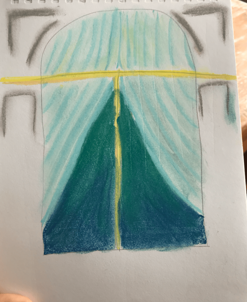
Trial 2 Surface 2 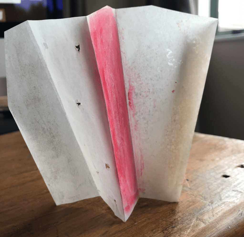
Trial 2 Surface 3
In my first surface I drew on the snow covered roof and played with negative space to create shapes.
In my second surface I looked at the way shadows were used to create shapes and depth and the way colour changes at different depths.
In my third surface I experimented with colour reflecting on other surfaces using butter paper to allow colour to move through the layers.
Group activity: In studio groups make a time to meetup in collaborate chat room and discuss the surfaces you have made.


Lighting:
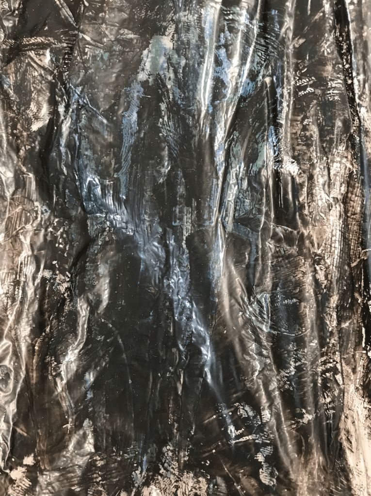
Trial 1 Surface 1 – Direct Sunlight 
Trial 1 Surface 1 – Backlit 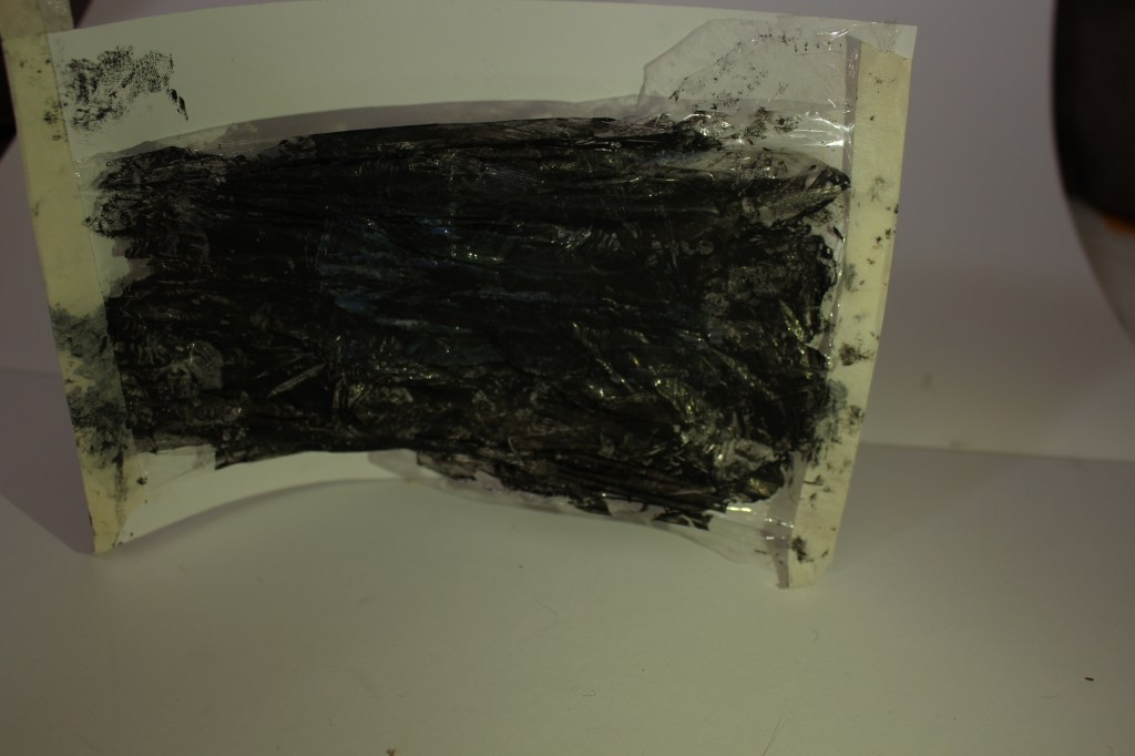
Trial 1 Surface 1 – Side Lit 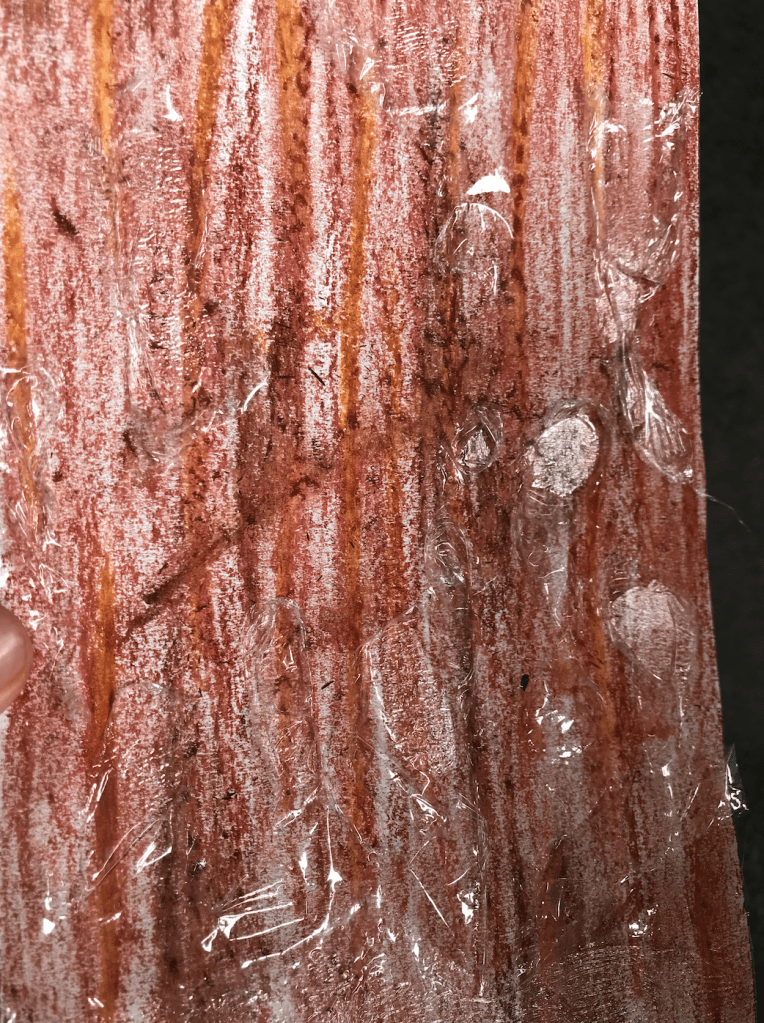
Trial 1 Surface 2 – Direct Sunlight 
Trial 1 Surface 2 – Backlit 
Trial 1 Surface 2 – Side Lit 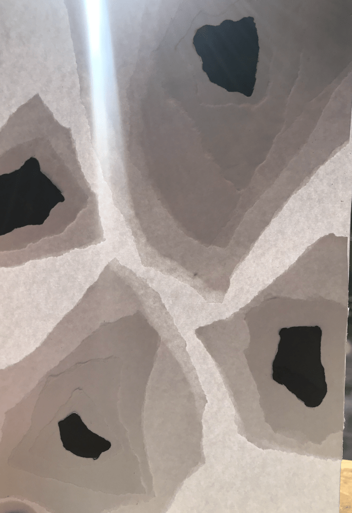
Trial 1 Surface 3 – Backlit 
Trial 1 Surface 3 – Side Lit 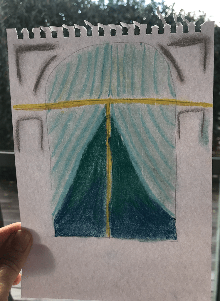
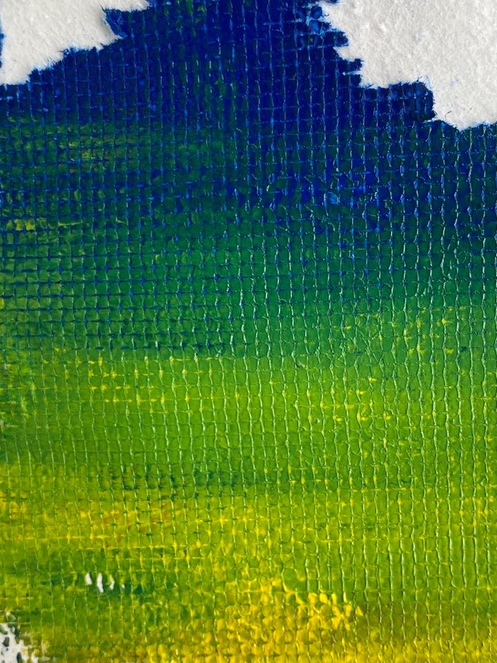
Trial 2 Surface 2 – Backlit 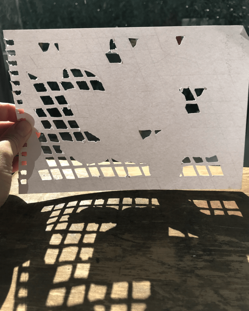
Trial 2 Surface 1 – Backlit 
Trial 2 Surface 1 – Side Lit 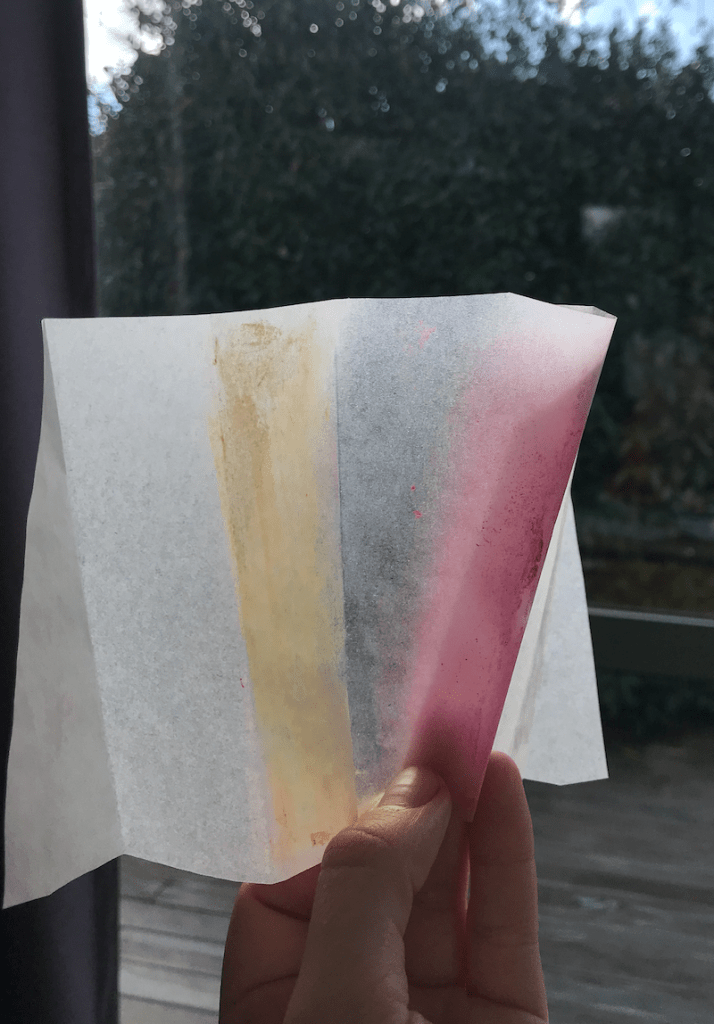
Trial 2 Surface 3 – Backlit 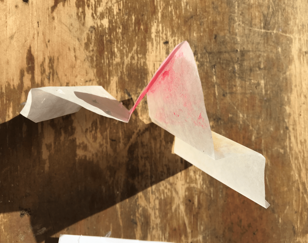
Trial 2 Surface 3 – Direct Sunlight 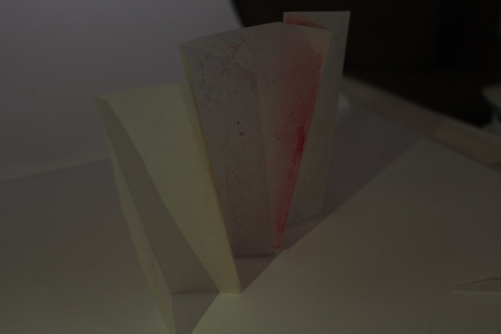
Trial 2 Surface 3 – Side Lit
Through this lighting exercise I discovered how much light can affect the surface and can create new shapes or depth depending on how it interacts with the surface. My favourite outcome was Trial 1 Surface 3 – Backlit. Having the light be filtered through the different layers of paper made the surface very dynamic to look at and created a level of depth that isn’t there under other lighting conditions.
Week 4: Artist Model
Year 2 Semester 1My artist model is the director Wes Anderson and I will be focusing on his film The Grand Budapest Hotel.
Questions about Wes Andersons work:
When and where did he produce his work?
Wes Andersons The Grand Budapest Hotel was released in 2014 and was filmed at multiple locations around eastern Germany.
Identify the key conceptual ideas that underpin their work.
Nostalgia, Fascism, Colour. “We made a pastiche of the greatest hits of Eastern Europe” – Wes Anderson https://www.npr.org/2014/03/12/289423863/wes-anderson-we-made-a-pastiche-of-eastern-europes-greatest-hits
Anderson is also famous for the symmetry of his shots in all his films.
Identify their critical position on colour in relation to their work (i.e. how is colour applied, in what proportions, what particular theories about colour inform the making of the work, how does colour change dependent upon the environment in which the work is viewed.
The Grand Budapest Hotel uses colour to accentuate elements of the story. It was also used to emphasis different themes and the passage of time. Anderson is known for his bright colour ways in his films and The Grand Budapest Hotel is no different. However, Anderson didn’t use his classic soft yellow hue with this film instead went for a highly saturated palette.
With such a bright palette in use Anderson plays with the saturation to help communicate things like the impending war and flashback scenes exploring Zero’s memory of wartime by desaturating the colours.
What type of surface treatments are used in the work? Do they use matte, satin, or gloss paints or material finishes or all of them together? Why might they do this and what is the effect of doing this?
The film overall has a warm, bright palette with soft pastel accents. With this as the films base colour way Anderson used hardwoods, strong greens and golds in the Schloss Lutz to express oppressive wealth and used a cool bluish grey tint for Checkpoint Nineteen to show its slow decay and neglected position creating contrast and helping the viewer to differentiate location, mood, and time.
What scale are the artworks you have researched? How does scale impact on how the work is experienced and how colour and materiality are perceived?
To create the sense of size and grandeur in some of the more elaborate scenes the film makers used matte paintings and miniture effect techniques to play with the perspective. Scale models of structures were created to help set the scene of this fictitious world which Anderson has done in a few of his films previously. The scale model of the front elevation of The Grand Budapest hotel was one-eighteenth scale. It’s about four metres wide and three metres high.

The film also draws from Europe-set mid-century Hollywood films and the Library of Congress’s photocrom print collection of alpine resorts for visual motifs. These images did not showcase much of recognisable Europe; rather they catalogued obscure historical landmarks not known to the general public.
Complete the design research and carefully photograph your work to upload to your blog with some writing that reflects on this design exercise.


I focused on the use of colour, pattern, shape and symmetry when extracting ideas from Andersons work. I found that the use of symmetry creates the opportunity for pattern making and repetition. I also drew on the subtle details of The Grand Budapest Hotel such as the shadows and trimmings. I used the primary colours keeping the simplicity of the original design. I love the use of the arches and shadow making of layered materials and the atmosphere that the clean lines, curves and symmetry create.
When thinking about my application to the St James Theatre I will explore further the use of shadow making through layering. I will also play with the use of clean lines and repetition.
Model Making:

To create my third model I used the ribbon from my second model as it created soft shadows and caught light nicely creating depth. I then drew, from my first model, the layering technique through stacking and applied that to the ribbon. This created a third model that cast very interesting, clear shadows allowing the model to multiply on the surrounding surfaces. Through layering the material it allows light to break up its form making the structure take on new shapes depending on the angle that you view it, transitioning from solid to soft and back again.
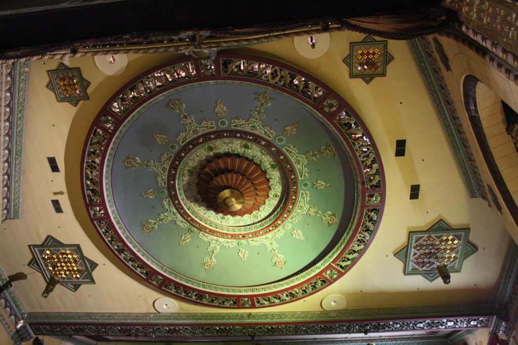
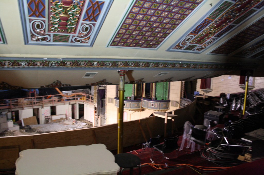
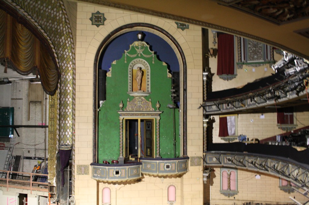
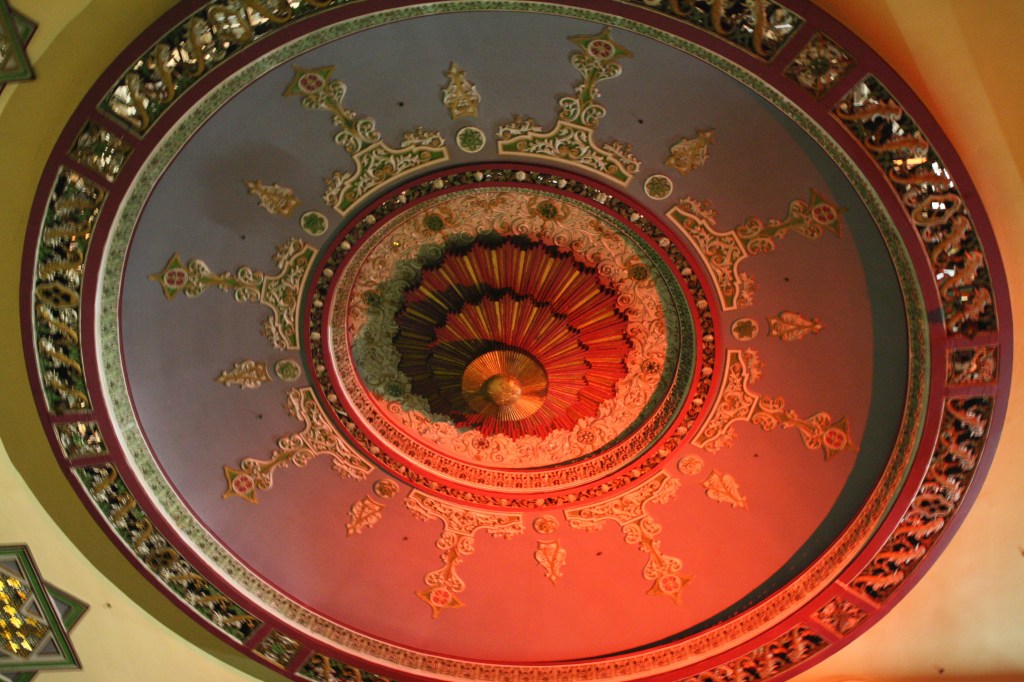
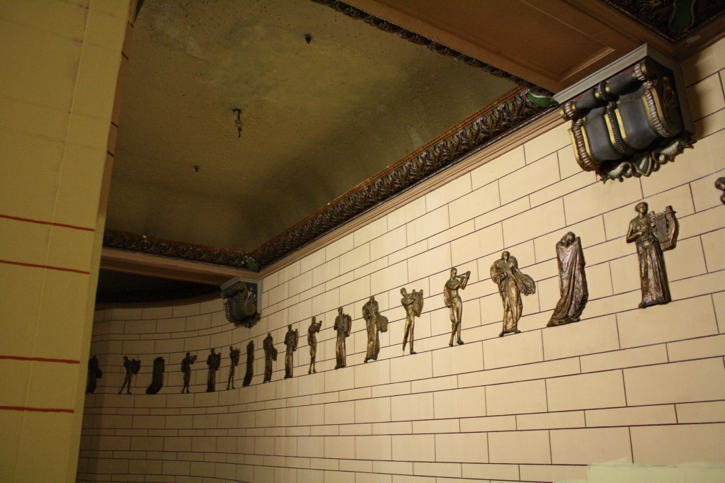
Week 3: Group Seminars and Site Visit
Year 2 Semester 1On Tuesday each group presented their seminar on their specific colour. It was really helpful having the different colours unpacked in a design capacity. I found getting a broader context around specific colours gave them more depth and adds another layer of detail when they’re being used in different spaces and products.
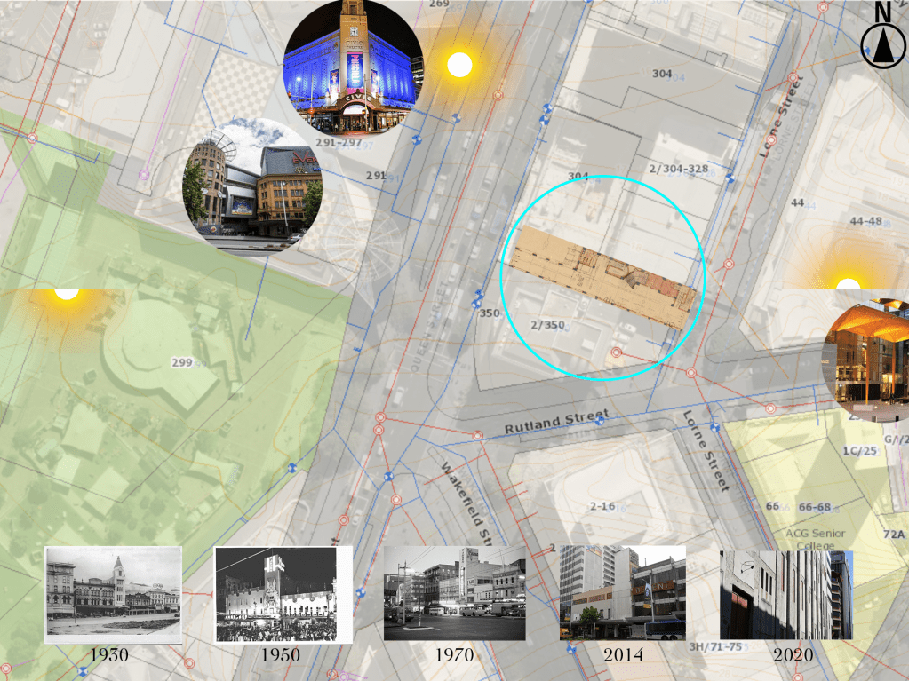
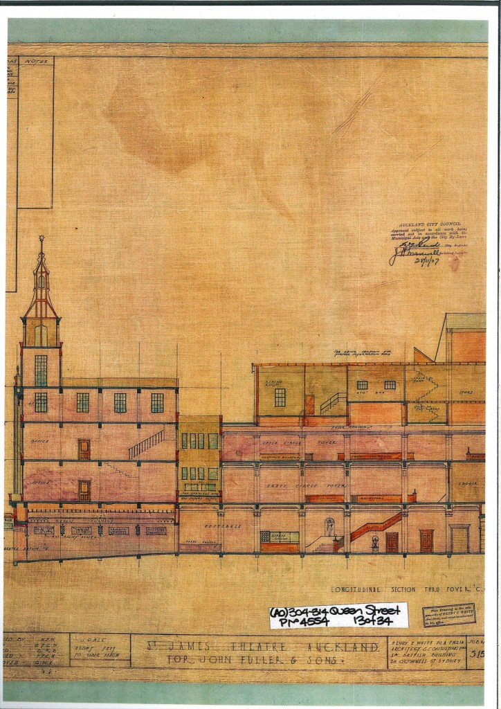
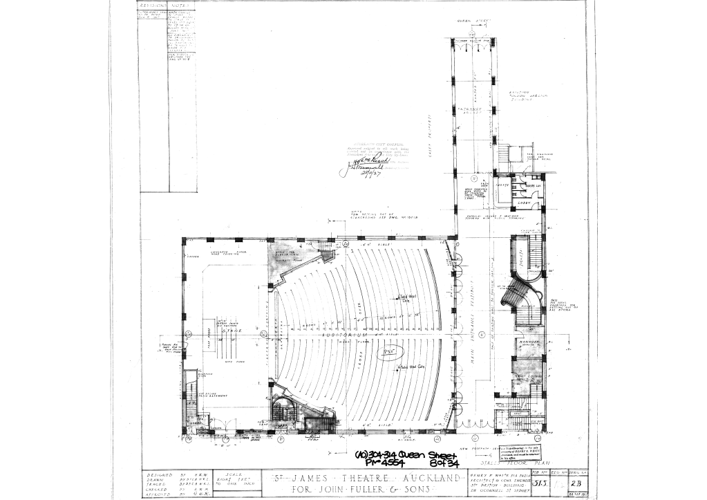
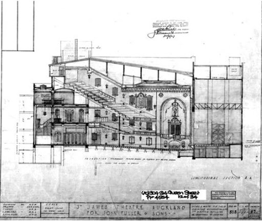
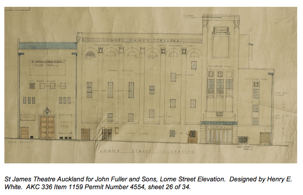
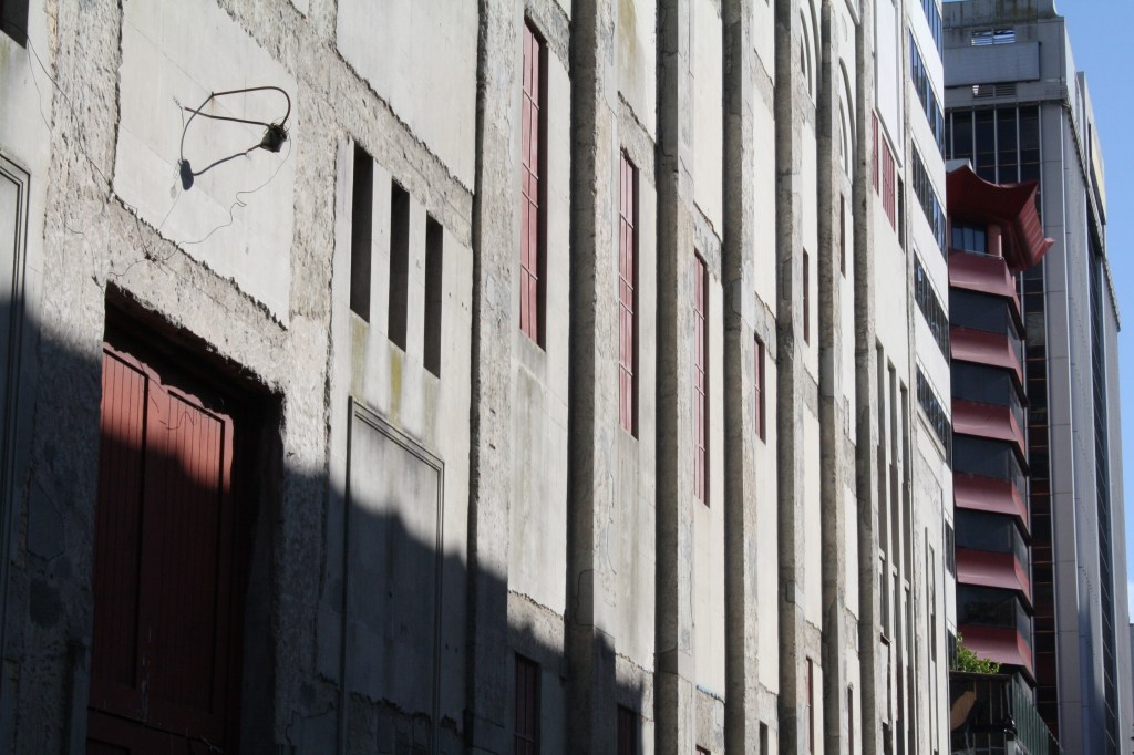
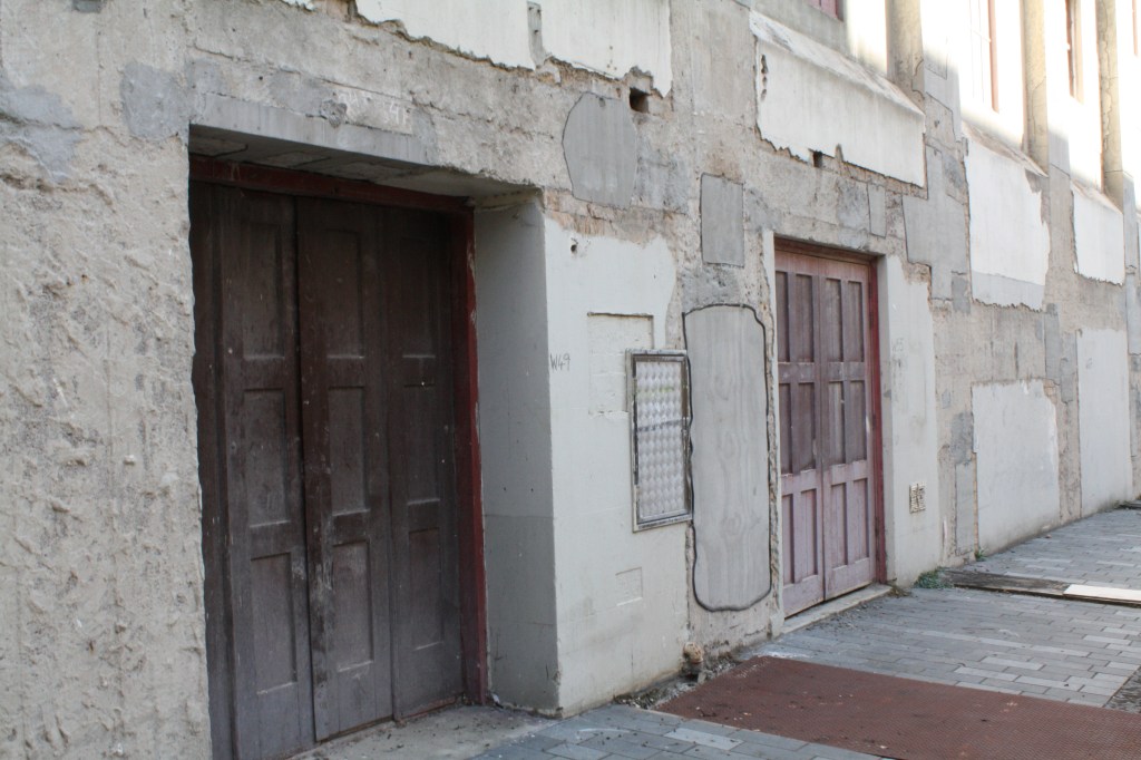
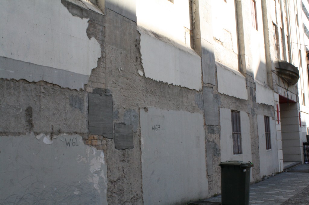
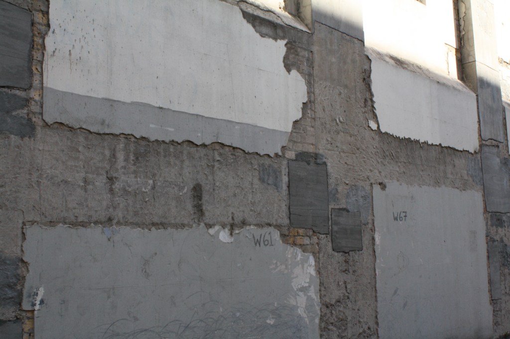
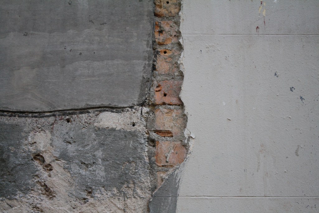
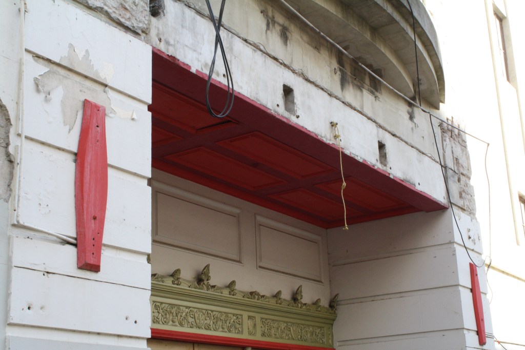
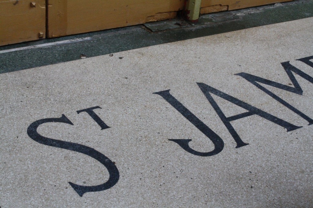
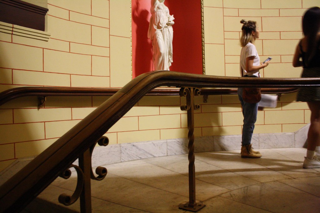
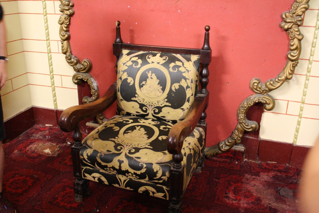
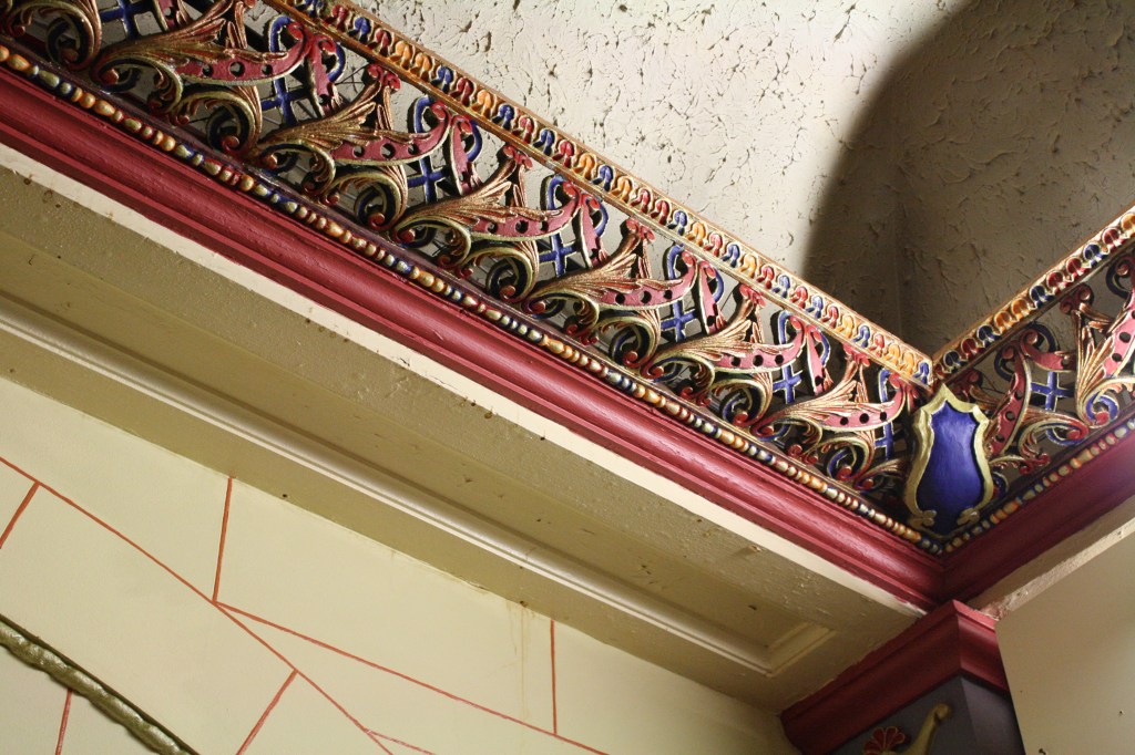
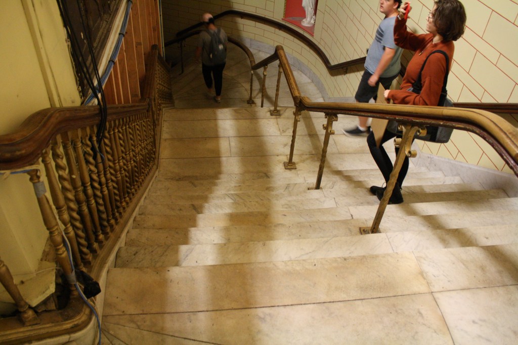
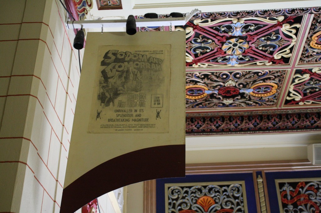
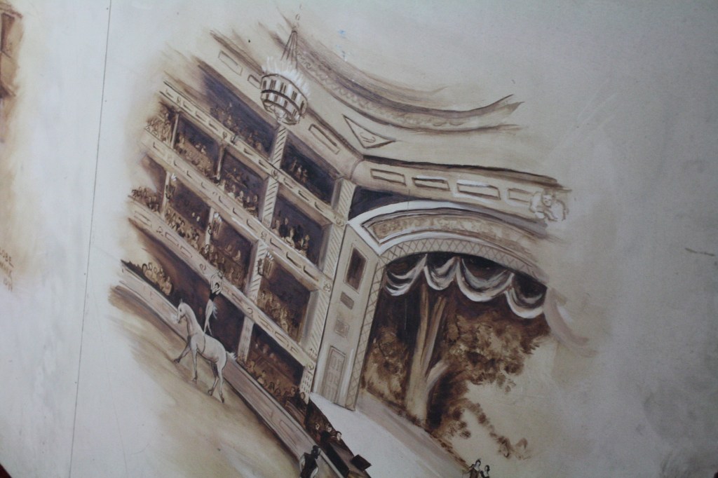
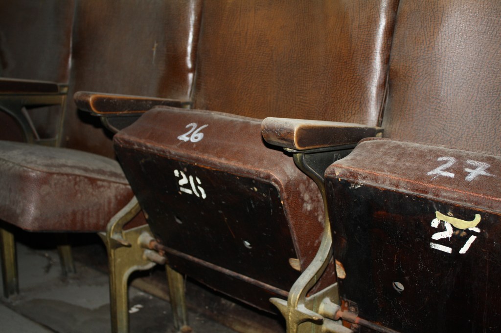
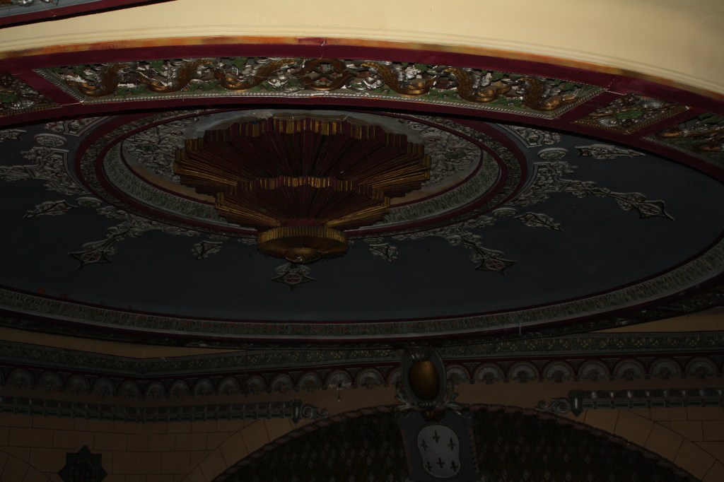
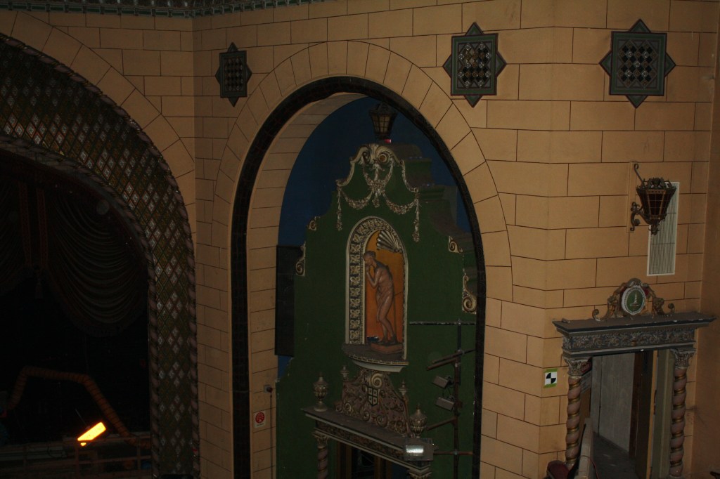
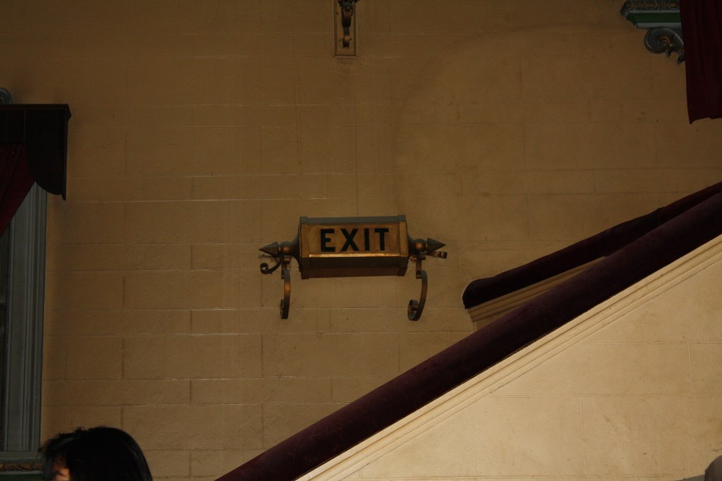
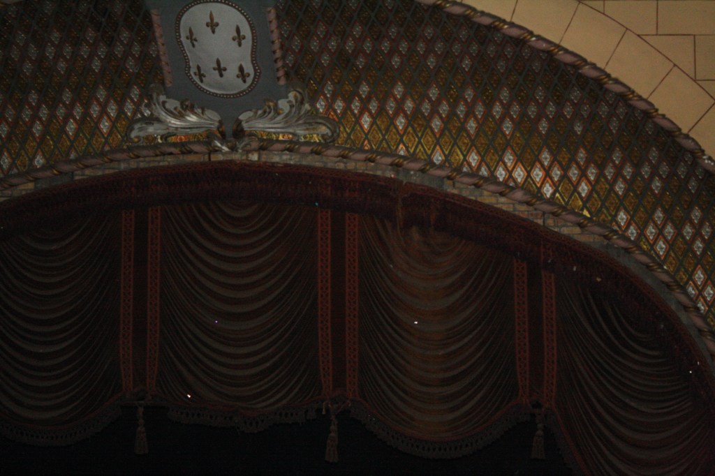
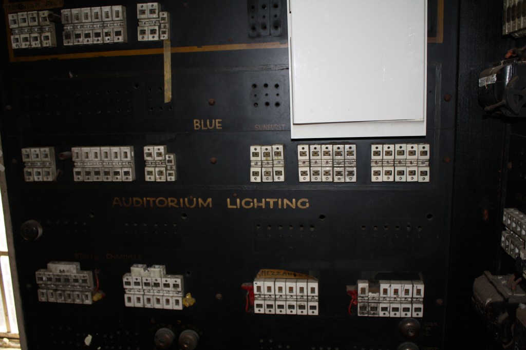
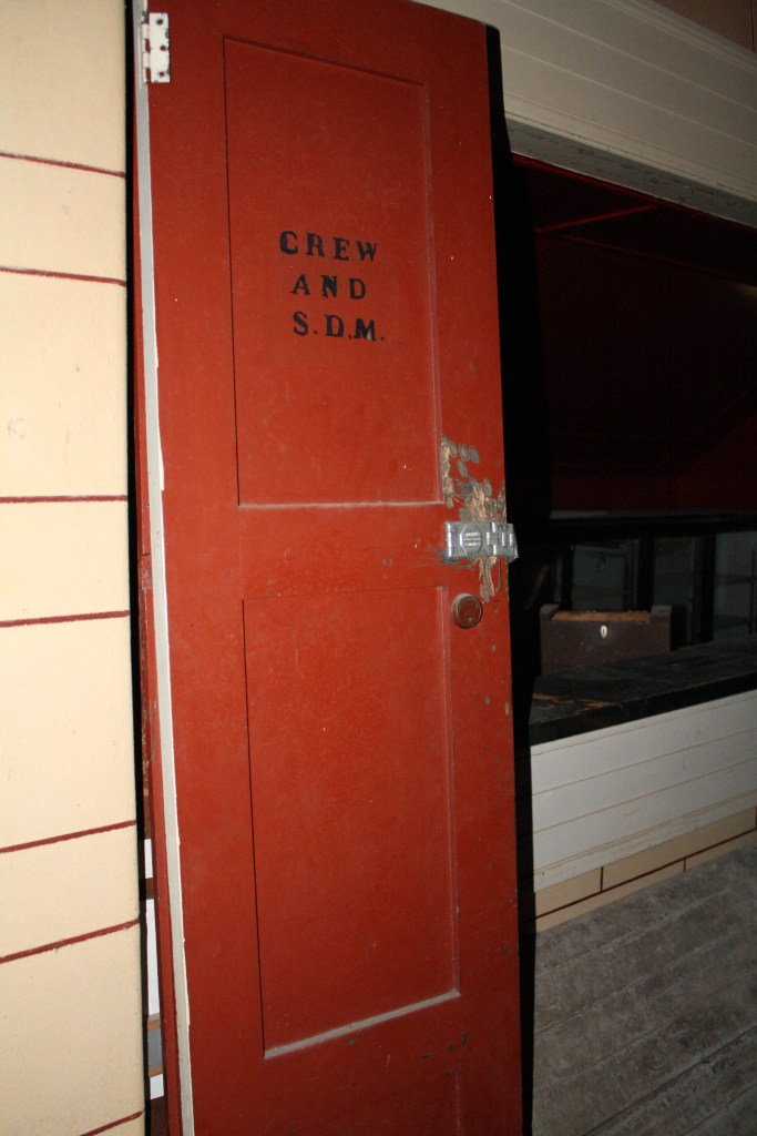
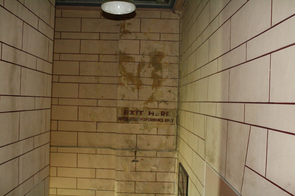
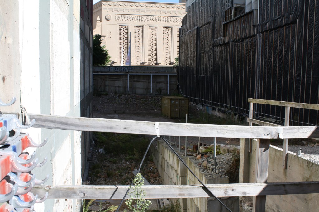
On Thursday we visited St James Theatre. We were given some context to the buildings history as-well as its future. It was built in 1928 designed by architect Henry Eli White who has also designed other theatres around NZ and Australia. The Theatre closed in 2007 due to concerns with the health and safety of the site. The theatre put on a few shows a few years ago so show the public that it was still in good nick and was just in need of repair rather than to be demolished. At this point all repairs and restorations have halted.
The theatre is classified as a “Category I” (“places of special or outstanding historical or cultural heritage significance or value”) historic place by the New Zealand Historic Places Trust.
It’s been a theatre for live shows and a night club Now people break in and drink etc. in its current state.


Experience in drawings:
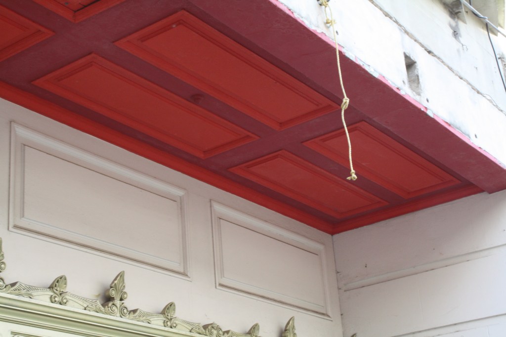
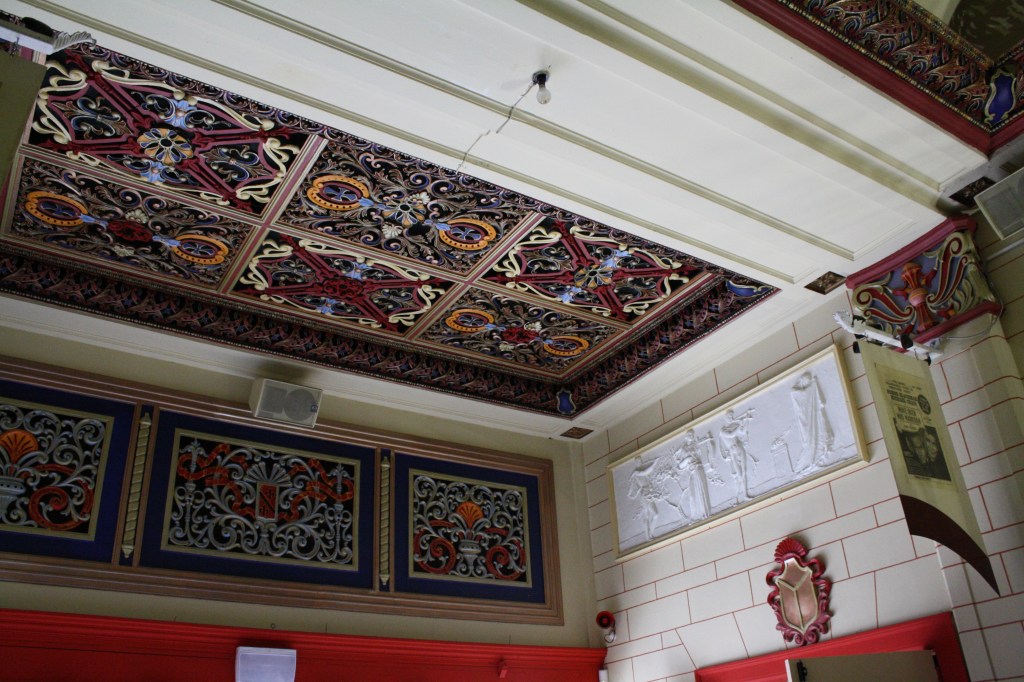
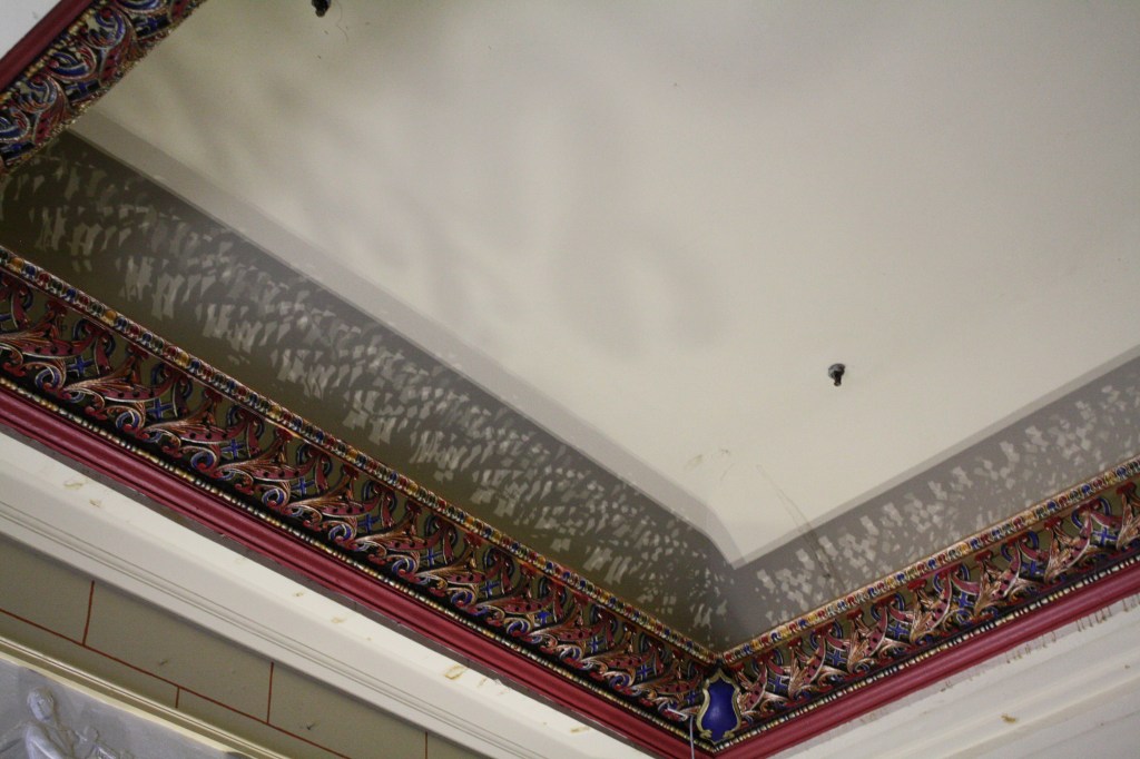
These drawings focus on light and shadow and the different ways they were created within the theatre. Soft shadows and strong shadows. 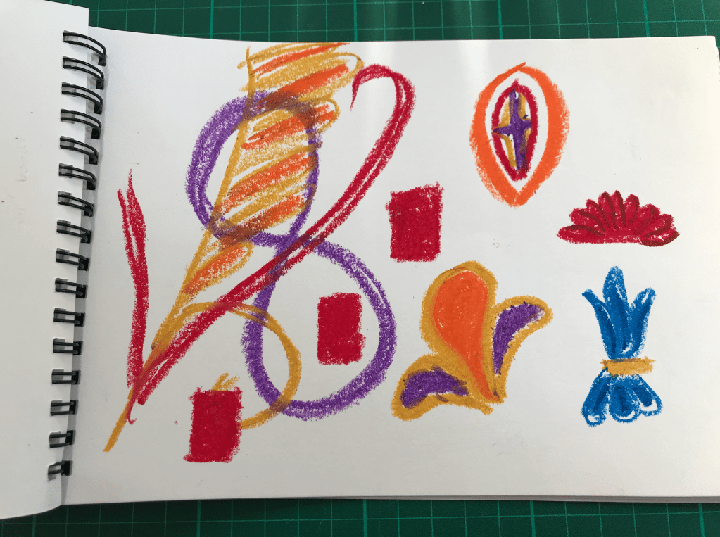
These drawings focus on the use of colour within the theatre. I looked at the depth the colours created and the relationship between them. 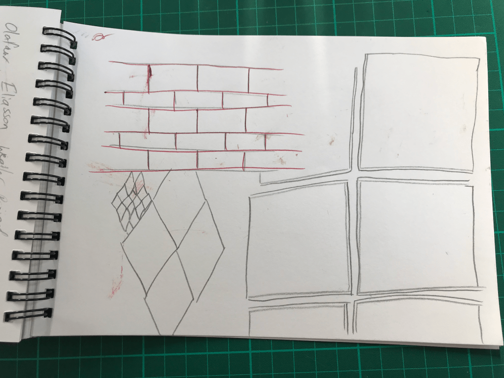
These drawings focus on patten found throughout the theatre.
Site Map: