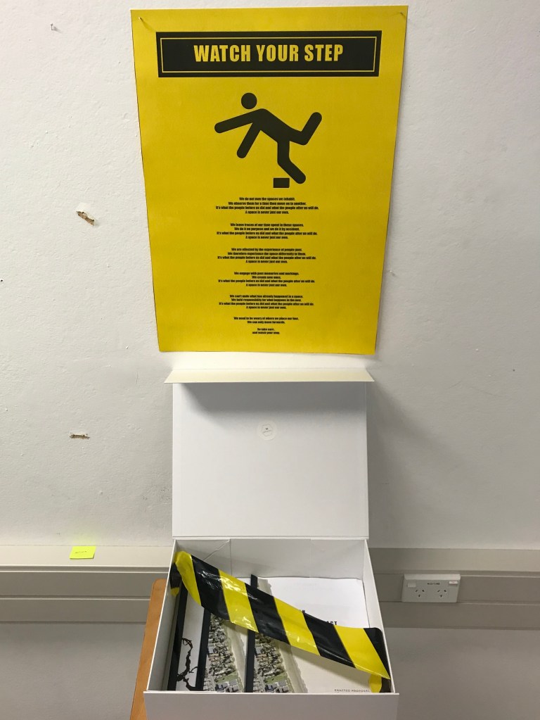
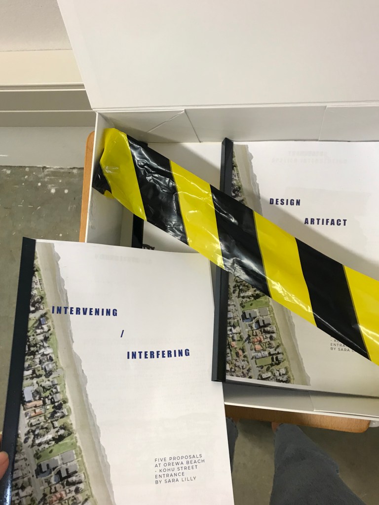
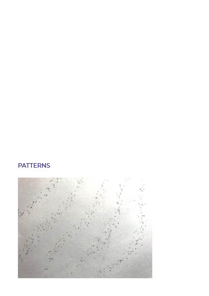
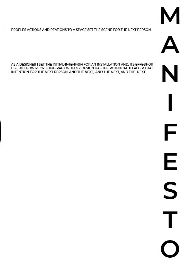
I played with a few ideas on how I wanted to present my work and make it somewhat interactive. My first idea was to have my manifesto on the ground so that it could be marked by peoples scuffed feet. My second idea was to add chalk powder to the box so that when opened it transfers onto your hands and then leaves marks on the paper. This would have shown up well on the yellow paper but because I didn’t end up using the yellow so the idea wouldn’t have worked. My final idea which is the one I used was to string caution tape over the opening of the box so you have to reach past it to get top the documents. this also makes you have to take care to get the documents out or not its up to you.
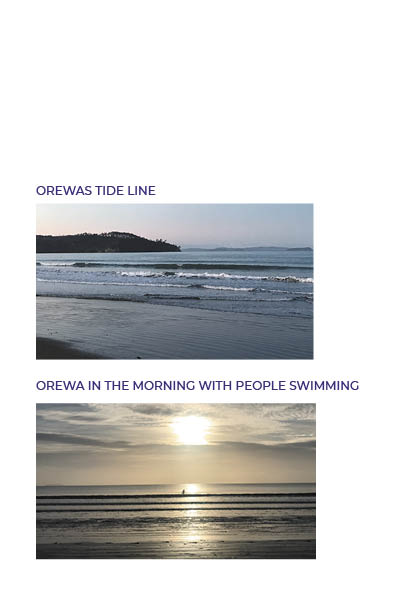
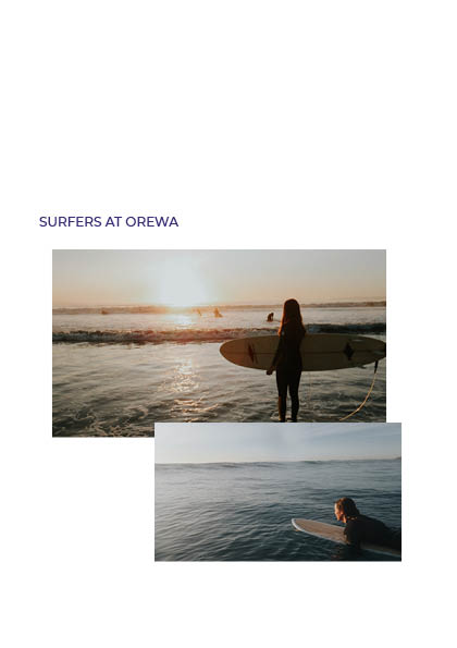
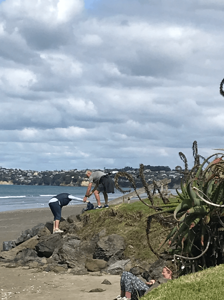
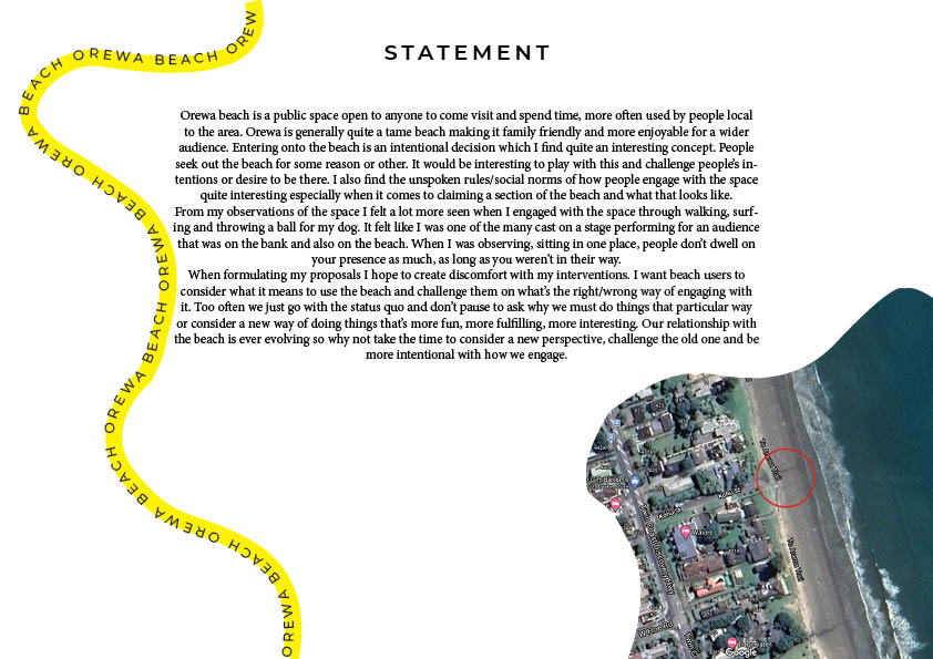
Orewa beach is a space open to anyone to visit and spend time. More often used by people local to the area. Orewa is generally quite a tame beach making it family friendly and more enjoyable for a wider audience. However, Orewa goes through seasons where the elements have eroded and damaged the beachfront, creating steep drops and destabilised access points.
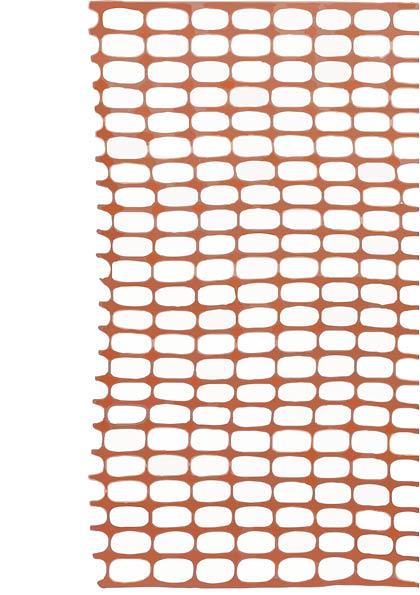
Heavy erosion during big storms results in temporary protective barriers being put up to protect people from hurting themselves from something like a fall and to protect the bank from further erosion from people. They are simple interventions in the space that due to the use of colour and placement they communicate, without words, that people need to take care in that area. Whether people actually respect this subtle, unspoken request, is a different story.
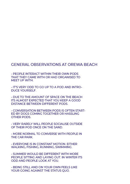
In my observations I found there is a certain level of entitlement toward this shared space. The unspoken rules/social norms of how people engage with the space are enforced by these entitled folk. How much space you take up, what kind of items you bring into the space, the amount of sound you make. If you don’t abide by these unspoken rules you get told off with multiple sets of evil eyes glaring at you and snarky remarks made out of ear shot.
As a spatial designer I want to challenge this sense of entitlement that we feel towards public space. To open the conversation as to how our entitlement makes us interact with our surroundings and how that then affects the space and the other people that enter into the space.
I want to explore this by creating discomfort and inconvenience and being disruptive as that’s a sure way to get people’s attention.
I want people to reflect on their actions and ask, what are you prioritising through the way you act in a space? Are people the real hazard in our spaces?
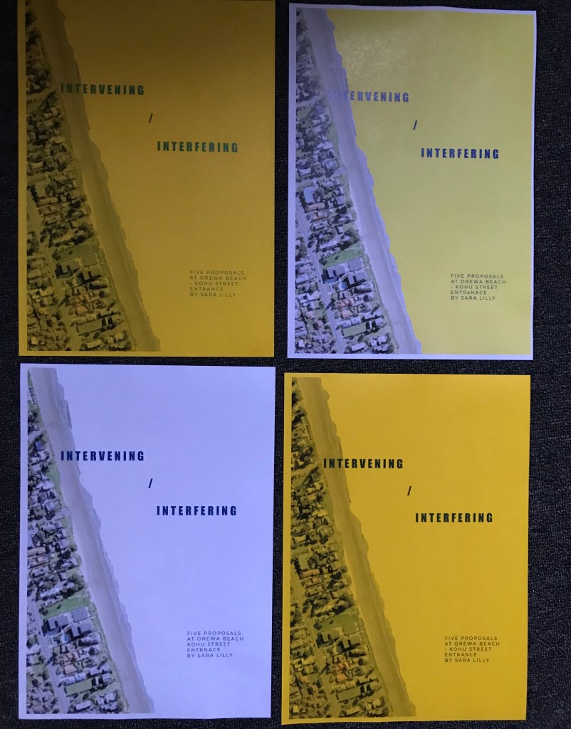
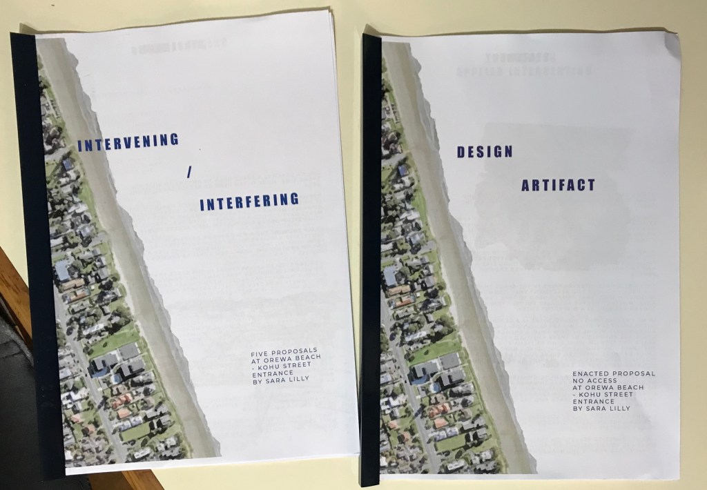
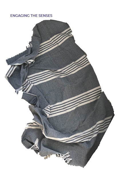
Final iteration of how its presented:
I reworked the layout of my document artefact editing images to give them a more interesting aesthetic and to focus on the main point of the image. I edited the way I described/ explained the interventions going more minimalistic like Allen Kaprows proposals for his happenings. I also played with the layout of the page a bit more using negative space as part of the page layout. This took a few goes playing with colouring the images, using different kinds of image tracing on illustrator and playing with different fonts and colours.
To tie my part two to my part three I added yellow in the background of my document to provide a nice aesthetic flow through my work but also drawing on the colours of the beach, blue and yellow helping set the scene.
For my physical copy I was going to print onto yellow paper so that it didn’t have that inky finish but when i printed out a test run the yellow muted all the other colours on the page leaving it looking quite dull. I did another test with altered colours on the page but still didn’t pop off the page. I then tested what it looked like when printed on white paper with a plain white background and then with a printed yellow background. The yellow had the inky finish I was still trying to avoid so I chose to print it on white with a white background, bound together with a blue Bindfast Bar.
To make my documents more easily accessible for my final presentation I collated them into an indesign document. I adopted the format I had used in my updated part two so that my part one would have the same aesthetic.
Final output:
I had made a list of the documents I was going to develop in my final presentation of part one but as I went through developing the final document I altered some of them using different mediums and styles to convey my findings and ideas in a more interesting way.
Documents:
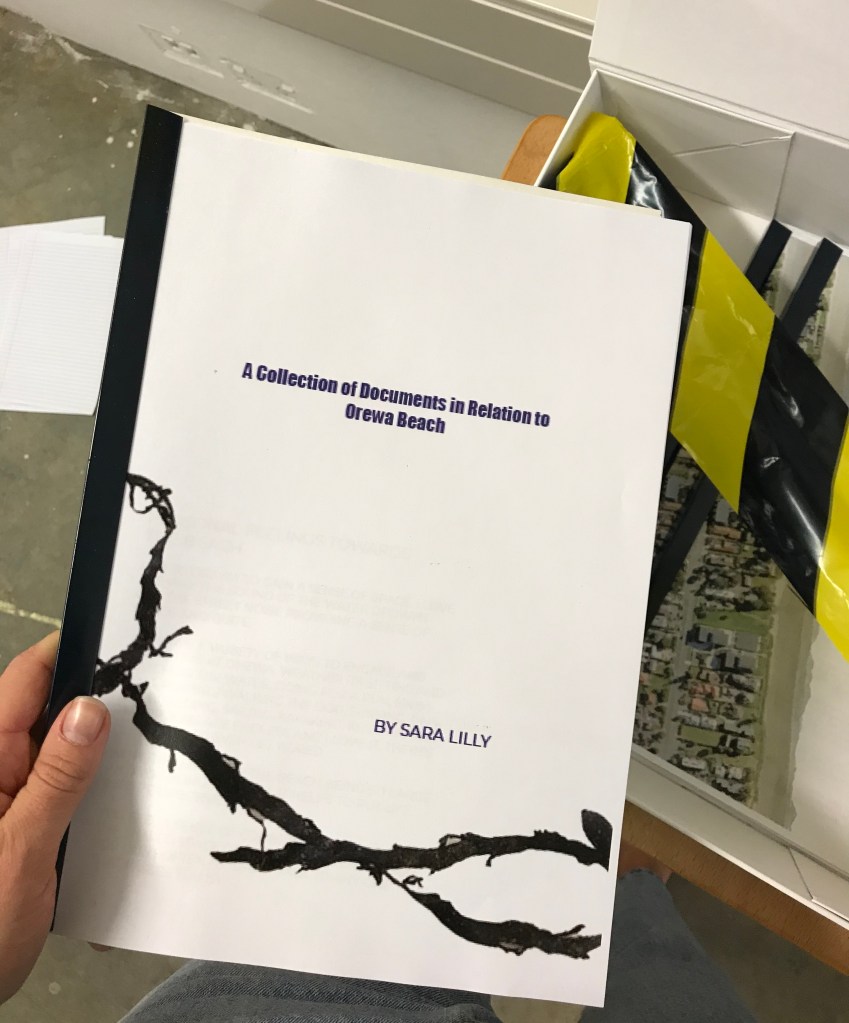
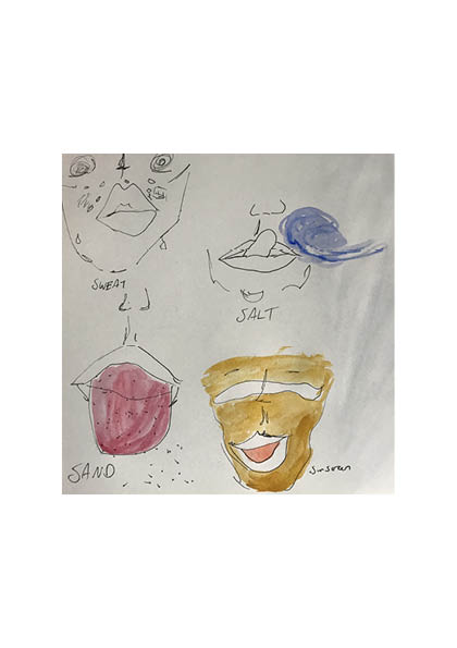
If i was to do this part one again i would buy a sketch book at the beginning of the process so all my sketches, thoughts and research is cohesive with the paper used and is more tactile to leaf through. It would also mean everything would be in one place from the beginning and would have the potential to become evidence of the environment by having spent so much time there. Things like marks from my sweaty hand, drops of salty water, and sand in the spine.
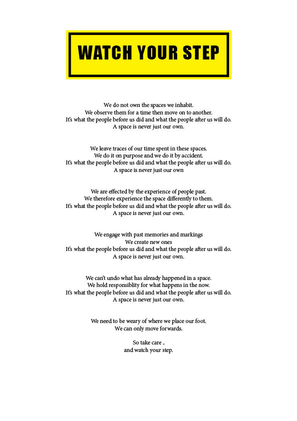
I went a bit more poetic with the way i formatted the text in this one. i think by establishing a rhythm through out the text it makes the final line have a stronger impact to the reader really bringing home the point. I also started playing with colour and carrying on the theme of caution and hazard sign tying in my part two project.
Presentation development:
colour
subtle boundaries
I was thinking it could be a cool continuation of the idea of taking care where you step by laying my manifesto on the floor to see if anyone stands on it – tread lightly, the affect of our actions on others. Gathering marks and footprint which then affects how its perceived for the next viewer and exploring this idea of being weary of your actions in your environment as they affect others.
Final iteration of manifesto:
Explain design decisions:
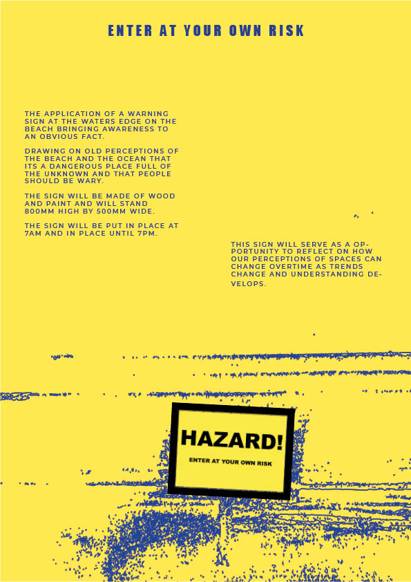
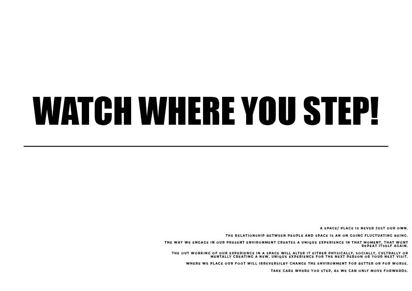
I used the colour and format of a caution sign to really bring home the theme of taking care and being cautious. I used a font that was clear to read but also bold and made a statement. To emphasis the caution sign style I added an image that is commonly used for caution signs when telling people to watch their step. Its a universally acknowledged sign that doesn’t require the use of the english language to understand. I chose a ‘falling’ image where the man was falling forwards as I focus on the forward motion of time in my manifesto.
I chatted with Rachel about my manifesto concept and my work up until this point which helped me to refine what my main focus was.
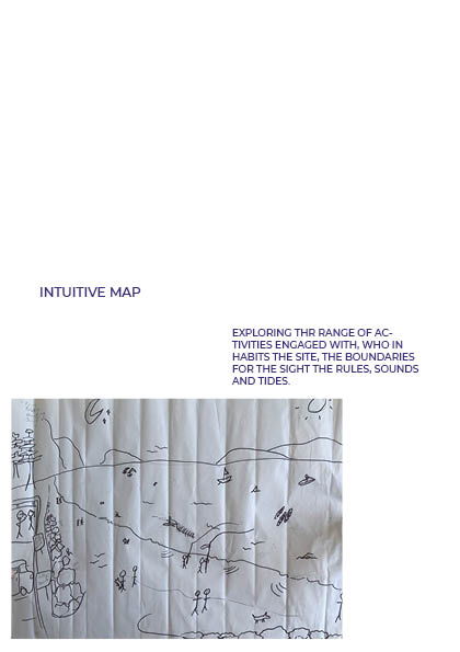
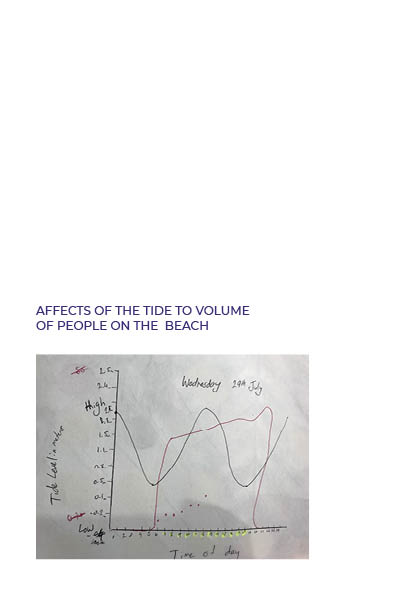
When thinking about the space that is Orewa Beach, it is time specific, tide specific which then affects the spaces peak occupancy.
In my part two I started to think more about what our actions do to the space and how that can effect other peoples experiences especially when considering having to be cautious and prevent/protect from injury or destruction.
Taking care of space is a theme that came up which I actually really value and I think it is important to consider how do we touch the ground.
What does it mean to tread lightly and engage the social in that frame of mind.
Rahmani uses her art as a mode of claiming space; for protection from environmental damage. I didn’t realise how powerful art can actually be on the social dynamics regarding a space. By implementing her blue markings on these trees and copy righting her work, she was able to disrupt plans for installing natural gas pipelines in New York State. Art always opens up discussion so the output of this intervention isn’t just that the pipelines cant be built but that the issue of fossil fuels and the disastrous effect of these kinds or companies is highlighted and brought to the centre of discussion further aiding her cause of fighting human pollution.
Andy Goldsworthy:
Goldsworthy works exclusively with natural materials and his sculptures/works are then combined with the natural process of the environment that he creates them in. He often documents the final output through photographs. I like that his works are conscious about not adding anything to an existing environment but re imaging its composition. I love his piece ‘Rain Shadow’ and the relationship that is explored through the elements involved. Canvas, dirt, rain and a person. If one of the elements were missing it would be a completely different output. It’s a great way of capturing a moment in time. When you look at it you can practically feel the rain.
Agnes is most famous for her planted interventions. More specifically ‘Wheatfield’.
“Planting and harvesting a field of wheat on land worth $4.5 billion created a powerful paradox. Wheatfield was a symbol, a universal concept; it represented food, energy, commerce, world trade, and economics. It referred to mismanagement, waste, world hunger and ecological concerns. It called attention to our misplaced priorities. The harvested grain traveled to twenty-eight cities around the world in an exhibition called “The International Art Show for the End of World Hunger”, organized by the Minnesota Museum of Art (1987-90). The seeds were carried away by people who planted them in many parts of the globe.”
By implementing an environmental installation in a place like wall street you are engaging the social contexts of trade, development, modern society, city living. ‘Wheatfield’ is such a stark contrast the the surrounding environment which provides a new perspective when viewing the concrete jungle and how unnatural it actually is. It does make you stop and think about what we value as a society. She also has an interest in time, putting the documentation of ‘Wheatfield’ in a time capsule to be opened in a thousand years from the time of the project. I think this is such a great addition to the whole project as it keeps our society acountable. we cant forget about what we learnt when engaging with ‘Wheatfield’ as we will be reviewed as to how we moved forward as a society once that time capsule is opened.
In my 8th manifesto I was playing with the layout of a welcome mat with the bold writing going across the middle of the page. If i was to develop it further i could turn it into more of a caution sign using bright colours and having it stand on a post.
My 9th manifesto used a larger text size making it easier to read than the 8th. I don’t love this one it seems a bit boring and simple. I need to develop my text some more to strengthen my main point and make my ideas clear to someone who may not come from a design background.
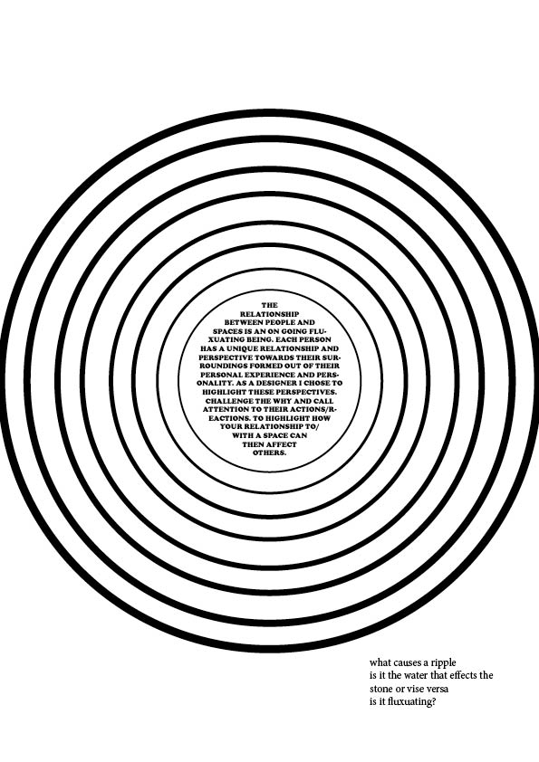
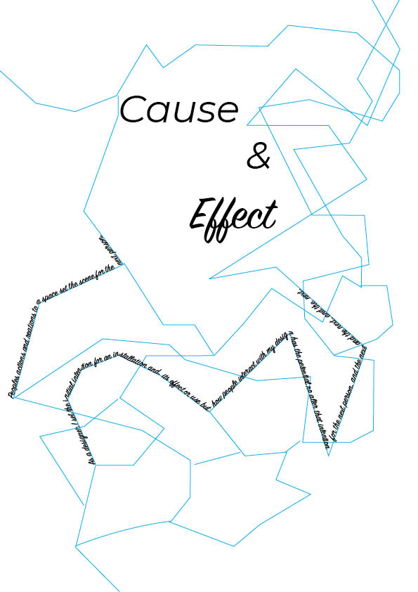
In manifesto 4 I was trying to convey the ripple effect with the manifesto at the centre being the initial ‘drop’ to cause the ripple.
The feedback I got for this one was that Lucy thought it looked more like a target than a ripple. She also posed the question of what causes a ripple. Is it the water that effects the stone or visa versa.
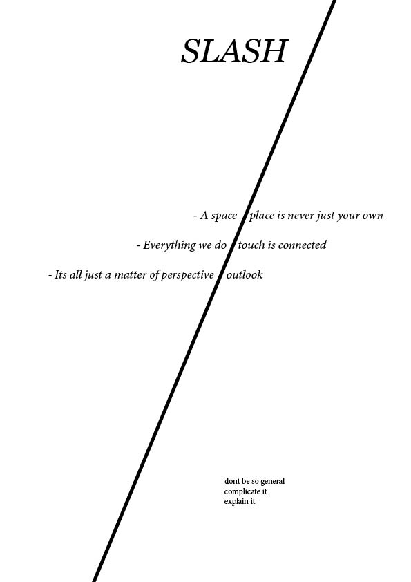
In manifesto 5 I don’t really know why I put lines through some of the words. I think I was trying to highlight key words in the manifesto but I didn’t have a strong reason as to why or why those words. I quite like the text going in the two different directions. They relate quite well together.
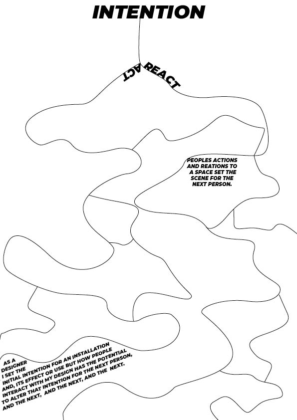
Manifesto 6 was a reworking of manifesto one. I was drawing on the format of a ‘Yes/No’ quiz map in the flow of the documents. I was also drawing on the idea of meandering rivers with the lay out of the lines.
More analysis of manifestos:
I Am for an Art: Claes Oldenburg on His 1961 “Ode to Possibilities”
Oldenburgs ode is very poetic with the rhythm of starting each line with ‘i am’. It creates a powerful flow and makes you engage with whats being said. I like that it also opens your eyes to the broadness of what art can be. That art isn’t just the classic painting hung up in museums but in the intricate details of modern life.
The use of different fonts and capital letters brings variety to the page emphasising the idea that art comes in many forms. This also brings emphasis to different words in the manifesto.
The use of explanation marks in the second half of the text ramps up the pace combined with the slow increase of the size of the text as we move down the page. The urgency increases.
The use of strong statements, then similies, then the key statement ‘Art is Cheap’ acts as a finale for the manifesto and frames that key statement nicely.
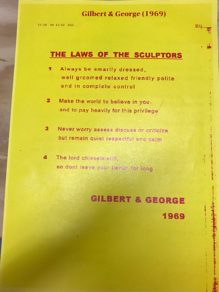
I really like this manifesto. Its orderly and concise which I think is a testament to the list format. Its very simple in its presentation not letting anything take away from the main point. The language used is very self assured and inspires action from people. Each point starts off with a brief statement which is then expanded on a little. this creates the tone of this call to action. Its an instruction.
a public declaration of intentions, opinions, objectives, or motives, as one issued by a government, sovereign, or organization.
Formats:
List
Poem
Graphic Poster
Report/article
This manifesto is very poetic in writing and uses abstract ideas to communicate the main point. The use of Font, text size and layout slowly draws you in as you focus in on the smaller texts creating a playful tone.
This manifesto is very direct and clear as it breaks down their process in a list with a clear font. No nonsense document.
This manifesto grabs your attention with the graphics used which then leads you to the message of the text focusing on our relationship with objects. The bold ‘Nice, very nice, nice’ captures your attention straight away.
The use of font and layout are very clean and orderly. The text itself plays a game of tug of war with each statement leaving you perplexed as to how ‘worth it’ it is to be a sculptor.
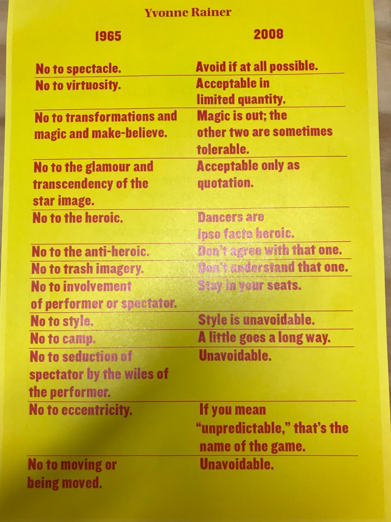
Yvonne Rainer is an American Dancer who’s reconsidered manifesto is a personal reflection on her past views. It’s very clear to understand and interesting how her perspective has evolved. It almost feels like a conversation.
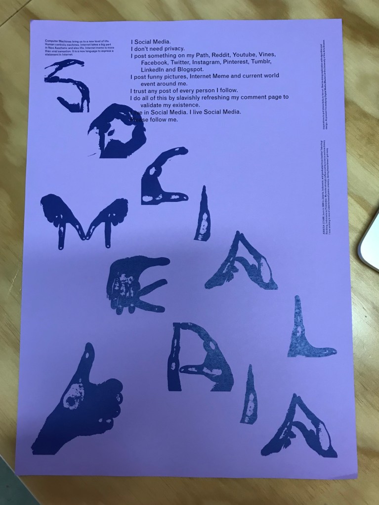
The use of the hands on this manifesto ties into the message of a thumbs up ‘like’ referred to in the text. Its taking the thumbs up symbol and extrapolating it to open the space for discussion.
Things to consider when analysing a manifesto –
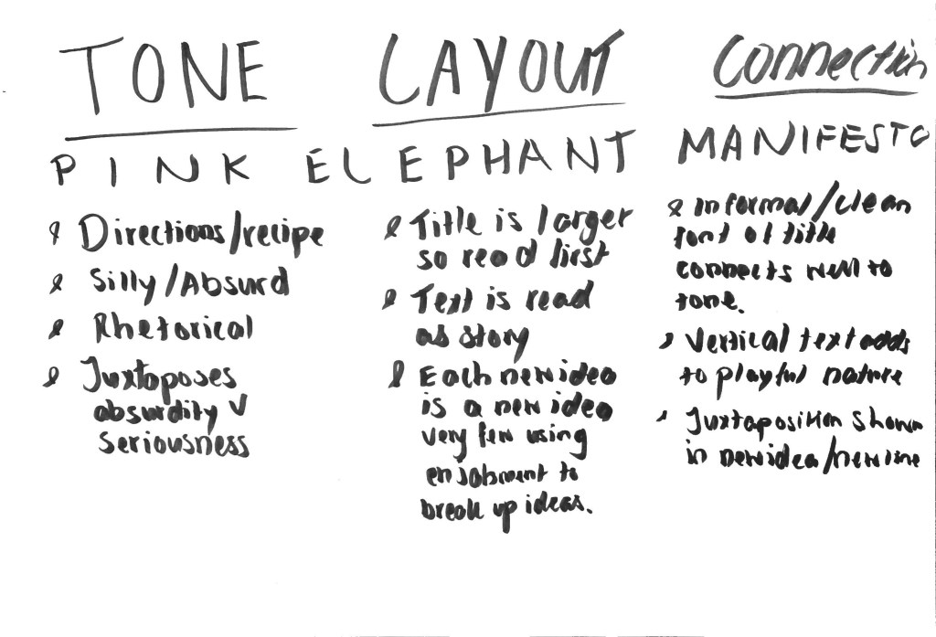
Tone
Layout
Connection between tone and layout
Concepts applied through the layout, text format and content of writing e.g. the title is missing its top half, does the text then cut out certain things like adfectives or is very to the point? no waffle?
who wrote it?
what was their context?
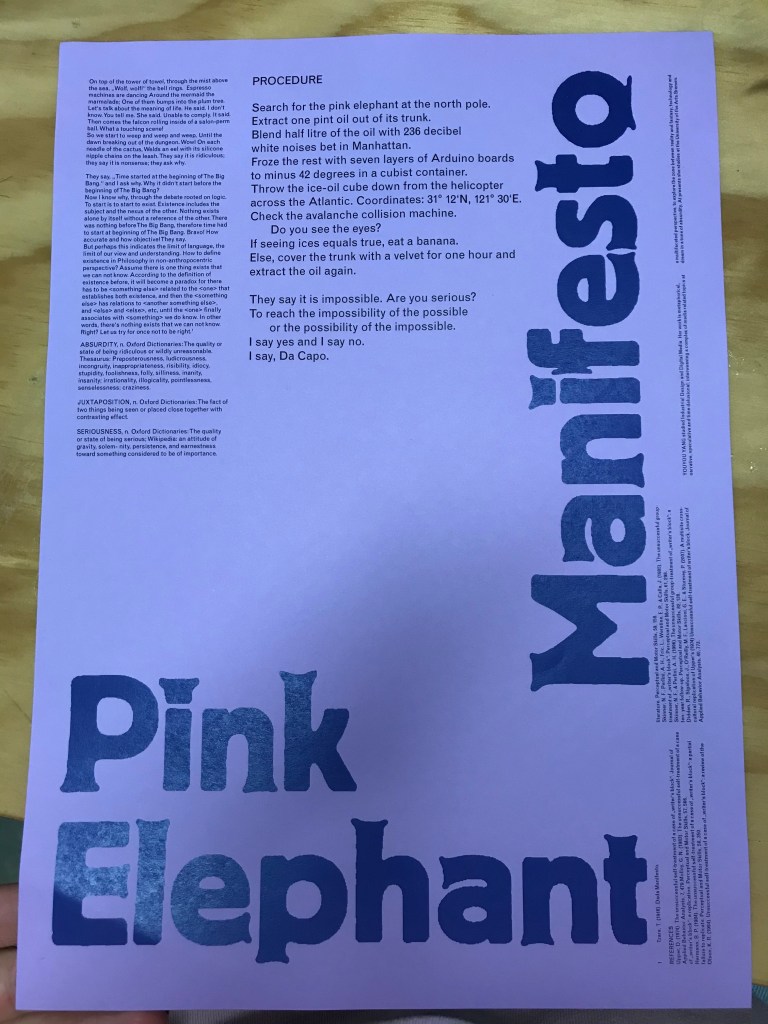
Analysing Pink Elephant Manifesto as a group:
What is it and why is it like that?
First Draft of my Manifesto:
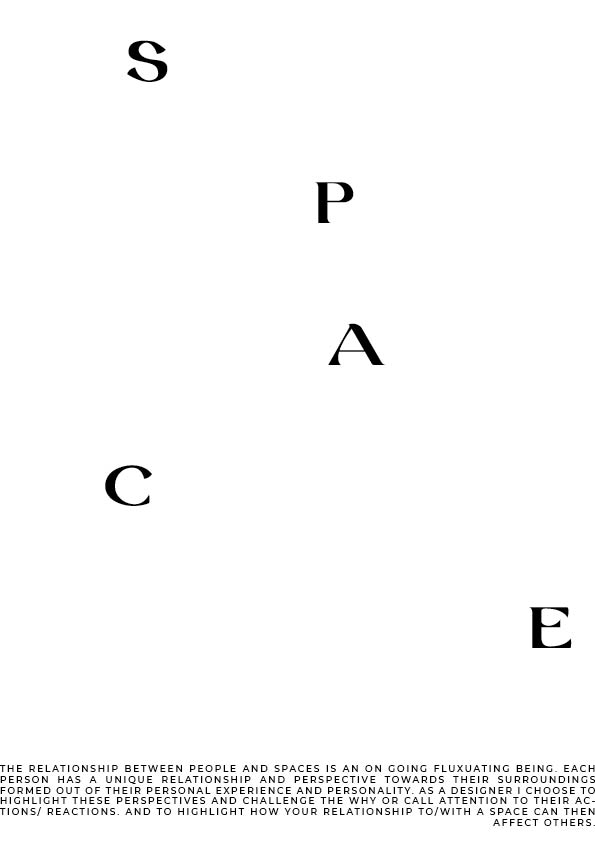
The relationship between people and spaces is an on going fluxuating being. Each person has a unique relationship and perspective towards their surroundings formed out of their personal experience and personality. As I designer I choose to highlight these perspectives and challenge the why or call attention to their actions/ reactions. And to highlight how your relationship to/with a space can then affect others.
A space/place is never just your own
Everything we do/touch is connected
Its all just a matter of perspective/outlook
Thursday:
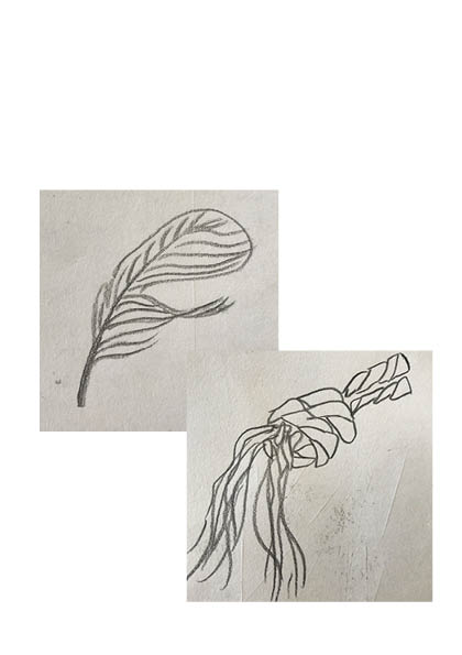
My first three manifestos:
no. 1
no. 2
no.3
In manifesto 1 I was trying to explore how everything is linked like a map or a root system where an action of one person effects the experience of the next. I also chose a script font where the letters flow onto the next to continue this theme. As I made more manifestos I found that this one was my least favourite.
In manifesto 2 I went for a minimal approach. I used italics to keep everything slanted and a list format to my punchy and to the point.
In my 3rd manifesto I played with the space on the document trying to arrange the letters in a random order to catch peoples attention with the manifesto at the bottom of the page. The letters of ‘space’ almost acts as a path drawing your eye down the page to the manifesto.
Feedback I got from Lucy on my manifestos was to not speak so generally with my ideas or concepts I was exploring. To complicate my sentences and explain them in a clear concise way.
After getting some feedback on my proposals I started to think more conceptually as to why I wanted to cause this disruption. What was the why of my intervention.
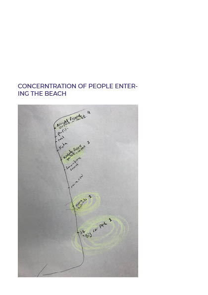
I started thinking more about Orewa in regards to hazards and having to be cautious.
Erosion in Orewa is common place as it gets hit quite hard by storms and you often see temporary fences up to protect people from the sheer drop that has now developed. Also by keeping people off the banks it protects them from further erosion by people.
These protective barriers bring up the question of what are we protecting. The environment? The people? What are people prioritising with their safety measures.
This article is an interesting conversation of what different people want to do to help deal with the issue of erosion in Orewa. You can see what people value by what tactic they side with and what they wish to protect.
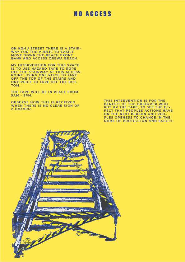
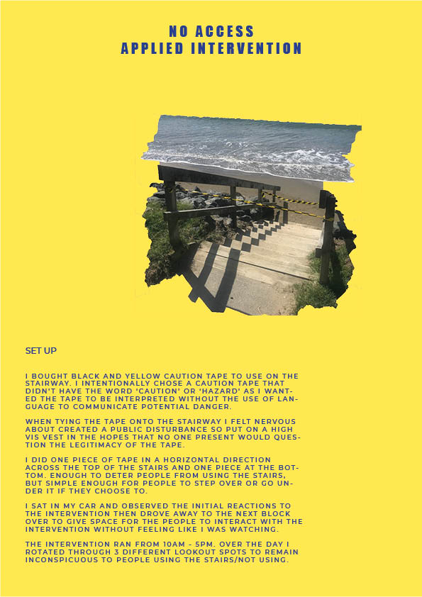
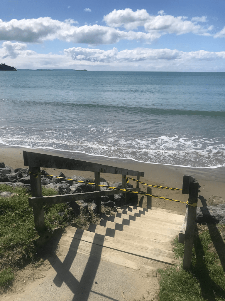
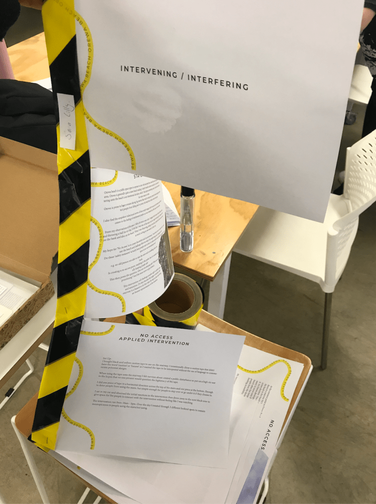
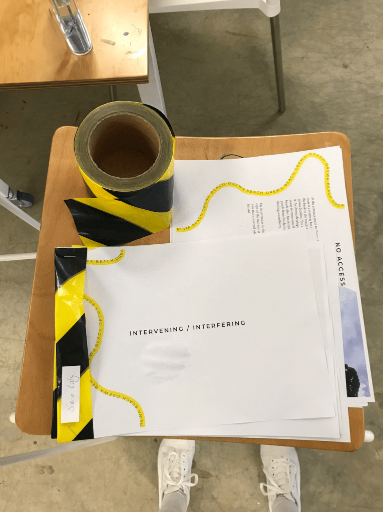
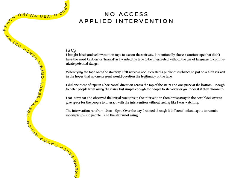
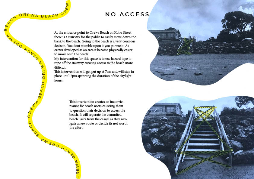
– in my initial proposal I had drawn a lot of caution tape used to section off the stair way. In my implemented intervention I did a simple strand at the top of the stairs and one at the bottom of the stairs. Enough to signal warning but not aggressive enough to deter people from ducking under it. This gives room for people to move around the tape if they deicide thats the best way forward. This might show that people value you their time more than a shared path way or their physical well being.
Documenting my final intervention process:
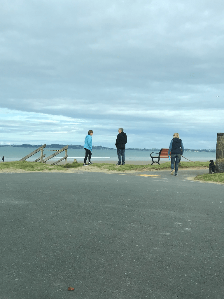
Observation notes from 10am-5pm:
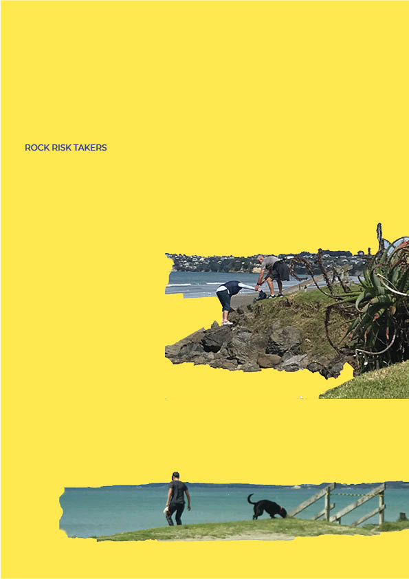
Person walking on beach who was already on beach disregarded the tape
Old bench Sitter looked for what could be the problem
Had to double take and then carried on
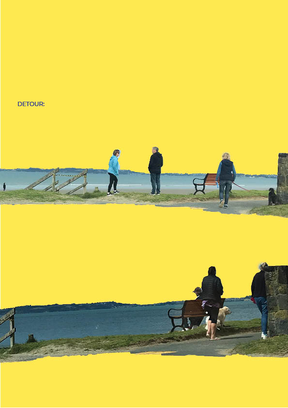
Dog walker detour to get down to beach
Cars turning around to go elsewhere
Old man ignored it and got help to duck under tape by seperate party
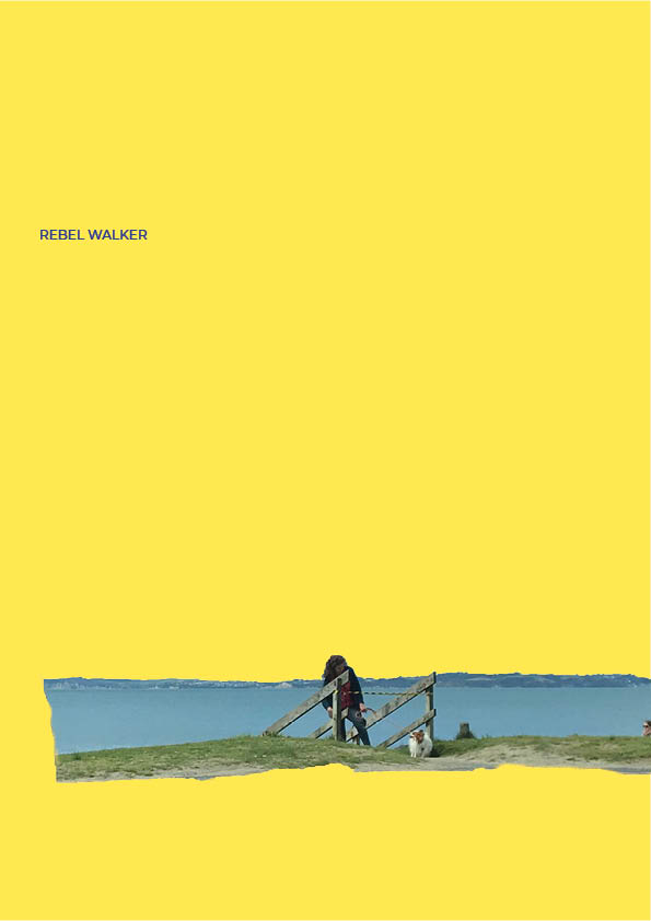
Wife found another way around
Mum and kid crawling
Old mate walked through both ends just coz at 4:23 (white older male)
Immediately followed by a seperate dog walker who used the stairs to come up
Didn’t think twice
Once tape was broken people didn’t seem to think twice about using stairs
Lady who had detoured earlier came up through the broken tape, checked it out after but still walked through
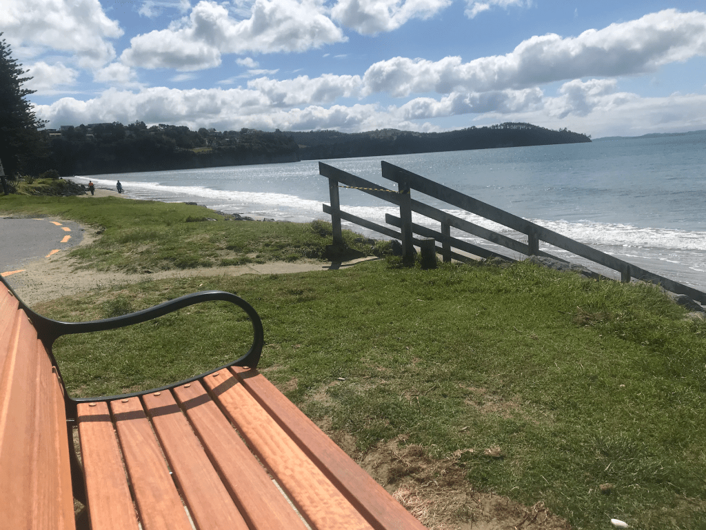
The intervention in place
1st Spot I observed from
2nd Spot I observed from
3rd Spot I observed from
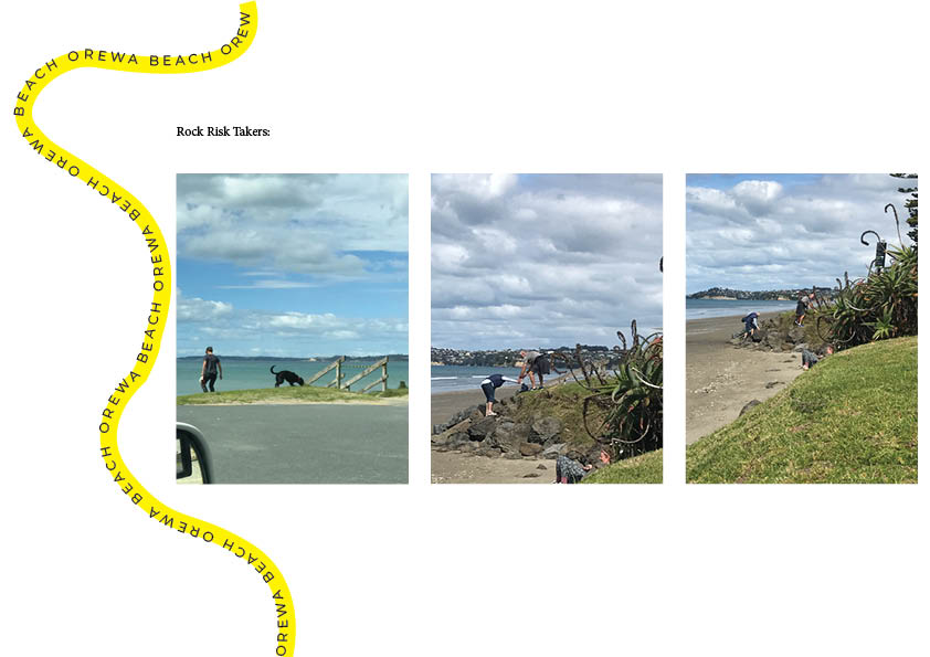
An elderly couple scaling the rocks next to the stair way.
Presentation ideas:
I wanted to incorporate the tape in my final presentation somehow. I had the idea to connect each page with the tape so that there is the option to string it up somewhere and still be used as caution tape.
Final presentation:
Something that I hadn’t planned but was a happy accident was that the yellow line at the bottom of each page lines up with the line on the top of the next creating a great aesthetic flow across the document. Due to the pages all being connected when you lifted off the first page the yellow line connected the pages as well as the caution tape.
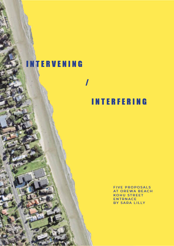
Orewa has a grass/ sandy bank that separates the beach from the street. There are stairways dotted along the length of the beach to make it easy to get down it. For this proposal I want to use caution tape to tape off the access point at Koho Street. My intention for this proposal is to challenge peoples eagerness to access the beach and seeing how they navigate a new path. It would also be interesting to see how the hazard tape is received when theres no evidence of a hazard on the stair way.
Proposal 4
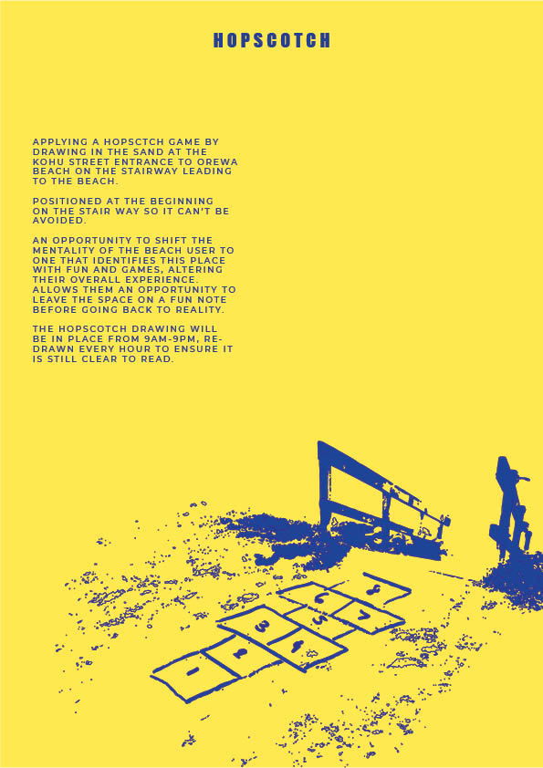
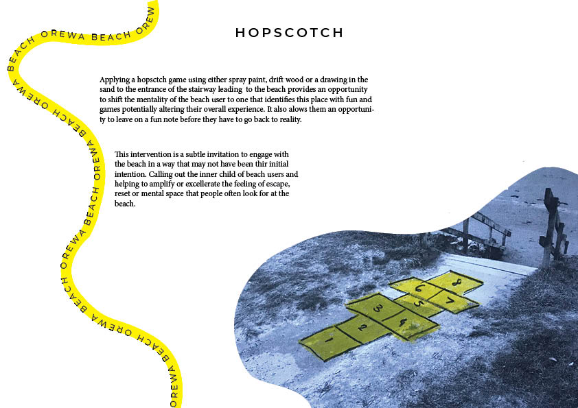
Hop scotch
One of the reasons people go to the beach it to have fun, relax and escape from the mundane routines of everyday life. I want to put in place a hopscotch game in front of the access point on Kohu street to invite people to actively engage with a game and loosen up in a visible way. The concept i’m exploring through this proposal is the physical outworking of someones internal processes.
Proposal 5
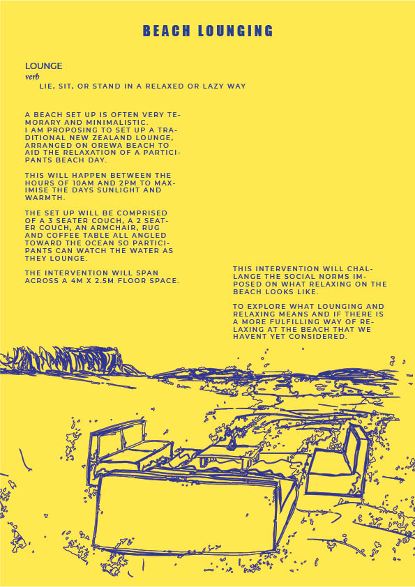
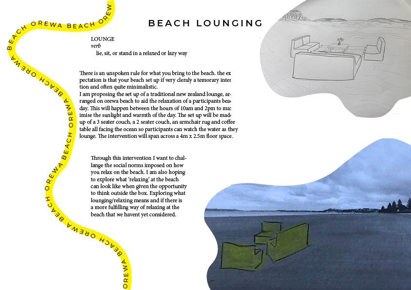
Beach Lounging
The concept i’m exploring with this proposal is what does it mean to relax on the beach. A lazy beach day. We have an idea in our head of what that looks like or should look like but i want to combine two ‘relaxed’ environments, the beach and the lounge, and see how it’s received by passerbys. I want to challenge the status quo on how we spend our time and how we set up our temporary space on the beach.
Further development on proposals:
In fleshing out my proposals,I have done some sketches but found that drawing on top of photos for context like Christo and Jeanne worked really well for portraying my ideas. I used a yellow oil pastel and a led pencil on each image to create some continuity.
I worked through the who, why, when, where and hows of each proposal also.
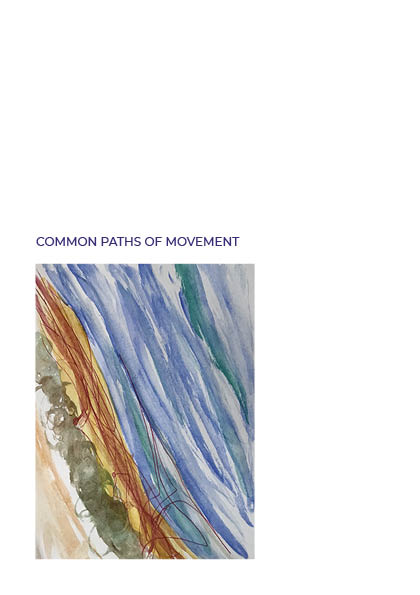
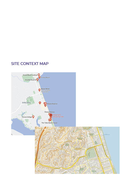
I’ve created a site map to locate where on the beach these proposals will be implemented and to provide a bit more context to the area.
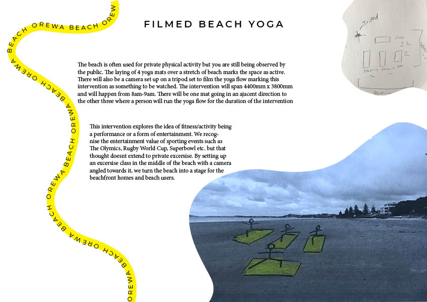
I have altered the beach yoga proposal. slightly adding in that the ‘class’ will be filmed on a tripod furthering the idea of it being some kind of performance. This might make people more intrigued.
Presentation brainstorm:
I want to draw on the themes of the beach with its organic shapes and us the yellow colour from the drawn on photos to create a cohesive compilation of documents that obviously all belong to each other. Much like Kaprow, I want the look of my proposals to communicate to the critic that they are all by the same artist.
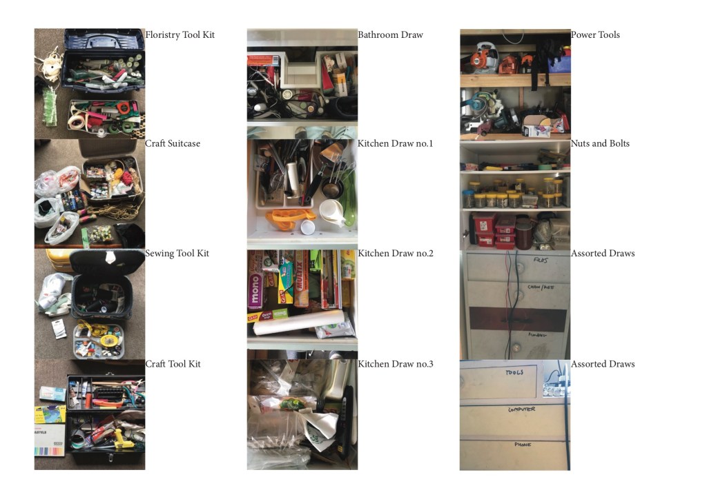
To create my inventory I systematically made my way through the different rooms in my house and tried to create flat lays of the different materials and tools I came across. I found this really helpful in terms of changing the way I think about what qualifies as a tool or material and opened my thinking up to what else could be utilised around the house.
We would like you to write 300 words as part of this exercise to situate your ideas. This writing should be supported by maps/diagrams to contextualise your thinking around your project:
When thinking about how I might intervene/interfere within my chosen space (Orewa Beach) i think it would be interesting to explore the idea of combining a term that I derived from my observation and tease it out drawing on how we perceive the same word but in a different context not related to the beach. For example I noted that people often go to the beach to relax. This can look like a walk along the beach, sitting watching the water, or catching up with friends. But when I think of the word relax, separate from the beach, I think of a couch or a space that I can lay down, sit and be comfortably supported.
In my observation of the space I found that people abide by unspoken social ‘rules’ such as accessing the beach where they are supposed to, picking up dog poop, respecting each other’s space etc. Another idea that i think could be interesting to explore, either through the reimagining of a term like relaxing or just on its own, is altering these social ‘rules’ causing people to rethink how they interact with the space. This could be something like tieing hazard tape on the stairway that leads to the beach.
My intention for my intervention is to cause people to rethink or stop and ask why we use the beach the way we do and consider if there’s a better, more interesting, more fun, more comfortable way of utilising the space. When we ignore the social norms of beach use how do people react, interact with the change or new way of thinking. As open and versatile as the beach is there are still quite a lot of social constraints about how we should or should not use/interact with the space.
Some questions to help with this:
Did something come out of the documentation that might drive these proposals?
Any hunches, intuitions, gravitational pulls?
Has something emerged from the documentation of others, that might shift the direction of the project?
Do you want to extend social activity that occurs, or introduce?
Are there connections between these ideas and the materials in your Inventory?
In addition, assemble some ‘like-minded’ projects/practices/practitioners/readings around your ‘hunches’:
Artist Research:
Christo and Jeanne Claude
Their use of multi media in their proposals make it very clear to read what they are proposing. Drawing on top of images make their ideas very present in the proposed environment. I also like how they take images of the site to provide context and include a site map in their proposals so its very clear what environment they will be implementing their installations in.
Allan Kaprow
Allan Kaprow has a very clear style in the way he presents his work. Using the same fonts, colour scheme and general aesthetic. You can easily identify that it’s him just by looking at the proposal which I quite like. He is very concise with his proposals. Only uses one main image to communicate the idea supported by a few short paragraphs that outline what his intention is. Each proposal is an invitation as part of his ‘happenings’ is the people that engage in the process. His proposals require the artist, the art and the audience to be fully realised.
Robert Smithson
Smithsons sketches don’t include much or any commentary to the drawing but you can still see what his intention is. There is obviously not enough information for his ideas to be realised off of these one off sketches but they accurately plant the initial concept. His proposals are very much imaginary and you see this in his work ‘Earth Map (White Limestone) of the Hypothetical Ice Cap of Gondwanaland Made Near Uxmal Yucatan, April 1969, Hypothetical Continent (Icecap of Gondwanaland), Yucatan, Mexico1969′ key word being hypothetical.
What is a proposal:
Dictionary definition –
proposal
noun
1.a plan or suggestion, especially a formal or written one, put forward for consideration by others
-A direct and clear written description of what will actually happen. Will this be easily graspable, given the information I have provided?
-A written outline of the relevant conceptual or contextual information. Why here/now/in this way/with this audience? The answer to this question should draw on how you as an individual designer have been thinking about the site and its social relations.
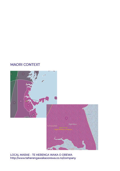
Space: Orewa Beach
Potential interventions –
Lounging at the Beach
Lounge at the beach drawing on the theme of relaxing and combing two different interpretations of what relaxing looks like. People go to the beach to relax and unwind but it is usually by going for a walk or laying on a towel. The way people often relax at home is in the lounge on a couch watching tv or reading a book etc it would be interesting to see how combining the two affects the enjoyment of the space for participants and how passerby react to the ‘misuse’ of the space. It could be interesting to explore the effect the tide has also.
Fitness Class
Highlighting that the beach is an active space and provides a space where people can come togetherfor a time before dispersing over the coast again. Yoga could be a good activity as its clear what it is once you lay down the yoga mat.
Sleep Space
People don’t tend to hang around Orewa beach past sunset but as far as i’m aware there is no regulated curfew. To set up a sleep space would be going against the status quo inviting people to spend the night at the beach. I think this would challenge how ingrained unspoken rules/expectations are in the community and also provide a unique experience.
Sectioning off an access point to the beach
Orewa has a bank that you need to climb down to access the beach. There are a lot of stairways to allow easy access up and down these banks along the length of the beach. To tape one of these access points off with hazard tape would then cause people to redirect their path. They will have to stop an consider their intentions and eagerness to access the space.
Hopscotch
Implementing a hopscotch game at either the top or bottom of a stairway onto the beach to highlight that this is a place of fun. To help get people to loosen up and to leave the space more relaxed and feeling lighter mentally.


