Project 3: Project Narrative

Year 1 Studio

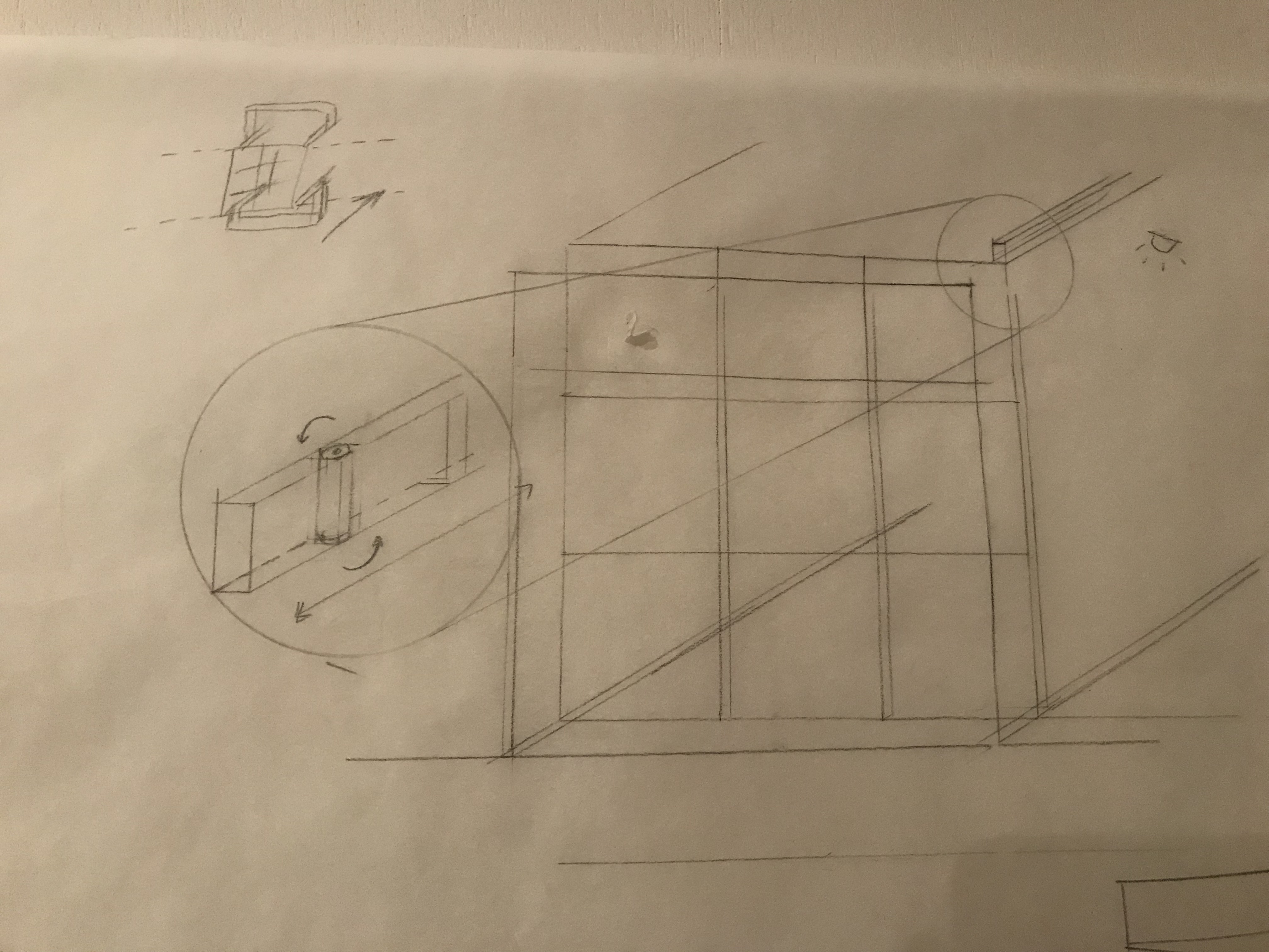
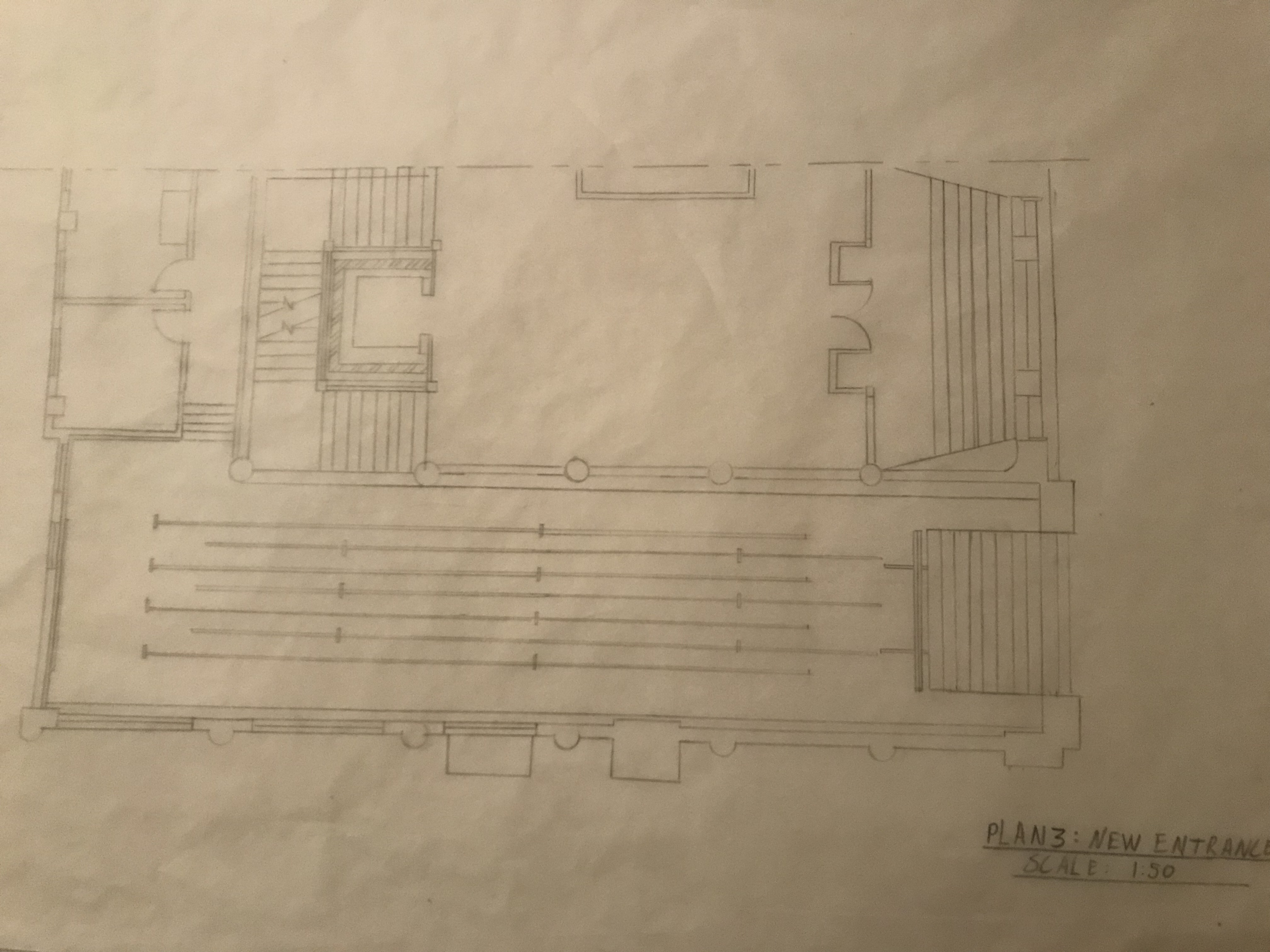
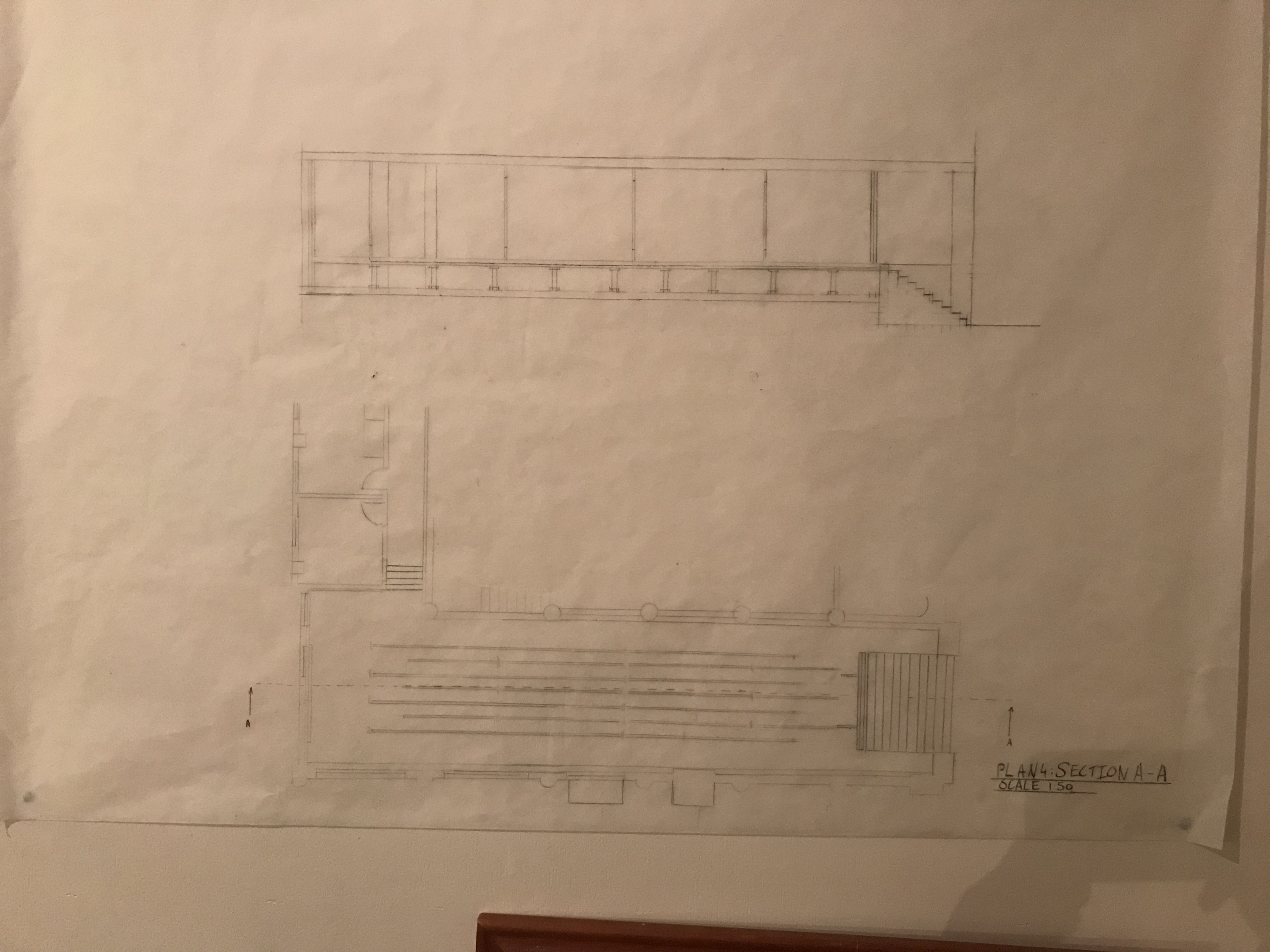
My design space for two strangers is created to aid the journey of two individuals from strangers to acquaintances through the need of communication to navigate the space and optimise it’s potential.

My strangers are travellers with an overnight stopover in Auckland City. I’m also wanting to emphasise that you don’t need to speak the same language to communicate effectively or to form a friendship.

The transition from strange to familiar is like that of sleep wake. In the beginning everything is new and unfamiliar. As we journey, we gain familiarity, and with that comfort in our minds and relationships.

Visual design strategy:

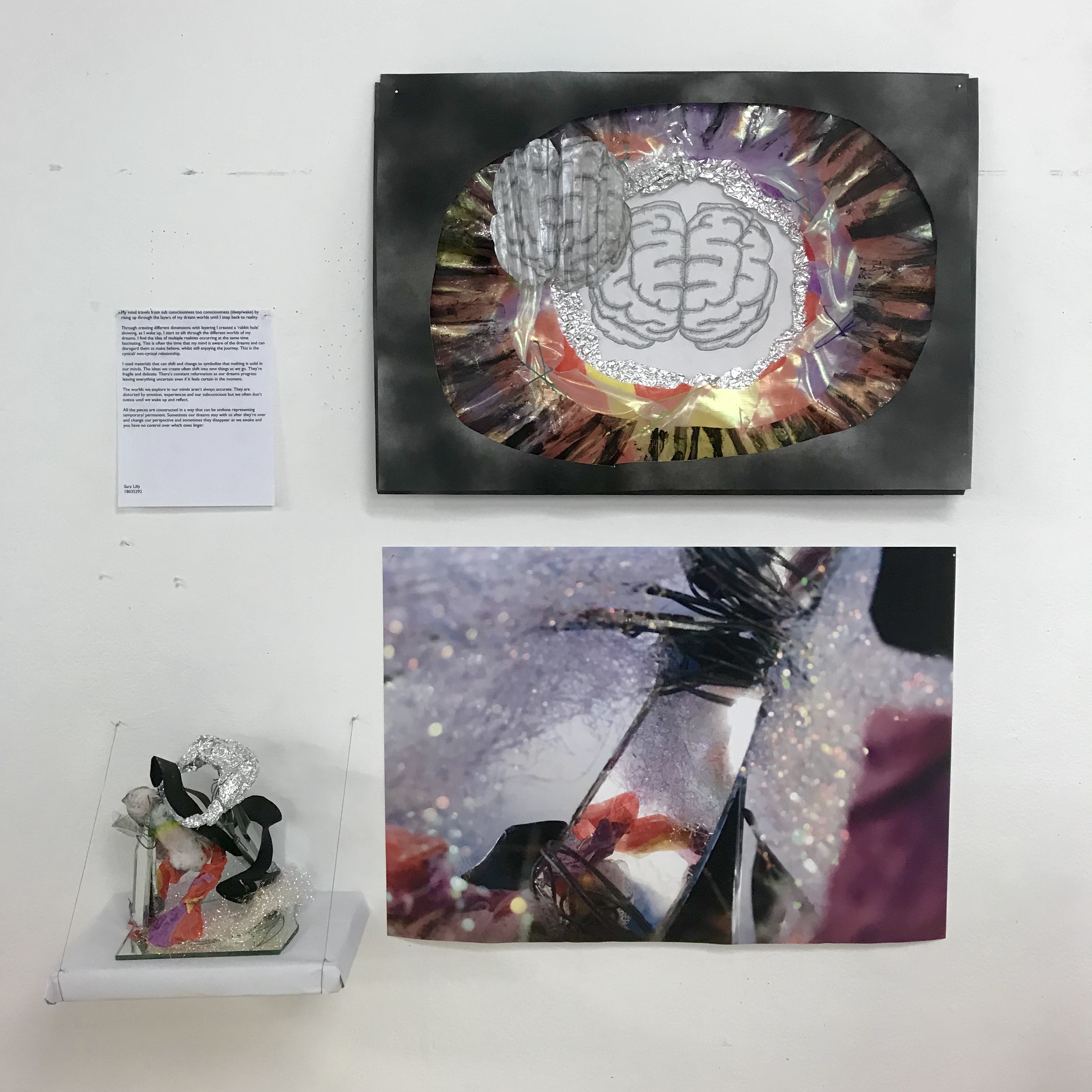
When deciding how to display my presentation i waited till the morning of my presentation when I had all of my work completed to trial different ideas for the layout. Because my work took up so much space I wanted to see exactly how much space was available for me to use.

I wanted the overall layout to feel open and clean so I made sure to leave room around each piece of work. When starting to pin things up I released that my site map was too small in comparison to the working drawings so re-printed it on A1. I originally had my atmospheric images on one A3 paper but decided it would look better if they were larger and seperate to create more of a flow from image to image taking you through the space.

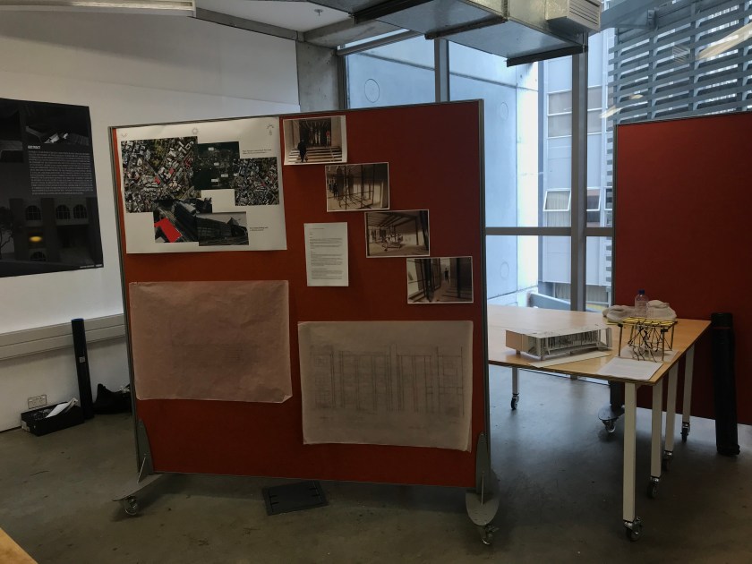
This was my final presentation layout.

Project 3: Interior Views

Year 1 Studio

I lasercut my final iteration and constructed it ready to take some interior views.

The atmospheric conditions that I wanted to create was a simulation of the natural sunlight that affects the gallery space over the day.

Looking at these pics you get a real sense that this space is a mechanical space and that the formations of the mirrors and platforms are temporary. It looks as if in a state of waiting. Waiting for a stranger to come and interact with the different elements.

The mirrors bring the outside into the space allowing the strangers to experience the exterior whilst in the interior. This draws on the threshold relationship between interior and exterior blurring the lines of what interior and exterior means.

Project 3: Modelling Space

Year 1 Studio

The main thematic ideas for my gallery space is to amplify the need to get out of your comfort zone and connect with unfamiliarity.

My design is created with the intention of forcing the strangers to communicate, interact and through their interactions to become familiar with each other allowing them to leave the space not as strangers but as Friends or acquaintances.

When thinking more about the nature of my strangers and their relationship to the space I developed my design to include a bathroom. I want my space to be a place where my strangers come when they are in between a destination and their origin. They are travellers of sorts and I know from my personal experience how ideal it is to have a nice place to bathe and get refreshed before heading onto the next place when travelling.

I decided not to include a kitchen in my design as I think it isn’t necessary considering that my strangers are travellers just passing through. From my own experience when travelling through a place, it is easier to eat out or to buy take away food. This is why there is still a table and bench to dine at allowing them the space to still enjoy a meal.

I made the bathroom very large and simple continuing the theme of symmetry through the space. I haven’t included any doors, just walls and panels to again force my strangers to communicate when in the bathroom to see where the other person is and if they are able to use the utilities if they are free.

I took inspiration for my bathroom from works from Anastasia Bushkova with her open plan bathroom designs (https://www.behance.net/gallery/50192283/Bathroom-for-Salini-Slr) and Stanislav Kaminskyi’s open plan bathroom designs (https://kaminskyi.com/en/all-projects/bedroom-with-a-view/)

In this first iteration of my model I noticed that the tracks in the ceiling create interesting light projections when lit from above. This was a happy accident that I will incorporate into my final model creating another level of light to dance around the space and be reflected and refracted off of the mirrors. This will need to be done my building in a false ceiling to fill with light above the tracks.

Project 3: Materiality and Detail

Year 1 Studio

In reviewing my original design I wanted to incorporate a tessellation as the shape of my sleeping platform so that the different platforms fit together when at the same level.

My first thought was the yin and yang symbol but due to the cultural significance it carries it seemed inappropriate.

With the development of my design I decided to incorporate a table and a seat to connect with my sleeping platform allowing for a more interesting tessellation and more levels to play with when adjusting the heights of the platforms.

I decided to use a winch system to adjust the heights of the different platforms as you are able to have complete control over the all the varying heights and is simple to operate for whoever needs to use it.

My space is quite industrial with the symmetry of the gallery design, clean lines and tracks running up and down the room. To continue this aesthetic my sleeping platform will be made of a clean cut wooden base with a gold brass trim to keep lightweight adding detail that catches the light and contrasts the wood and plain walls. To suspend the four platforms I have designed brass loops on the corners of the platform for a thick black rope to tie onto. continuing up from each corner the rope meets in a central position 1500mm above the platform allowing enough room to access the platform while also allowing room to vary the suspension level. The four corners connect on a brass loop that then connects to one rope running along the ceiling, down the wall to the side to a winch system, one winch for each platform.

I created a brass frame to suspend my four platforms drawing inspiration from the structures used in fly towers adding to the theatrical nature of my gallery space.

Drawing on the natural bindings of structures on ships I bound the corners with the thick black rope adding a nice design detail and providing more contrast to the smooth shiny metal whist also continuing the use of the rough rope used to suspend the platforms.

I looked into the mechanics and systems of fly towers in theaters to see if it was a system that could apply to my design for the suspension of the platforms. I like the way their structures look with all the ropes running along the beams. My space is already a bit theatrical with the drama that the mirrors create so bringing in a fly tower system or a version of one will continue this theme.

I read some of Beatrice Colominas The Century of the bed exploring how today we do almost everything from our beds. “The project started after Colomina read an article in the Wall Street Journal that shocked her, stating that 80 per cent of young professionals were working from their beds.” – Dezen.com

One of Colominas key examples of this was Hugh Hefner running his empire from the safety of his round bed.

Hugh Hefner
Fly Tower Section from the New Concert Hall in Central Conservatory of Music in Beijing

Floor Plan
Section
Elevation

Project 3: Programme + sketch design

Year 1 Studio

Starting project 3 I began thinking about an interesting way of creating a sleep space and the relationship I wanted it to create between two strangers.

The definition of a stranger in the dictionary is – ‘a person whom one does not know or with whom one is not familiar.

“Don’t talk to strangers” ‘

In my experience through travelling overseas I am struck by how simple it is to go from being a stranger with someone to calling them a friend. All it takes is a choice to reach out and make contact.

I want my sleep platform to force the strangers to engage with each other, to make that contact, so as they leave the gallery space they are no longer strangers.

My gallery is interactive with the way you can manipulate the room with the mirrors and I am wanting to continue that interactive aspect with the sleep platform.

I brainstormed a few ideas and settled on one that simulates a weighing scale.

I like the motion that comes with sleeping on a suspended structure as I find it relaxing.

One platform directly affects the other so the people using them will have to communicate to both be able to get to their beds

The varying levels of the sleeping platforms also allows the strangers some privacy from one another but if the balance is right they are able to sleep side by side.

I researched different belay systems, pulley systems and hoists to start working out the functionality of the two platforms. I don’t want the beds to be two free flowing as that would be quite disruptive to people sleeping on them and also could be dangerous. I was hoping to find a mechanism that locks the platforms at a desires height and then can unlock to reset. belays and pulleys

I then looked at a manual option if the strangers where to manually change the height of the beds and set it in place once satisfied and ready to sleep. 

I am unsure wether I want to include some weights into the room for the strangers to have more control over the height of the bed or to leave up to chance with the weight of the individuals affecting the levels. This would make it a weighing scale.

In my first prototype I attached a rope to the centre of the rope connecting the two platforms as a means of controlling the levels. It felt clumsy and I will be using an alternative option of altering and securing the heights of the platforms.

I did some designer research to see some examples of other suspended sleeping platforms and quite liked Adam Cornish’s wooden hammock. The way he had made a fluid, soft looking structure out of hard, solid materials is quite satisfying. 

I looked into some of Sarah Sze’s work also as she has done a few suspended installations. It was helpful to see how she suspends her structures.

Sarah Sze Installation
Adam Cornish Wooden Hammock

Project 2: Presentation

Year 1 Studio

For my final presentation of this project I felt there wasn’t many options for the displaying of my different pieces as they are so large. I brainstormed a few different layouts but decided the first one made the most logical sense.

When I got to the studio I found that my drawings took up even more space than expected so I altered my layout accordingly. I overlapped my drawing to show the flow and development of my ideas as I moved through the design process. The section drawing is to the left hand side of the other plan drawings, leading your eye across to the model on the podium.

The tracks on both the window and the mirrors create a relationship between the room and the inhabitants for when they come together they can transform the space.

Similar to our dreams where our surroundings are reflected in a new way in our subconscious, you can create your own version of reality through the moving and positioning of the mirrors within the room.

Opening and closing of the window affects how much outside noise is allowed into the room. When fully closed you get peace and quiet.

Abstract:

My design of a new threshold moment in to the gallery space is through the journey up a staircase and the pushing of the window. The concaved nature of the entrance draws you in and as you look in you see the city reflected out to you. You don’t expect to see the city when looking into a room but similar to your dreams not everything makes sense. The reflection create a new world within the gallery for people to interact with inside the space as well as when they pass by the window. A city within a room.I have explored the relationships of open/closed, loud/muted, movement/stasis and light/dark and incorporated these relationships into my threshold design.

Project 2: Threshold/Model

Year 1 Studio

I have made my model out of cardboard as it is easier to alter if I change my design once seeing how it functions as a model.

Joining it together I am using a combination of masking tape and glue to tightly bind the edges together.

To tidy up the edges and create clean surfaces I have covered the cardboard with white paper.

To simulate the mirrors I used thin wire for the frames and tinfoil as the mirror. I don’t like how messy this looks as you can’t have full manipulation over the wire. I think next time I’ll use a laser cutter to get the fine details into my design.

As I assembled my model I noticed there was an empty space on either side of the stair way which would be reflected into the mirrors. I didn’t want the reflection of those inlets to mix with the reflection of the city so I added a wall on either side of the window to externalise the sides of the staircase and create a clean, flat surface at the front of the gallery space.

Project 2: Site

Year 1 Studio

To start our research on Monday 18th for our second project we went on a site visit to Albert park through to the gallery site.

On our walk from uni to the park, and then around the park I made a few sketches of different notable spots and made notes on the sounds, movement, sun patterns, history, atmosphere, human interaction and other observations to reference later when creating a site map. Whilst in the park I thought about the experience and purpose of a park, being a place to pause, an escape and a sanctuary, it provides space in a compact area but is also contained in a way, as the city has imposed edges to the spread of nature of the park.

When moving towards the gallery site and entering into the lobby space I noted how the experience and atmosphere was very different than that of the park and the effect of the threshold transition from outside to inside.

I noticed the smell was stuffy and heavier inside, the light was dim and artificial but in a warm tone making the space feel more intimate, there was a slight echo around the lobby, and the temperature was cool rolling off the concrete walls.

Moving inside also effected the social protocols within our group causing people to be quieter, move in a more restrained manor and created a sense of privacy from being outside and feeling more public.

On Wednesday, in a group, we had a go at creating a site map out of our collective sketches and research, thinking about the relationship between our information and trying to make sure it was cohesive and was easily understood when presenting it to the class. Our threshold relationships we were exploring were: Open space to Enclosed space, Light to Dark and Movement to Stasis. The layout of our site map followed our journey from the park to the gallery site. I think these threshold moments are very relevant to the gallery site in relation to sleep/wake and will consider them when creating my own site map.

Over the rest of the week I researched Albert park and the area surrounding the gallery site. I learnt more about the history and how the 2nd world war lead to the development of the tunnels under Albert park. They were built incase of an air raid to provide shelter to the city.

The topography has been affected my volcanic activity over time and the general landscape has been affected by the development of infrastructure massively. Albert park is made from volcanic ash from an eruption years ago. The development of Auckland City’s infrastructure has lead to much busier roads surrounding the gallery space and a lot less space surrounding St Pauls gallery, this will have affected natural light access to the space.

On my final site map I focused on open/closed, loud/muted, movement/stasis, light/dark. I used sketches to communicate the sound in Albert park vs the gallery space and to communicate the atmosphere in the different spaces. I used a layered drop down layout for my images to communicate the passage of time and atmosphere in the different areas of Albert park and the gallery site.

Project 2: Drawing Threshold Plan + Section

Year 1 Studio

Monday 25th we presented our site maps to the class. I found this helpful to see how other students interpreted the brief and the way they explored their threshold relationships.

We were able to enter into the gallery space for the first time and take all the measurements we need to start drawing our plan and section drawings. I observed the natural light and the way it affected the room. The shadow it cast on the ground was beautiful and i’d love to incorporate this into my design. The light also bounces off the walls and carries quite far down the room creating a lovely naturally light space.

The space felt very open and calm which caused people to move slowly and be more relaxed. It is quite a private space despite the large window. You are only able to see pedestrians when right up close to the window therefore thats the only time they can see you.

The buildings opposite the gallery are made of a reflective glass allowing a reflection of the sky and the city to be seen from the gallery space creating a unique view of the city.

The gallery space is very much a blank canvas for us to use which makes me excited to start designing.

I started researching different, unique doors/ ways of entering into a space. I like the idea of an interactive experience between the person and the door.

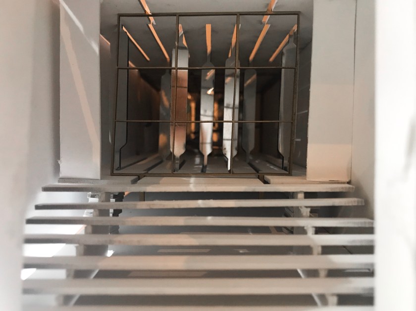
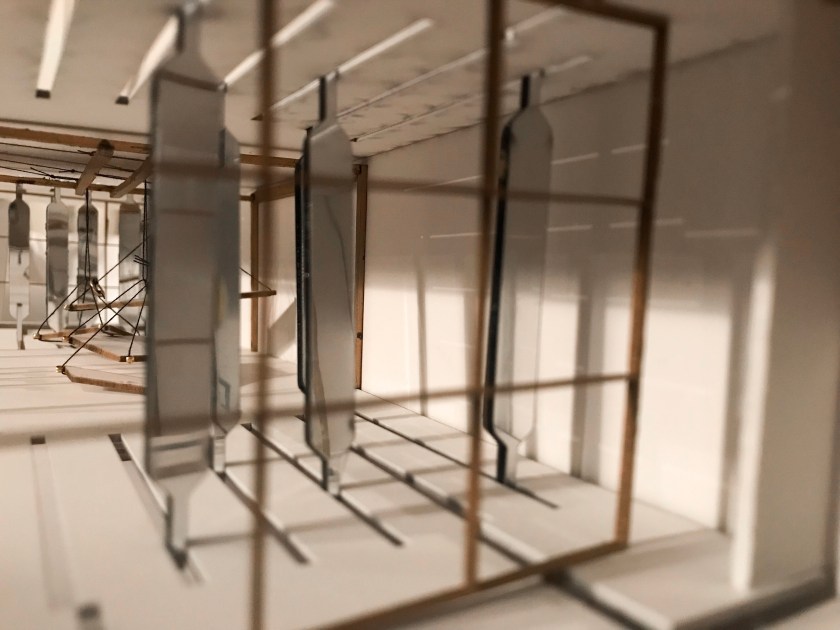
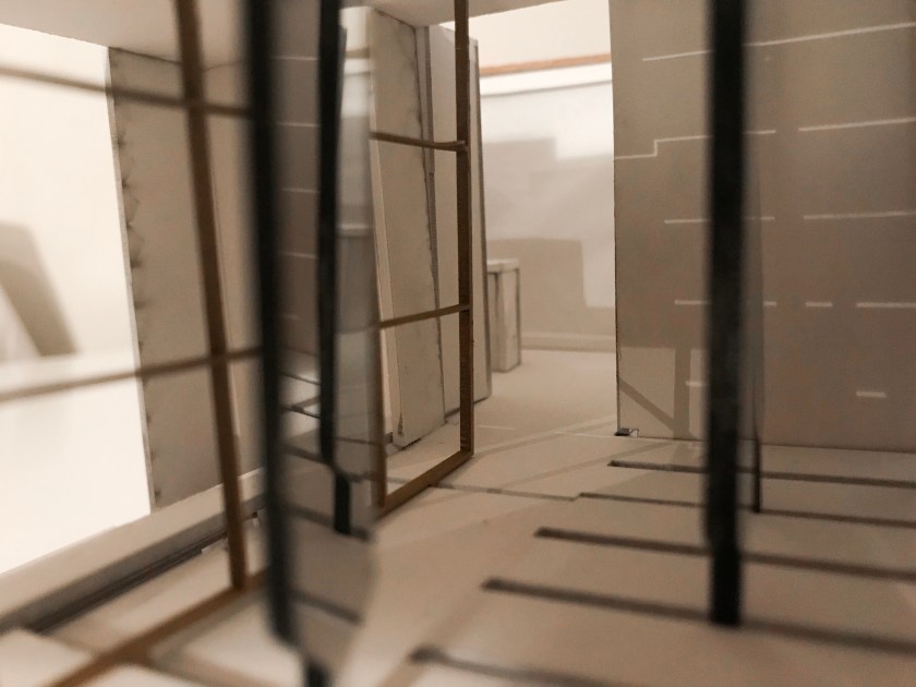
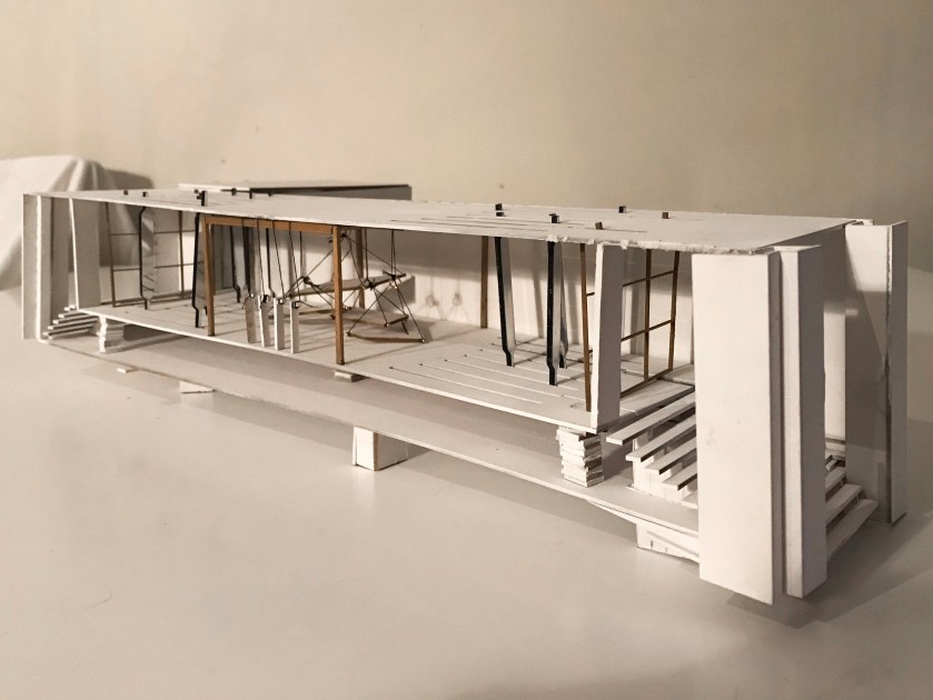
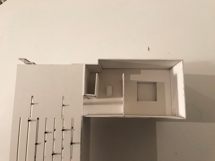
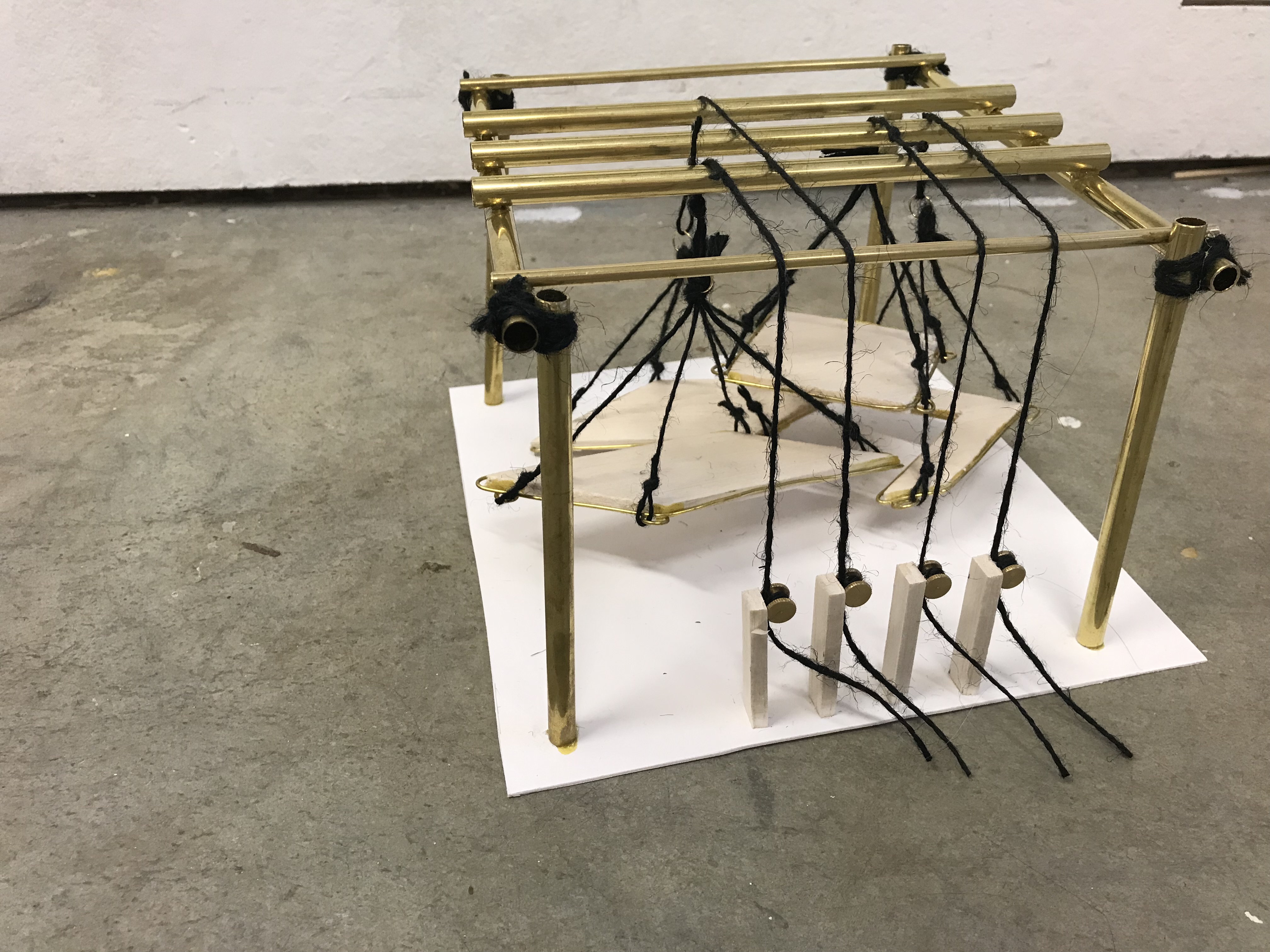
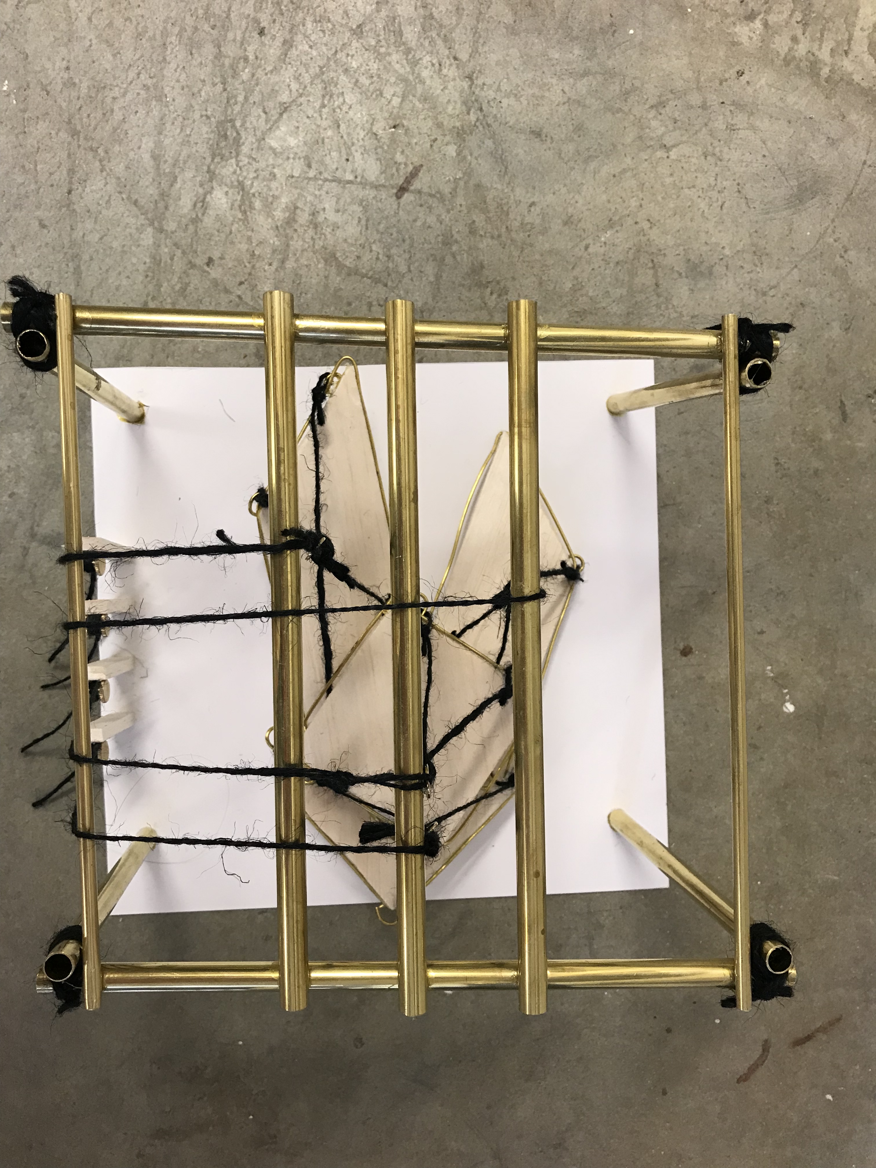
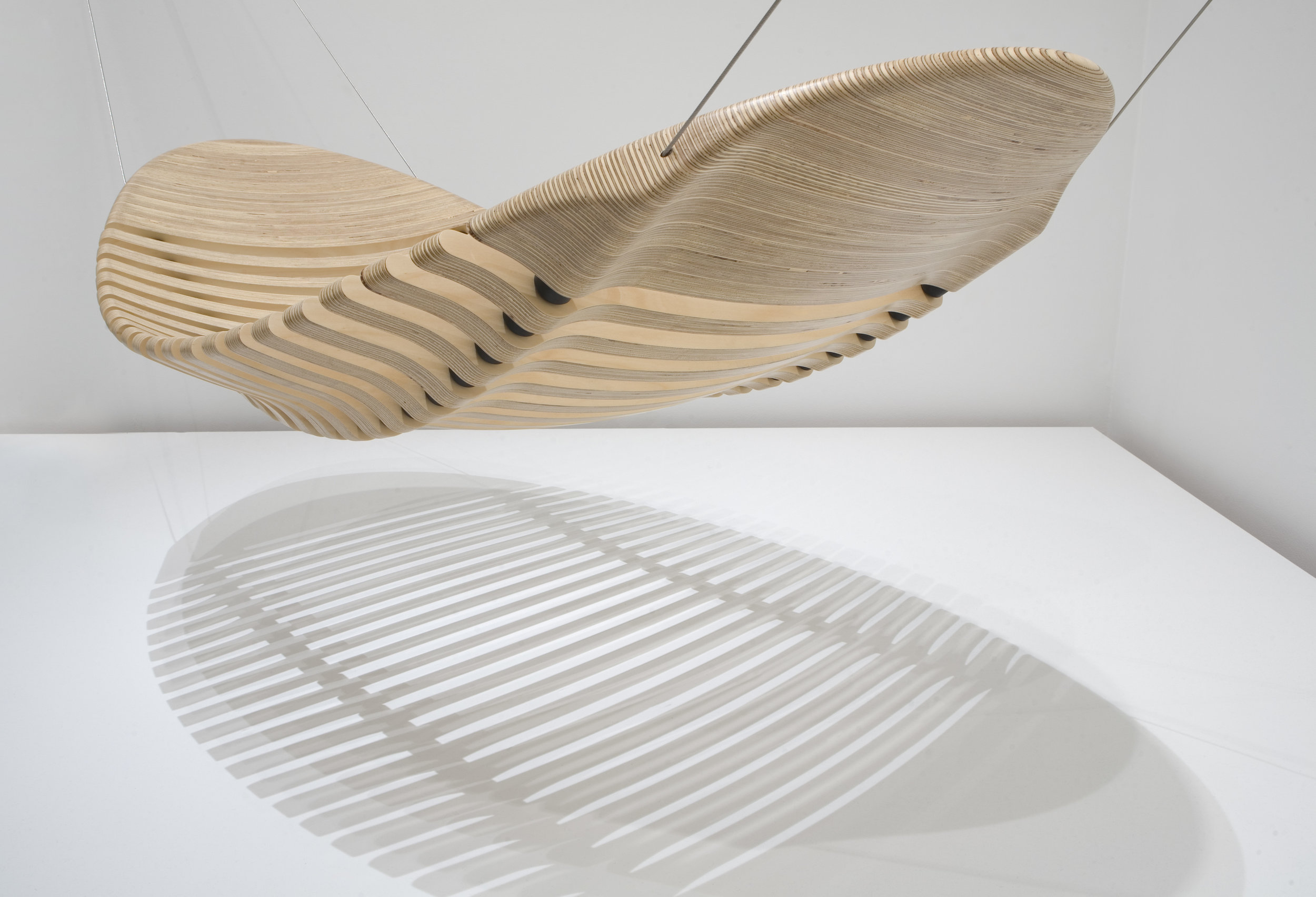
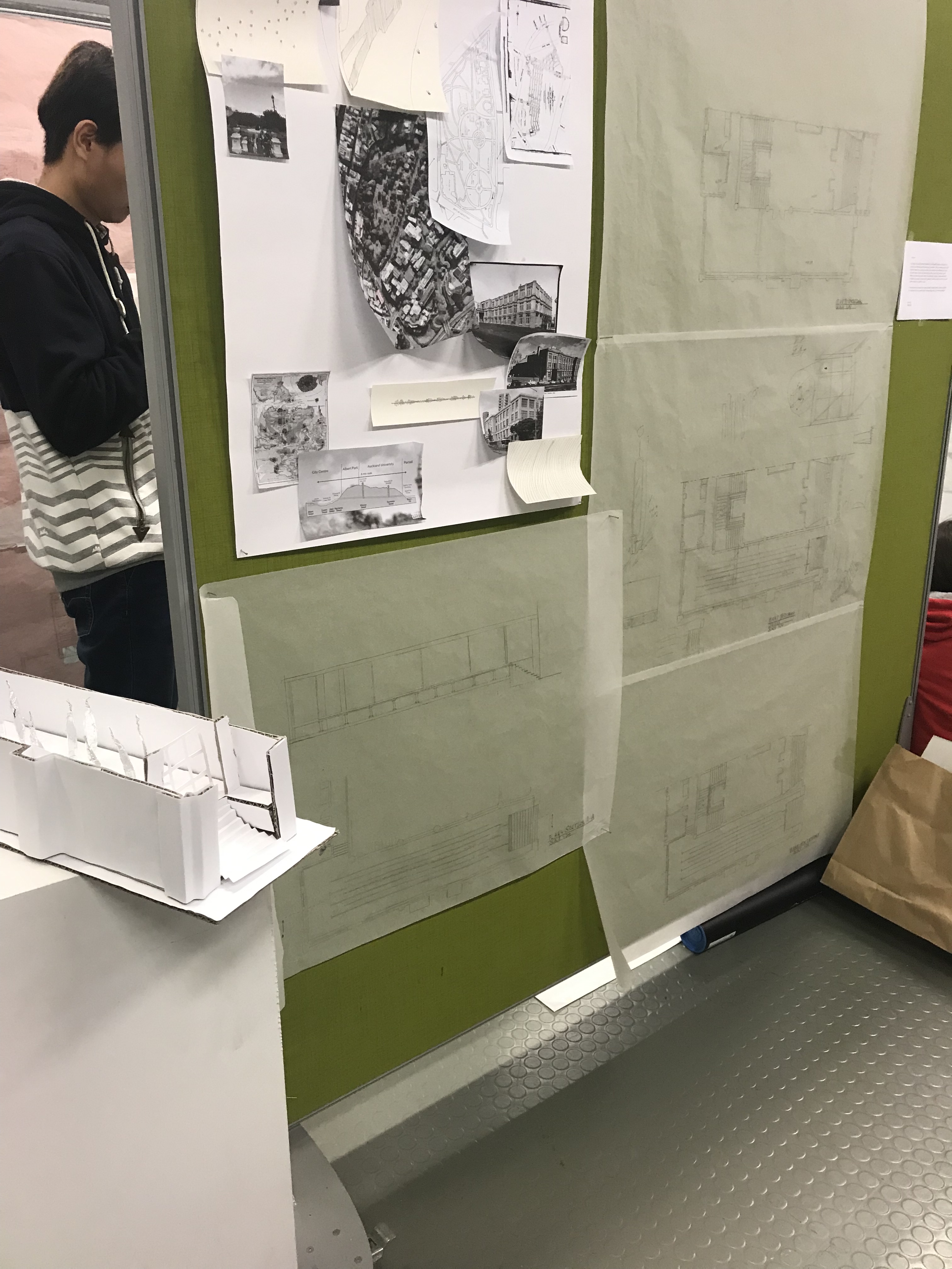
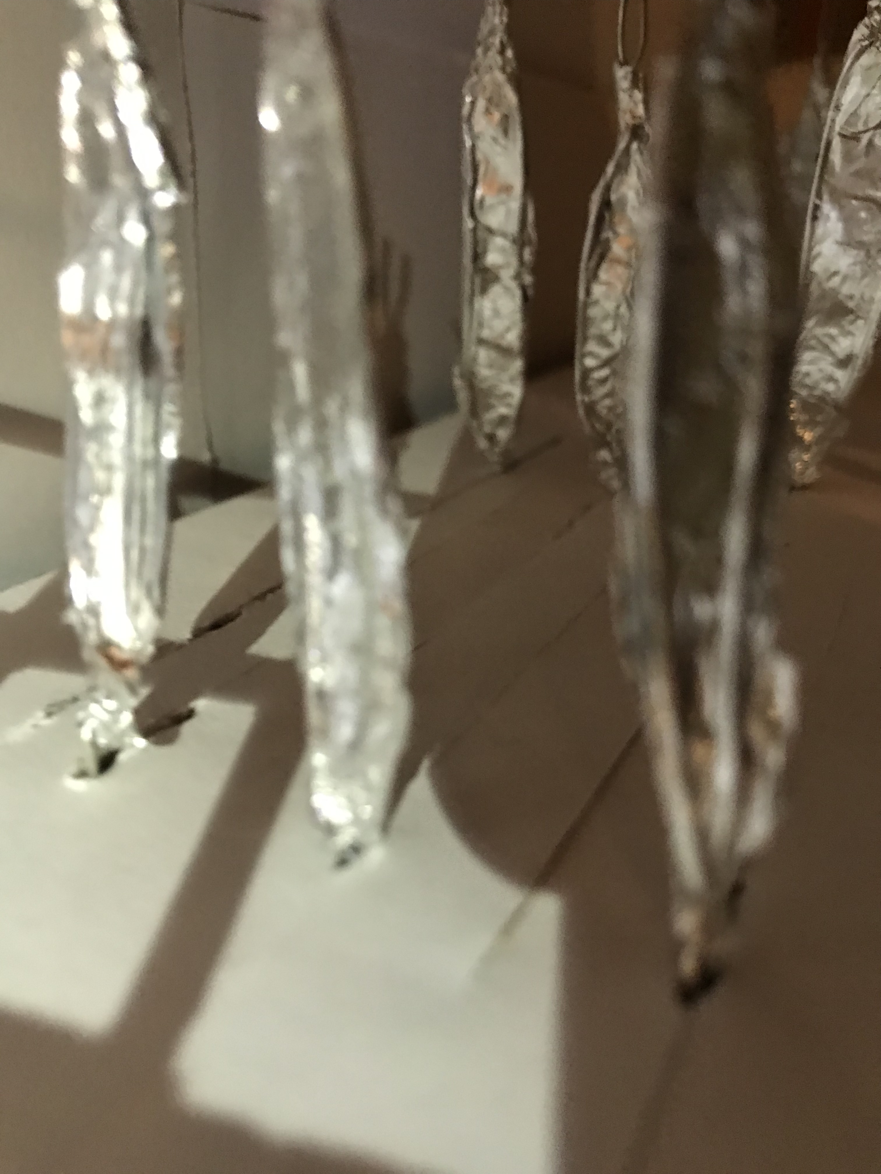
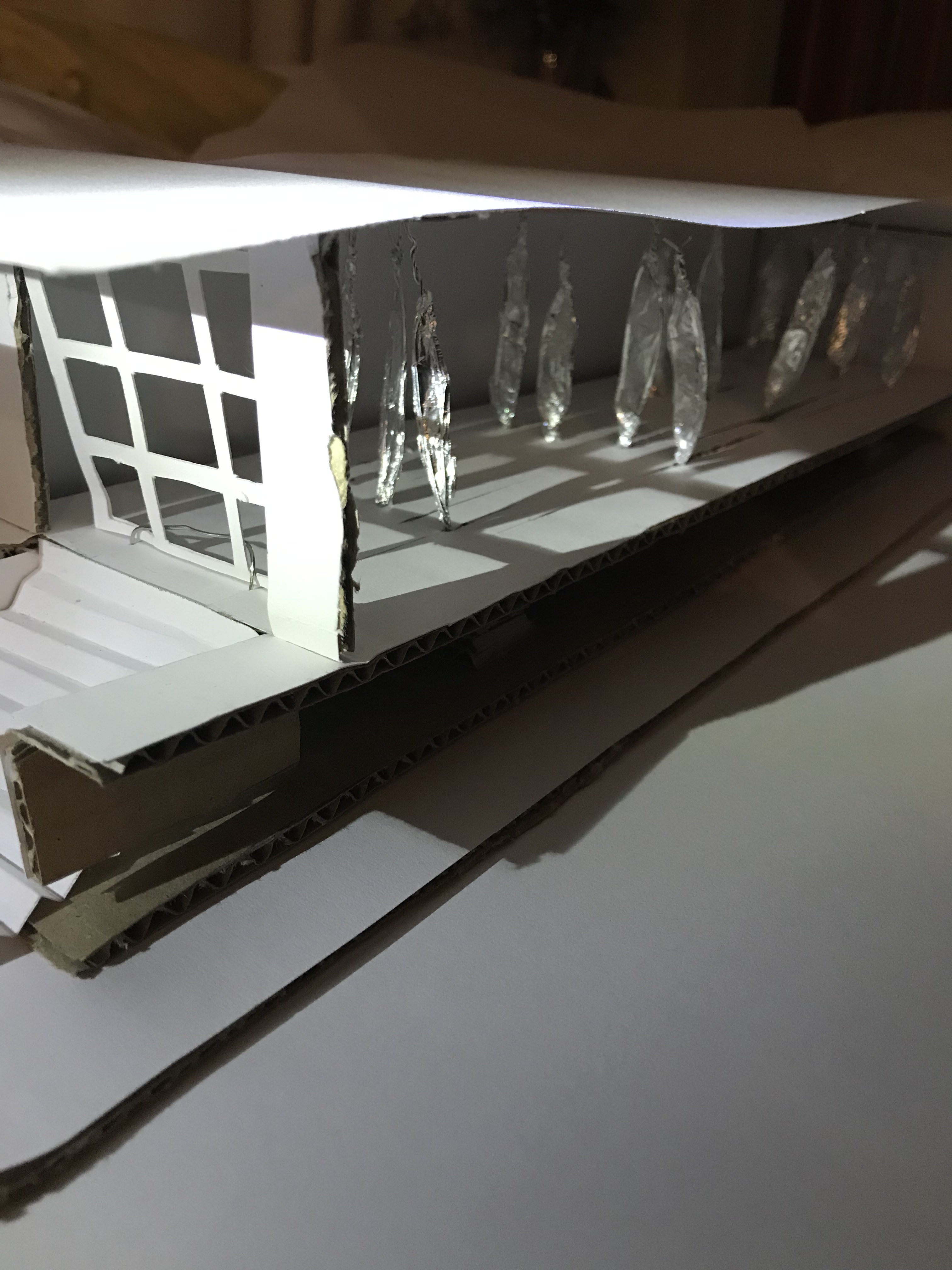
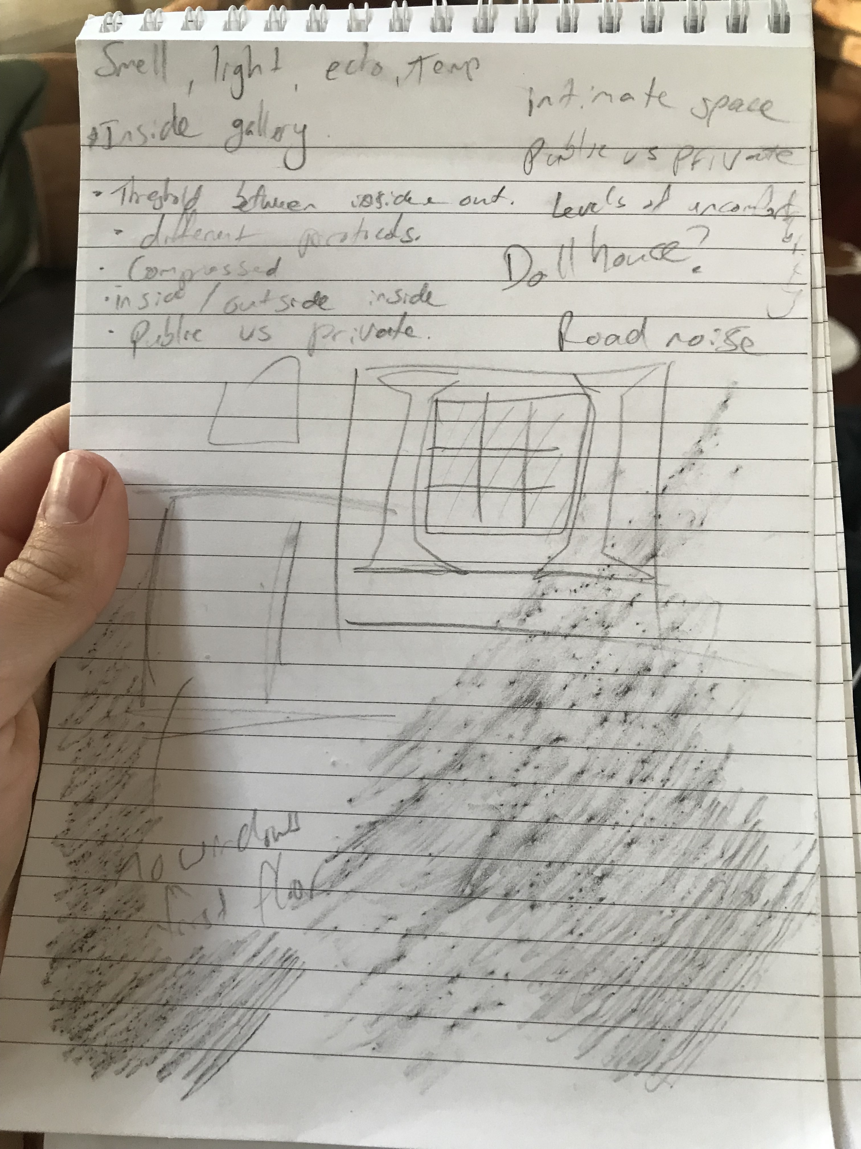
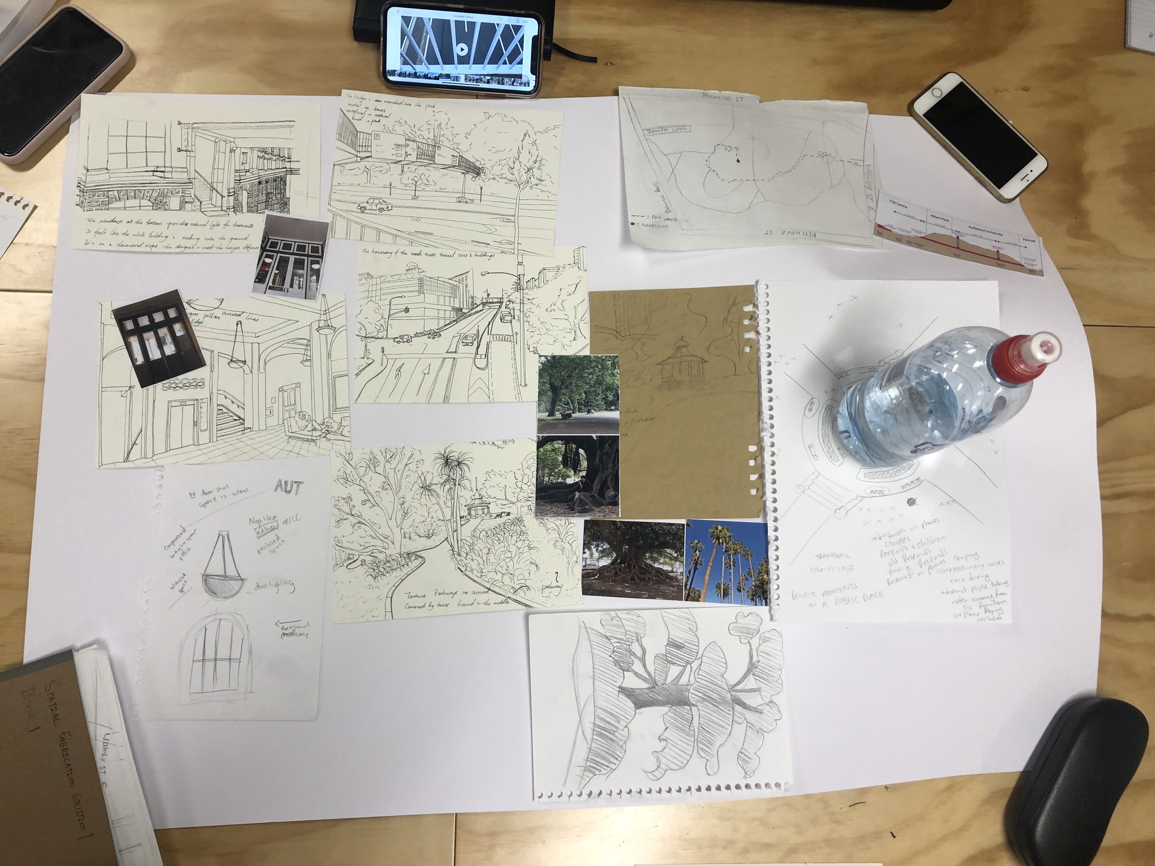
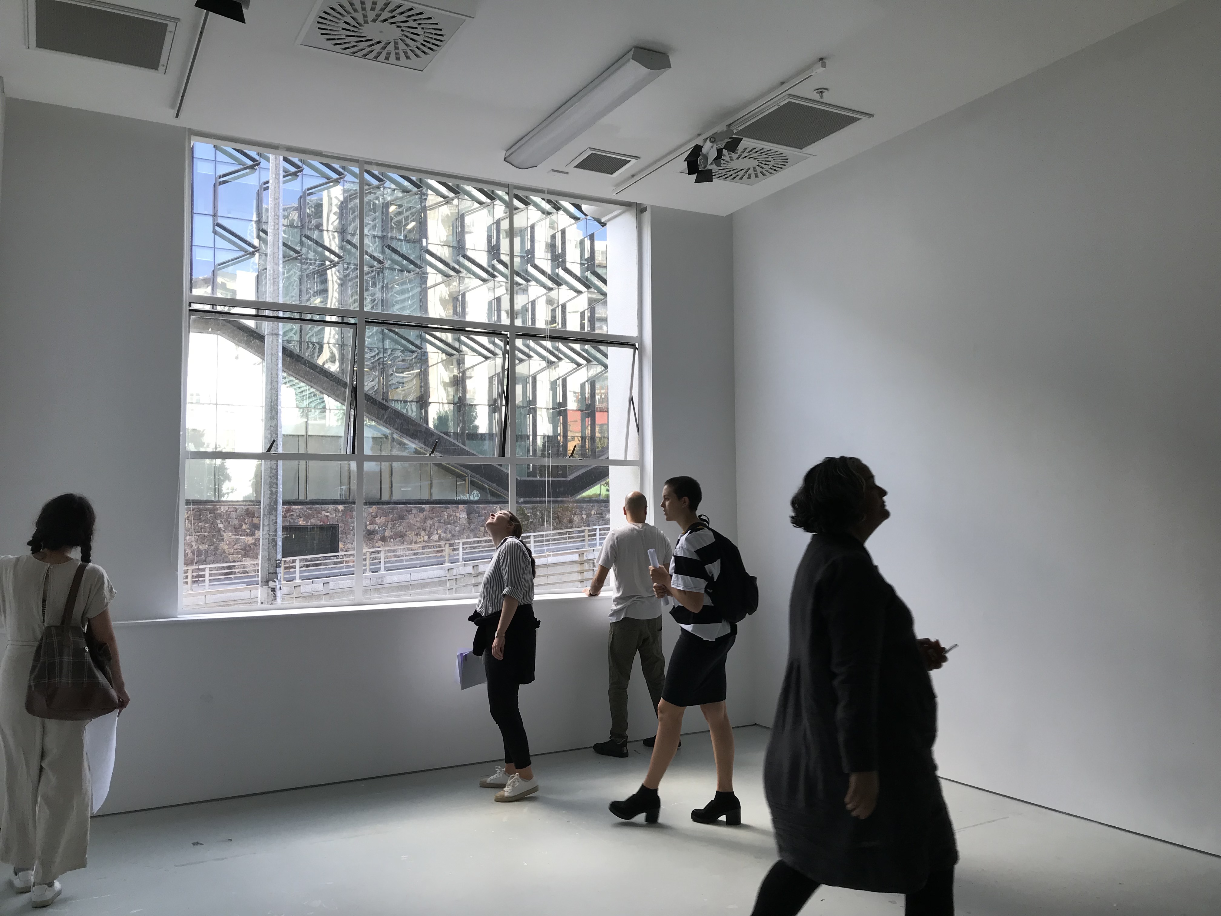
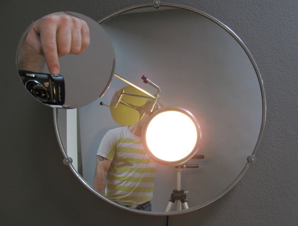
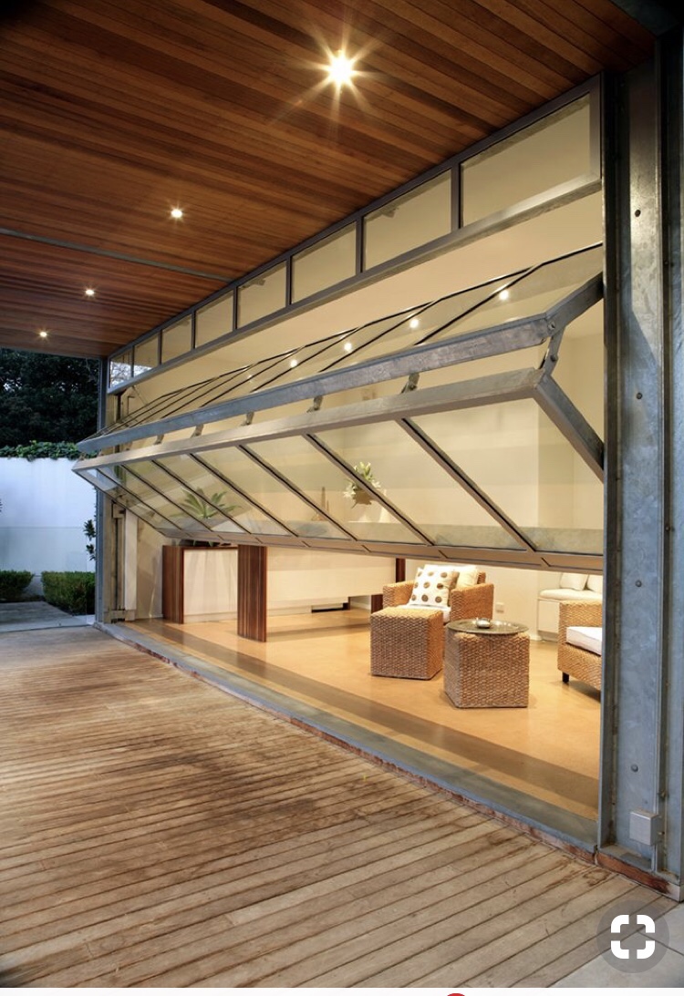
Image source: Gliderol

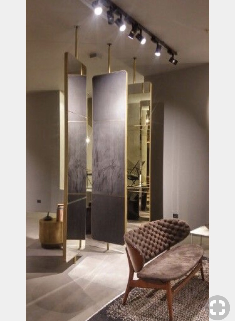
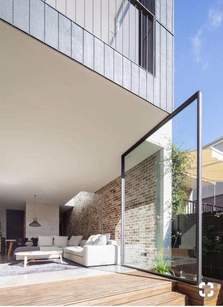
Source: Marston Architects

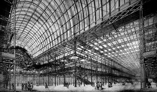
Source: Paz Arquitectura

On Wednesday I started my plan drawings. I wanted to centre my new threshold moment around the front facing window. To focus more on the window I have designed a false floor that is raised by 1000mm to meet the base of the window. The entrance into the space will be through the window. There will be two sets of parallel rollers on tracks so as you push the window, it moves straight back. This then opens two spaces two your left and right to enter into the gallery. I didn’t know how i wanted to lead people to the window. At first i designed a stair way that wrapped around the corner of the building leading to a platform in front of the window. this design imposed onto the footpath and wasn’t as grand as I had hoped.

I consulted with Pip and she brought the idea of moving further into the space to create a grander entrance which I hadn’t considered. I altered my design incorporating this feedback, moving further into the gallery space to fit a staircase up to the window.

I wanted to do something with the interior of the space. I used mirrors in my first project so did some research on how different designers have used mirrors. Eileen Gray designed the Satellite mirror for a bathroom setting but it creates an interesting reflection having the two mirrors. Spandana Gopel with Tiipoi designed Mirror 6 which is a large, raw, circular mirror. Large scale is quite striking in a mirror and the imperfection holds it own unique beauty.

Through my research I came across the use of sectioned mirrors in an interior space and love the way it changed the space.

Apartment in Kyiv, Ukraine – Source Pinterest
Baxter Cinema Milano – Source Pinterest
Origin unknown – Source Pinterest

I like the way mirrors manipulate a room so I incorporated some slim mirrors that are also on tracks in the ceiling and floor so they can move up and down the room. Bringing the outside in. It allows the people that are in the space to interact with the interior as well as the exterior landscape. This also allows pedestrians to interact with the space as they are passing by seeing their own surroundings being reflected back at them. A city in a room.

Joseph Paxtons crystal palace similarly has this concept of bringing the outside in. Its quite surreal and blurs the line of interior/ exterior creating a unique space to interact with.

Joseph Paxtons Crystal Palace

Week 3: Presentation

Year 1 Studio

Preparing for my presentation on my sleep/ wake project I completed my final a2 concept drawing, printed an atmospheric photo of my model and finished my abstract.

I drafted a few ways of arranging my four items to see how they fit best and to figure out which arrangement created the most impact.

When I got to class however I had to alter my plan as I was unable to use a stand for my model because there was a table in the way.

I made a shelf with the top of a shoe box and some thin wire and attached it to the wall. This actually created a nice clean platform for my model and it brought it closer to the rest of my work. This made for a nice flow between all of my pieces, more so I think, than if I had had my model on a stand.

Abstract

I was confident conveying my idea and thought process and found it helpful to have my work critiqued. I was able to see where I need to improve going into the next part of the project. I need to focus less on the real objects, like the brain, and explore the concepts that the objects represent.

Im excited to see what I create for part two of our sleep/wake project with this in mind.