Week 6: A3 Surface Application and First Iteration of Design

Year 2 Semester 1
A3 Surface Design Application

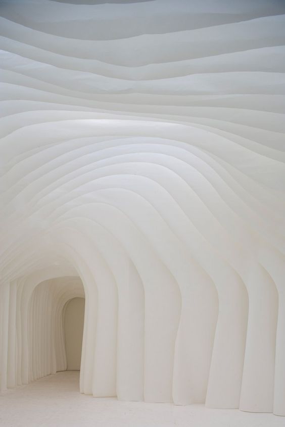
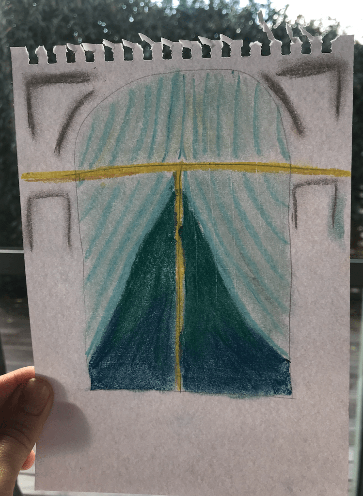
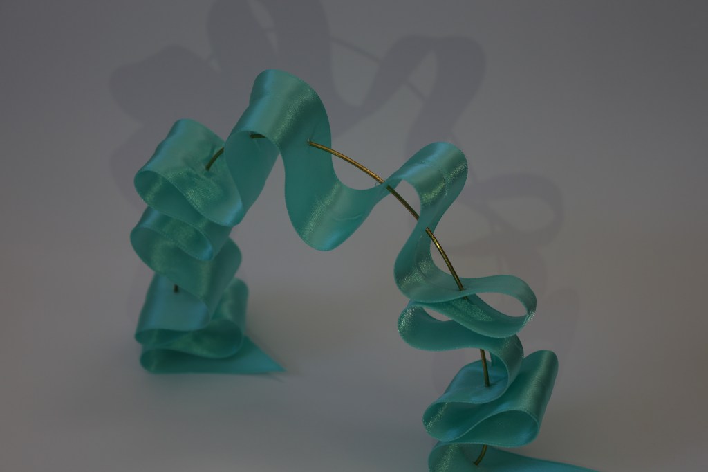
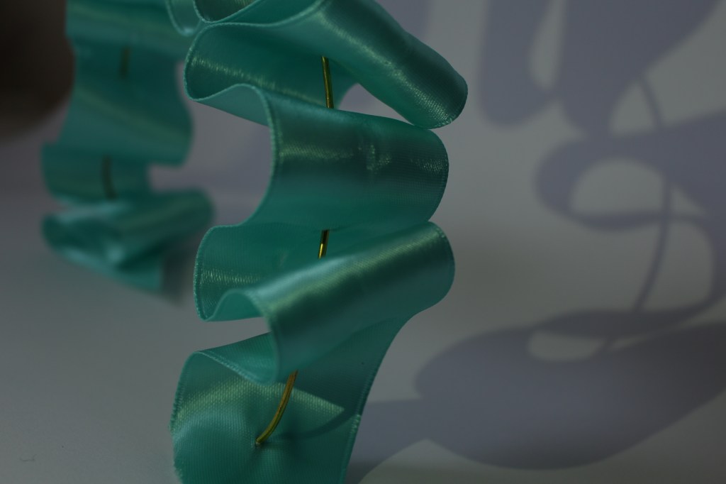
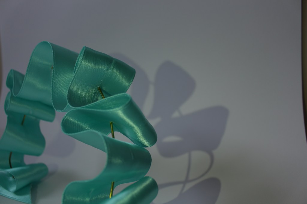
When thinking about my surface application, I went back to my favourite model of my ribbon archway that I created during my artist research. I liked the soft atmosphere this model created more that any of the models created in my surface research.

Drawing on this model of the ribbon woven through brass wire, I expanded the scale, and thought through the issue of the satin ribbon material holding its form at a larger scale. By weaving wire into the fabric it gives it the strength to support its own weight when at a larger scale.

These ribbon archways will be located at the Lorne Street entrance to the theatre drawing guests into the space.

In between each archway will be soft lighting allowing the blue satin to catch the light and shine into the space. The walls and ceiling will be painted a darker blue that will bounce out through reflecting off of the surface of the ribbon creating more depth to the blue of the ribbon.

Initial design concepts and first iteration of design:

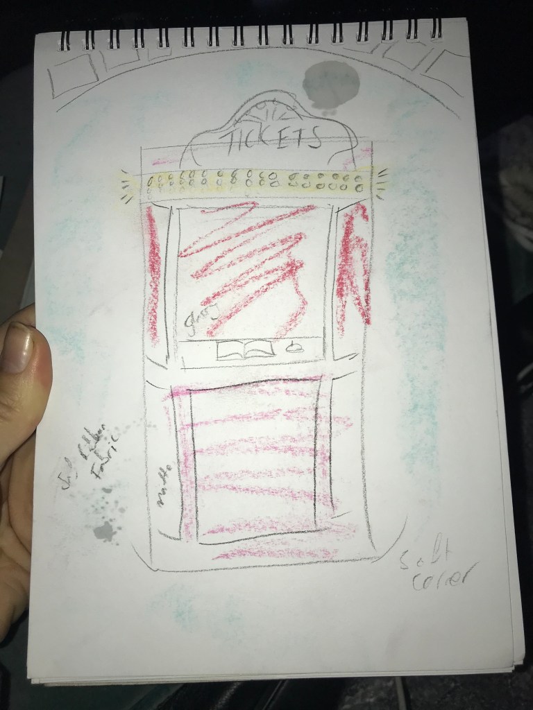
When thinking about the overall intention for the space i drew on the order and simplicity of Andersons work and the classic style he often uses in his films. With this in mind i designed a ticket booth to stand in the middle of the space oriented towards the Lorne St entrance. This brings the theatre aspect into the design space. With the ribbon archways at the entrance it draws the focus to the ticket booth as it blocks your peripheral view of the space.

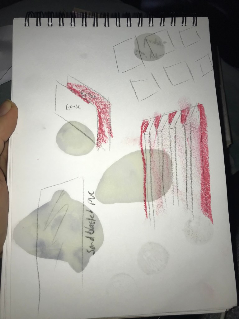
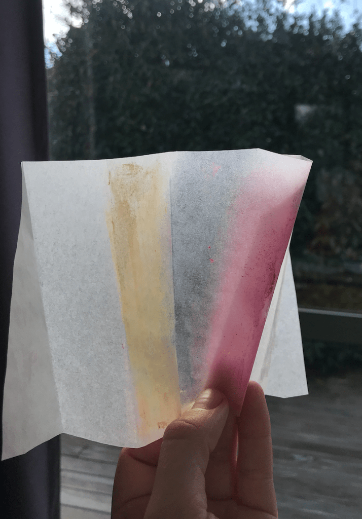
Anderson also uses colour to create a point. I applied this thinking to the colours I will use in the space. I played with the idea of have the walls be a bright colour but be broken up with either ribbon archways or frosted plastic sheets encroaching into the space allowing the colour to bleed into the space through bouncing off of these surfaces. This idea was influenced by my model from Trial 2 Surface 3.

Developing this idea of colour further, I would use bright red and soft pink for the ticket booth and to contrast the soft blues of the ribbon archways helping to emphasis the ticket booth as the key focal point.

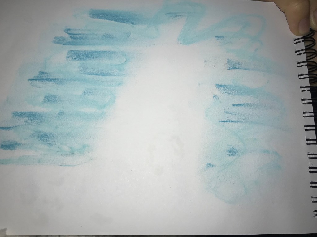
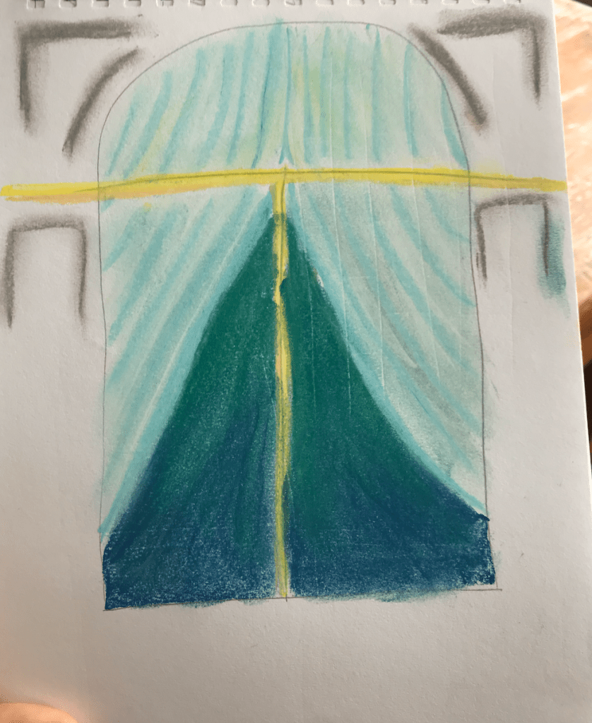
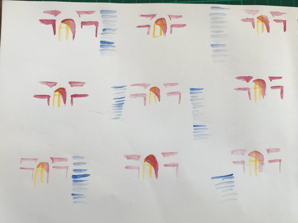
Once I decided on the ribbon archway design, I trialed what the colour of the walls could look like with the archways.

I felt that using red would take away from the main contrast of the ticket booths colour scheme. I liked the use of a darker blue better as it gives depth to the ribbon as-well as keeping the main contrasts between the walls and the ticket booth.

Theory Week 7:

Year 2 Theory

Readings:

  1. The Purpose of Heritage in The heritage crusade and the spoils of history by David Lowenthal
  2. What is heritage? in Understanding the politics of heritage by Rodney Harrison

Ted Talk on Indigenous Heritage:

Locals perspective on heritage: https://thespinoff.co.nz/society/12-04-2020/lockdown-letters-17-morgan-godfery-the-ground-beneath-our-feet/

Theory Week 6:

Year 2 Theory

Reading:
Radical Interiority: Playboy Architecture 1953-1979
by Beatriz Colomina


How does Colomina say Playboy Magazine affected reader’s tastes or desires for interior space?

“Playboy made it acceptable for men to be interested in modern architecture and design.”


Who were some prominent Modernist designers? What do their designs have in common?

Frank Lloyd Wright, Mies van der Rohe, and Buckminster Fuller were all celebrated for their masculine sophistication and designed architecture that leant towards a possible future of design.


What is the social context of the beginnings of Playboy Magazine in 1953? What else was happening
(or had happened) in the world at the time?

It was after the great depression and the economy was starting to take off again due to the middle class becoming more prominent.


Why do you think Playboy Magazine is described by Colomina as making “it acceptable for men to
be interested in modern architecture and design”? Why do you think that it might have been seen
prior to this as “unacceptable” in the public consciousness?

At the time of the first few publications of playboy, architecture, and all things to do with the home, were the womens domain. Playboy provided a masculine alternative to looking at design and architecture.


How does the desireable contemporary interior differ from the “Playboy Interior”, or from the
Modernist interior?

The playboy interior is solely based around securing a conquest whereas contemporary and modernist interiors are more focused on the items and composition of the space.


What does Colomina say makes the Playboy Interior feel ‘futuristic’, or ‘seductive’?

“Everything is seen through the lens of design.” “Playboy relentlessly dissects each dimension of the interior.Far from simply providing an array of seductive images, Playboy analyzes the architecture of seduction. It offers a kind of user’s manual to the reader.”

What magazine/publication/platform would you describe as having a big influence on interior design
and taste now?

I would say magazines like Architectural Digest and influencers like Kim Kardashian hold a-lot of influence over interior design and taste now as everyone is watching them all the time.


How do you think social/cultural/political shifts have altered how we want to live in or design our
interior spaces now?

I think these shifts have allowed more freedom in design and more options for design. We are no longer so strongly tied to the functionality of a space and are therefore able to have our spaces be more of a self expression of ourselves or is an area where we can experiment with new ideas.

Week 5: Slow Surfaces

Year 2 Semester 1

Part 1:

Surface I observed in my home:

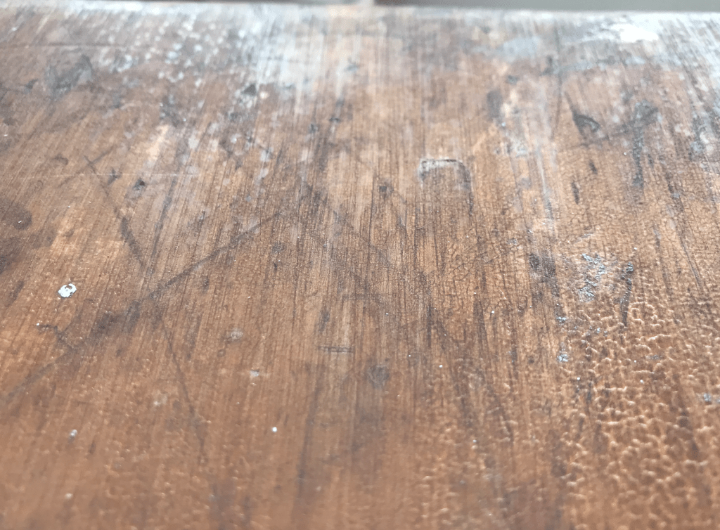
You can see the different stages of the varnish deterioration. This contrasts the consistency of the wood grain with the sporadic, random cracks in the varnish.

The contrasting relationship of matte vs sheen with the different areas of varnish deterioration. Horizontal light vs vertical light allows these varnish patterns and sheen appear and disappear.

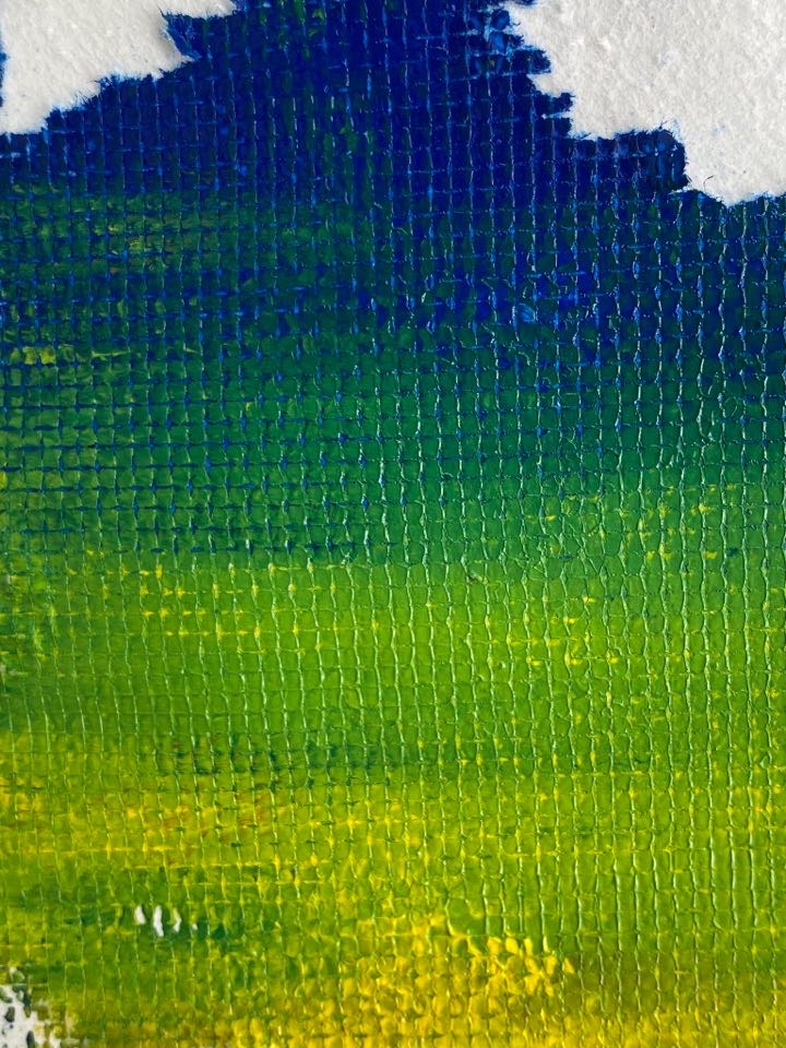
This surface has layers of texture. Wood grain, varnish, scratches, marks, indents, holes, dirt, paint platter making for a very detailed surface.

Group activity: 

I found just how much light comes into play when thinking about interesting surfaces. Light and shadow bring a surface to life and create depth even when the surface is flat.

Making:

I found that layering was a very effective tool when trying to translate texture and depth. Interesting surfaces seem to have multiple layers and the longer you look at them the more layers, texture and detail emerge so i attempted to create that same depth through layering with my surfaces. If I was to develop these surfaces deeper I would experiment with more layering with different materials.

Part 2:

Produce a second series of surface designs based on your analysis of the temporality, movement, materiality, atmospheric affects, of the creative work you have studied.

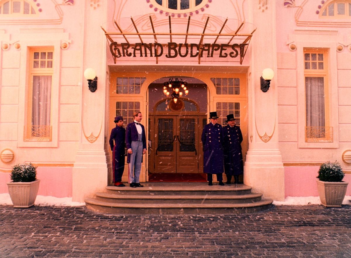
I was drawing on my artist model Wes Andersons Grand Budapest Hotel to influence my surface designs.

The Magnificent Locations Of The Grand Budapest Hotel — LocationsHub

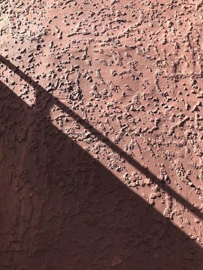
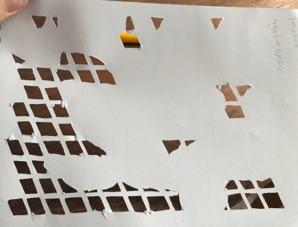
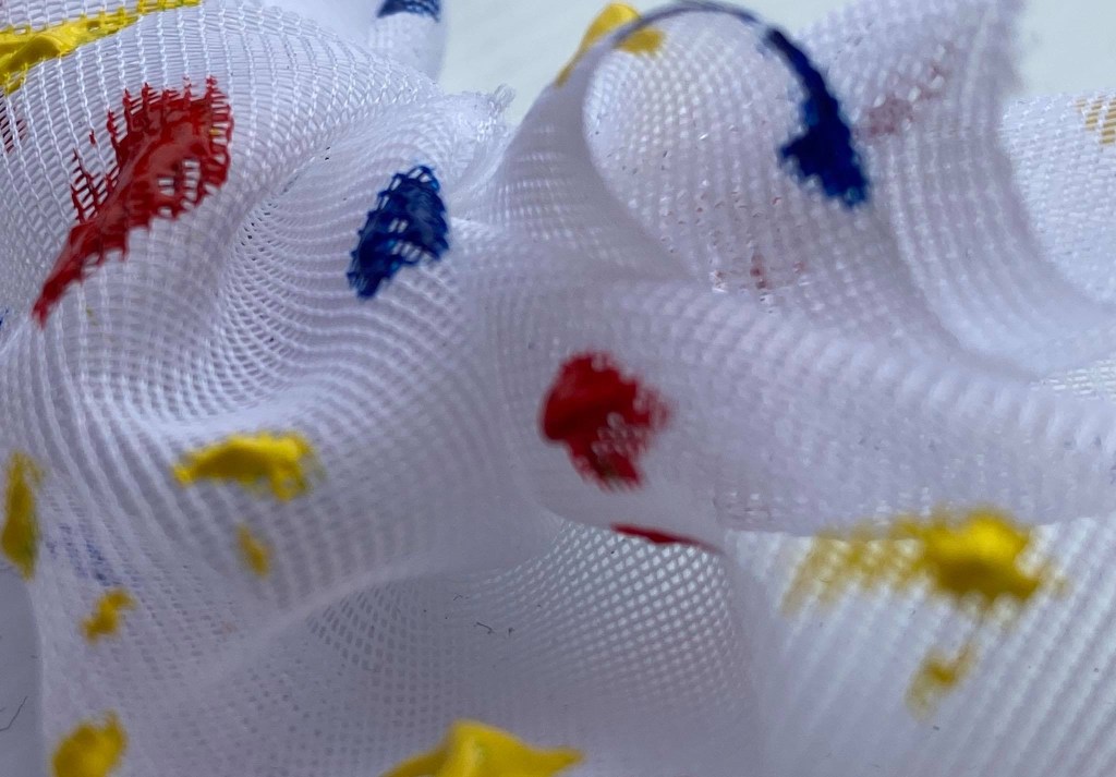
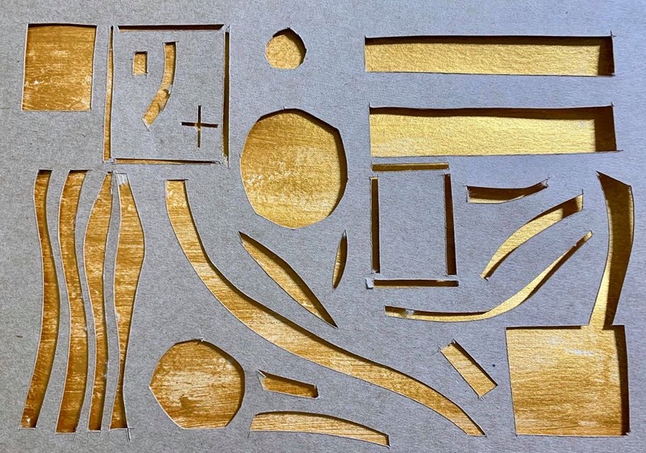
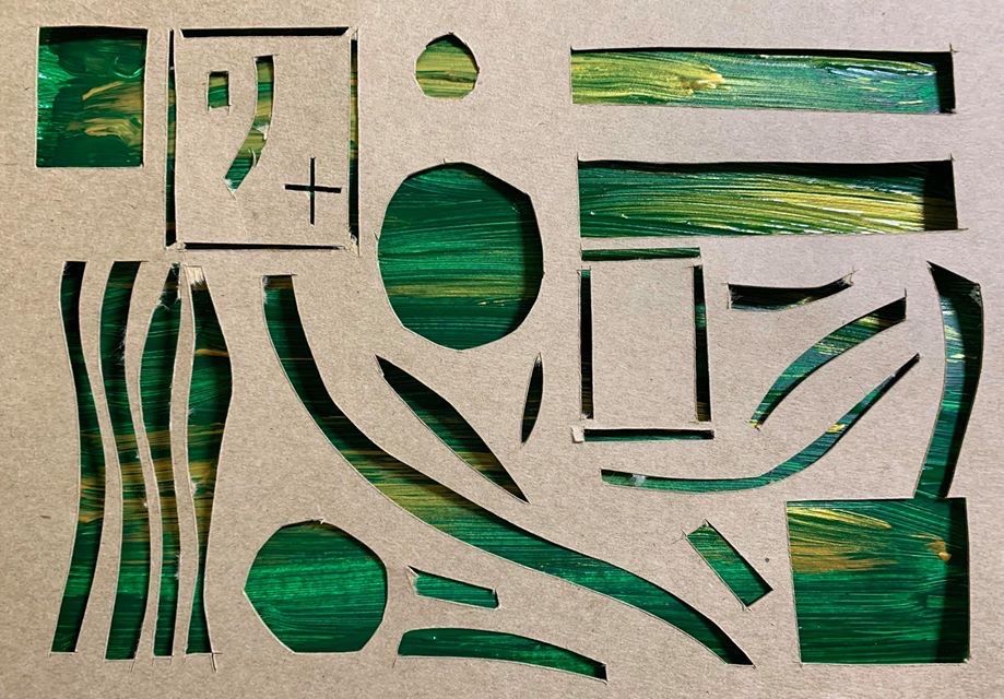
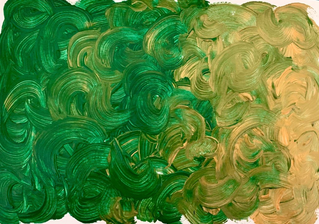
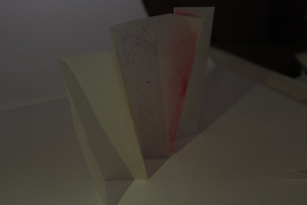
In my first surface I drew on the snow covered roof and played with negative space to create shapes.

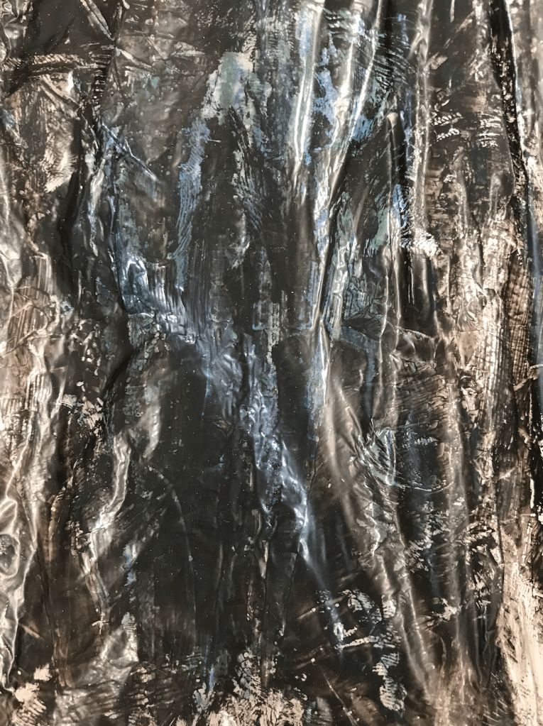
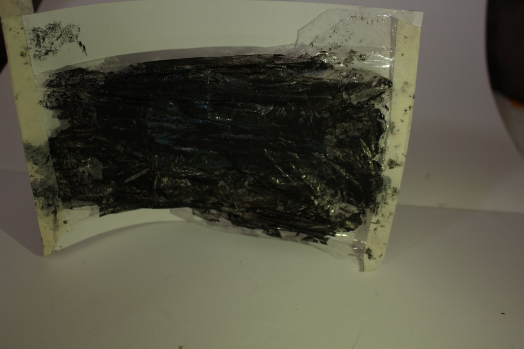
In my second surface I looked at the way shadows were used to create shapes and depth and the way colour changes at different depths.

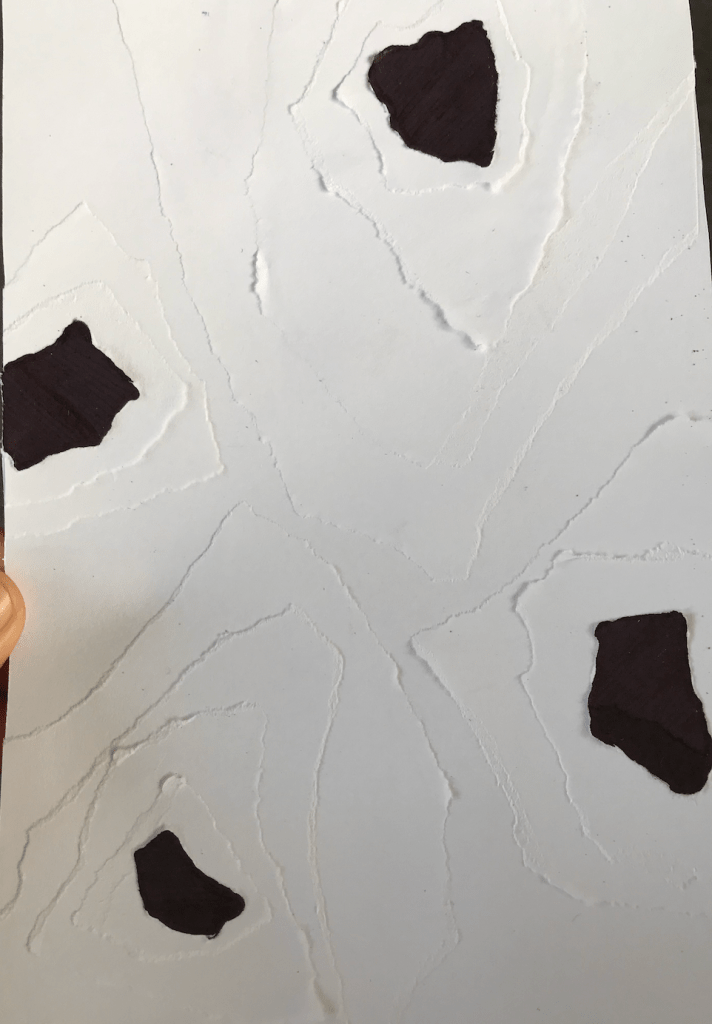
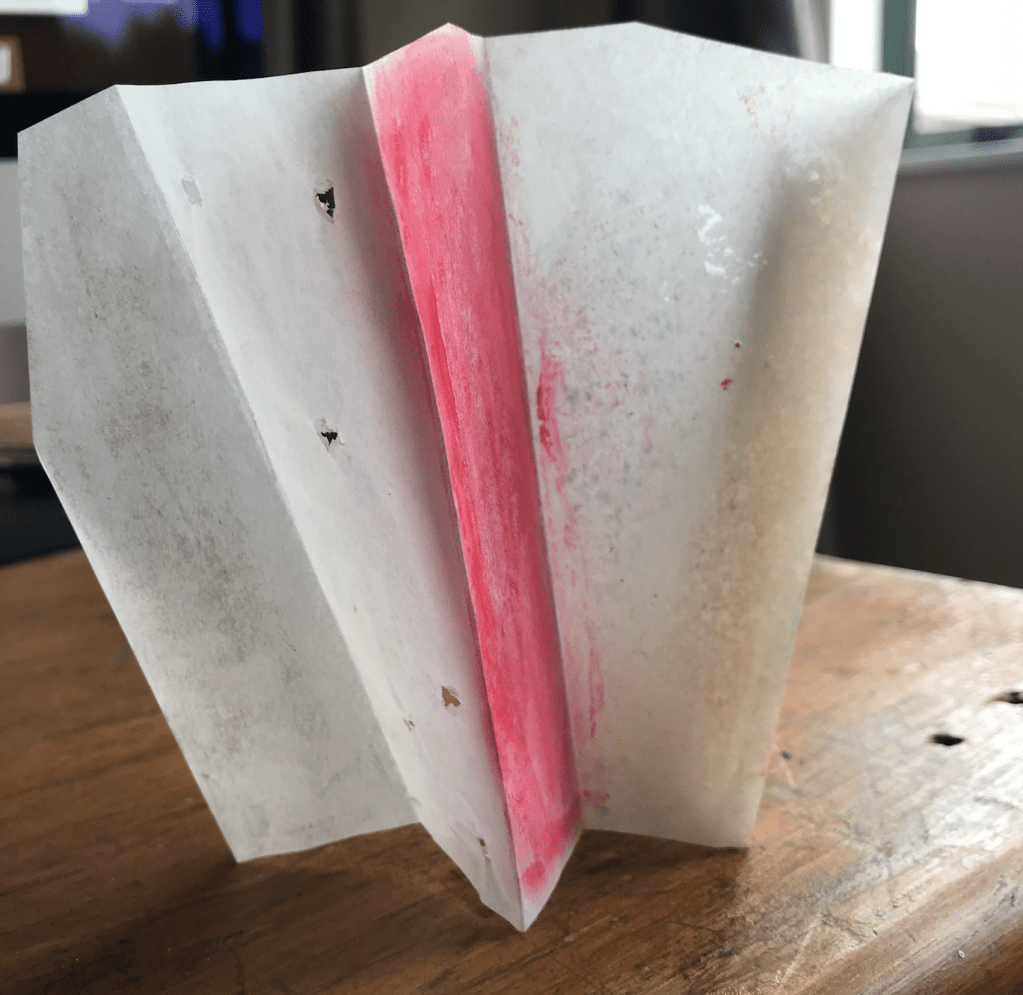
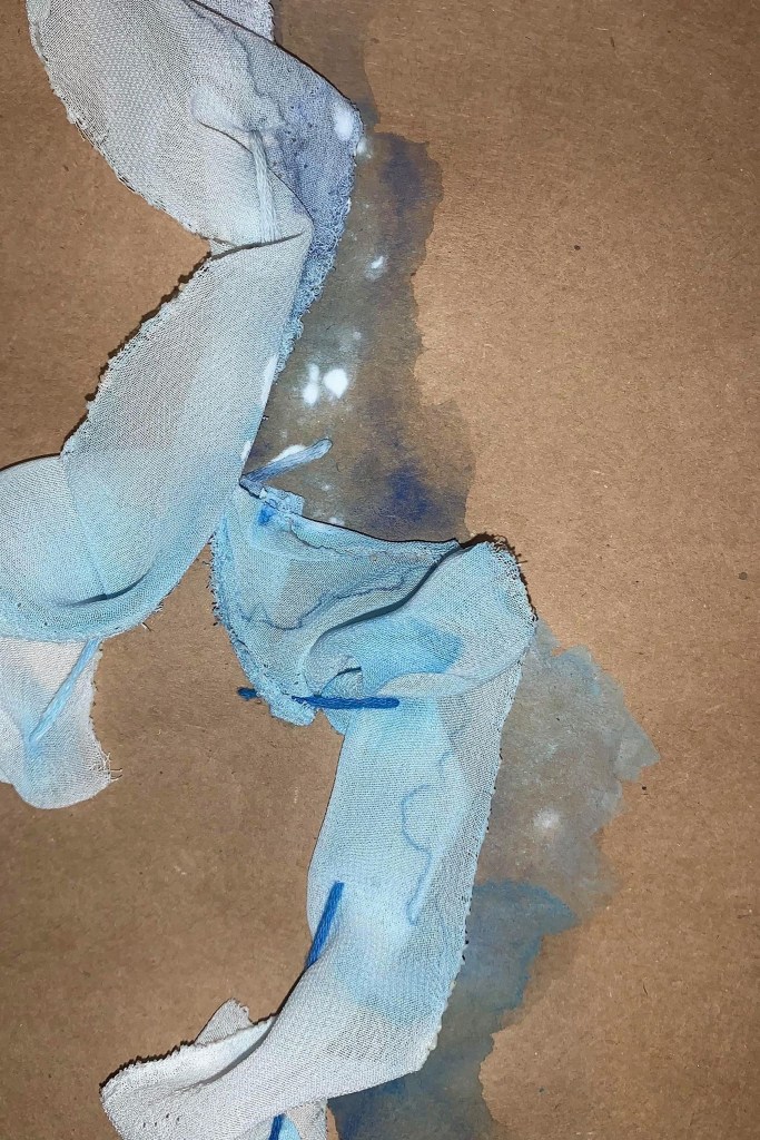
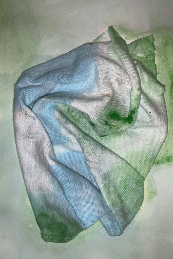
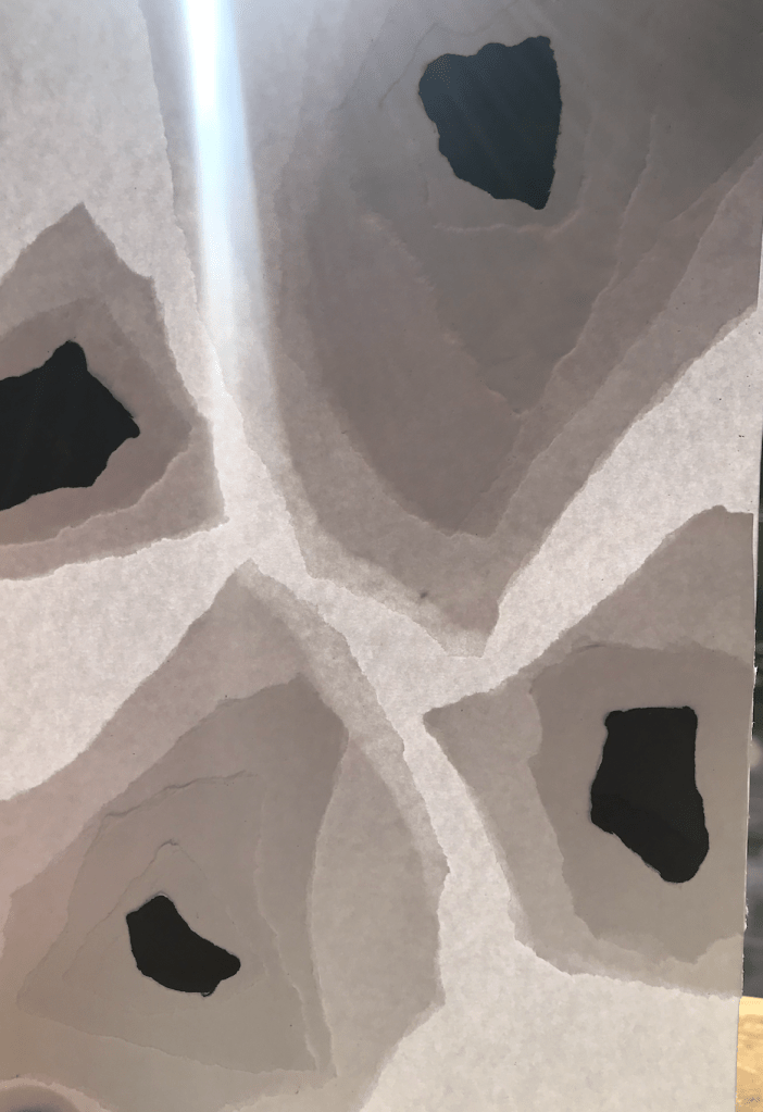
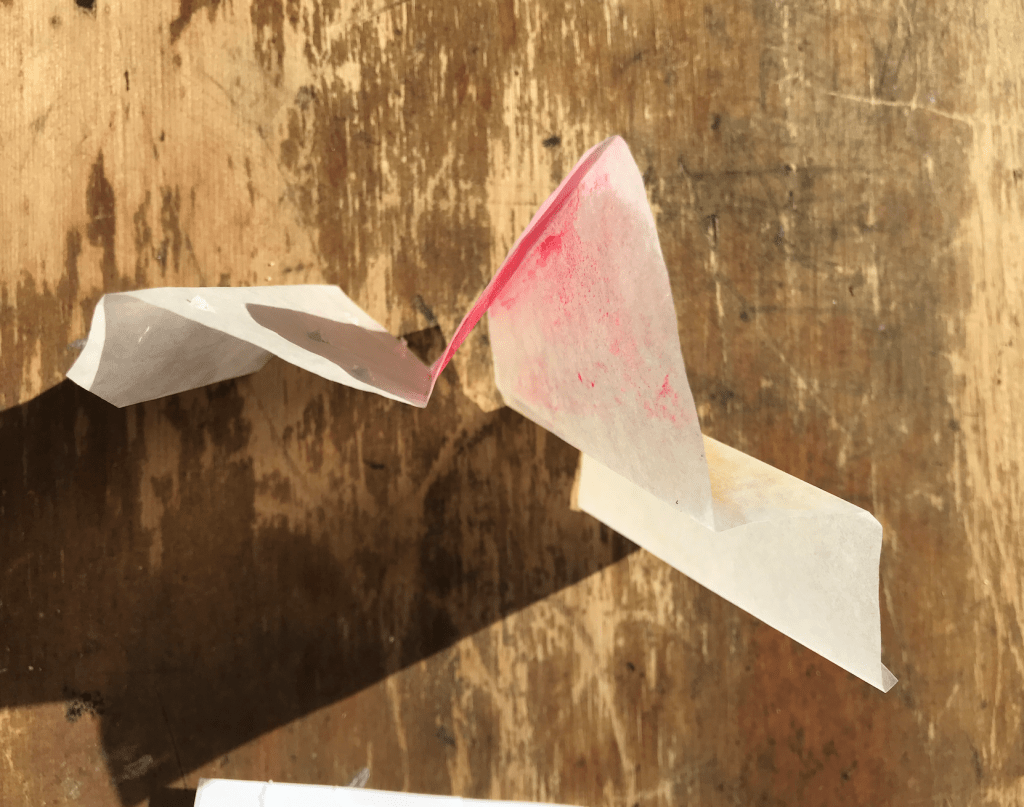
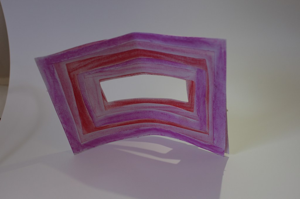
In my third surface I experimented with colour reflecting on other surfaces using butter paper to allow colour to move through the layers.

Group activity:  In studio groups make a time to meetup in collaborate chat room and discuss the surfaces you have made.

Lighting:

Through this lighting exercise I discovered how much light can affect the surface and can create new shapes or depth depending on how it interacts with the surface. My favourite outcome was Trial 1 Surface 3 – Backlit. Having the light be filtered through the different layers of paper made the surface very dynamic to look at and created a level of depth that isn’t there under other lighting conditions.

Week 5: Politics of Installation

Year 2 Theory

Reading:
Politics of Installation by Boris Groys

How does Groys describe the relationship between the ‘field of art’ and the ‘art market’?

“The field of art is today frequently equated with the art market, and the artwork is primarily identified as a commodity. That art functions in the context of the art market, and every work of art is a commodity, is beyond doubt; yet art is also made and exhibited for those who do not want to be art collectors, and it is in fact these people who constitute the majority of the art public.”

What is the main two concepts that he seeks to differentiate through an ‘analysis of difference’ at the
bottom of page one?

The two main concepts he is wanting to differentiate is the artist and the curator.

How is an art exhibition and an art installation different in Groys’ view? How does he
describe the viewer/audience in relationshp to each
?

It’s different because an exhibition is conceived as an accumulation of art objects placed next to one another in an exhibition space to be viewed in succession. In this case, the exhibition space works as an extension of neutral, public urban space. The body of the viewer in this setting remains outside of the art: art takes place in front of the viewer’s eyes—as an art object, a performance, or a film.

An installation operates by means of a symbolic privatization of the public space of an exhibition. It may appear to be a standard, curated exhibition, but its space is designed according to the sovereign will of an individual artist who is not supposed to publicly justify the selection of the included objects, or the organisation of the installation space as a whole. It invites the visitor to experience this space as the holistic, totalising space of an artwork.

How would you describe an ‘exhibition’? How does Groys describe the ‘exhibition space’?

I would describe an exhibition as a collection of work displayed in such a way that the public can easily see them. Groys describes exhibition space as being “conceived as an accumulation of art objects placed next to one another in an exhibition space to be viewed in succession. In this case, the exhibition space works as an extension of neutral, public urban space—as something like a side alley into which the passerby may turn upon payment of an admission fee”

What is the role of a ‘curator’, both in the past and in the present time?

The role of a curator in the past has been collecting “sacral objects of the past, presenting them as mere art objects in the neutral, empty exhibition spaces of the modern museum or Kunsthalle. The first art museums… collected all sorts of “beautiful” functional objects previously used for religious rites, interior decoration, or manifestations of personal wealth, and exhibited them as works of art, that is, as defunctionalized autonomous objects set up for the mere purpose of being viewed.”

In present time a curator’s role is “to safeguard its public character, while bringing the individual artworks into this public space, making them accessible to the public, publicizing them.”

What do you think a “defunctionalized design fragment” is?

I think it is an object taken out of its intended environment, stripped of any functional value and used purely to be observed as art.

When, in Groys’ view, did artists begin to seek autonomy/freedom/sovereignty for their work?

In the modern era when artists “have required the right to make sovereign decisions regarding the content and the form of their work beyond any explanation or justification vis-à-vis the public.”

How would you describe an ‘installation’? How does Groys describe the ‘installation’ as a space?

I would describe an an installation as a wholistic display of art where the pieces are all linked and communicate an idea collectively.

Groys describes it as a “means of a symbolic privatization of the public space of an exhibition. It may appear to be a standard, curated exhibition, but its space is designed according to the sovereign will of an individual artist who is not supposed to publicly justify the selection of the included objects, or the organization of the installation space as a whole.”

What does an installation do to a space, that an exhibition does not?

“What the installation offers to the fluid, circulating multitudes is an aura of the here and now. The installation is, above all, a mass-cultural version of individual flânerie, as described by Benjamin, and therefore a place for the emergence of aura, for “profane illumination.””

In relationship to last week’s lecture (Landscape Part II), do you see any relationship between ‘installation’ and colonisation or land ownership?

The relationship between last weeks texts and this weeks is the parallel of curated design dictated by public consumption. They both highlight how humans want everything to be somewhat practical and serve a purpose.

What different kinds of ‘freedom’ does Groys write that artists and curators embody? Is it always the
same or has it changed over time/ in different situations?

“The artist and the curator embody, in a very conspicuous manner, these two different kinds of freedom: the sovereign, unconditional, publicly irresponsible freedom of art-making, and the institutional, conditional, publicly responsible freedom of curatorship.”

It hasn’t always been this way. It is, somewhat, new way of operating “in the last decades we have seen the emergence of innovative curatorial projects that seem to empower the curator to act in an authorial, sovereign way. And we have also seen the emergence of artistic practices seeking to be collaborative, democratic, decentralized, de-authorized.”

What does Groys write is the relationship between democracy or democratic access to installation
art?

“The visitor of a typical exhibition remains on his or her own territory, as a symbolic owner of the space where the artworks are delivered to his or her gaze and judgment.”

“The space of an artistic installation is the symbolic private property of the artist. By entering this space, the visitor leaves the public territory of democratic legitimacy and enters the space of sovereign, authoritarian control.”

How does Groys see installation art as reflecting contemporary society? Can we see spatial design and
architecture in a similar light? Why/Why not?

“Art’s function is to show, to make visible the realities that are generally overlooked. By taking aesthetic responsibility in a very explicit way for the design of the installation space, the artist reveals the hidden sovereign dimension of the contemporary democratic order that politics, for the most part, tries to conceal.”

“The artistic installation is thus a space of unconcealment (in the Heideggerian sense) of the heterotopic, sovereign power that is concealed behind the obscure transparency of the democratic order.”

I think we can see Spatial Design and Architecture in a similar light because they too are a form of art that has the opportunity to tell a story in the details and depth of the design.

Week 4: Artist Model

Year 2 Semester 1

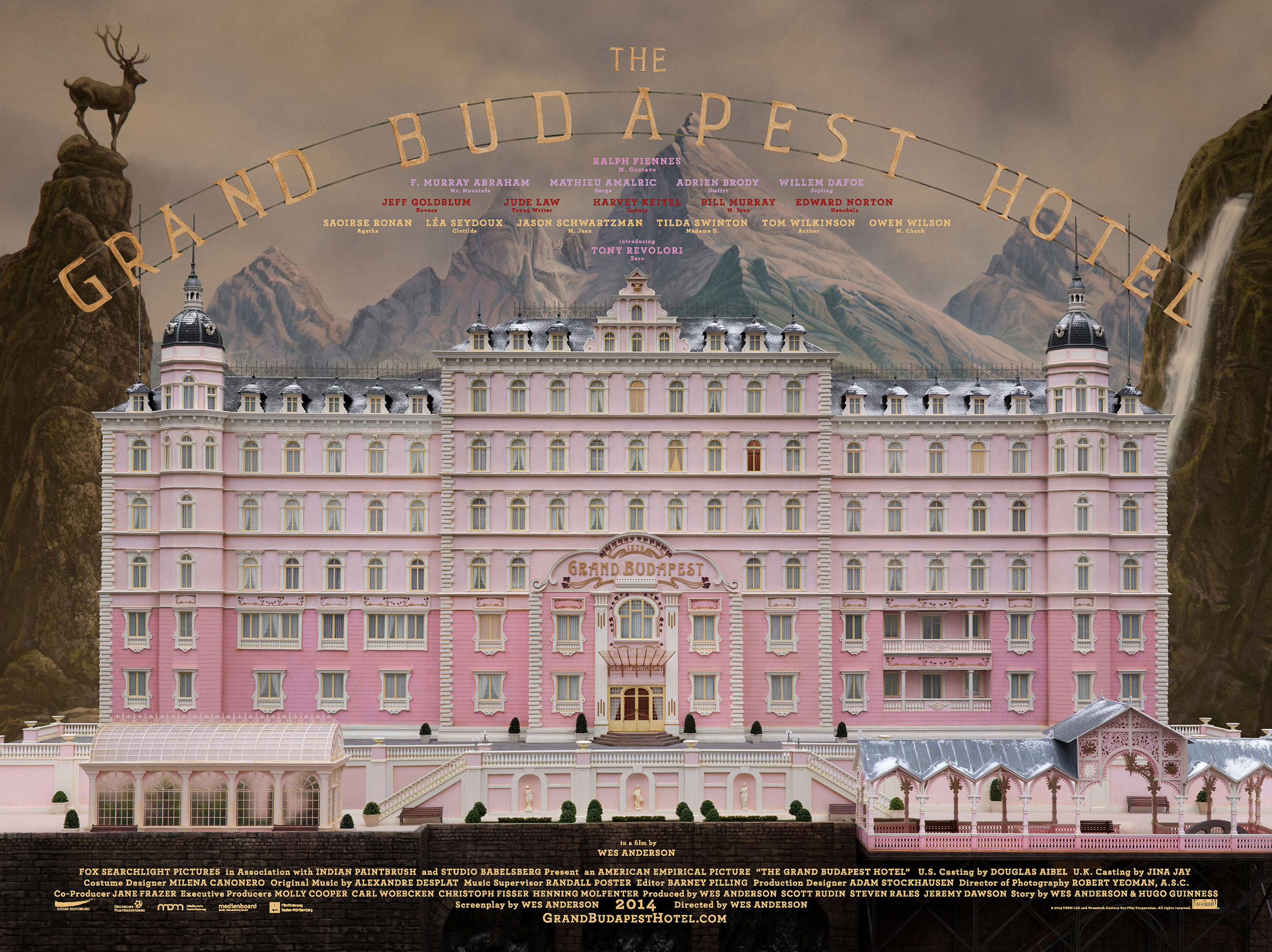
My artist model is the director Wes Anderson and I will be focusing on his film The Grand Budapest Hotel.

Image result for the grand budapest hotel

Questions about Wes Andersons work:

When and where did he produce his work?

Wes Andersons The Grand Budapest Hotel was released in 2014 and was filmed at multiple locations around eastern Germany.

Identify the key conceptual ideas that underpin their work.

Nostalgia, Fascism, Colour. “We made a pastiche of the greatest hits of Eastern Europe” – Wes Anderson https://www.npr.org/2014/03/12/289423863/wes-anderson-we-made-a-pastiche-of-eastern-europes-greatest-hits

Anderson is also famous for the symmetry of his shots in all his films.

Identify their critical position on colour in relation to their work (i.e. how is colour applied, in what proportions, what particular theories about colour inform the making of the work, how does colour change dependent upon the environment in which the work is viewed.

The Grand Budapest Hotel uses colour to accentuate elements of the story. It was also used to emphasis different themes and the passage of time. Anderson is known for his bright colour ways in his films and The Grand Budapest Hotel is no different. However, Anderson didn’t use his classic soft yellow hue with this film instead went for a highly saturated palette.

With such a bright palette in use Anderson plays with the saturation to help communicate things like the impending war and flashback scenes exploring Zero’s memory of wartime by desaturating the colours.

What type of surface treatments are used in the work? Do they use matte, satin, or gloss paints or material finishes or all of them together? Why might they do this and what is the effect of doing this?

The film overall has a warm, bright palette with soft pastel accents. With this as the films base colour way Anderson used hardwoods, strong greens and golds in the Schloss Lutz to express oppressive wealth and used a cool bluish grey tint for Checkpoint Nineteen to show its slow decay and neglected position creating contrast and helping the viewer to differentiate location, mood, and time.

What scale are the artworks you have researched? How does scale impact on how the work is experienced and how colour and materiality are perceived?

To create the sense of size and grandeur in some of the more elaborate scenes the film makers used matte paintings and miniture effect techniques to play with the perspective. Scale models of structures were created to help set the scene of this fictitious world which Anderson has done in a few of his films previously. The scale model of the front elevation of The Grand Budapest hotel was one-eighteenth scale. It’s about four metres wide and three metres high.

Modelmaker Alex Friedrich works on the hotel miniature

The film also draws from Europe-set mid-century Hollywood films and the Library of Congress’s photocrom print collection of alpine resorts for visual motifs. These images did not showcase much of recognisable Europe; rather they catalogued obscure historical landmarks not known to the general public.

Gabriel Sanchez Talks 'Grand Budapest Hotel' | Animation World Network

Complete the design research and carefully photograph your work to upload to your blog with some writing that reflects on this design exercise.

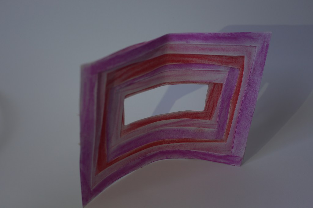
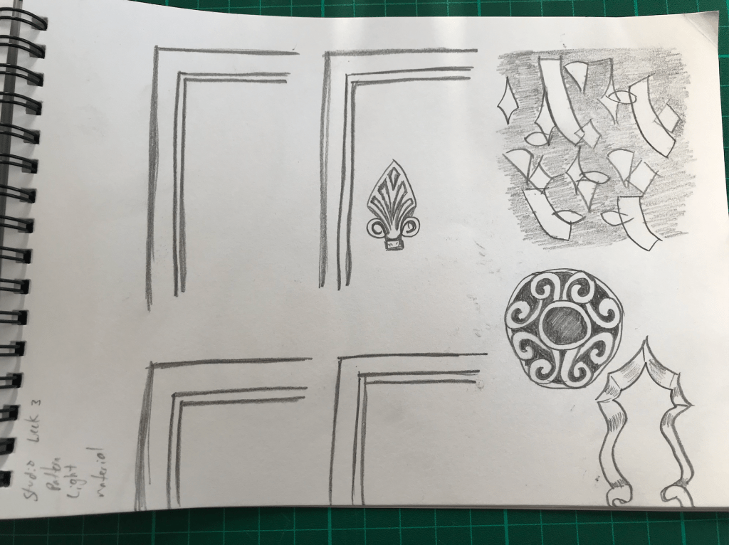
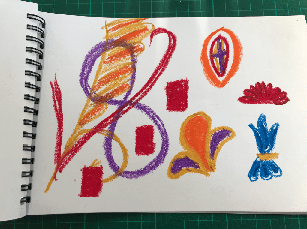
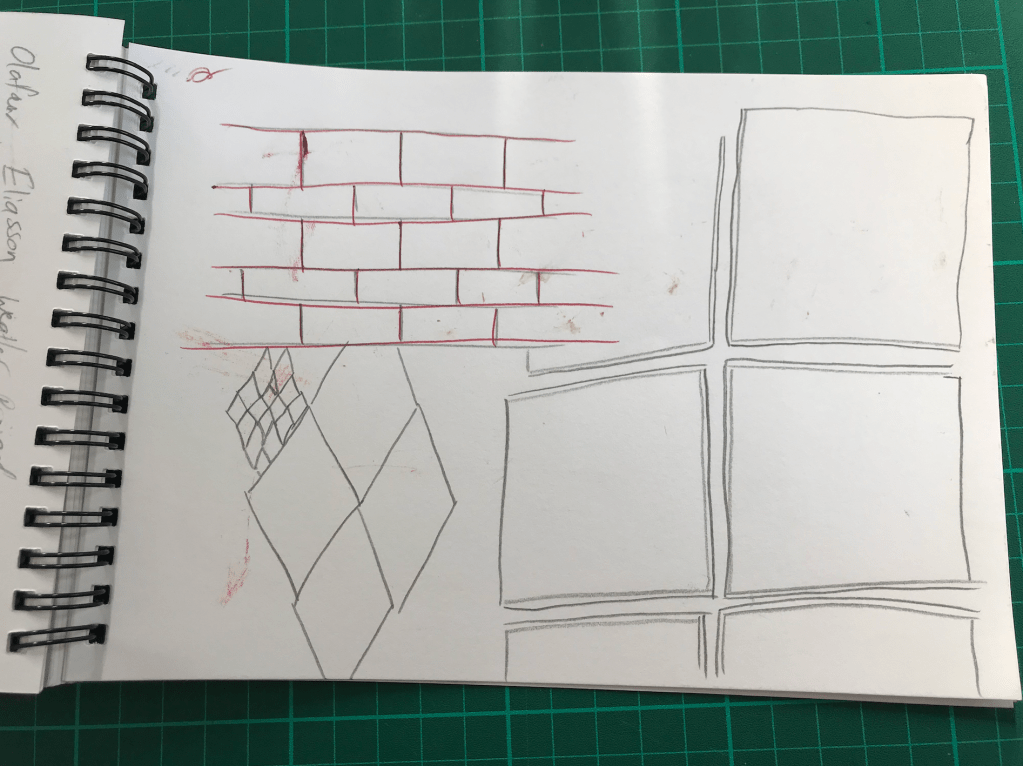
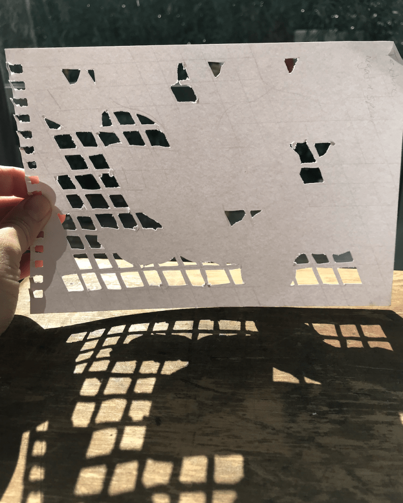
I focused on the use of colour, pattern, shape and symmetry when extracting ideas from Andersons work. I found that the use of symmetry creates the opportunity for pattern making and repetition. I also drew on the subtle details of The Grand Budapest Hotel such as the shadows and trimmings. I used the primary colours keeping the simplicity of the original design. I love the use of the arches and shadow making of layered materials and the atmosphere that the clean lines, curves and symmetry create.
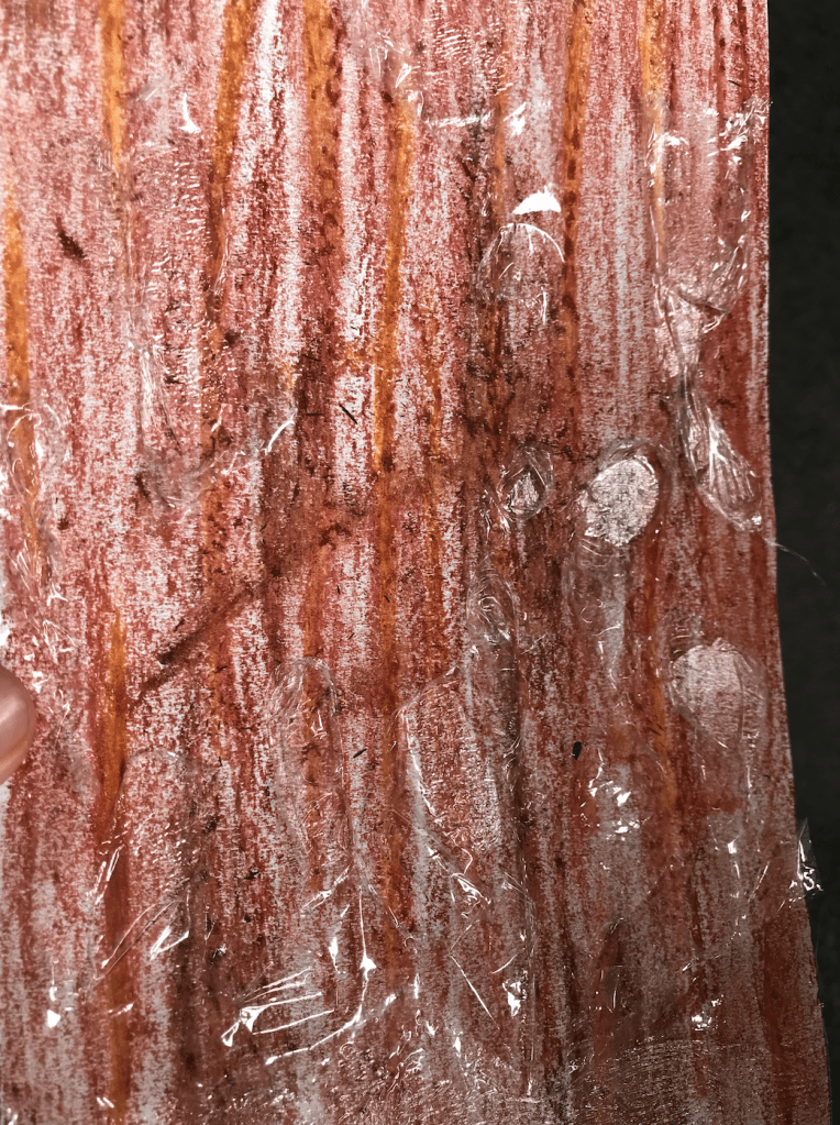
When thinking about my application to the St James Theatre I will explore further the use of shadow making through layering. I will also play with the use of clean lines and repetition.

Model Making:

Model 2 exploring surface textures and shadow

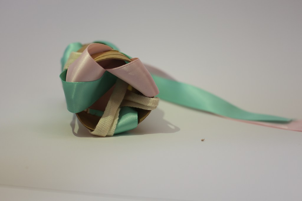
To create my third model I used the ribbon from my second model as it created soft shadows and caught light nicely creating depth. I then drew, from my first model, the layering technique through stacking and applied that to the ribbon. This created a third model that cast very interesting, clear shadows allowing the model to multiply on the surrounding surfaces. Through layering the material it allows light to break up its form making the structure take on new shapes depending on the angle that you view it, transitioning from solid to soft and back again.

Week 3: Group Seminars and Site Visit

Year 2 Semester 1

On Tuesday each group presented their seminar on their specific colour. It was really helpful having the different colours unpacked in a design capacity. I found getting a broader context around specific colours gave them more depth and adds another layer of detail when they’re being used in different spaces and products.

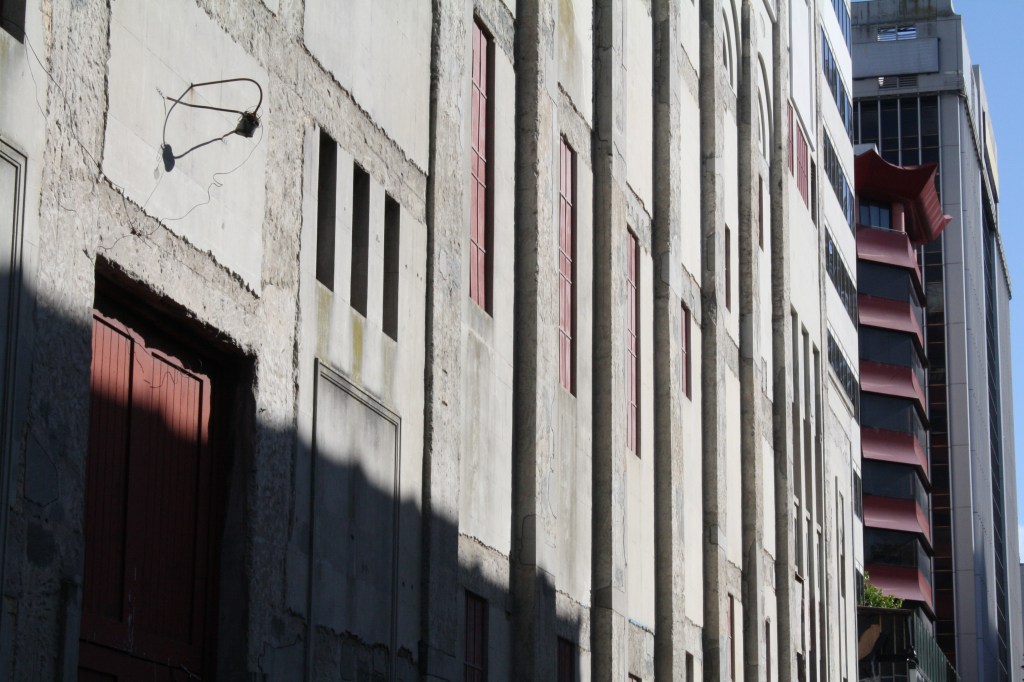
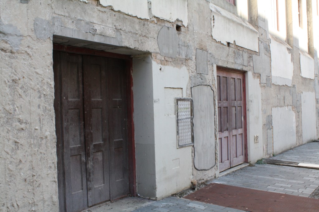
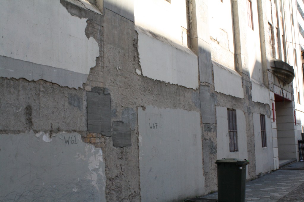
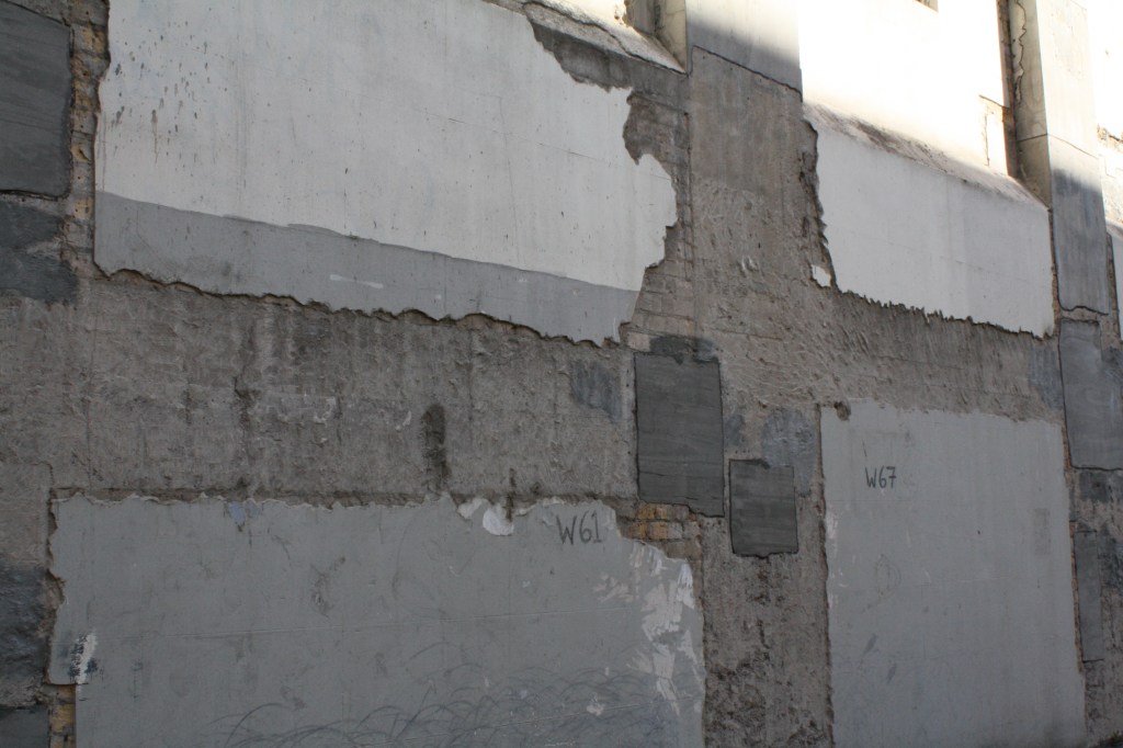
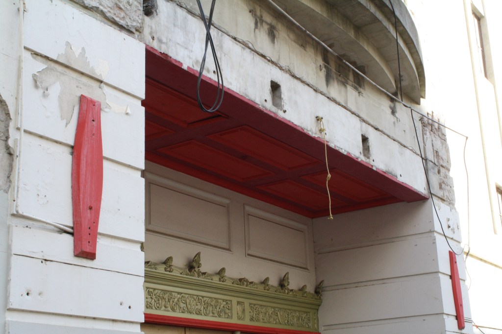
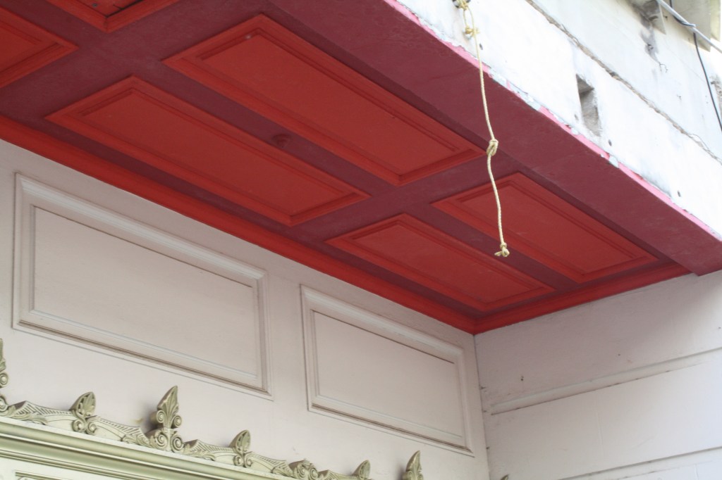
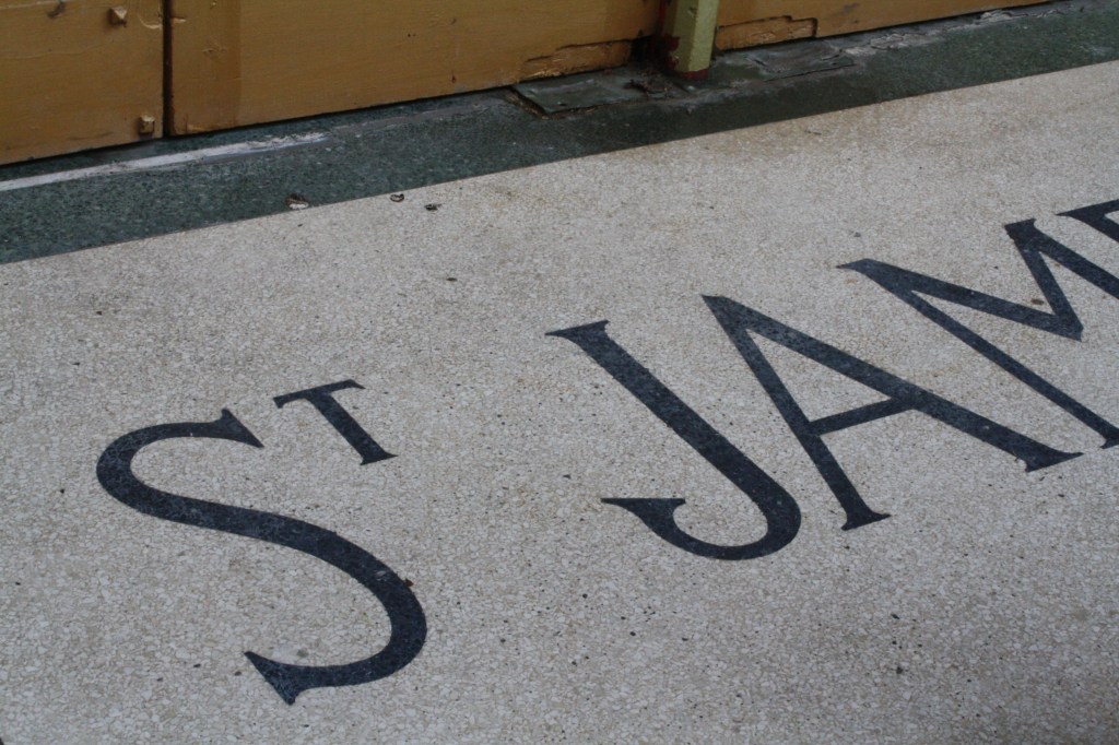
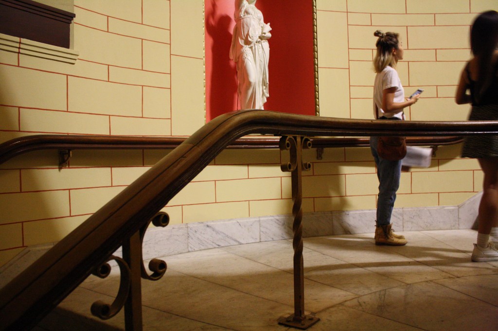
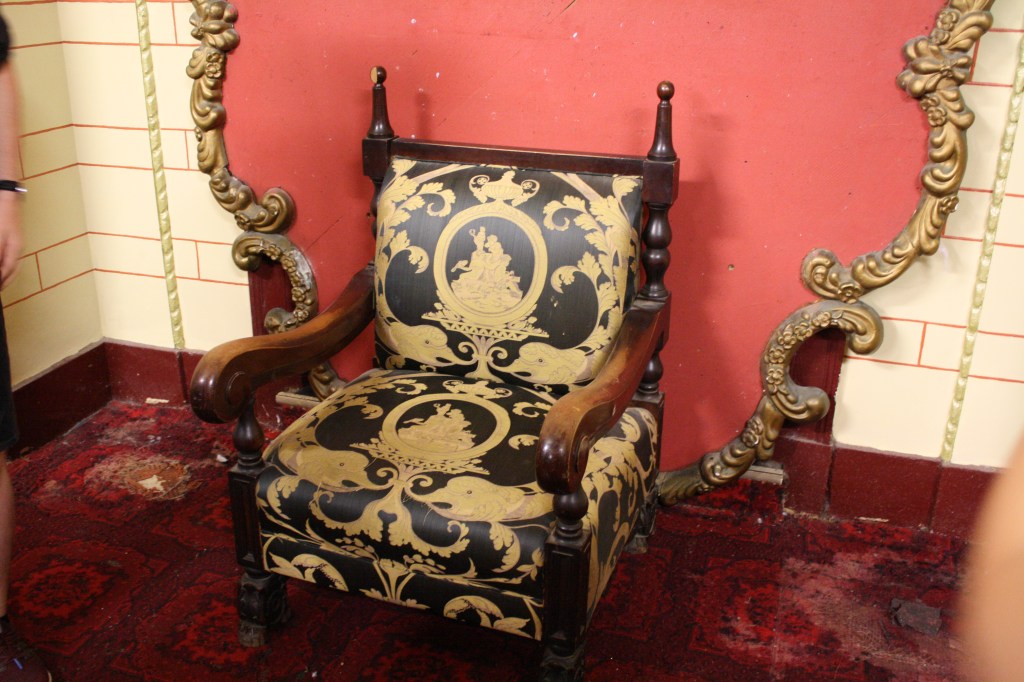
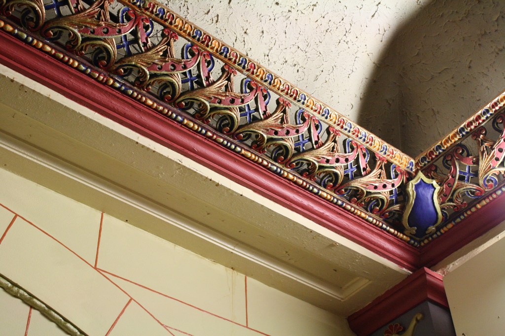
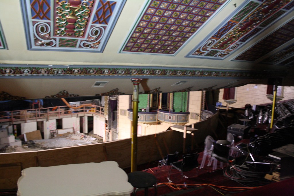
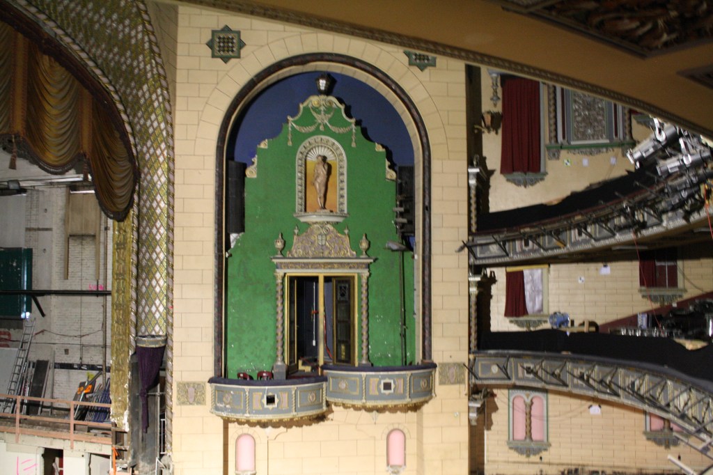
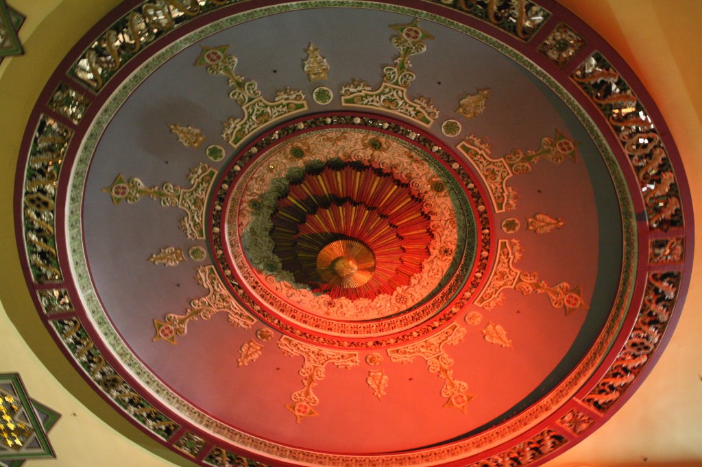
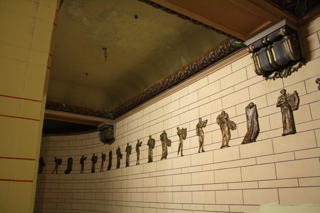
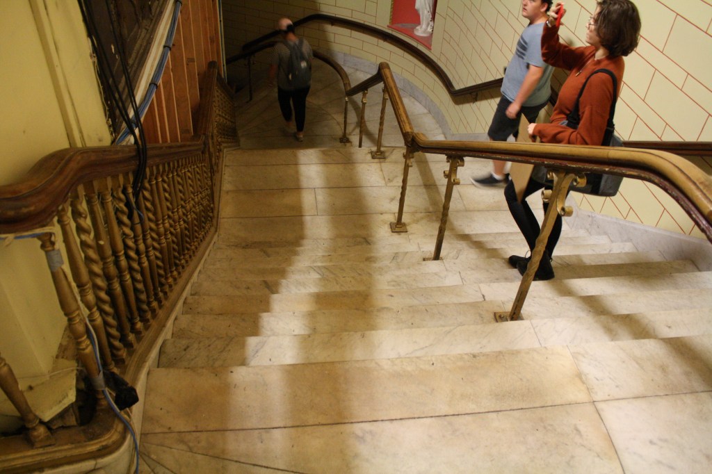
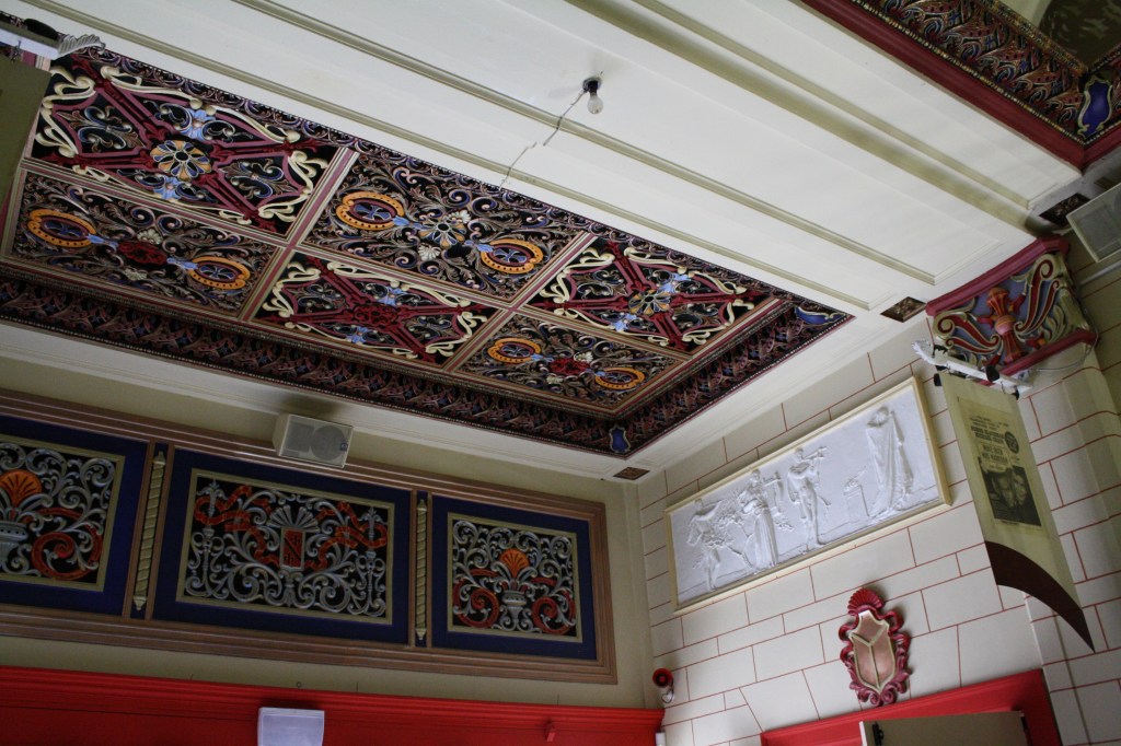
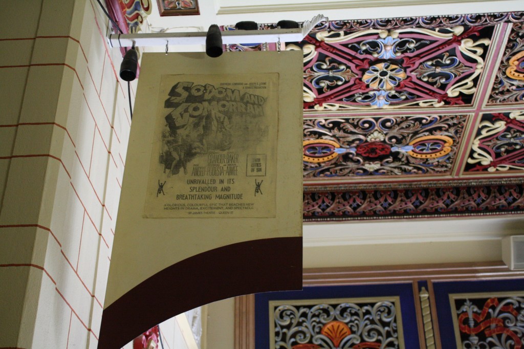
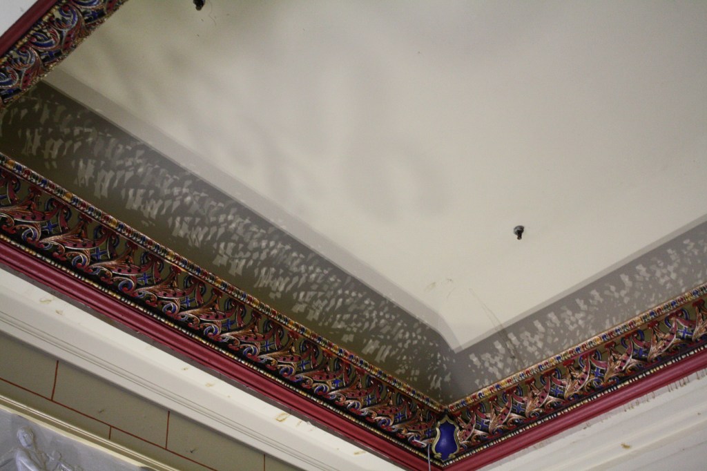
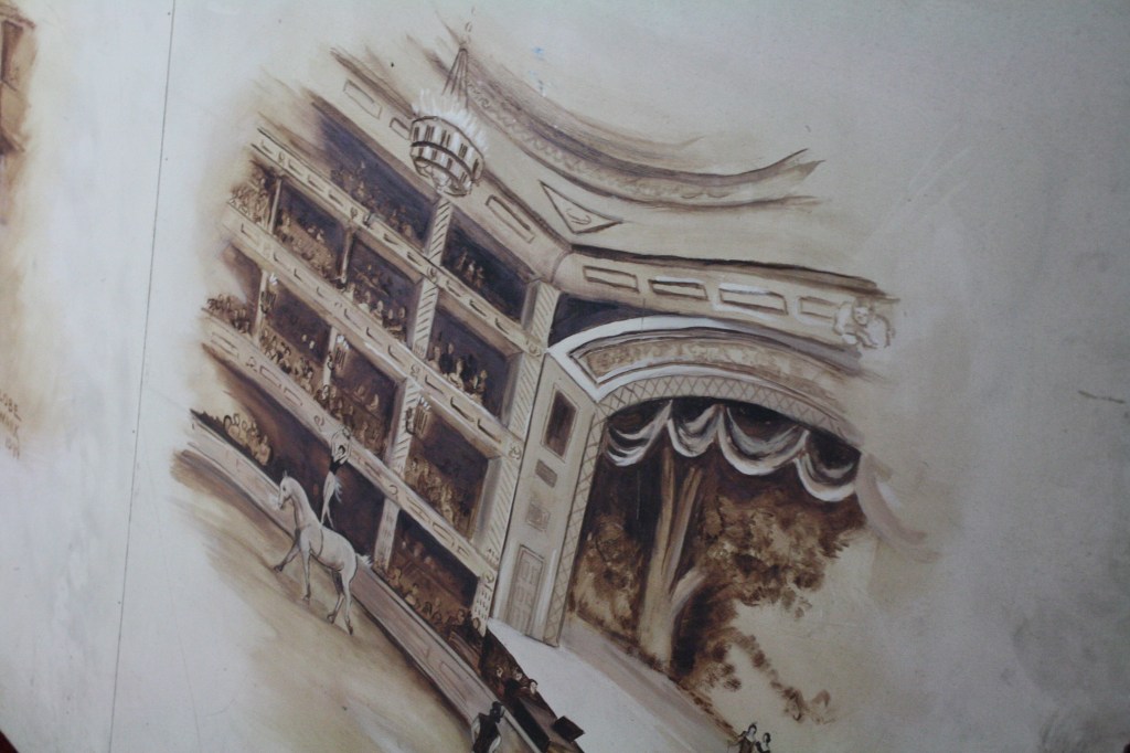
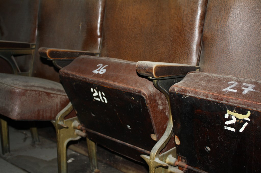
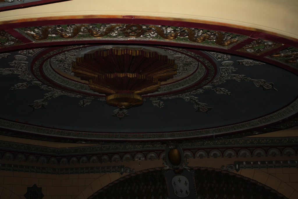
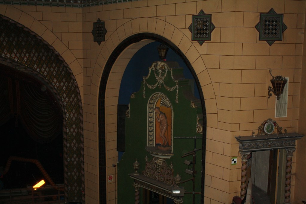
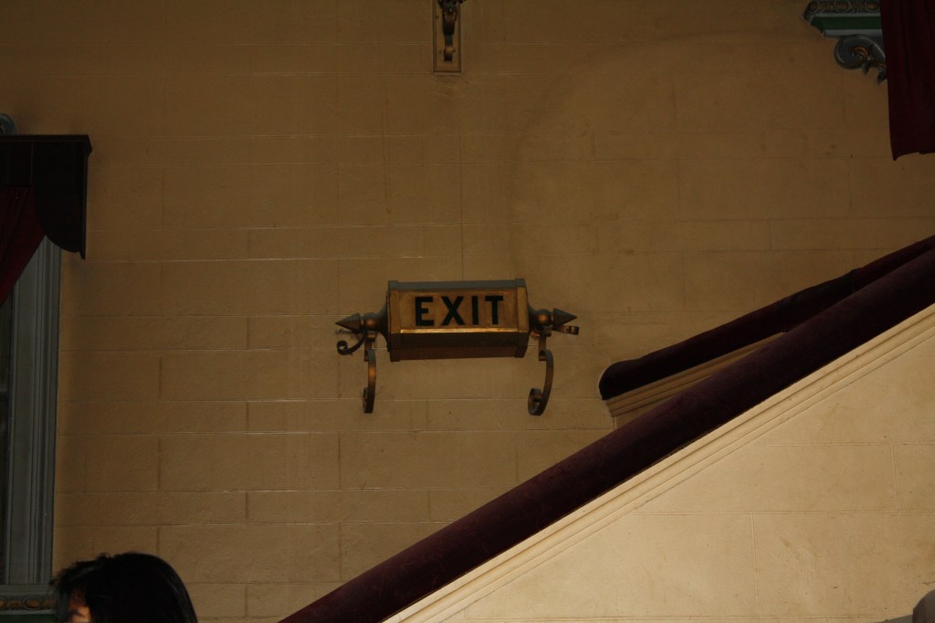
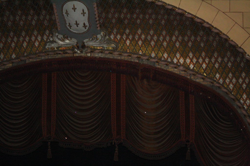
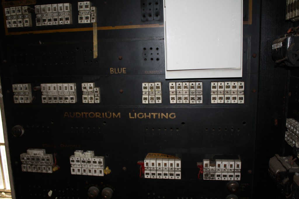
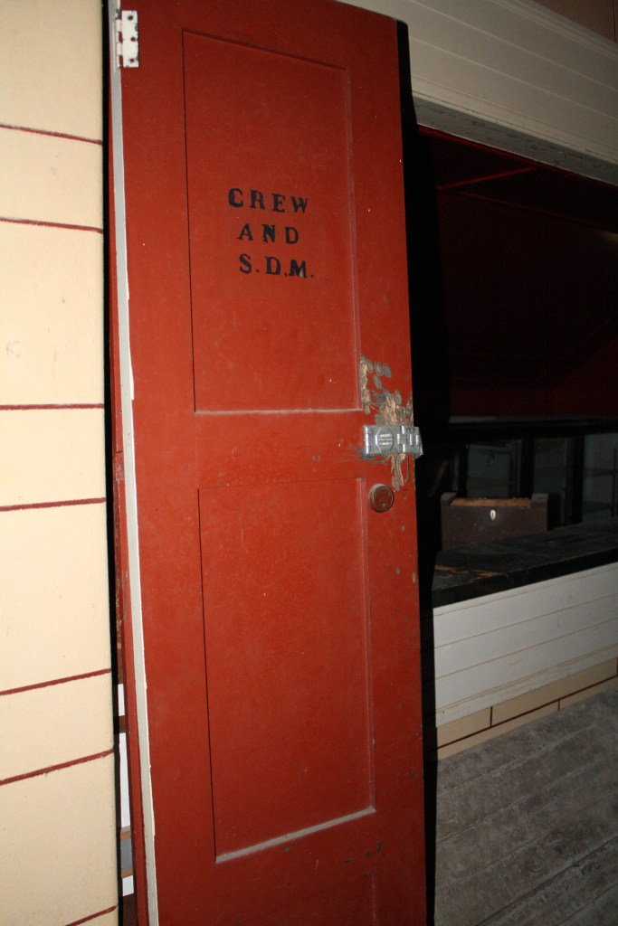
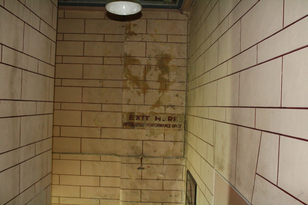
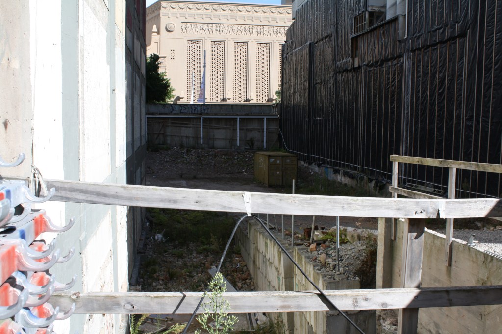
On Thursday we visited St James Theatre. We were given some context to the buildings history as-well as its future. It was built in 1928 designed by architect Henry Eli White who has also designed other theatres around NZ and Australia. The Theatre closed in 2007 due to concerns with the health and safety of the site. The theatre put on a few shows a few years ago so show the public that it was still in good nick and was just in need of repair rather than to be demolished. At this point all repairs and restorations have halted.

The theatre is classified as a “Category I” (“places of special or outstanding historical or cultural heritage significance or value”) historic place by the New Zealand Historic Places Trust.

It’s been a theatre for live shows and a night club Now people break in and drink etc. in its current state.

Experience in drawings:

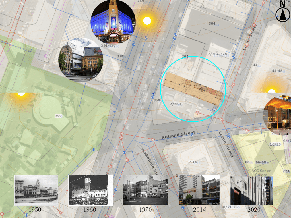
Site Map:

Theory Week 3:

Year 2 Theory

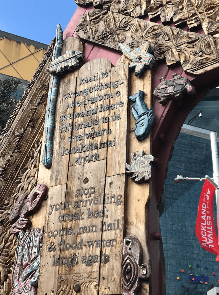
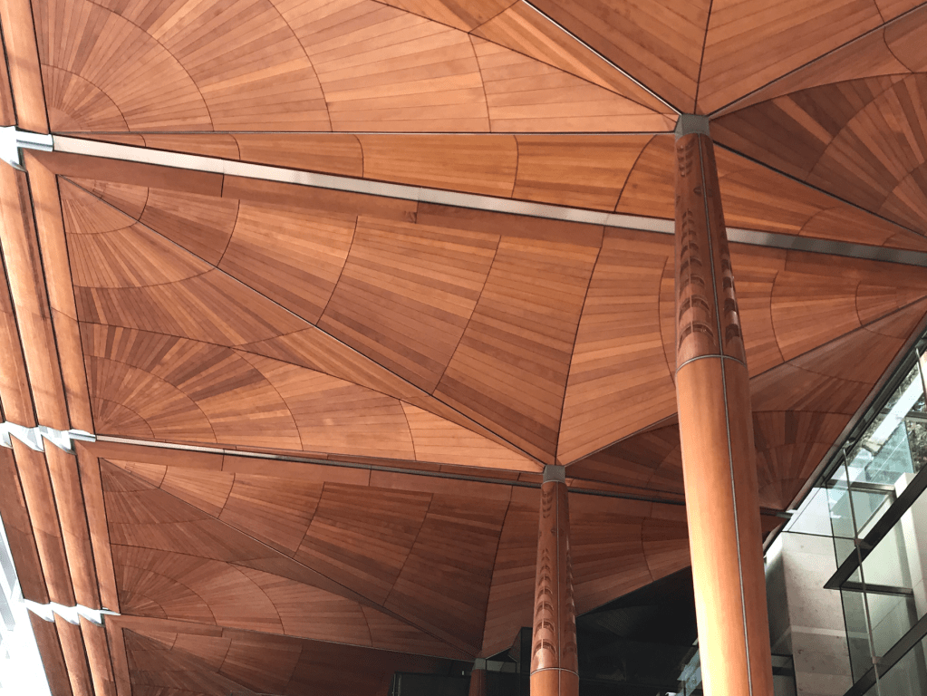
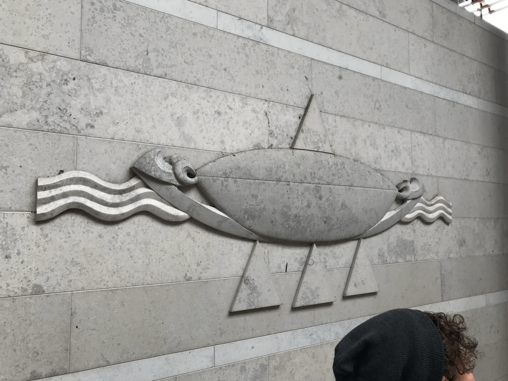
We had Grayson Goffe from the Auckland Design Office, lead us on a walking tour (hikoi) that highlights Māori public art, architecture and design in the city.

Another intention behind this walk was to develop our thinking of how the Te Aranga design principles have impacted the city and how they are applied in practice from an expert

How within a design context do you incorporate without appropriation?

We are allowed to celebrate what we share in common. It’s an opportunity to open up a dialogue. Creative inquiry

Theory Week 4:

Year 2 Theory

Ecology, Landscape, Nature

Texts – John Dixon Hunt, “Reading and Writing the Site” (1992), Rebecca Solnit, “The Orbits of Earthly Bodies” (2003), Timothy Morton, excerpt from The Ecological Thought (2010)

John Dixon Hunt, “Reading and Writing the Site” (1992)

1) What is “second nature”, according to the Roman writer Cicero? What other term could
be used as a synonym for “second nature”, according to John Dixon Hunt? Why is this
kind of nature a “second” nature? What is “first”? (pp. 131-32)

  • Second nature is “all of the elements which men and women introduce into the physical world to make it more habitable, to make it serve their purposes.”
  • A synonym could be an augmented nature, derivative nature or mediated worlds.
  • This is a second nature as the things built upon the land came second to the land itself.
  • First nature is the untouched land e.g. the wilderness

2) What is “third nature”? Why do you think this is “third”? i.e. why is “third nature” said to “go beyond” or be an advance or development upon “second nature”?

  • Third nature is things like gardens where nature has been carefully curated and designed
  • I think this is “third” because its a form of going back to the original first nature but because it is intentional and designed it isn’t first nature.
  • It goes beyond second nature because its purpose is more for pleasure over utility

3) What does John Dixon Hunt say is the main point he is trying to make when he brings up the terms first, second, and third nature? What do these terms tell us about the human relation to nature? (132)

  • “The point to emphasise here is the fashion in which first nature has constantly been processed for human consumption, either into second or into second and then third natures.”
  • This tells us that humans are always processing the landscape to see what it can give us in either functionality or beauty. What more can we get out of our landscape. It is a very selfish mindset.

4) What is the “picturesque”? (p. 132) What does this word mean in common parlance?
What does it mean in relation to the history of landscape design? Look it up online and
find out as much as you can about it.

  • The picturesque is “a mode of processing the physical world for consumption or for our greater comfort.
  • In common parlance it means something visually attractive. A picture perfect scene.
  • In relation to the history of landscape design, designing has been influenced by the expectation that the end result is “picturesque”

5) What is the “sublime”? (p. 132) What does this word mean in common parlance? What does it mean in relation to the history of art and philosophy? Look it up online and find out as much as you can about it.

  • Sublime is a term used for the features of nature that are ‘terrifying and threatening’ to make them more manageable mentally and culturally.
  • Today it means of great excellence
  • Sublime in the history of art and philosophy has been deemed an artistic effect productive of the strongest emotion the mind is capable of feeling. https://www.tate.org.uk/art/art-terms/s/sublime

6) What is a garden? How does John Dixon Hunt define the garden, on p. 133? (Clue: What does the word “milieu” mean? What is its etymological/original meaning? Look this up.)

  • A garden is a piece of land where plants and nature has been curated and intentionally placed for the benefit of humans.
  • “Gardens are, if not ways of actually coming to terms with the first and second natures, at least retrospective ways of registering ways on how we have come to terms with them.”
  • Milieu means a person’s social environment
  • The etymological/original meaning is middle place

SOME KEY WORDS / CONCEPTUAL TOOLKIT from Dixon Hunt’s article
First nature | Second nature | Third nature
Cultural landscape
The Picturesque
The Sublime

Rebecca Solnit, “The Orbits of Earthly Bodies” (2003)

1) What is the great irony about living or holidaying in the countryside that Solnit points
out in the first few paragraphs of her article?

The irony is that she is constantly leaving the place she’s staying. Driving to run errands, see friends or sight see.

2) Solnit is trying to burst some of our illusions about the countryside. What are some of
the common illusions that we have about living or holidaying in the countryside?

Some illusions are that the country side is more of a natural way of living. That you are able to slow down and escape from it all when in reality that only happens for part of the time. That time ends every time you jump in the car to do something practical.

3) What are ranchettes? What does Solnit mean when she says that “ranchettes seem to
preserve the frontier individualism of every-nuclear-unit-for-itself; they’re generally
antithetical to the ways in which community and density consolidate resources”? (334)

Ranchette – A small ranch or large home lot, often on the outskirts of a major metropolitan area and just past the planned neighbourhoods.

Ranchettes are the country version of the suburbs which people commute out of to their “real communities, jobs, research and resources”. Lifestyle blocks for people who want the space but have no intention to work the land. Solnit is trying to communicate that these are ranchettes are counter productive. they put strain on facilities that were designed to cater for their immediate community not the wider outskirts of the area. It takes a-lot of resources without any real contribution.

4) What is the “new urbanism”? (334 bottom) Look this up online and find out as much as
you can about this movement. Why is Solnit ambivalent about the new urbanism?

New urbanism is an ‘urban design movement which promotes environmentally friendly habits by creating walkable neighborhoods containing a wide range of housing and job types’. – wikipedia

Solnit is ambivalent because on one hand it provides an opportunity to create accessible ‘public luxury and pedestrian space’ and bring back a sense of community as neighbours mingle in their day to day but on the other hand most of the US is designed to “make driving a necessity” and these people on the outer areas of a new urbanism community would be left isolated from the community.

5) According to Solnit, how have we tended to define nature? What’s wrong with this
way of defining nature? (p. 335)

We have tended to define nature as ‘things to look at’. The fault in this way of thinking is we as human beings are natural so everything we create, evolve and develop is natural as it steamed from us. ‘Natural’ should be were we are comfortable, able to sustain ourselves and where your ‘scale is adequate’.

6) Why do you think Solnit compares city activities (shopping, people-watching) to hunting and gathering in the wilderness? (p. 335 middle) Why do you think she says that New York City might be the most natural space in all of America? (p. 335 top)
What is she trying to do to the way we think of cities?

  • I think Solnit compares these things as they are essentially the same things when you break them down. You are looking for food and sustenance, keeping an eye out for danger, companionship or safety and replenishing supplies to comfortably survive.
  • New York might be the most natural place in America as there are no social, economical or cultural barriers stopping people from inhabiting the same space. This means you get all sorts of people from all sorts of walks of life mixing and rubbing shoulders with each other every day.
  • Solnit is trying to shift our way of thinking about cities being an unnatural concrete jungle to a natural evolution of a community of people inhabiting the same space.

7) What’s the problem with the term “pedestrian-scale”? (335 middle)

The problem is it only caters for able bodied individuals. This way of thinking excludes a huge percentage of our population.

8) Why do you think Solnit included a found quote from a Pottery Barn catalogue as her
epigraph? What does the epigraph tell us about the point she is trying to make in the
essay?

I think Solnit included the quote to point out how we idealise rural living when living in an urban community. The point this makes is that humans are never satisfied with their reality as things like work, commuting and errands follow us everywhere we go.


SOME KEY WORDS / CONCEPTUAL TOOLKIT from Solnit’s article
Nature vs Culture | Country vs City | Rural vs Urban | Individualism vs community (p. 334)
New urbanism (p. 334 bottom)
Democracy and democratic space (p. 335 top)

Timothy Morton, excerpt from The Ecological Thought (2010)
As you read through this excerpt by Morton, jot down a list of your own questions about it,
and, if there’s time in tutorials, raise them with your tutor.

Theory Week 2:

Year 2 Theory

Readings:

Too Close to See: Notes on Friendship, A Conversation with Johan Frederik Hartle by Celine Condorelli and Support Structures: An Interview with Mark Cousins by Celine Condorelli

How would you define a ‘support structure’?

A skeleton-like structure designed purely for the function of providing support to another structure. Often with no beauty incorporated into its design.

What are some examples of ‘support structures’? Physical, political, conceptual, etc.

A physical support structure is something like scaffolding and buttresses, political support structure could be a government party or voters/supporters. Conceptual support structures anything that is committed to keeping something upright.

What are some conditions or requirements for a structure to be considered a support?

Has a positive impact, is second in priority, committed to the success of the structure.

What is the relationship between the supporter and the supported?

I would say that it is a partnership designed to uplift one by relying on the other.

How might we connected the format of the texts (as conversations) to her notions of support?

Conversation is relationship/friendship which is a support structure in itself. 

What is Condorelli’s creative practice?

Installation artist

Can you identify the threads of connection between her writing and her making? What are they?

Both her writing and making cause you to look at things from a new perspective and reflect on the relationship between things and the result of that relationship.

She identifies ‘friendship’ as having a political dimension. What does she mean by this? How does she discuss this in the text?
I think she means that in friendship you are invested in a certain outcome and are both rooting for that same outcome. Much like politics where you both want the same thing so work together to achieve success to create change or strengthen a way of life.
How would you define ‘friendship’? What about ‘solidarity’?

I would define friendship as a mutual appreciation for each other, the enjoyment of their company and companionship and an investment into their success and wellbeing. I would define solidarity as the reliance on yourself only and the commitment to one way of thinking.