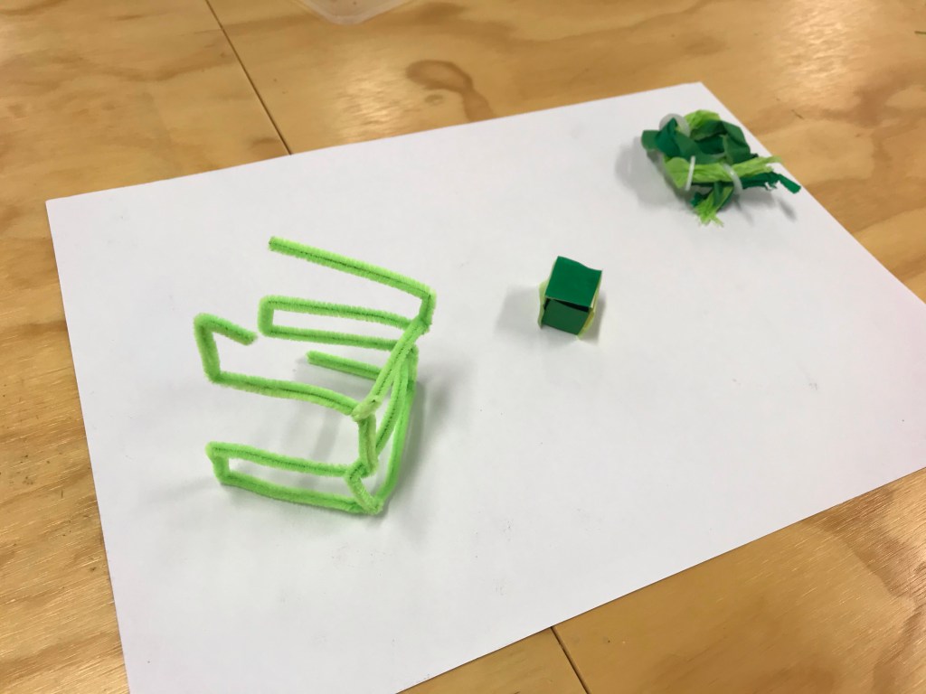
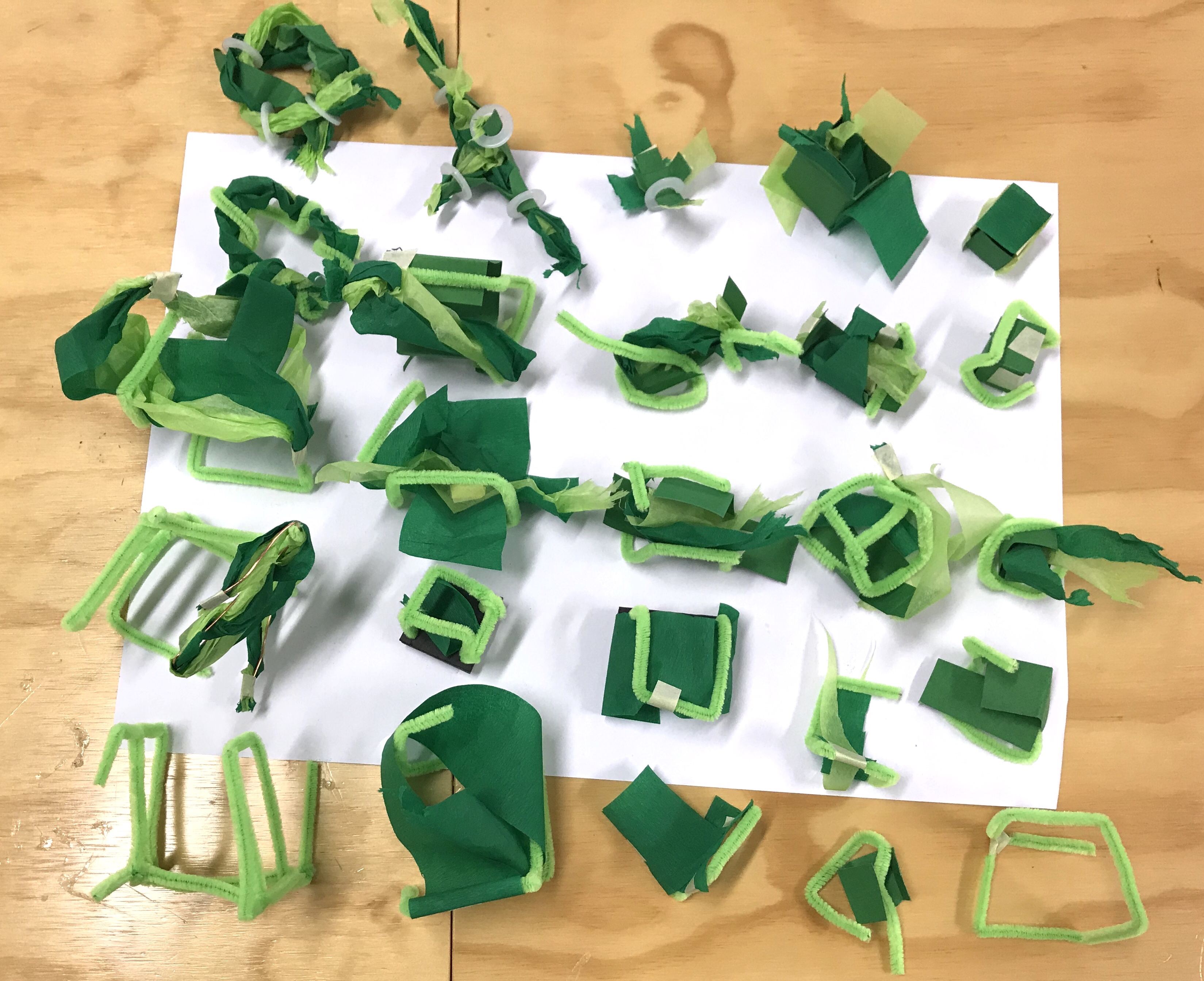
Today we created 3D models from our 2D colour collages.
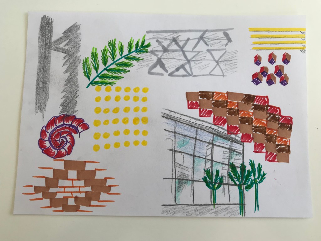
Before I started making my models I analysed my collage, looking for elements that could expand nicely into a 3D model.
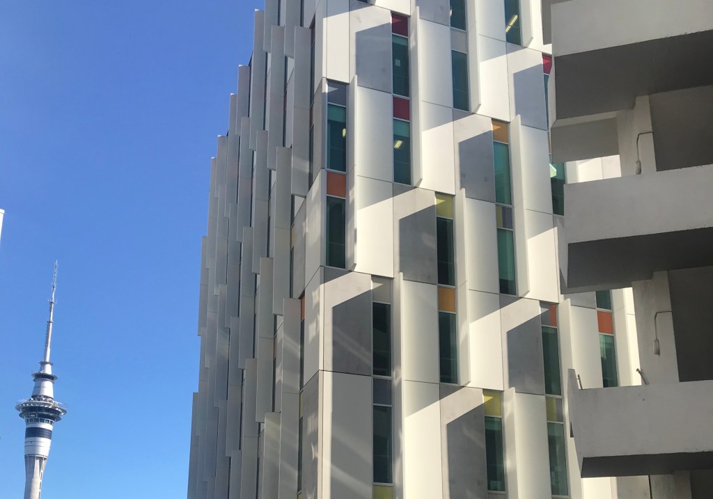
In my collage I had focused on the bright detail colours rather than the greys of the cement. I have also drawn on reflections and shadows.
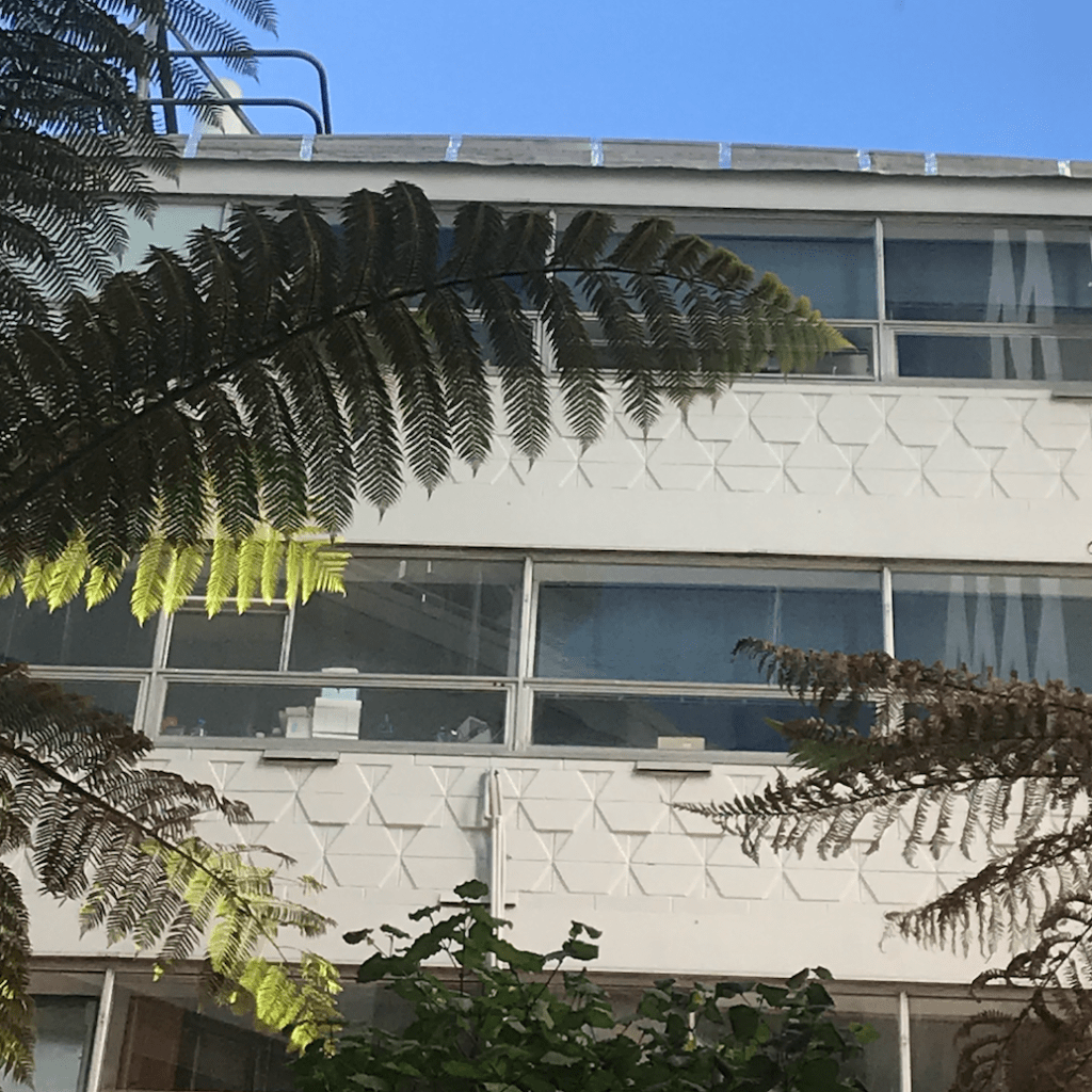
In my collage a grid like pattern re-appeared a few times. This contrasted the plants that I had incorporated showing the contrast relationship within the city of nature vs the urban environment.
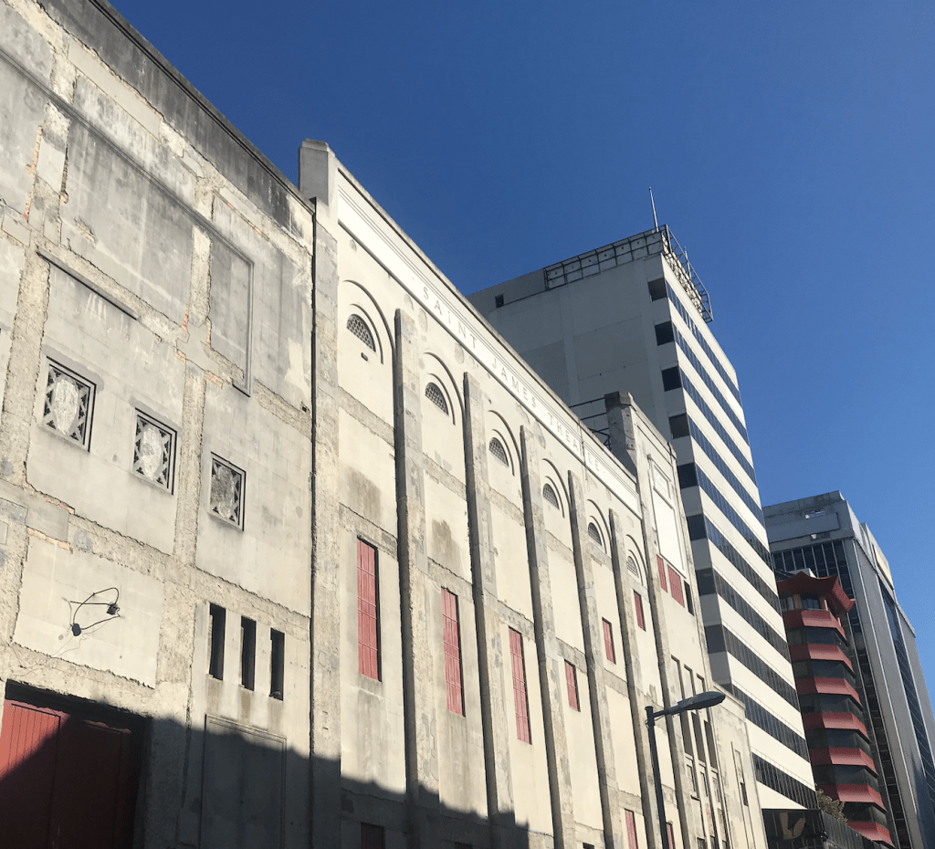
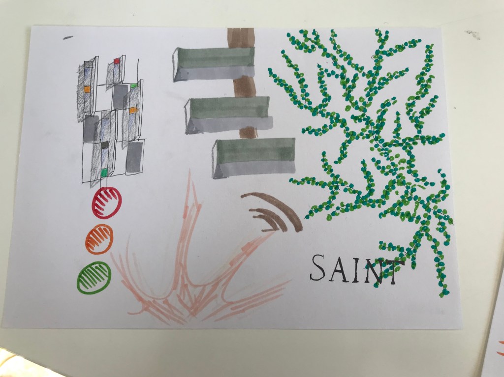
From left to right the collage takes you along the walk from Aut to Saint James Theatre. This wasn’t originally my intention but came through really nicely and gives my collage a sense of coherence.
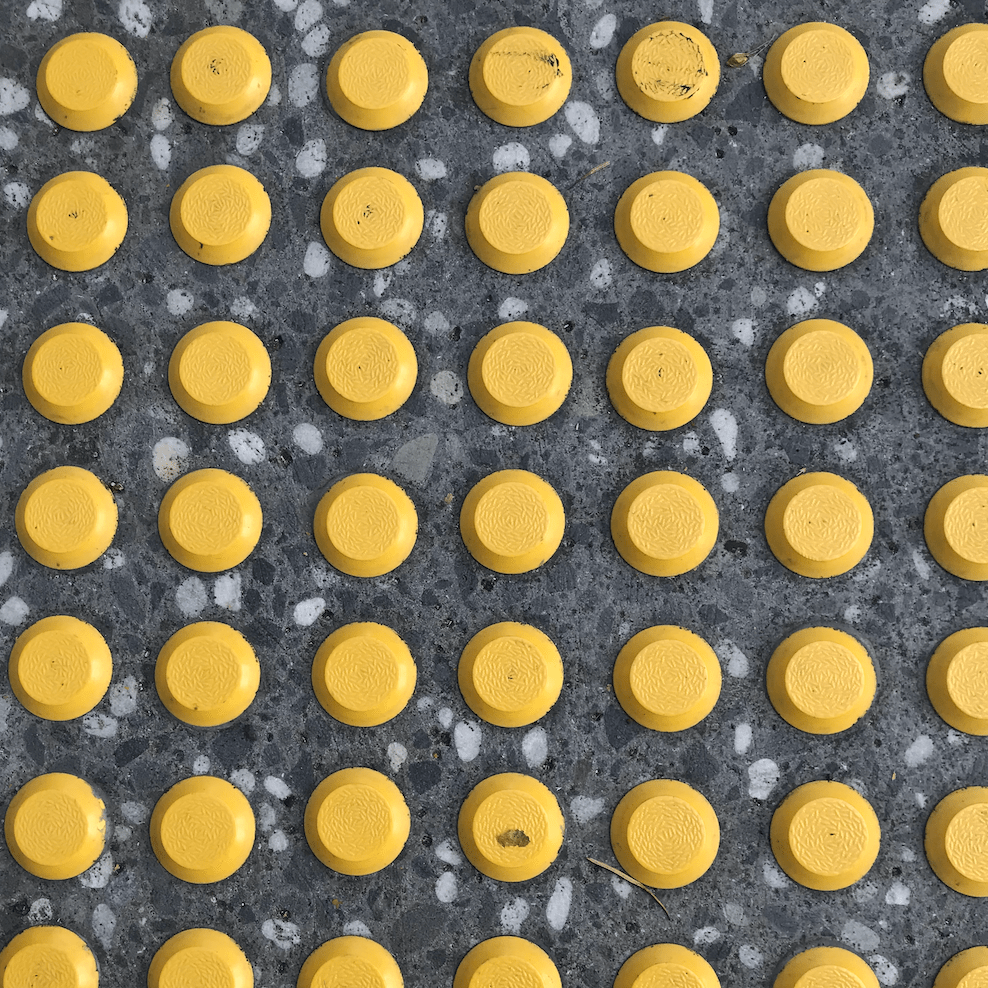
When looking at my 2D collage I saw that some of the grid used for the windows could be folded into a box. The stair shape could also link to the brick work in a 3D capacity or could just be an interesting shape to work with. The yellow dots also have to potential to become spheres or tunnels.
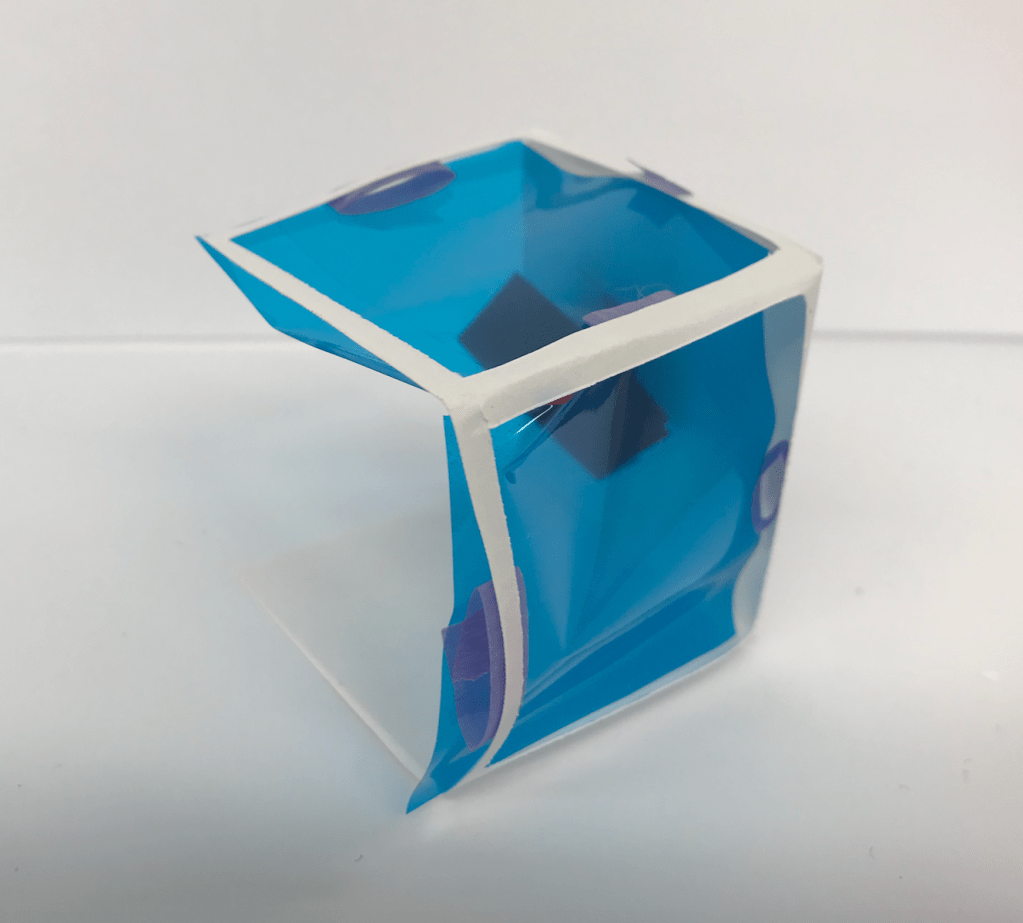
Model 1. Focusing on Colour, Light and Shadow 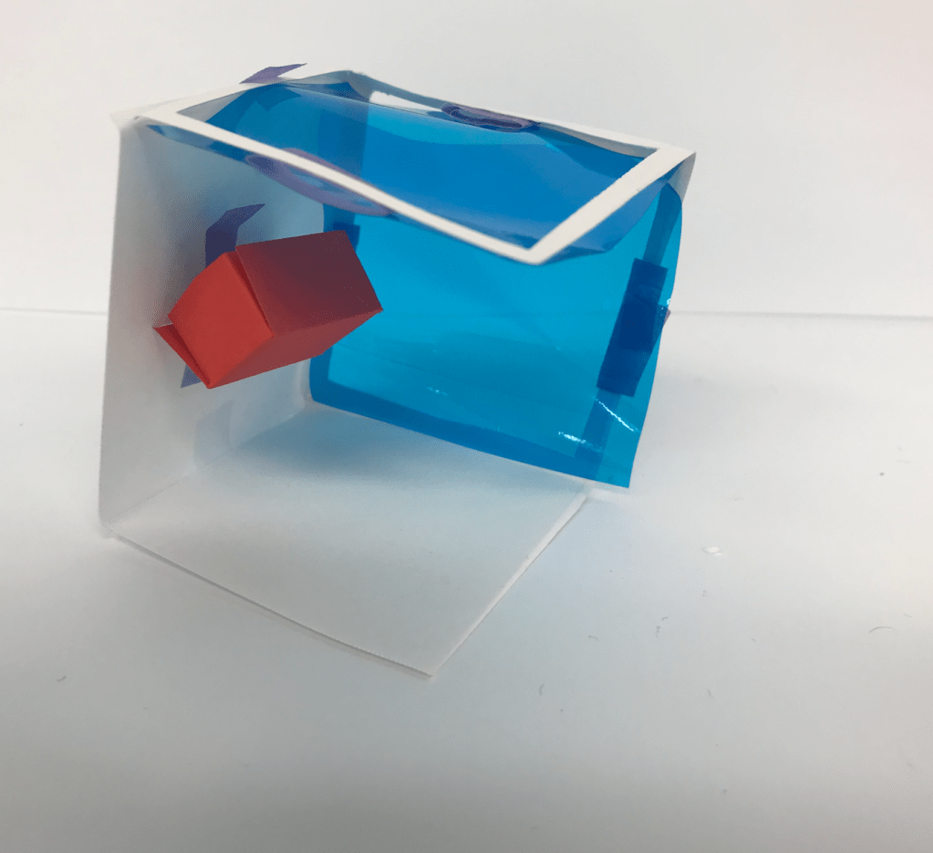
Model 1. 
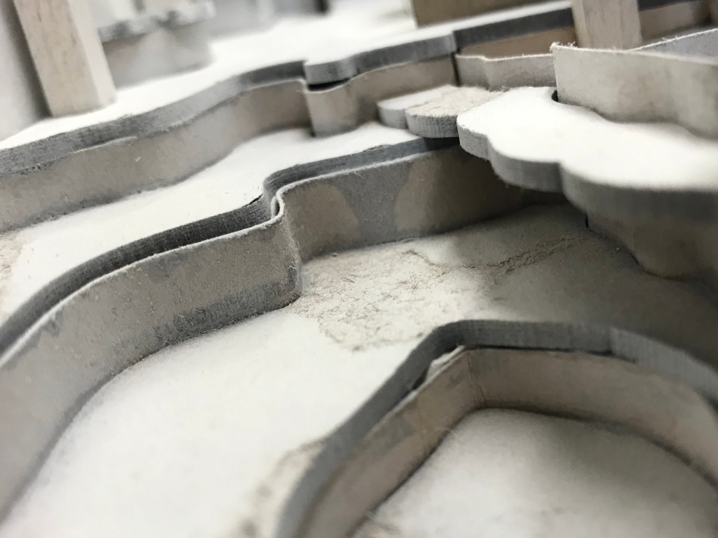
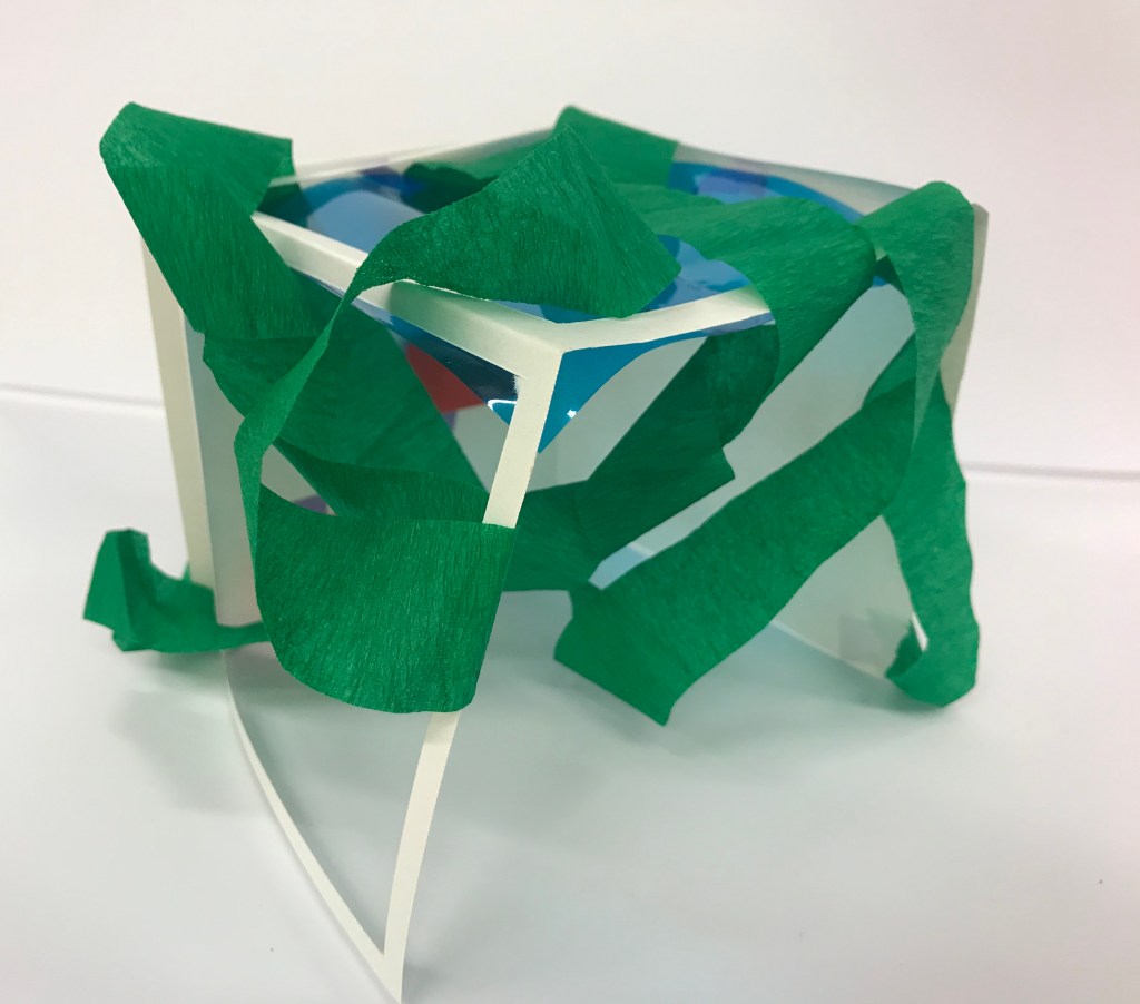
Model 2. Focusing on Surface Texture and Shadow
Model 1 Analysis: The blue window created a projected blue hue on the surrounding surface. Projected colour as opposed to applied colour. Having the box open allowed for interesting shadow and light play to move within the space as-well as play with open vs closed space. Looking through the blue window also changed the colour of red brick when looking through it.
Model 2 Analysis: In focusing on texture I drew on the contrasting textures of the matte aspects of nature and the glossy shiny aspects of glass from the buildings. In looking at my model it almost tells a story of nature trying to reclaim the urban environment as the matte green wraps itself around the glossy blue structure. The shadows it creates is a broken up blue hue where the light can cut through and dark where the green intersects the path of light emphasising this idea of nature taking over.
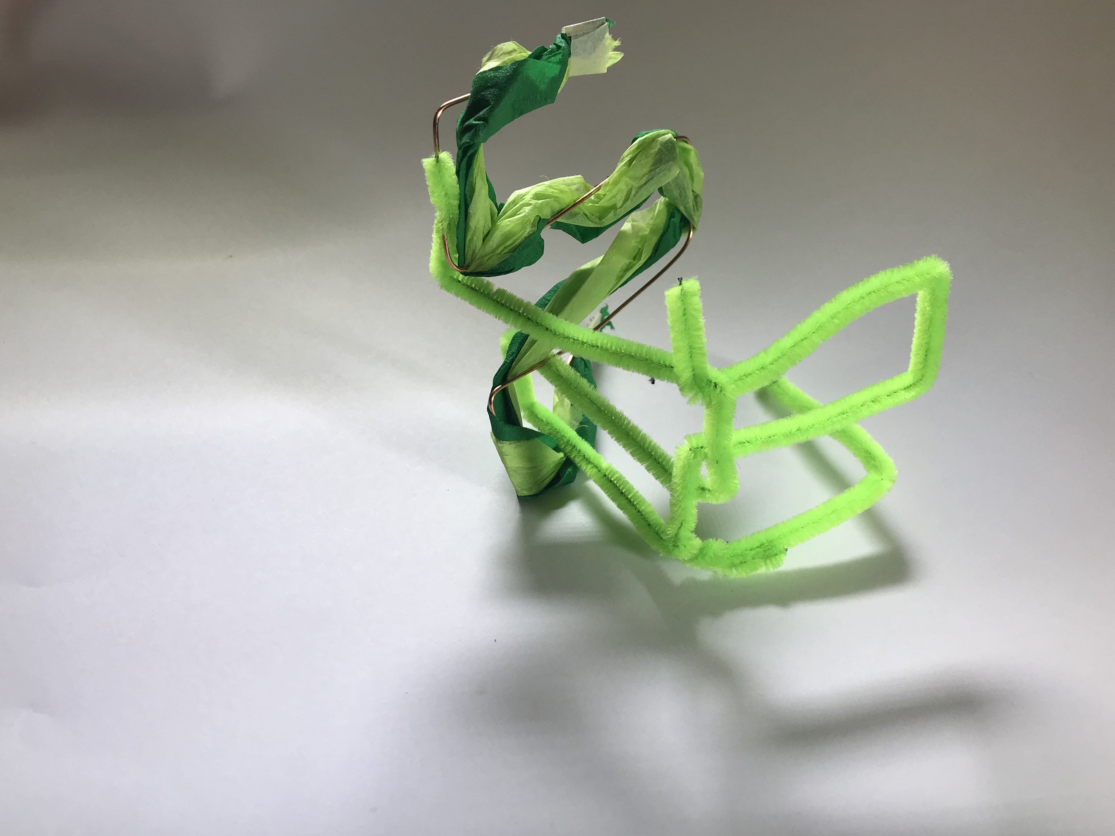
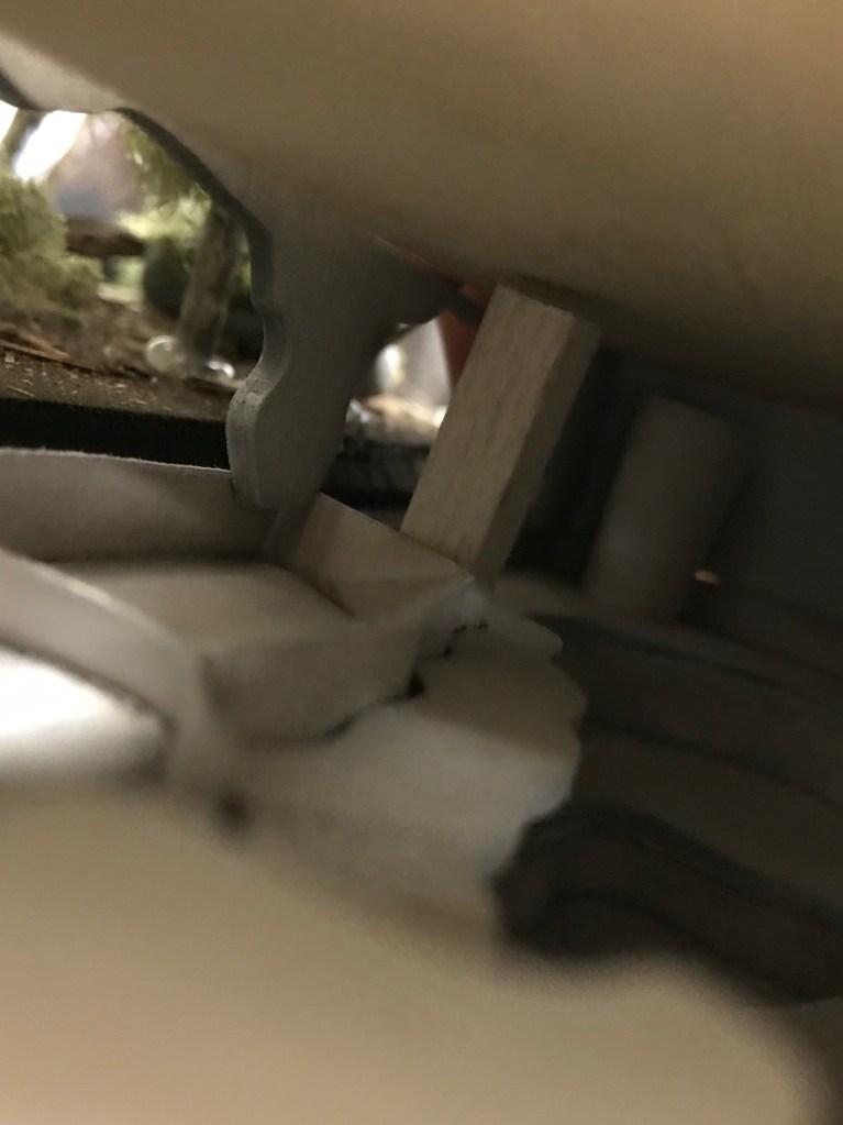
Model 3. Connecting models 1 and 2 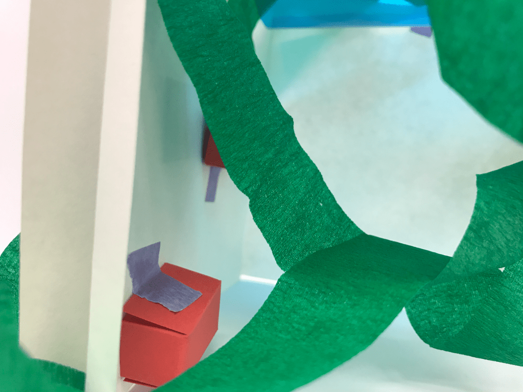
Interior view of Model 3 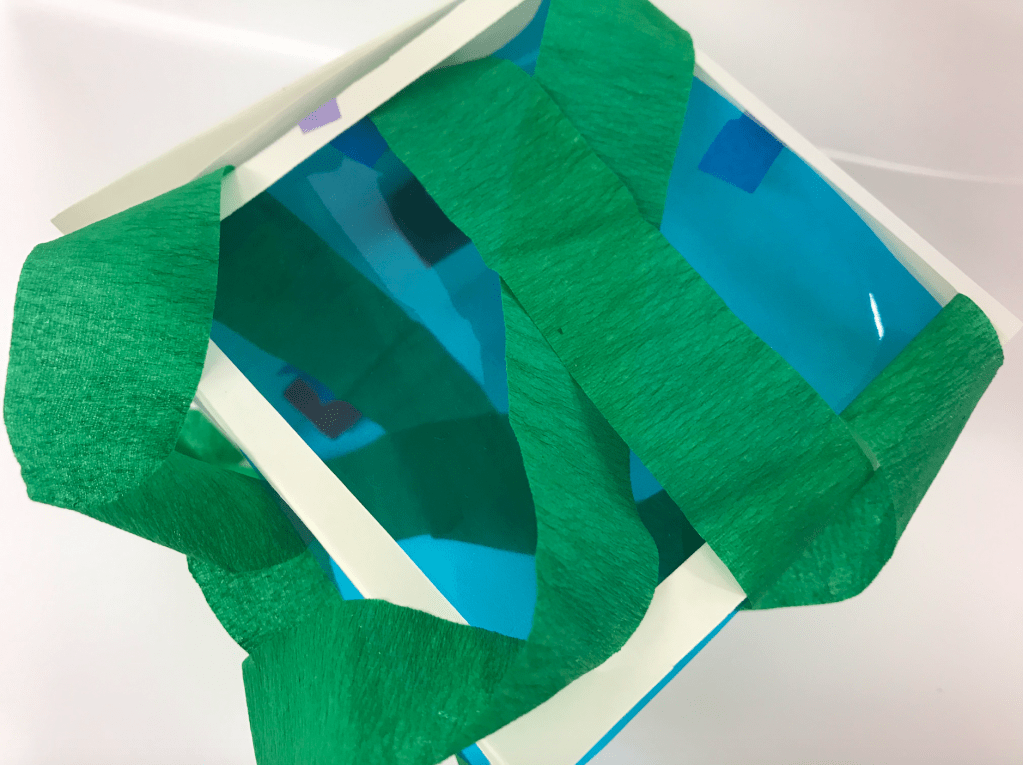
Top view of Model 3 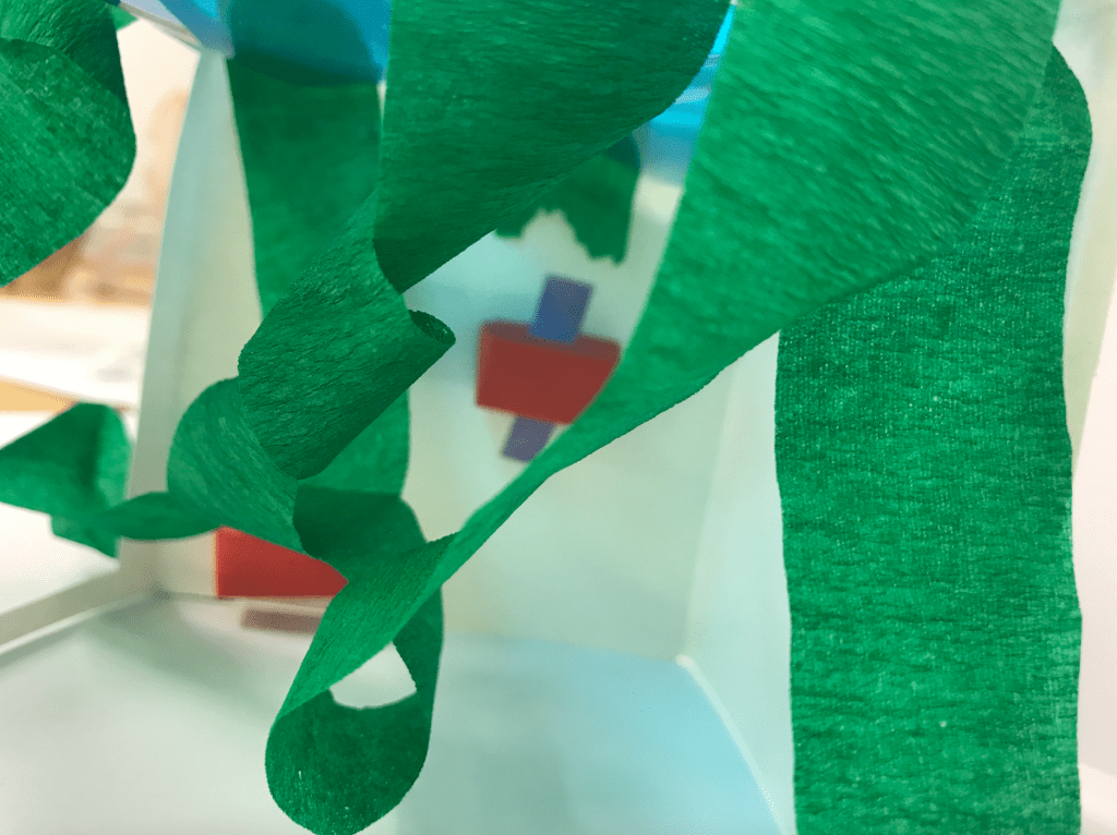
Interior View of Model 3 
Interior View of Model 3
In our third model I had to connect models 1 and 2. I continued the theme of nature trying to reclaim the urban environment by wrapping the green in and around the model. i used the window design of model 1 which allowed the green of nature to penetrait into the interior of the space. the two models married quite well. i used clean suare lines