Other work examples:
- https://drive.google.com/file/d/1IFPy5E-BUjgpYFptYFWDDKZD1w6_AYnR/view
- https://www.atelierjonesdesign.co.nz/blogs/news/i-spy-with-my-little-eye-public-installation-for-art-week-2019
- https://www.dezeen.com/2015/05/18/tripod-installation-likearchitects-stairs-balconies-porto-portugal/
Co design work shop on Wednesday:
Workshop:
Some of the feed back i got from Frank Liu at the co design workshop was to make the interior space of the house, useable. Up until now i was intending for my work to be for observation only but it makes more sense to allow access when reviewing my initial concept of connecting otherwise distanced neighbour’s and provided the physical space to meet one another in a neutral zone.
I was also encouraged to consider the way my intervention functions at night as well as in the day. Are there specific times that its open? Do you have curtains that close as night? How is it lit?
Some elements of my design that i need to communicate more clearly are details around materials, time of access, who can use the space/ how many people can use the space, why i’ve used an industrial styled faux fire escape, whats the significance of the fire escape (allegory for the urban environment?), what is the space inside doing, whats the specific narrative?
Design Development:
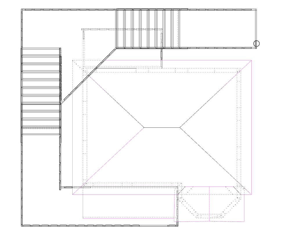
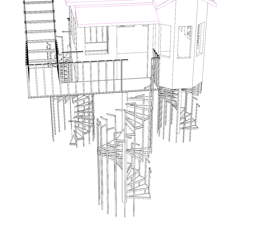
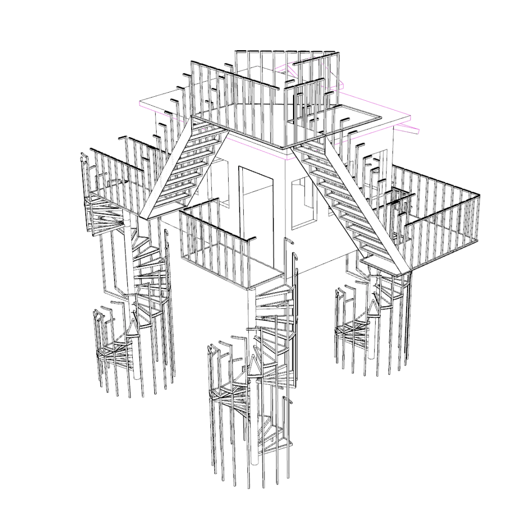
Fire Escape section –
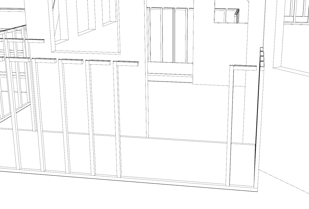
My current design has too many holes in the fire escape section and would be unsafe for the public. Looking at the style of home that i have based my installation house off of, they all have a front porch or has a white picket fence around the front. I wanted my railing on the fire escape to me an ode to that element of that era/ style of housing.


Multiple vertical pieces in a line to form a barrier. I did want to add a modern spin on it by having the vertical section curve to be horizontal at the top. creating a hand rail.


I also changed the lay out of the Fire escape and the way it wraps around the house.
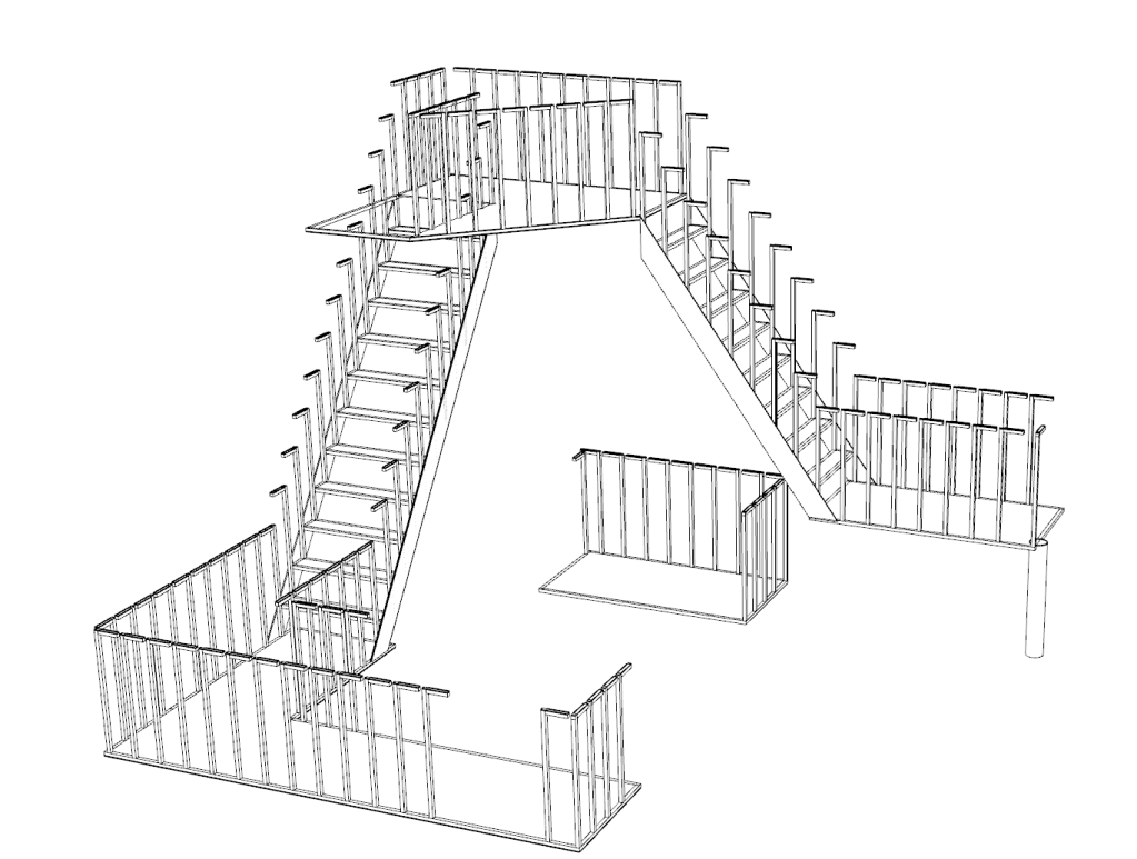
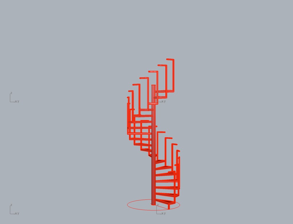
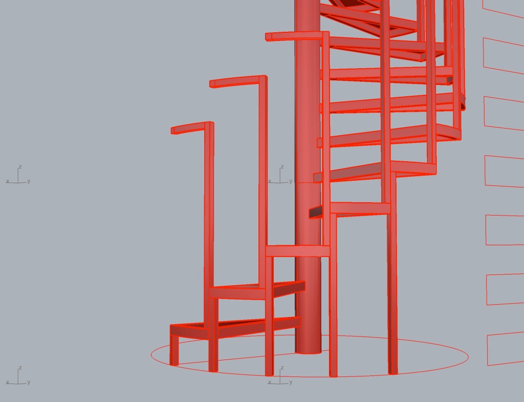
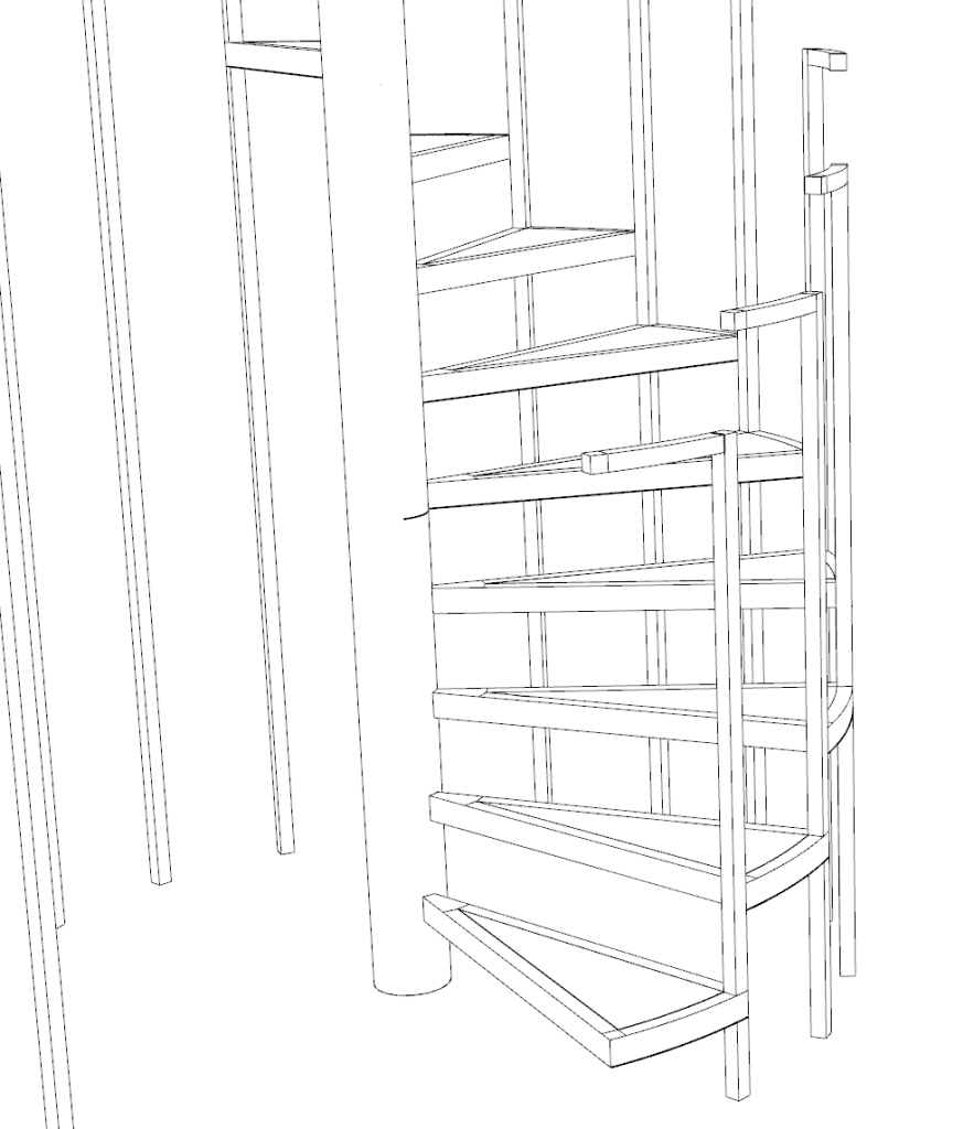
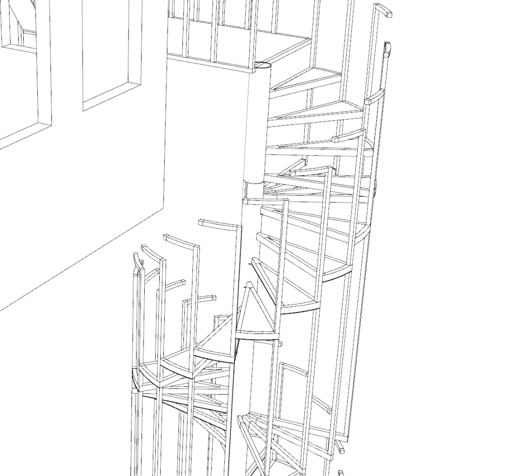
Stair Development –
I didn’t like how dense my first rhino model of the stairs looked. I wanted it to be skeletal like many industrial structures are like scaffolding etc. I also wanted there to be opportunity for kids/ small people to weave through the structure.


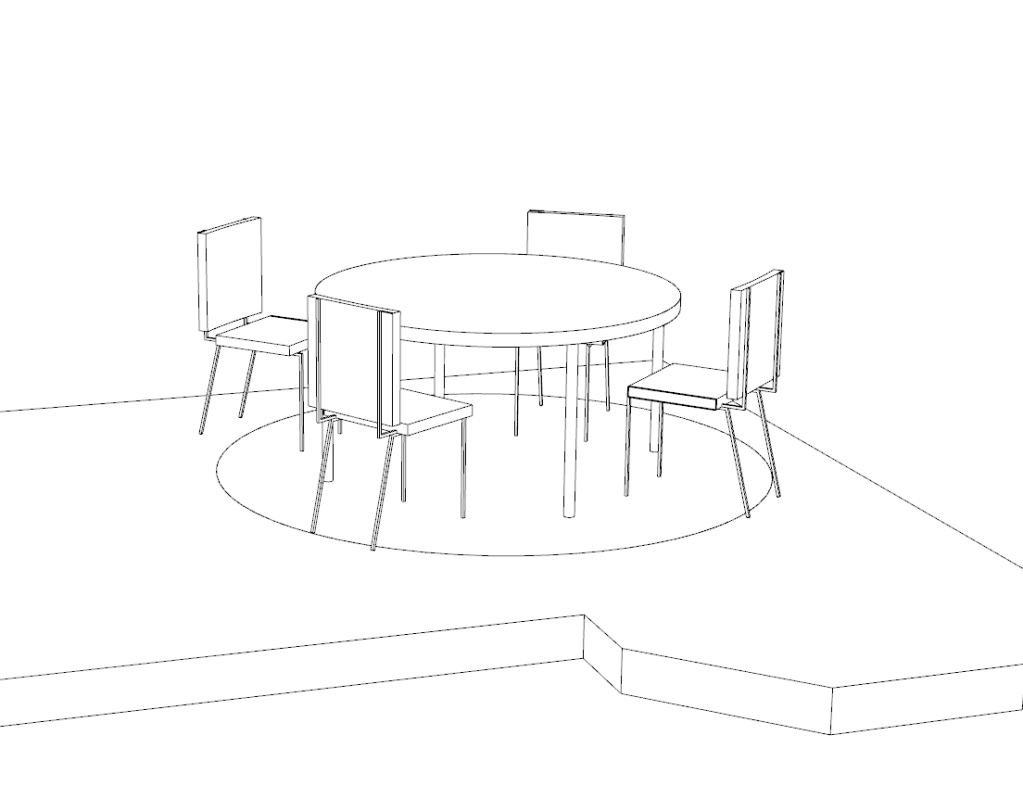
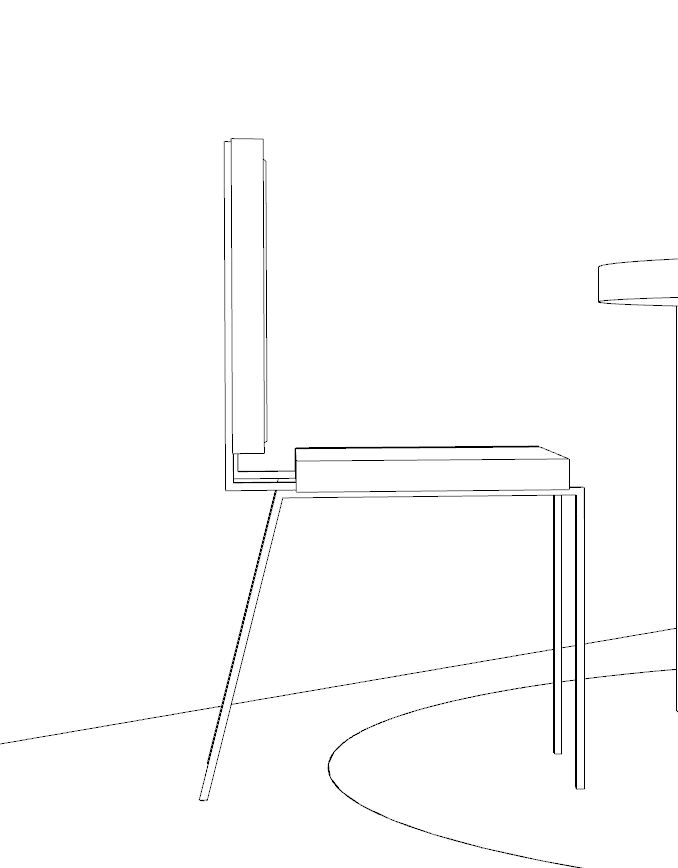
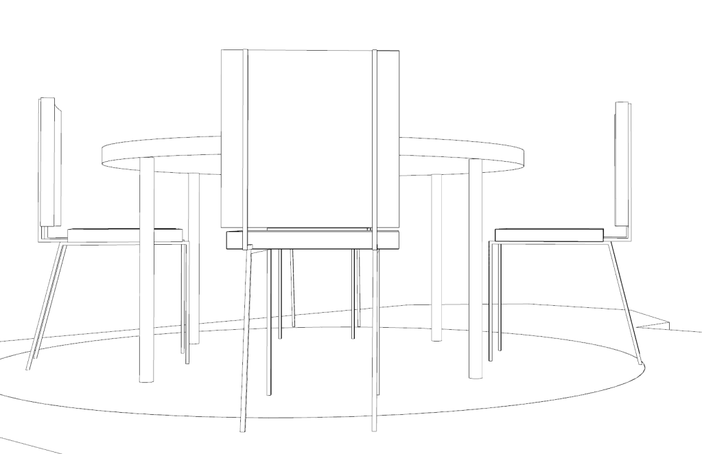
Dining table development:
Inspo:


Because my installation house is styled after the homes prevalent in the 50s/ 60s I looked at dining tables and chairs from that era. Skinny legs, simple shapes but still comfortable and stylish. I also went from two chairs to four to try and encourage more group gatherings over couples as that’ll bring more communal interactions.
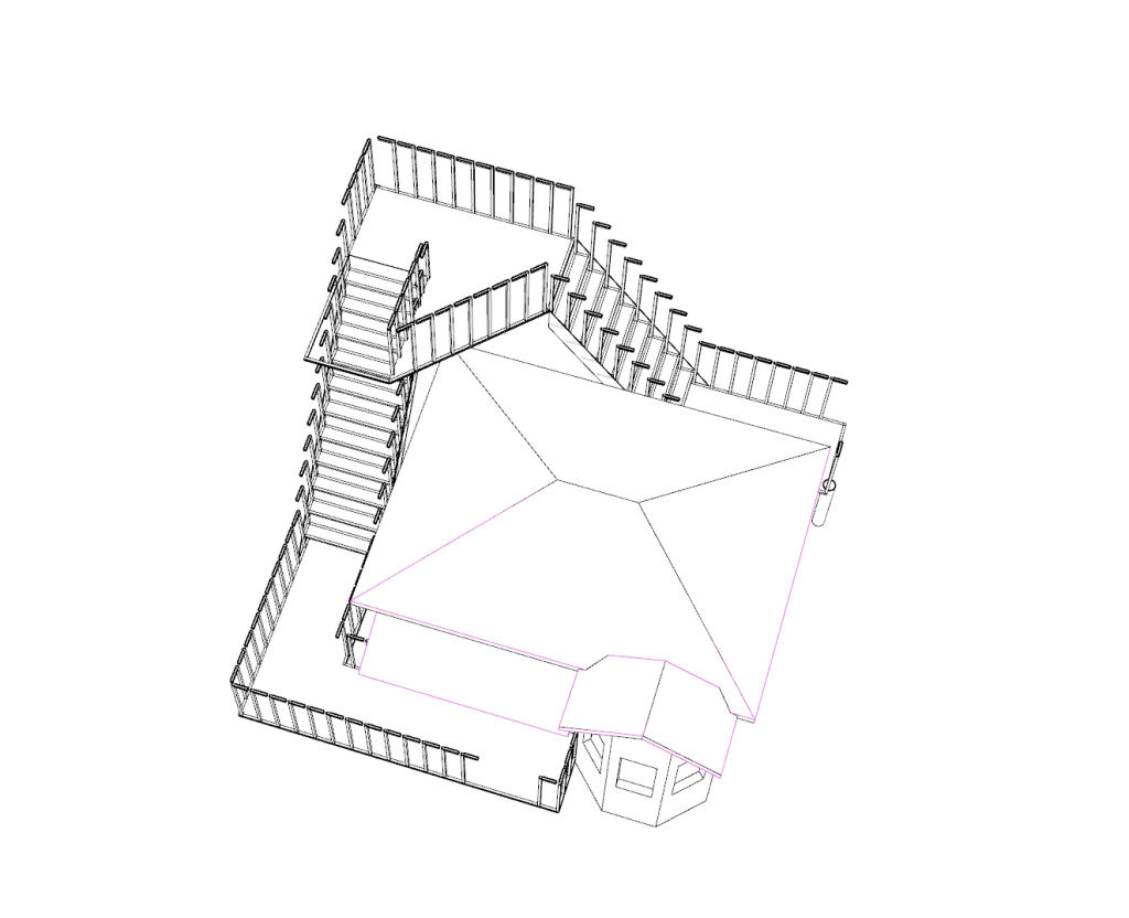
House –
Taking on board Franks feedback from the workshop, i’ve added in a second entry at the back of the house structure. This will allow multiple people to access the space simultaneously and will encourage more spontaneous meetings within the house. It also means having three sets of the stairs which looks super dynamic from the street. It creates a bit of a zone under the house which i quite like. Having three steel stair structures will also provide the strength to suspend the house off the ground.
I’ve added a round section within the floor under the table and chairs, which will be transparent, allowing pedestrians the opportunity to watch the table without engaging with the structure. It also draws the focus once again to the table and chairs.
I was thinking that id have the whole floor be transparent or be a metal grid that you could see through but thought it wouldn’t be practical if people were wearing dresses etc. As a compromise i’ve included a circle of transparent red acrylic under the table and chairs bringing focus to the table and chairs whilst also allowing pedestrians to look in from below.
