My verbal presentation and feedback from guest designers –
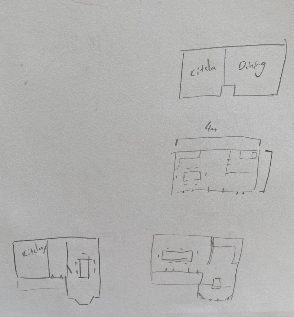
Final Changes:
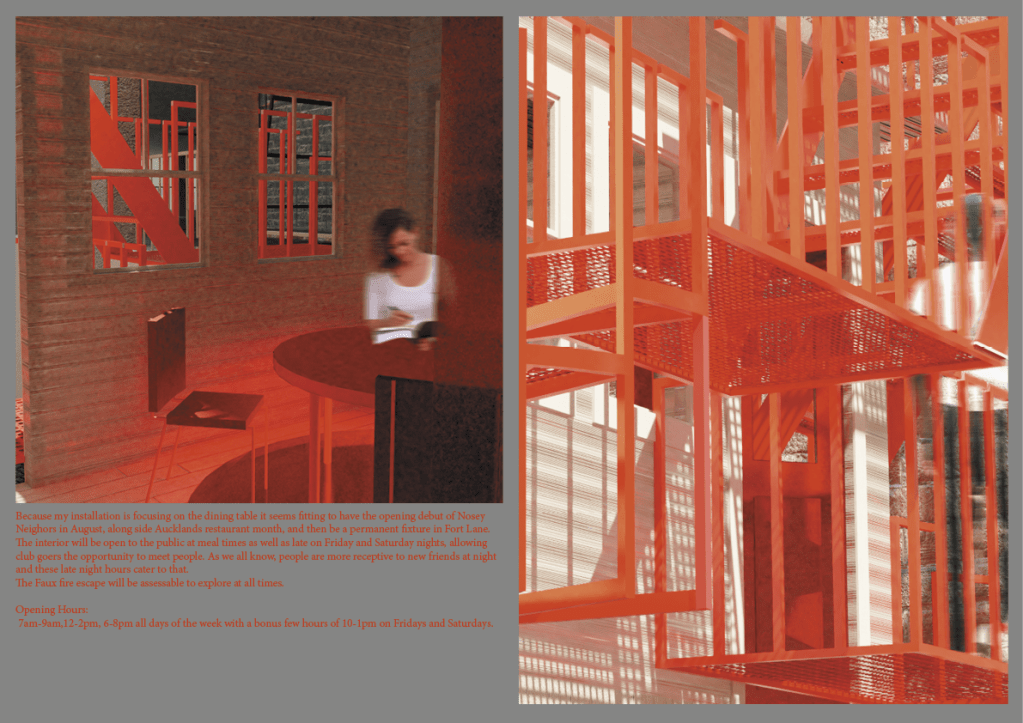
Taking my feedback into consideration i have decided to make my installation a permanent fixture in Fort lane. It will have the opening debut in August, along side Aucklands restaurant month, and then be a permanent. The interior will be open to the public at meal times as well as late on Friday and Saturday nights, allowing club goers the opportunity to meet people. As we all know, people are more receptive to new friends at night and these late night hours cater to that.
The Faux fire escape will be assessable to explore at all times.
Opening Hours: 7am-9am,12-2pm, 6-8pm all days of the week with a bonus few hours of 10-1pm on Fridays and Saturdays.
Having it as a permanent fixture will allow urban dwellers to become familiar with it and it will provide opportunity for connection all year round. It can become a hub for the local community to meet.
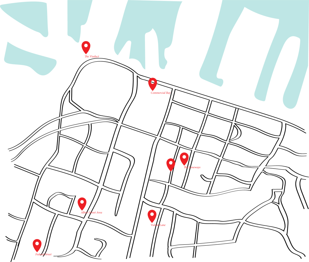
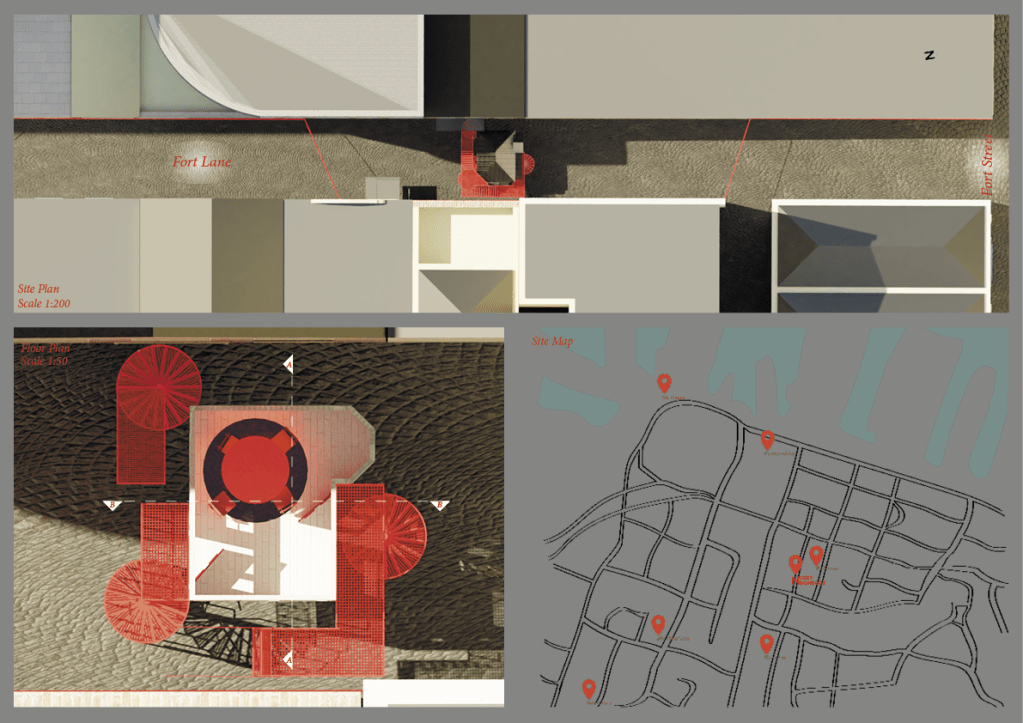
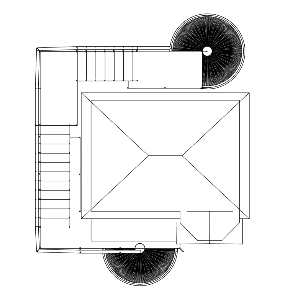
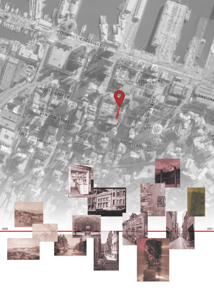
Ive also added an updated site map to my presentation locating local restaurant areas that are supplied by heart of the city which include restaurants that feature in Auckland restaurant month. This positions my installation in relation to these restaurants.
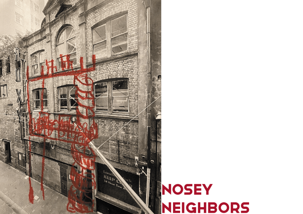
I added the Nosey Neighbours Logo under the pin that locates the site on my final presentation, which i didn’t add in this version and had the grey background that i used for my final document which looked quite good and made everything cohesive.
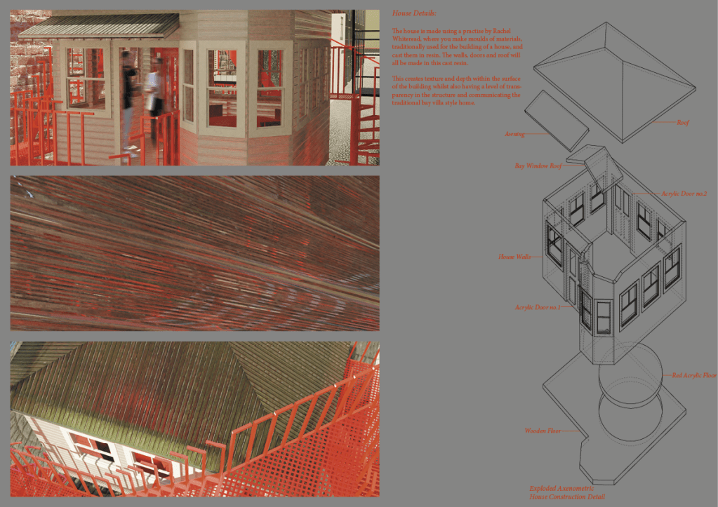
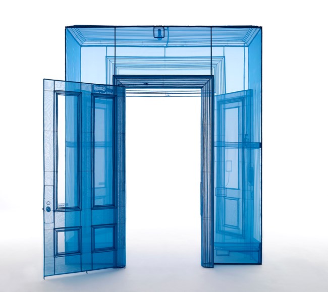
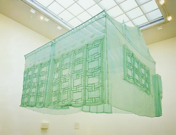
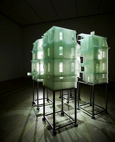
When applying materials to my model in blender i was wanting to achieve a level of transparency with the construction of the house and faux fire escape similar to Do Hu Suhs work with nylon and steel. Still quite structural but with an incredible atmospheric narrative.
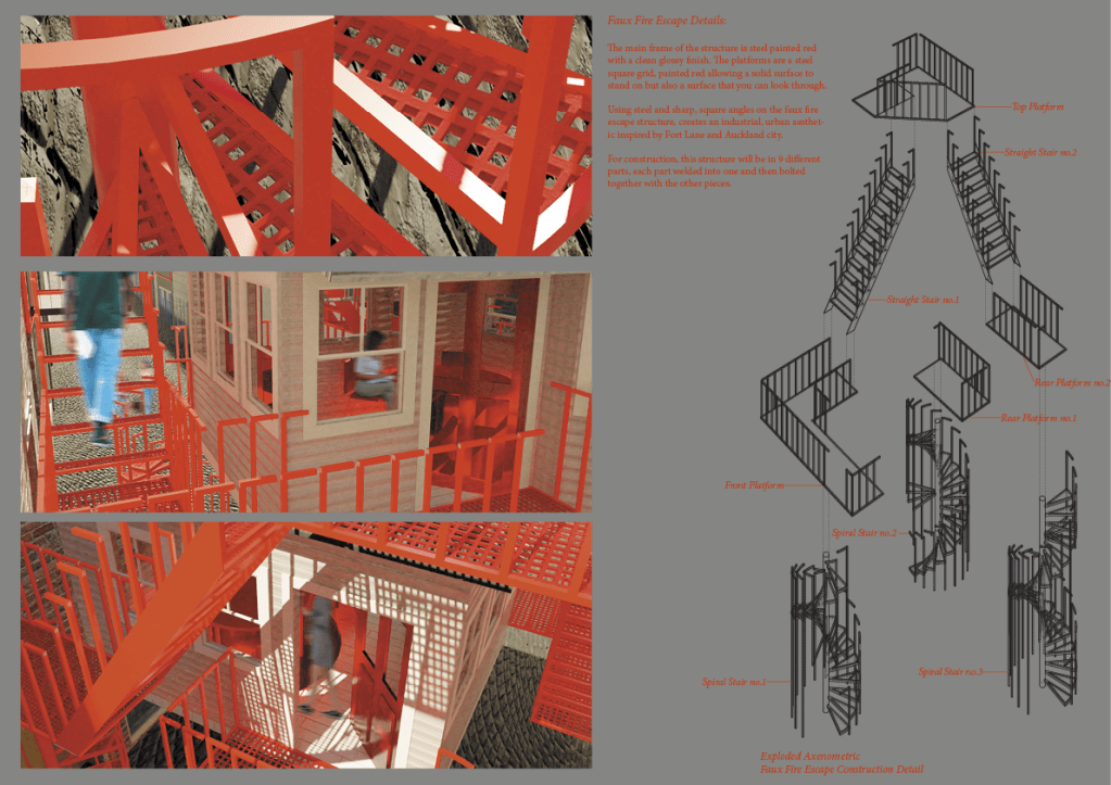
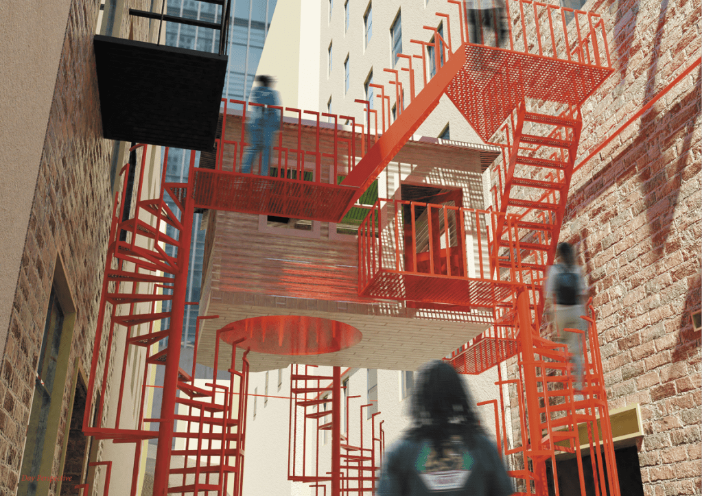
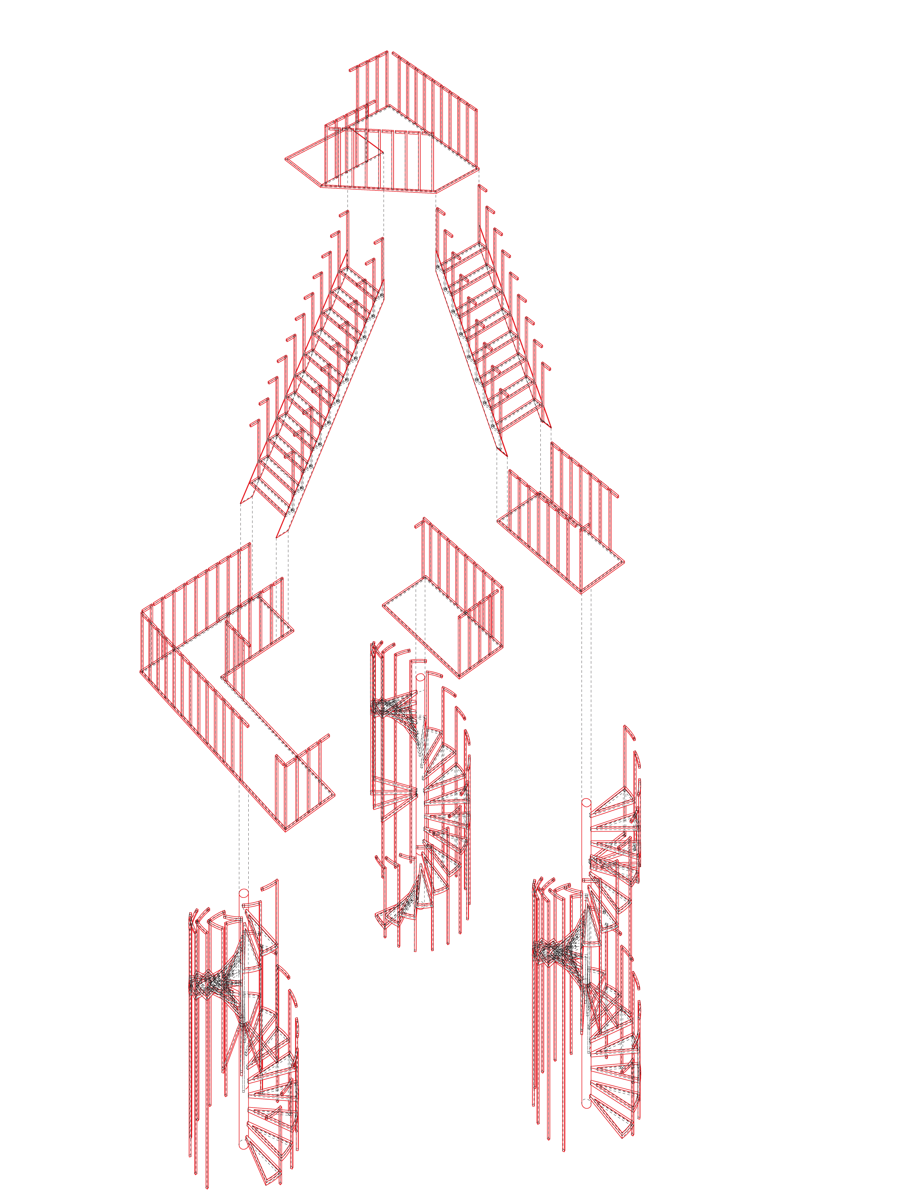
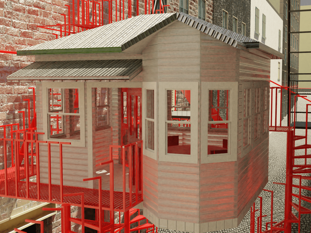
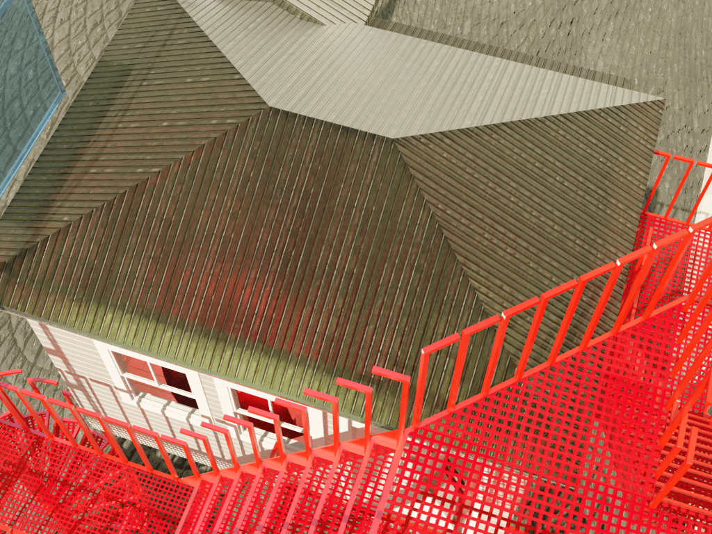
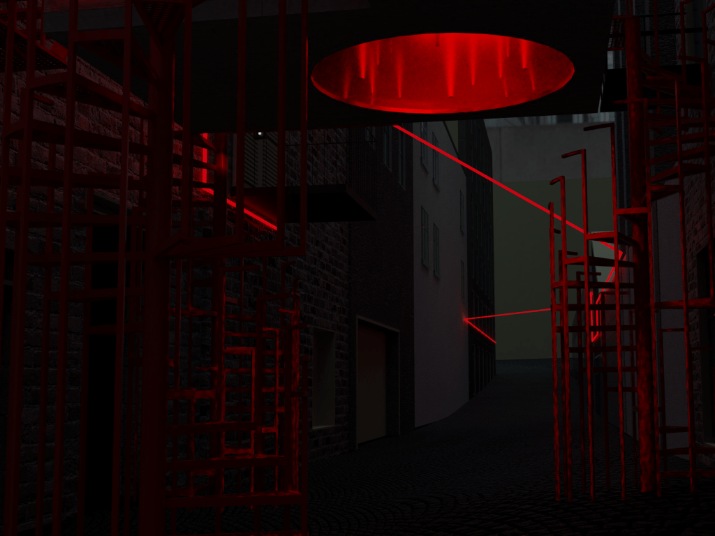
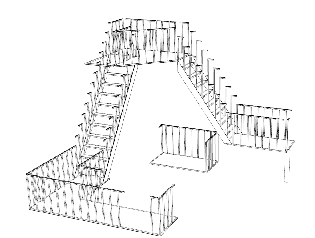
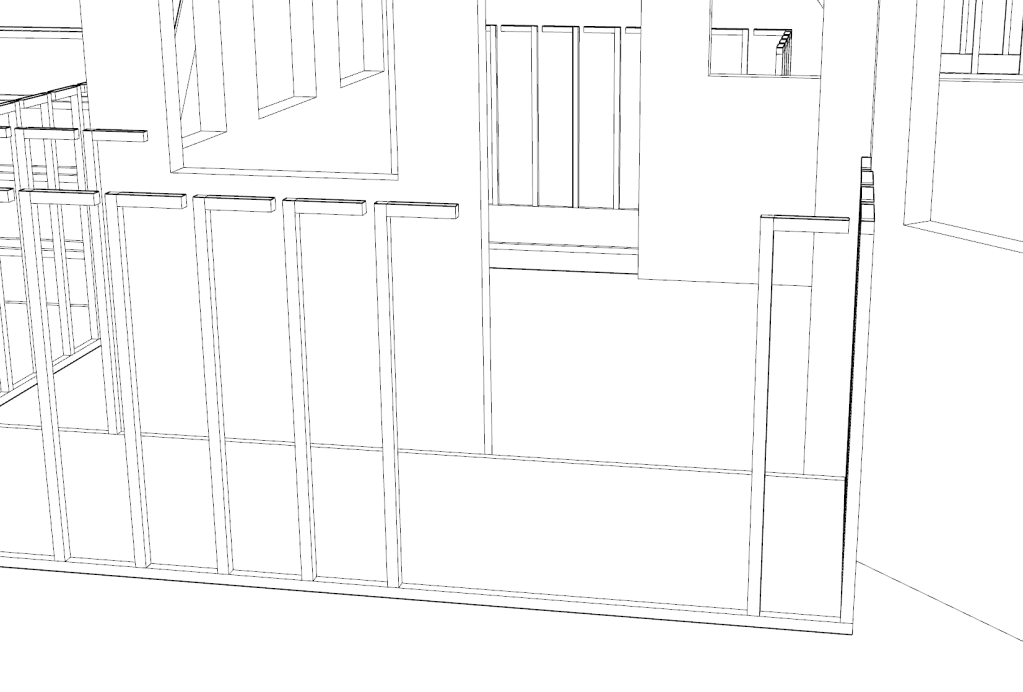
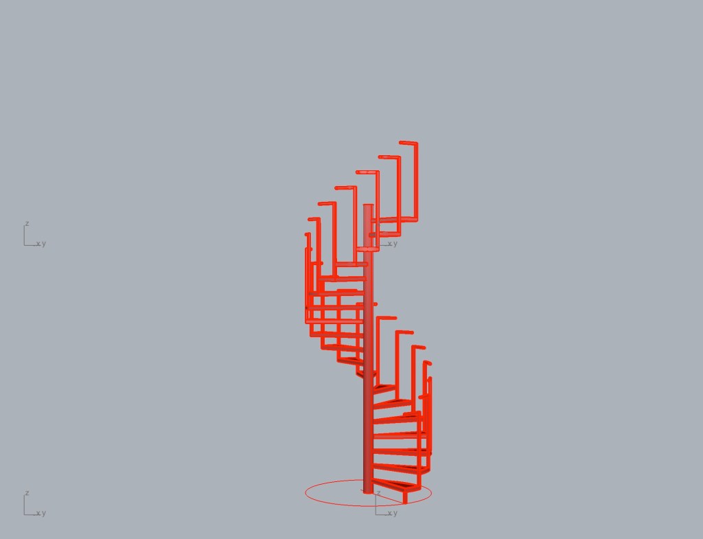
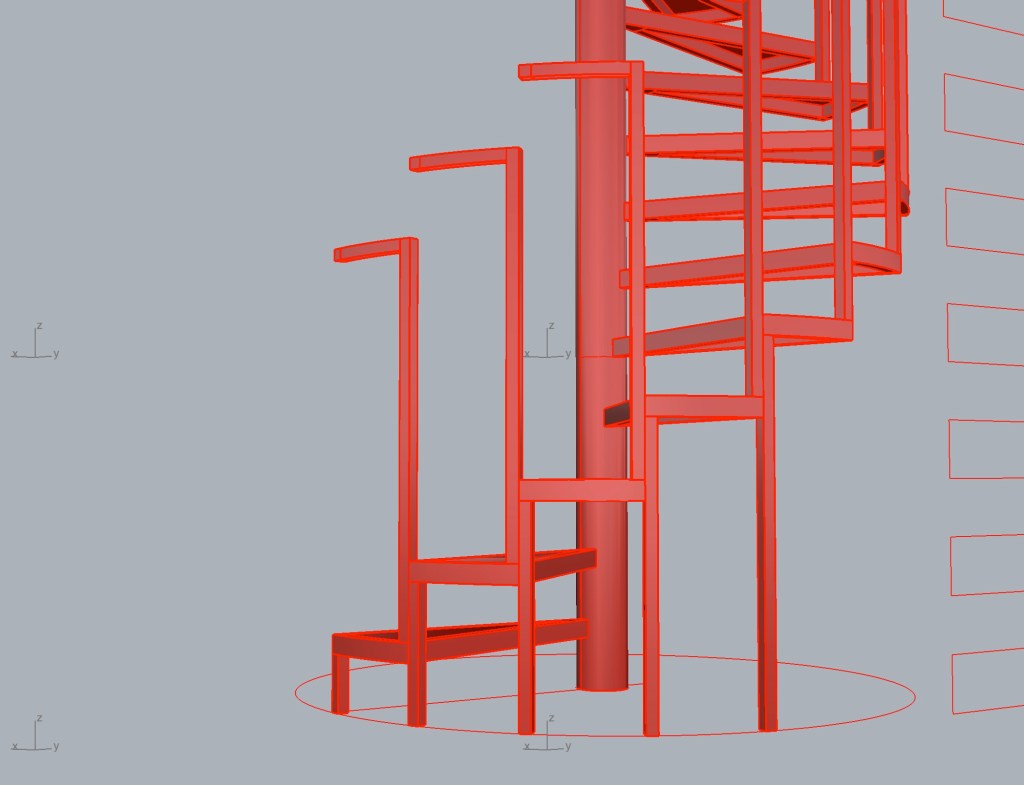
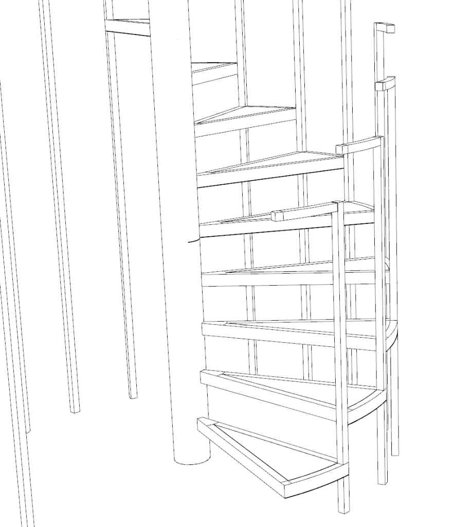
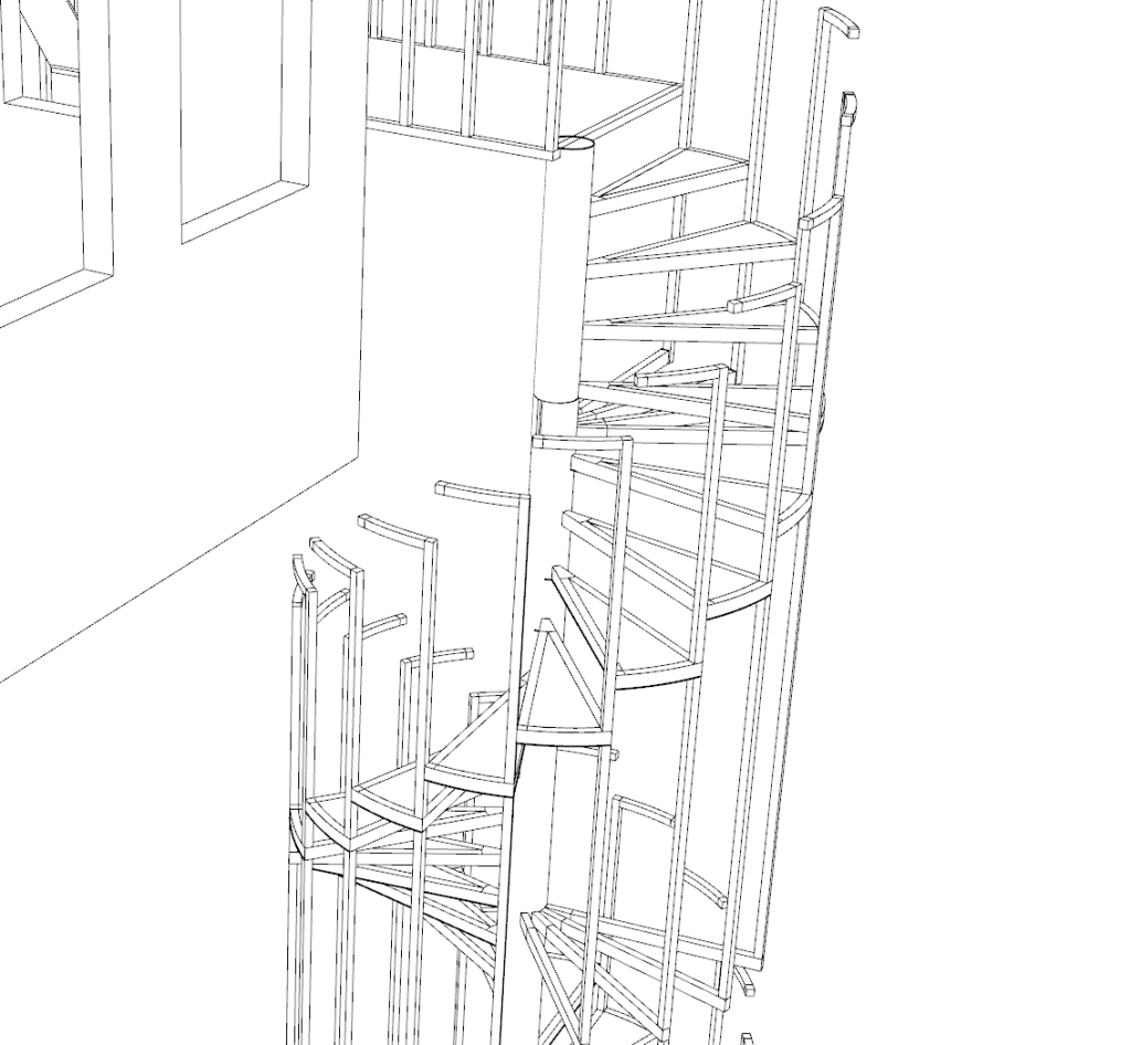
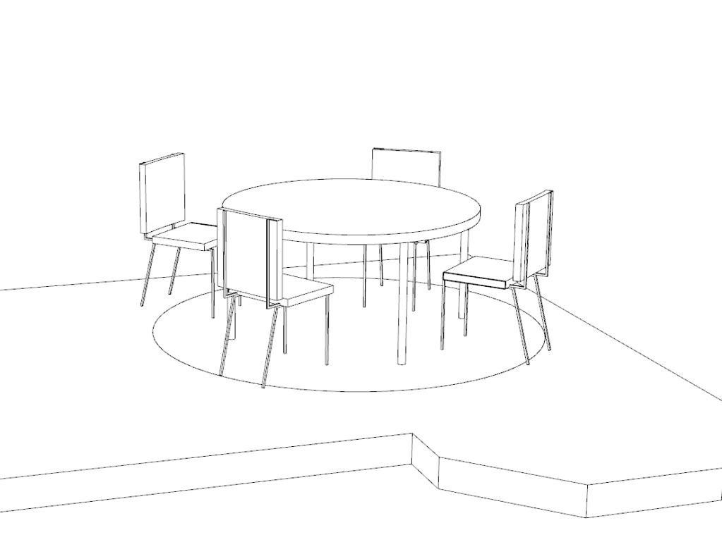
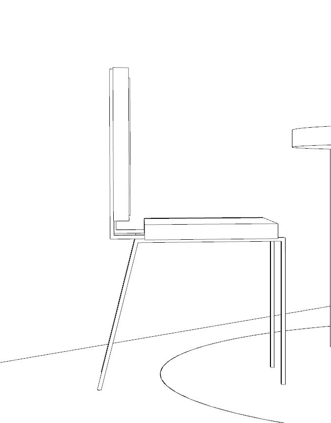
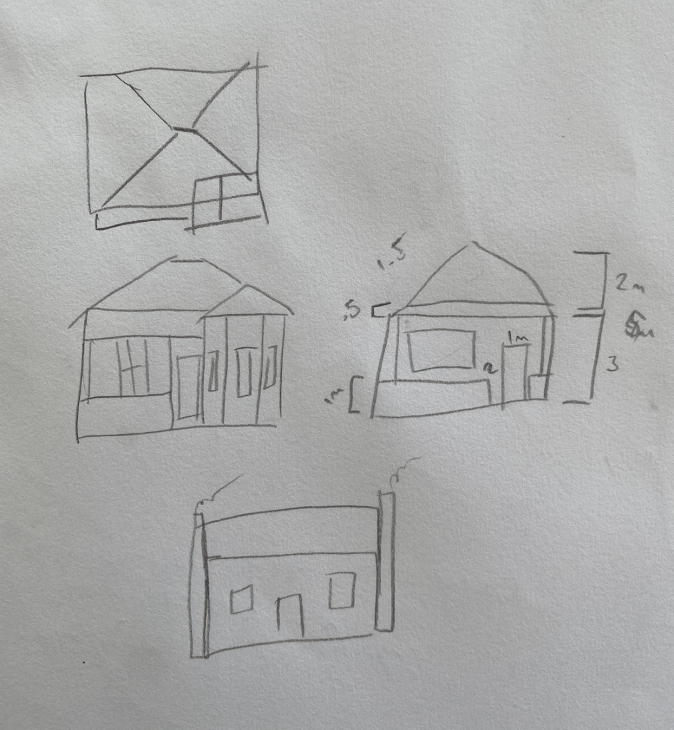
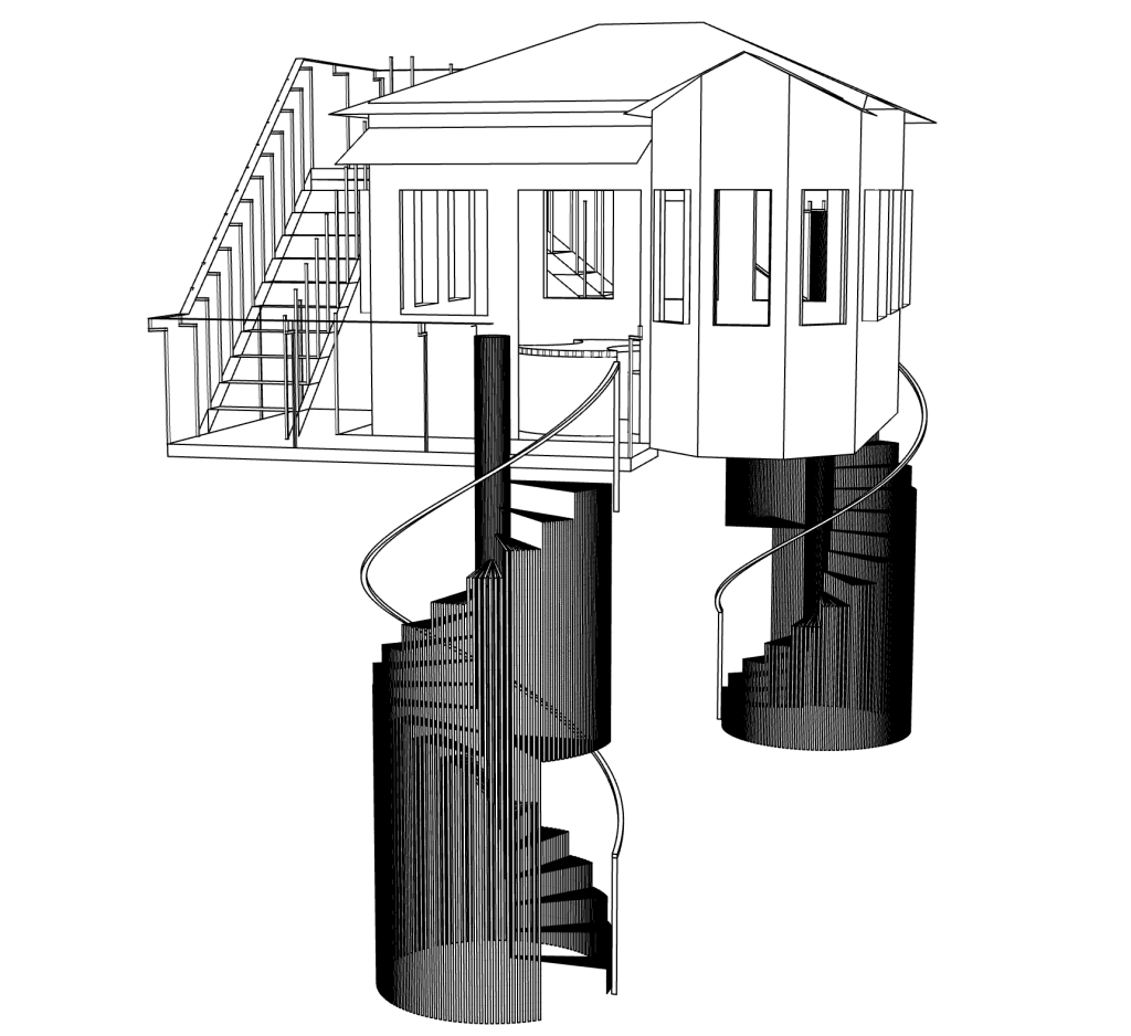
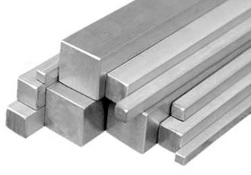
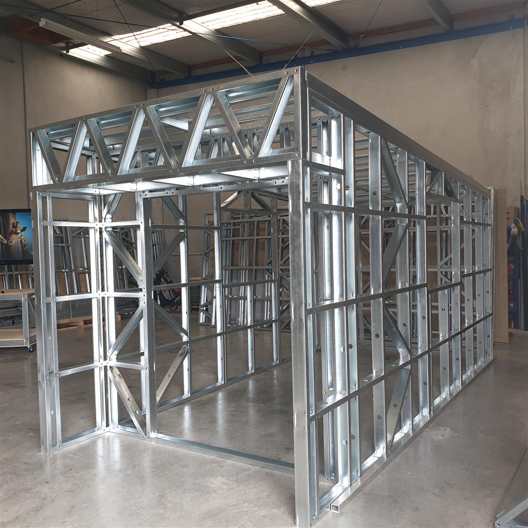
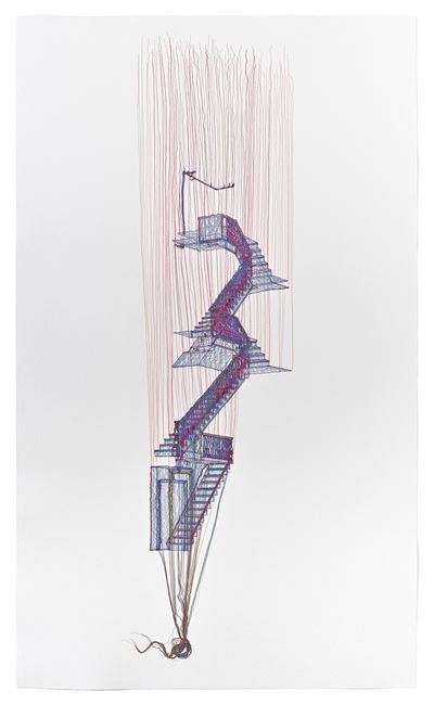
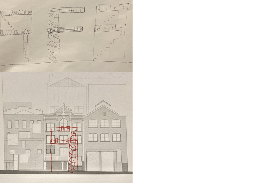
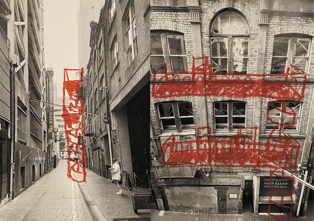
The faux fire escape material decisions where easy for me to make. I knew i wanted the main frame of the structure to be steel painted red with a clean glossy finish. For the platforms i wanted them to be a steel red painted square grid allowing a solid surface to stand on but also a surface that you can look through. Using steel and sharp square angles on the faux fire escape structure creates an industrial, urban aesthetic inspired by Fort Land and Auckland city. For construction, this structure will be in 9 different parts, each part welded into one and then bolted together with the other pieces.
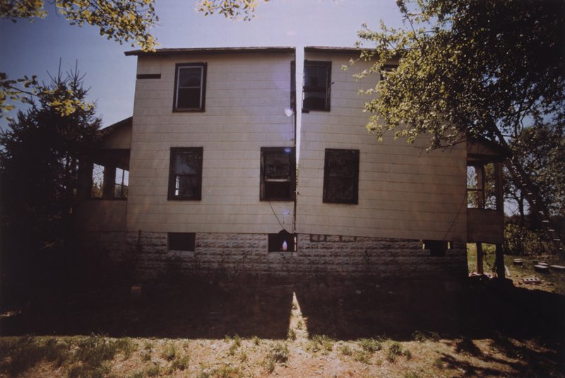
For the house i decided to have the walls, doors and roof be made using a practise by Rachel Whiteread. Where you make moulds of materials, traditionally used for the building of a house, and cast them in resin. This creates texture and depth within the surface of the building whilst also having a level of transparency in the structure.
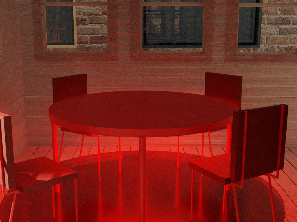
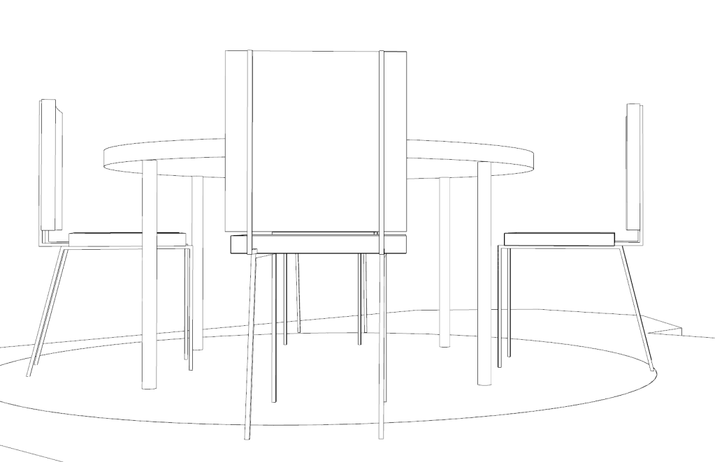
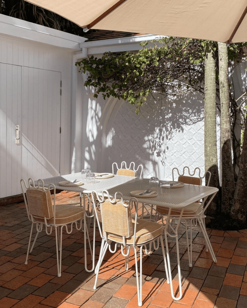
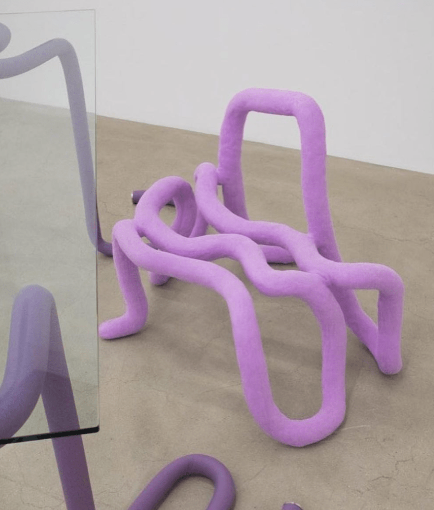
For the materiality of my table and chairs I went with a red painted steel frame on the chairs and legs. I used a red velvet on the chairs to create a soft environment and make it comfortable to spend time. The table will be made using a red formica as its hard wearing but also warm to touch as apposed to my other idea which was to have a completely steel table.
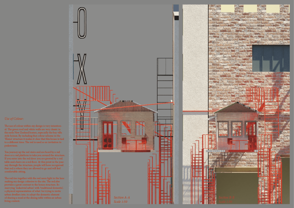
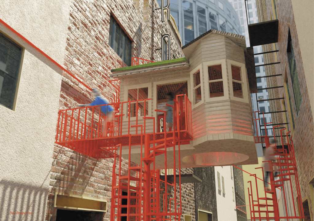
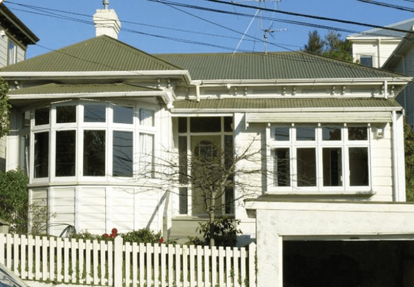
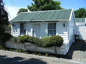
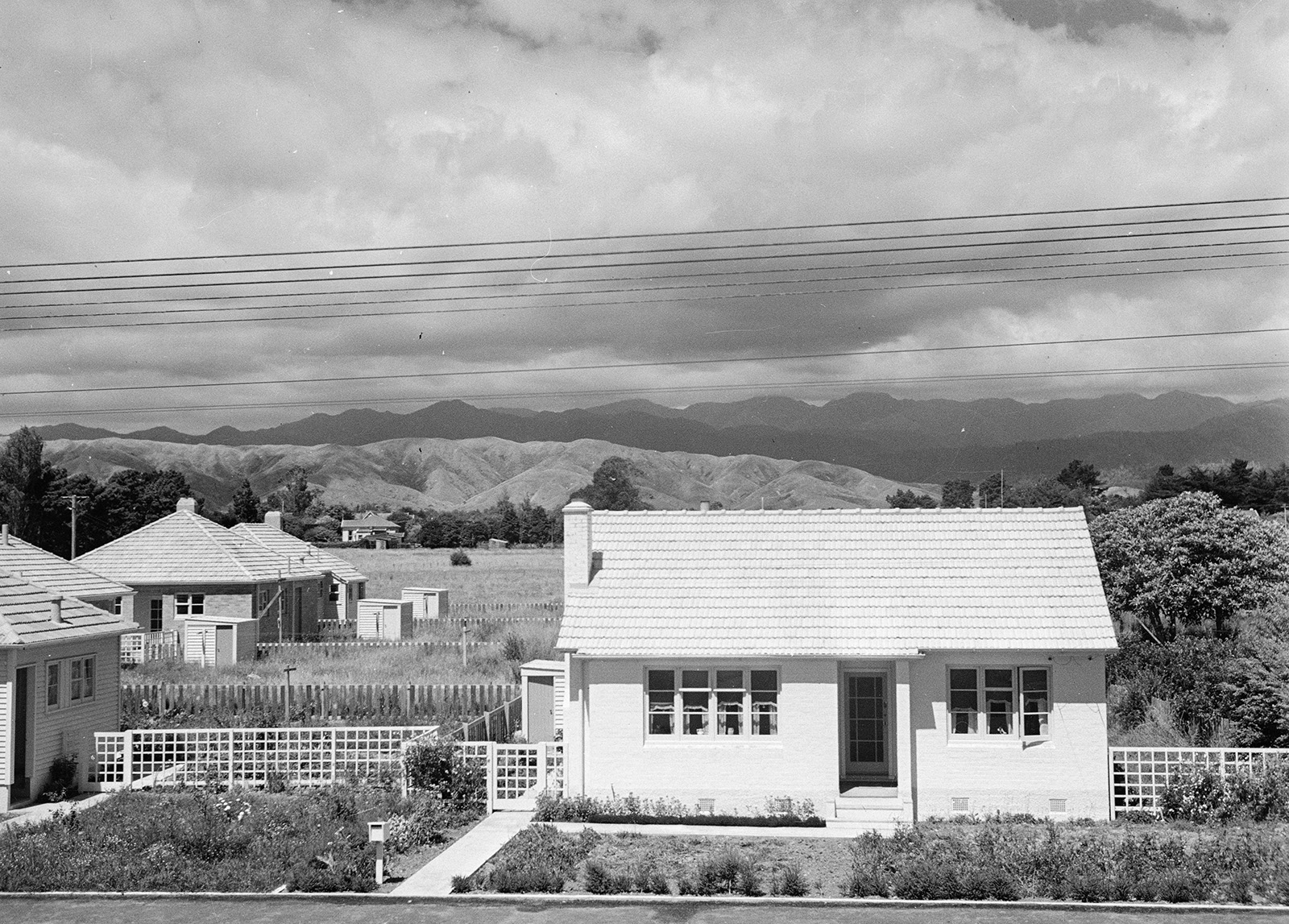
The use of colour within my design is very intentional. The green roof and white walls are very classic in the early New Zealand homes especially the bay villa styled homes. By including that colour scheme in the resin cast structure it makes it clear that this house is tied to a different time. The red is used as an invitation to pedestrians. A yellow brick road of sorts. You journey up the red stairs and are faced by a red door or a red platform to take you around the structure. If you enter into the red door you are greeted by a red table and chairs on a red floor. At this point in the journey through the structure, people will have recognised that red is where they are allowed to go and will feel comfortable sitting.
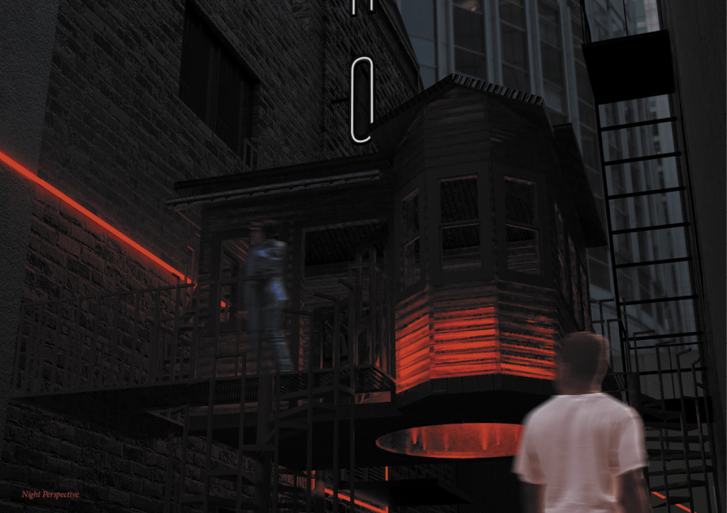
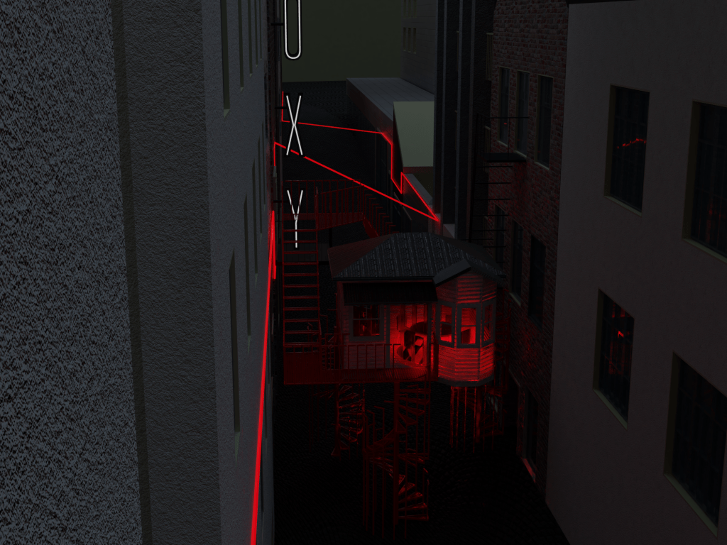
The red ties together with the red neon light in the lane making my design cohesive to the site. The red also provides a great contrast to the house structure. Its marrying ‘industrial urban’ with ‘traditional domestic’, a physical representation of what i’m trying to invite urban dwellers into. to adopt the domestic element of sharing a meal at the dining table within an urban living condition.
The use of light in my installation is used to in a way to draw attention to the centre piece of my design, the table and chairs. The lighting sits on the under side of the table which floods the room in red which you can see through the cast resin walls and ceiling. It also shines through the red acrylic circle in the floor which lights the lane at night.
Temporal/ contextual details:
The installation will be up for the month of August to coincide with Aucklands restaurant month. This will hopefully encourage urban dwellers to grab food from the featured restaurants and meet at my Nosey Neighbours installation to enjoy their meal and meet new people.
Because my installation is focusing on the dining table it seems fitting to tie it to Aucklands restaurant month and to also open the interior to the public at meal times. It will also be open late on Friday and Saturday night to allow club goers the opportunity to meet people as we all know peoples walls come down at night and are more receptive to new friends.
The Faux fire escape will be assessable a to explore at all times.
The Interior will be open 7am-9am, 12-2pm, 6-8pm all days of the week with a bonus few hours of 10-1pm on Friday and Saturday.
Final written presentation:
Statement:
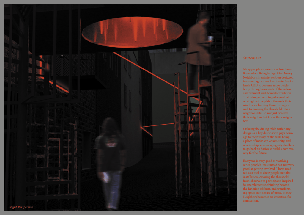
Many people experience urban loneliness when living in big cities. Nosey Neighbors is an intervention designed to encourage urban dwellers in Auckland’s CBD to become more neighborly through elements of the urban environment and domestic tradition. To challenge them to go beyond observing their neighbor through their window or hearing them through a wall to crossing the threshold into a neighbor’s life. To not just observe their neighbor but know their neighbor.
Utilizing the dining table within my design as a key destination within my site pays homage to the history of the table being a place of intimacy, community, and relationship, encouraging city dwellers to go back to basics to build a community for the future.
Everyone is very good at watching other people’s lives unfold but not very good at getting involved. I have used red as a tool to draw people into the installation, crossing the threshold from observer to participant. Inspired by anarchitecture, thinking beyond the function of form, and transforming space into a state of mind, Nosey Neighbors becomes an invitation for connection.
Some of the feed back i got from Frank Liu at the co design workshop was to make the interior space of the house, useable. Up until now i was intending for my work to be for observation only but it makes more sense to allow access when reviewing my initial concept of connecting otherwise distanced neighbour’s and provided the physical space to meet one another in a neutral zone.
I was also encouraged to consider the way my intervention functions at night as well as in the day. Are there specific times that its open? Do you have curtains that close as night? How is it lit?
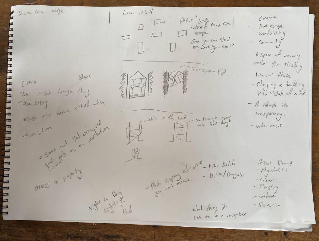
Some elements of my design that i need to communicate more clearly are details around materials, time of access, who can use the space/ how many people can use the space, why i’ve used an industrial styled faux fire escape, whats the significance of the fire escape (allegory for the urban environment?), what is the space inside doing, whats the specific narrative?
Design Development:
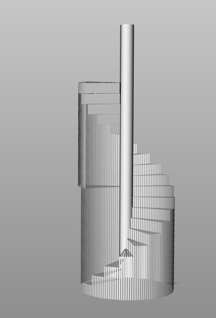
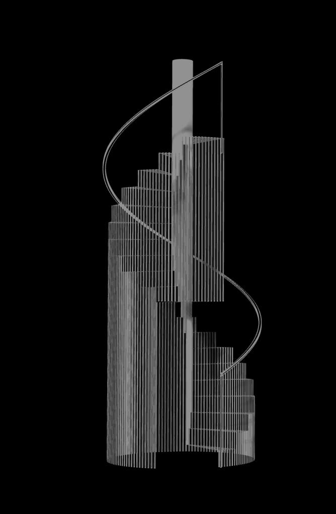
Fire Escape section –
My current design has too many holes in the fire escape section and would be unsafe for the public. Looking at the style of home that i have based my installation house off of, they all have a front porch or has a white picket fence around the front. I wanted my railing on the fire escape to me an ode to that element of that era/ style of housing.
Multiple vertical pieces in a line to form a barrier. I did want to add a modern spin on it by having the vertical section curve to be horizontal at the top. creating a hand rail.
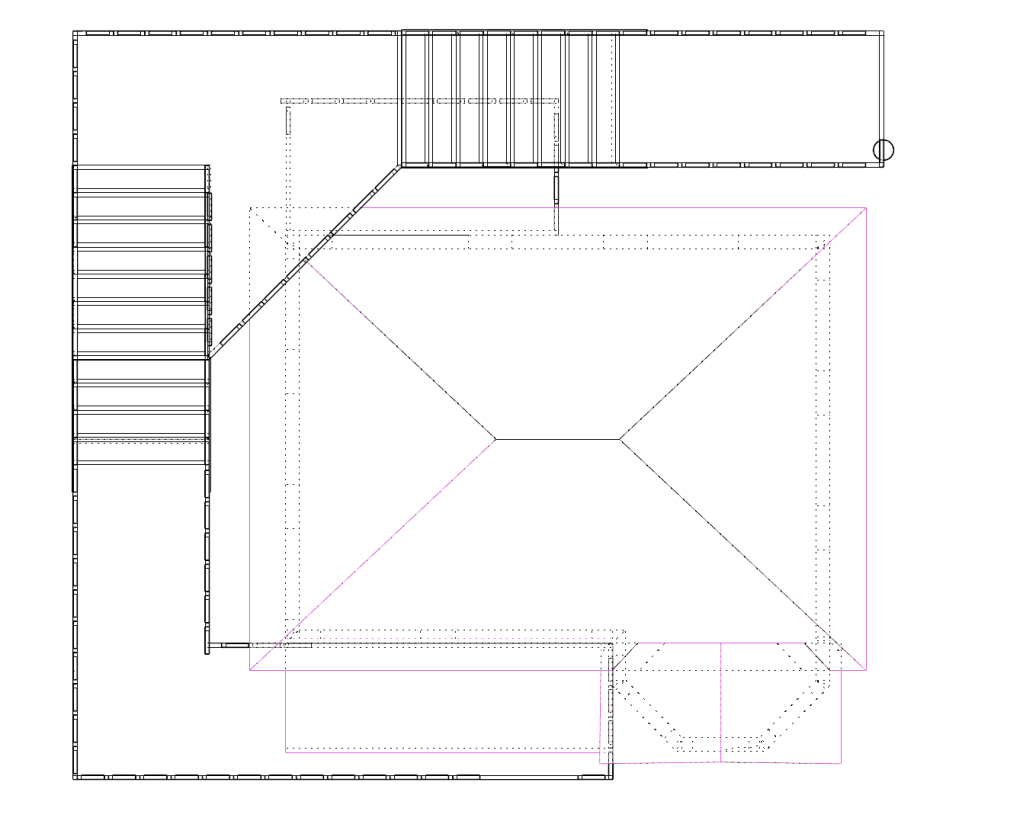
I also changed the lay out of the Fire escape and the way it wraps around the house.
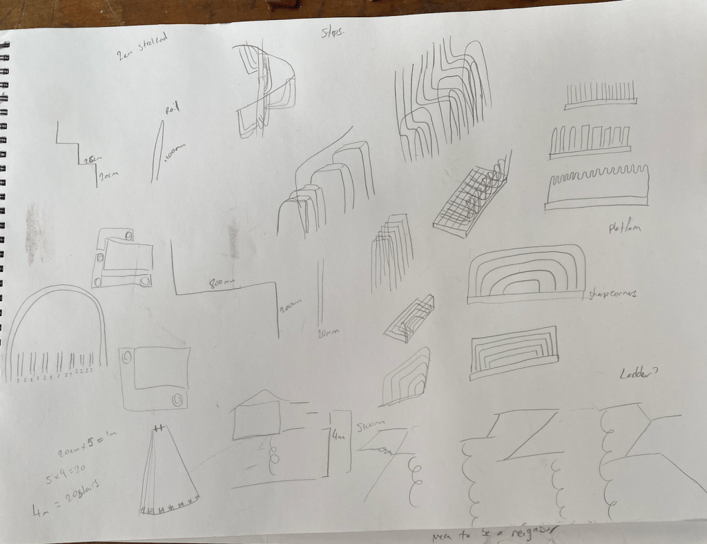
Stair Development –
I didn’t like how dense my first rhino model of the stairs looked. I wanted it to be skeletal like many industrial structures are like scaffolding etc. I also wanted there to be opportunity for kids/ small people to weave through the structure.
Dining table development:
Inspo:
Because my installation house is styled after the homes prevalent in the 50s/ 60s I looked at dining tables and chairs from that era. Skinny legs, simple shapes but still comfortable and stylish. I also went from two chairs to four to try and encourage more group gatherings over couples as that’ll bring more communal interactions.
House –
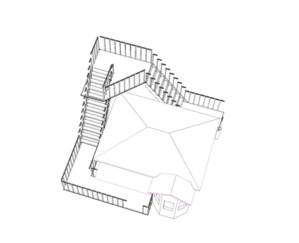
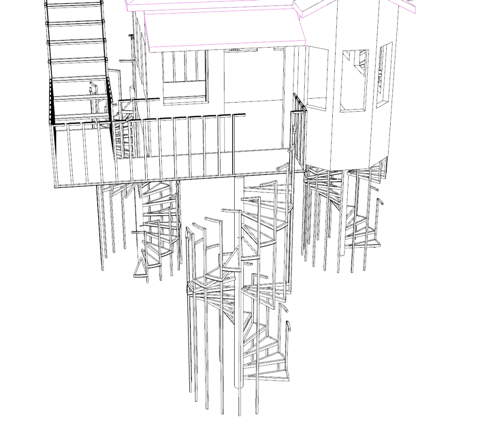
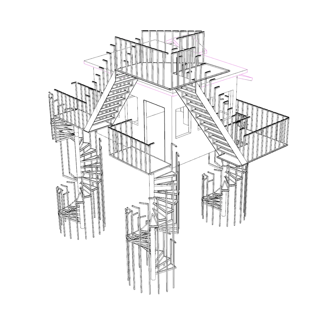
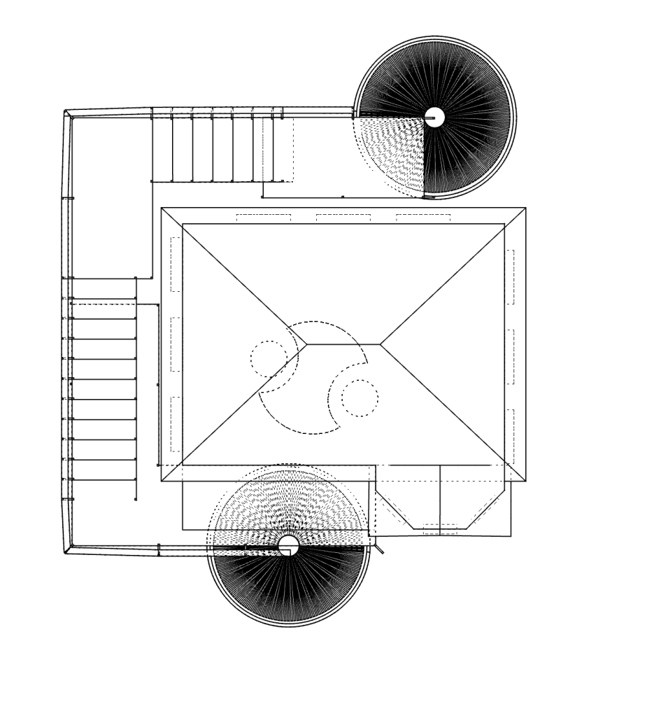
Taking on board Franks feedback from the workshop, i’ve added in a second entry at the back of the house structure. This will allow multiple people to access the space simultaneously and will encourage more spontaneous meetings within the house. It also means having three sets of the stairs which looks super dynamic from the street. It creates a bit of a zone under the house which i quite like. Having three steel stair structures will also provide the strength to suspend the house off the ground.
I’ve added a round section within the floor under the table and chairs, which will be transparent, allowing pedestrians the opportunity to watch the table without engaging with the structure. It also draws the focus once again to the table and chairs.
I was thinking that id have the whole floor be transparent or be a metal grid that you could see through but thought it wouldn’t be practical if people were wearing dresses etc. As a compromise i’ve included a circle of transparent red acrylic under the table and chairs bringing focus to the table and chairs whilst also allowing pedestrians to look in from below.
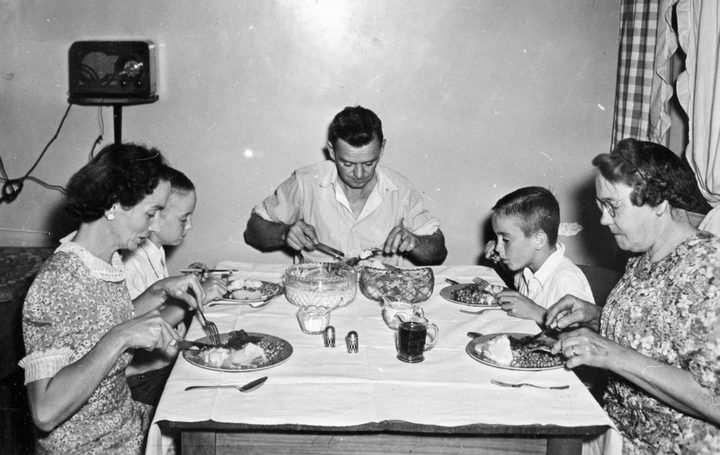
Research around the diner table. the place for intimate connection. an invitation to invite your neighbour over instead of watching them from a distance?
1950s idyllic family dinner – peak of private dining?
“Traditional dining tables were composed of a mixture of different materials made up of marble, wood or metal. The typical structure was supported by 4 strong pillars linked together with X shaped stretchers exhibiting a beautiful blend of authority and efficiency. During initial development period of dining tables, shapes were big and mostly rectangular that allowed the head of the household to occupy the top end. This gave him the privilege of viewing and addressing all his guests and family members at once. During ancient times, families were not only larger, but the house constituted of a community with several families living together. Hence, there was a need of large dining tables that acted as a center piece for dining room. It made each member of the house socialise during mealtimes while enjoying delicious food and drinks.”
“You got to show off all your lavish things: beautiful chairs, the linens, the plates. There was an art of eating, and an art of living that was associated with a dining table that was huge,”
“The decline in the popularity of the dining room, beginning in the 1950s, coincided with several shifts in American eating and home habits. People started to work longer hours. Families eventually ate together less often. The successful marketing of the “TV dinner” by Swanson in 1954 practically begged us to stop using our dining rooms. But the modern emphasis on the kitchen stemmed from a change in hosting patterns.”
“Millennials and Gen Z aren’t ruled by the principles of Emily Post the way people were decades ago. I personally associate dining rooms with old people, not my agemates. As Nisha Chittal reported for The Goods, millennials do value friendship, but they don’t have much interest in the theatrics of hosting a traditional dinner party. “Some people might have to sit on the floor, but the important thing is getting together with friends and enjoying each other’s company — not stressing out about tablescapes and etiquette,” she wrote. People dine together wherever and whenever they can, and focus on the quality of their company rather than their surroundings.”
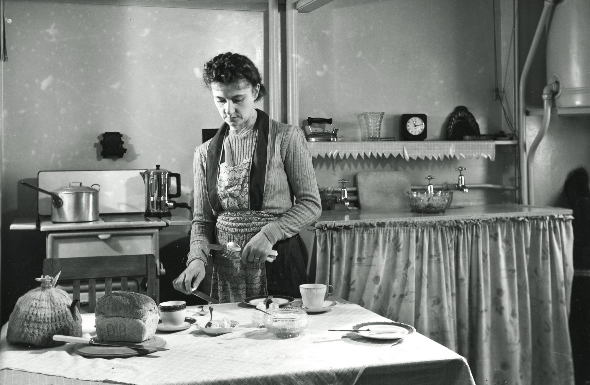
A 1965 photograph of a housewife and her husband, divided by a wall between the kitchen and dining room.
we don’t remember how to dine together. I want to provide a reminder
“Traditionally, meals were synonymous with togetherness.”
“I think the dining room represents all of that — the fight against the rupture of families,” says Benjamin.”
“Yet, there’s something beautiful in the concept of a room dedicated to eating and sharing conversation. There’s a lot of talk about a “loneliness epidemic” — many Americans feel more isolated than ever even though we’re arguably more connected than ever, the pandemic is making it worse, you know the story. We’re consolidating our lives in some ways, but we aren’t necessarily living together with closeness. We lost the dining room as soon as we lost that intimacy. It seems nice to have a designated refuge in the home space, somewhere to gather and discuss the drama of the world over a warm, shared meal. It might be the best way through an increasingly isolating future,’
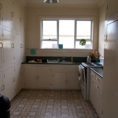
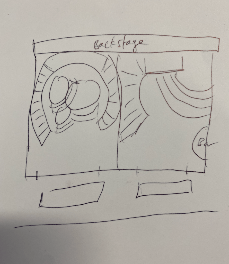
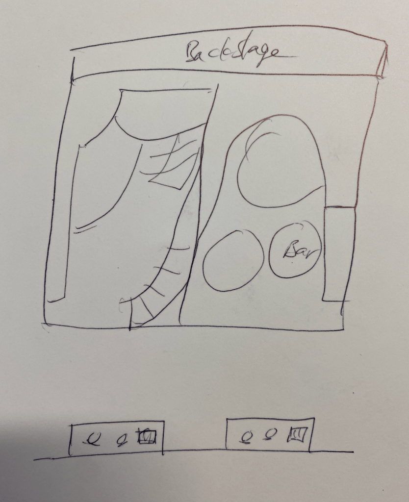
My first idea for the interior of the house structure was to recrete an early nz homes floor plan with a kitchen/ dining space and a small bedroom. I found the old fashions kitchens quite intriguing and wanted to build a replica within the space.
Kitchen elements:
short curtains
lino floors
wallpaper (acrylic? engraved wallpaper?)
sink
stove
cabinetry
bench
Dining table – candelabras, plates and cutlery?
As I began designing in rhino I realised that with the space available it doesn’t allow a lot of floor space within the home structure. If i built in a kitchen into the space it would distract from the dining table which i want to be the main focus of the space.
Taking inspiration again from ‘The Lighthouse’ by Michael Parekowhai, I decided to simplify the interior fit out of the house structure to just having a dining table and chairs to make it very clear that that is the focus of the installation. To focus more of the quality of the interior elements rather than the volume. To think about form, materiality, construction and colour of the dining table and chairs.
I want to spend some time intricately designing the table and chairs as they will be the focal point.
a glimpse into interior – physical and psychological
Transparency
Urban oasis/ escape
Personal interest/ elements:
psychedlics
colour
florestry
nature
escapeism
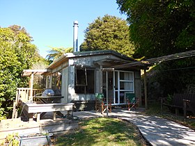
kiwi batch
villa/ bungalow
Ideas:
Examples/ Inspo of Kiwi homes:
19th century: Building a better Britain
Cottage, Sydenham, ChristchurchVilla, Royal Oak, Auckland
Houses from this period are divided into cottages and villas. The first houses built in New Zealand were cottages.[20] Villas were the larger and more expensively built equivalent. The typical villa has the kitchen to the rear of the house and separate from the dining room, as food preparation was meant to occur out of sight.[21]
What is service lane meaning?Service roads, or frontage roads, run parallel to a main road and allow local traffic to gain access to property
More Inspo:
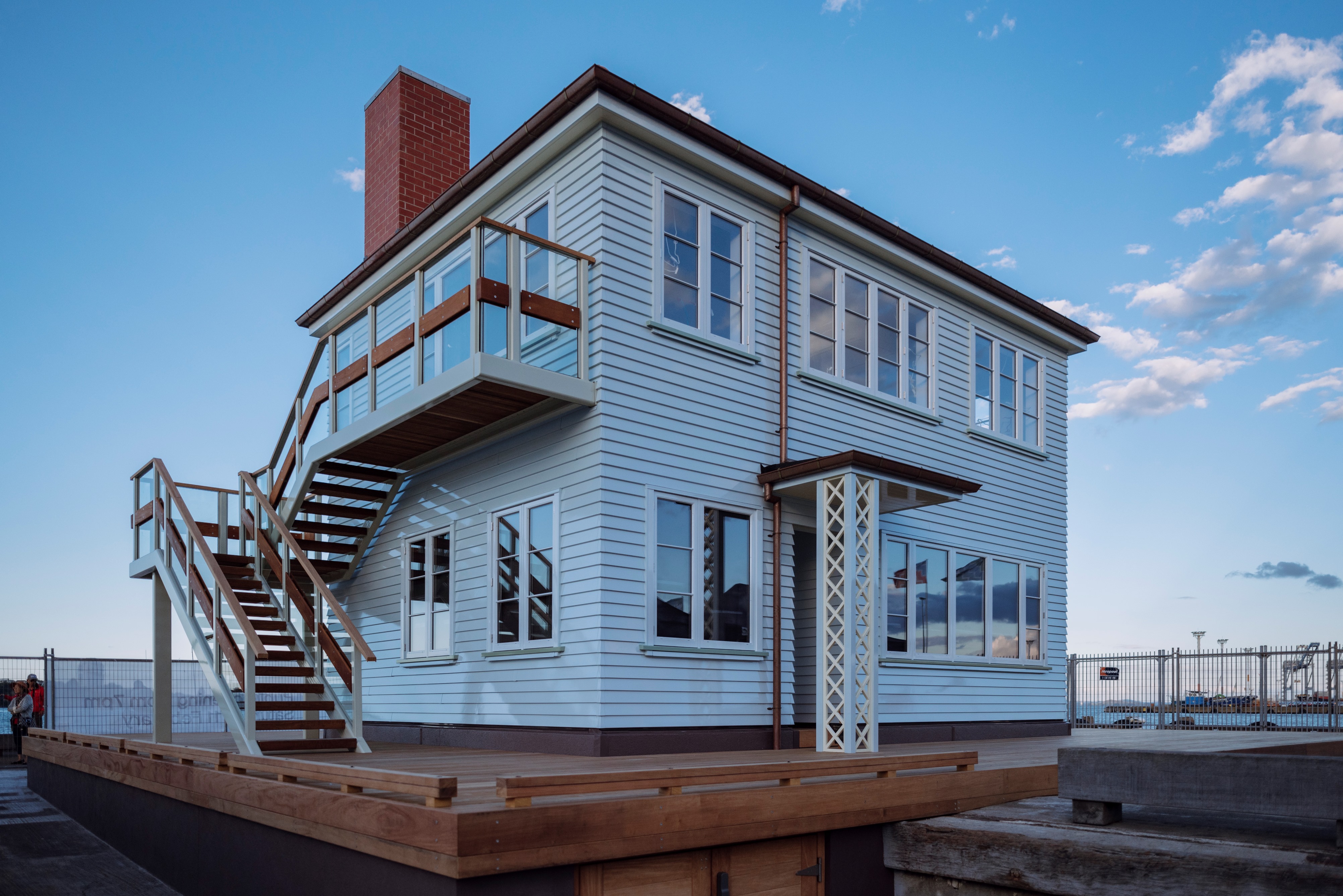
“In one corner there is a fireplace; it’s really just a memory of a one. Cook’s feet face towards that fire. It’s as if he’s warming his feet, but his gaze and mind are somewhere else.
“The coloured light implies the notion of ahi kā; the idea that the home fires are burning and the lights are still on,” says Michael Parekowha
“Together with the work’s location on Auckland’s busy harbor, the net impact of The Lighthouse‘s design is a commentary on the impact of discovery and colonialism on New Zealand sovereignty and society. The most spectacular ways to consider the project’s impact is from the water, after dark.”
Who are the neighbors, and how are they being nosey? Answer these questions through the experience of your design. What will encourage viewers to snoop around your chosen site, and what will they see if they engage with your work?
There is a lot of potential to explore your concepts in a dramatic and narratively satisfying way. Dive into the script/program for your proposal and give us some concrete landing points. This could be found in one or two specific details, that lead to the rest of the project being resolved. Start with one specific detail, view, or moment that sums up your intended affect. You are responding to both the brief and the site in a sensitive and considered way.
Artist research:
Gordon Matta-Clark
‘Anarchitecture – a combination of ‘anarchy’ and ‘architecture’
Whatever its origin, the term Anarchitecture, expressing as it does a creative tension between Apollonian and Dionysian opposites, has come to summarise many of the concerns explored by Matta-Clark during his brief career.’
‘The first object he suggests for inclusion is a plain board with the words ‘NOTHING WORKS’ written on it. This fundamentally anti-functional statement, described in his letter as ‘a reaction to the prime-crime axium of modern design-fighters’, stands in direct opposition to the whole ethos of utilitarian modernism.’
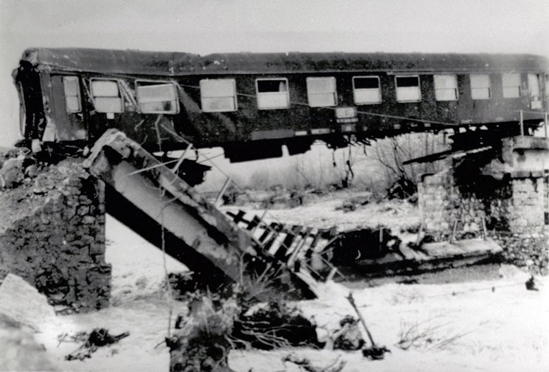
‘In a footnote, Louis Sullivan’s dictum ‘form follows function’ is manipulated through the distorting mirror of the artist’s compulsive punning to become ‘form fallows function’. If this wordplay means anything it implies that a rigid adherence to certain ideas of form will restrict an object or a building’s usefulness. An opposite approach might be to allow an object’s appearance to suggest spontaneous new uses, in the way that the carriage of a wrecked train suddenly becomes a bridge in the photograph included in the Anarchitecture show.’
‘and speaking of the importance that living in an apartment and meeting neighbours from his window high above the ground had had on his artistic development.’
‘Aware as he must have been of the street-drama of the construction and demolition going on around him, motifs that came to play a part in his own practice,15 Matta-Clark would have been equally aware of the argument raging in the neighbourhood in which he lived.’
proposing that more could be learned by closely observing the urban environment as it was than imposing grand plans upon it.
A RESPONSE TO COSMETIC DESIGN COMPLETION THROUGH REMOVAL COMPLETION THROUGH COLLAPSE COMPLETION THROUGH EMPTINESS
Anarchitecture celebrated the inner city in all its disorder and variety and crazy juxtaposition of eras and styles
He had long been fascinated by glimpses of the interiors of buildings, whether seen through a window or through the work of the wrecking-ball, as in the series of photographs he took of the exposed walls of semi-demolished buildings that became Wallspaper 1972
he was really very much interested in this idea that the city had a life which was in the air, it had a life which is on the ground and it had a life below the ground
Slicing up and re-building these apartments, both for himself and for others as a way to earn a little cash, was one of the ways Matta-Clark developed his ideas about the sculptural use of space. As he put it, ‘one of my favourite definitions of the difference between architecture and sculpture is whether there is plumbing’.
Matta-Clark himself was more interested, as he put it in his notebooks, in converting a building into a state of mind
Anarchitecture was, as he wrote on an art card, ‘about making space without building it’
Calling the ancient ruins of Europe benign because they have been ‘swept clean’ – preserved too conscientiously, perhaps – Matta-Clark goes on to propose non-u-ments to be the most provocative relics. The following year, in a letter to artist and dancer Carol Goodden, he expanded on his idea of the non-u-ment: ‘1) it is just as good at any size 2) it is totally unfit for people 3) it invites the visitor to move away’.5
Their installation against the walls of 112 Greene Street – a building that was also ruined, but given new purpose as an exhibition space – doubly underscores how places ‘unfit for people’ can be re-imagined under the right circumstances.
a space of memory rather than history
In Matta-Clark’s words, Fake Estates was intended to comment on ‘spaces that wouldn’t be seen and certainly not occupied. Buying them was my own take on the strangeness of property demarcation lines. Property is so all-pervasive. Everyone’s notion of ownership is completely determined by the use factor.’8 Matta-Clark’s attention to these spaces – a stretch along a gutter, or the matted grass that complements a concrete driveway – reimagines the private-public relationship with space, questioning the way that society values space based on use-value and ownership, and even challenging the concept of private property.
We were thinking more about metaphoric voids, gaps, leftover spaces, places that were not developed … for example, the places where you stop to tie your shoelaces, places that are just interruptions in your daily movements. These places are also perceptually significant because they make reference to movement space
he was actively repurposing the grand ruins of a previous economic structure as a site for the ritual of artistic practice. It is ironic, therefore, that through the refurbishing of previously forgotten spaces, the lofts of Soho became economically valuable again, and the real estate developers eventually came to claim them
Matta-Clark’s work – coming at the intersection between architecture, installation, sculpture, performance, film, photography and cuisine
Walls Paper in particular exposes the shifting terrain of cities, delicately articulating the tension between architecture and ruin, and intervening in the space between the shiny spectacle of capital and its eventual, inevitable decay.
“They were a group of fifteen micro-parcels of land in Queens, left-over properties from an architect’s drawing. One or two of the prize ones were a foot strip down somebody’s driveway and a foot of sidewalk. And the others were curbstone and gutter space. What I basically wanted to do was to designate spaces that wouldn’t be seen and certainly not occupied.”
‘As an architect, what has long fascinated me about the Fake Estates was the unbuildabuility of the parcels—that is, their inability to receive a building in the traditional sense. Matta-Clark is suggesting rhetorically that a site could be something else than a piece of land to receive a building. Furthermore, I was fascinated with the idea that an act of documentation could constitute an end result in itself.’
“liminal” phase, in which individuals are neither in their former group or position nor yet re-introduced into society, is very significant.
During this time, each individual prepares him or herself for the future, and the responsibilities that will come, yet during that time they are not constrained. Thus, barriers that might normally exist between people of different social status, for example, dissolve and each person is regarded as simply another person in the same liminal state.
During the liminal stage, normally accepted differences between the participants, such as social class, are often de-emphasized or ignored. A social structure of communitas forms: One based on common humanity and equality rather than recognized hierarchy. For example, during a pilgrimage, members of an upper class and members of a lower class might mix and talk as equals, when in normal life they would likely never talk at all or their conversation might be limited to giving orders
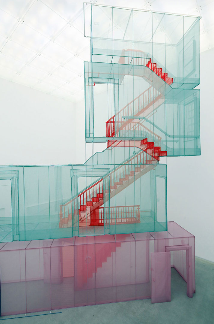
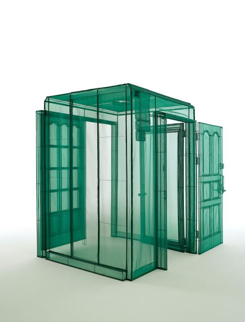
He also works across various media, including paintings and film which explores the concept of space and home. His work is particularly well known in relation to anti-monumentalism. His works convey his life experiences, including the homes he has lived in and the diversity of the people he has met.
contemporary artist renowned for his ethereal one-to-one-scale fabric replicas of former residences and domestic settings that have notions of memory, displacement, and home embedded into their permeable and translucent surfaces.
Chris’s note – he work considers similar concepts to yours – publics, the urban, and viewership. It also reminded me of your work in terms of aesthetics, with the industrial/constructional scaffold appearance.
Orjis’ work allows us to change how we view our urban ecology, and reconnect with the natural world in an intimate way, how does your work allow us to view something differently? Through what means?
ask yourself what history or narrative does your work allow us to view?
Key ideas/ themes from research that i want to take further:
‘a rigid adherence to certain ideas of form will restrict an object or a building’s usefulness.’ Think outside the box. See the potential an object or space could have outside of what we are told it should be or what service it should provide. Be abstract/ fantastical with its purpose.
What could be learned by closely observing the urban environment as it is?
crazy juxtaposition of eras and styles in the urban environment.
glimpses of the interiors of buildings through windows or holes on the wall.
‘difference between architecture and sculpture is whether there is plumbing’.
Changing a building into a state of mind.
a space of memory rather than history
liminal phase
Think more abstract when thinking about materiality. Transparency?
Each guest will each assume the role of a particular character Mystery Parties involve a combination of improvisational acting, storytelling, and creative problem solving. Each guest will play the part of that character throughout the course of the game. Each character has specific personality traits, goals, secrets, and information, all of which are included in the character sheet; a big part of the fun is getting into character and taking on a new, exciting role.
A mysterious Event will occur At some point during the party, an Event will occur that will force the players to come together in order to solve a problem or unravel a mystery. Traditionally, the Event in question will be the murder of one of the characters (as played by a guest), but the parties crafted by Playing With Murder often use this basic framework to accommodate different types of Events, thereby ensuring that your guests will be surprised and entertained (even if they are veteran murder mystery party players).
Solve the mystery! Your guests will need to use the information that their characters know (as well as additional clues that are provided during the game) to solve the mystery or overcome the problem posed by the Event. Typically this culminates in the guests voting on the identity of the murderer, but again, different parties will have different specific goals. All of our parties also come complete with additional subgames (treasure hunts, unique character goals and special puzzles) that are guaranteed to keep the action intense and your guests motivated and focused.
Expanded Game For Large Groups
If you have extra players, there are two ways that you can accommodate everyone:
Investigator Role – Additional players have the option of playing the role of “Investigators”. In this role the players are not suspects and do not have character backgrounds but can question the suspects and try to solve the mystery along with the other players. Expanded Games include a PDF guide that explains how to use the Investigator role, as well as printable character sheets and name tags for anyone that is playing an Investigator.
Multiple Groups – It is also possible to break your guests up into groups and play multiple instances of the game at the same time. The game will more or less happen the same way; the host makes announcements and each group moves their game forward simultaneously based on the host’s instructions. It’s good to have one assistant in each group to answer questions and facilitate gameplay within the group. This method provides a more intimate experience for your guests, who get better acquainted with a smaller group and participate in a more digestible story
Murder in Manhattan is a 171-page downloadable PDF file that you print at home. It includes the following features:
An introduction that explains the basic principles of running a mystery-party and provides specific tips on props, menu items, sound effects, and special tips to help make your party exciting, memorable and easy to run
Step-by-step instructions on how to prepare for your party
A detailed party guidebook that will walk you through the event in a simple, easy-to-understand format
Instructions on how to run the party for a large group
Nametags and character sheets for each player – the character sheets include tips on costuming and role-playing, as well special goals and gossip unique to each character
Fully customizable invitations, complete with RSVP cards and guest lists
One of the great paradoxes of modern consumerism is that these goods are mass-market signifiers of exclusivity, tokens of aristocratic populism. We may not be able to afford them, but we are invited to believe that we still deserve them, and that their acquisition will be the fulfillment of a dream. If we can’t touch what Gatsby has, at least we can look.
“The Bling Ring” follows a group of Los Angeles teenagers who break into the houses of the young and famous and make off with the surplus.
Using the Internet to find the addresses and track the whereabouts of Paris Hilton, Lindsay Lohan, Megan Fox and others, these children not only “go shopping” for jewellery, lingerie and other swag, but also step into the lives of their absent, unwitting hosts. They hang around in the empty houses less like robbers than like guests, uninvited because of some curious oversight on the part of the universe. Most members of the ring are from relatively privileged backgrounds themselves, and their proximity to their victims sharpens both their envy and their sense of entitlement.
Interior ‘set/stage’ design ideas:
Tuesday:
Sequences
View from platform into window
night view looking down lane at platform bathed in light
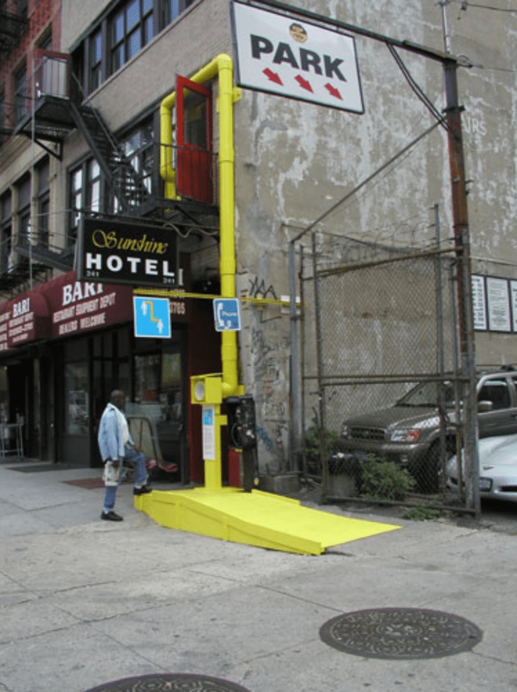
‘The sculpture is a functional alternative “telephone”. It uses PVC pipe and mirrors to make an aural and visual communication link from the second floor lobby of the Sunshine Hotel, to the street below. Passers-by on the street can call up through the tube and be heard in the Sunshine’s communal lobby area. If a resident chooses to answer the call and engage in a conversation through the tube, the sculpture offers a space to have a face to face conversation over a distance of 36 feet. The natural acoustics of the PVC pipe amplify and carry the sound of each person’s voice, creating an aural proximity. At the same time, a periscopic mirror system in the tubes carries the image of the person’s face you are speaking to, but it appears very small and upside-down, visually emphasizing the distance between the two conversants.’
Utility/ service lane/ industrial
Faux // community in the urban // public vs private
The semi-industrial nature has been retained with the spaces and balcony formed out of black steel sheet. Previous services that were a mess have been reassembled and organised but not sanitised. Between here and Queen Street are tenancies which border a shared walkway that overlooks the courtyard. While this has sacrificed net lettable area, it has created a relaxed circulation space that resolves the chaos and brings a sense of order to the disorderly.
The Imperial is thorough fare: deliberate, considered and meticulously detailed. Yet it is neither sterile nor alienating. It mixes a language of black steel, slick tiles and glass with rough brick, exposed concrete and timber that in lesser hands could easily have descended to the tacky. But here, Fearon and Hay have risen above this and produced an elegant solution, made sense of senseless circulation and have, magically, produced a silk purse from the sow’s ear that once comprised these neglected buildings.
he two theatres and an unusual gable loft with clerestory windows called “the Boathouse”, which was probably a warehouse in its previous life.
The theatre seated 500 people and ran screenings continuously in two sessions – 11am to 5pm and 6.30-11pm. “Go where the crowds go. Nothing unworthy of the entertainment but the prices. Fancy!” declared an advertisement in the Observer on December 2, 1911. Adults paid 6p and children 3p.
What’s unusual about the development is that, although the buildings have heritage protection on their Queen St frontage, it doesn’t extend to the rear of the buildings which push through to Fort Lane. If it had wanted to, Phillimore could have demolished the rear site and put up a high-rise to match the glass and concrete ugliness that defines Auckland’s CBD.
The 1910s were an exciting period of technological and stylistic experimentation for movie makers. During this decade, Cinema matured as an artistic medium and transformed into a popular method of storytelling.
Sound recording was not yet invented, so movies of the 1910s were silent. They were basically black and white, although some of the scenes were tinted in a specific color in order to heighten the dramatic impact.
Title cards were only used to tell the more complex parts of the story, but the backbone was pantomime – gestures and body language. The mute performance of the actors was emphasized by a background music, usually played by an orchestra.


:no_upscale()/cdn.vox-cdn.com/uploads/chorus_asset/file/22399639/LEDGEEE.jpg)


.jpg)